How to Interpret P-values: Webinar Reflection

Big thanks to Eva Murray and Andy Kriebel for inviting me onto their BrightTalk channel for a second time. If you missed it, Stats for Data Visualization Part 2 served up a refresher on p-values:

webinar 2

Since our primary audience tends to be those in data visualization, I used the regression output in Tableau to highlight the p-value in a test for regression towards the end. However, I spent the majority of the webinar discussing p-values in general because the logic of p-values applies broadly to all those tests you may or may not remember from school: t-tests, Chi-Square, z-tests, f-tests, Pearson, Spearman, ANOVA, MANOVA, MANCOVA, etc etc.

I’m dedicating the remainder of this post to some “rules” about statistical tests. If you consider publishing your research, you’ll be required to give more information about your data for researchers to consider your p-value meaningful. In the webinar, I did not dive into the assumptions and conditions necessary for a test for linear regression and it would be careless of me to leave it out of my blog. If you use p-values to drive decisions, please read on.

More about Tests for Linear Regression

Cautions always come with statistical tests – those cautions do not fall solely on the p-value “cut-off” debate.

p_values
Note: This cartoon uses sarcasm to poke fun at blindly following p-values.

Do you plan to publish your findings?

To publish your findings in a journal or use your research in a dissertation, the data must meet each condition/assumption before moving forward with the calculations and p-value interpretation, else the p-value is not meaningful.

Each statistical test comes with its own set of conditions and assumptions that justify the use of that test. Tests for Linear Regression have between 5 and 10 assumptions and conditions that must be met (depending on the type of regression and application).

Below I’ve listed a non-exhaustive list of common assumptions/conditions to check before running a test for linear regression (in no particular order).

  1. The independent and dependent variables are continuous variables.
  2. The two variables exhibit a linear relationship – check with scatterplot.
  3. No significant outliers present in the residual plot (AKA points with extremely large residuals) – check with residual plot.
  4. Observations are independent of each other (as in, the existence of one data point does not influence another) – test with Durbin-Watson statistic.
  5. The data shows homoscedasticity (which means the variances remains the same along entire line of best fit) – check the residual plot, then test with Levene’s or Brown-Forsythe’s tests.
  6. Normality – residuals must be approximately normally distributed – check using a histogram, normal probability plot of residuals. (In addition, a dissertation chair may require a Kolmogorov-Smirnov or Shapiro-Wilk test on the dependent and independent variables separately.) As sample size increases, this assumption may not be necessary thanks to the Central Limit Theorem.
  7. There is no correlation between the independent variable(s) and the residuals – check using a correlation matrix or variance inflation factor (VIF).
yo dawg
In other words, these are tests that must be performed in order to perform the test you actually care about.

Note: Check with your publication and/or dissertation chair for complete list of assumptions and conditions for your specific situation.

Can I use p-values only as a sniff test?

Short answer: Yes. But I recommend learning how to interpret them and their limitations. Glancing over the list of assumptions above can give a good indication of how sensitive regression models are to outliers and outside variables. I’d also be hesitant to draw conclusions based on a p-value alone for small datasets.

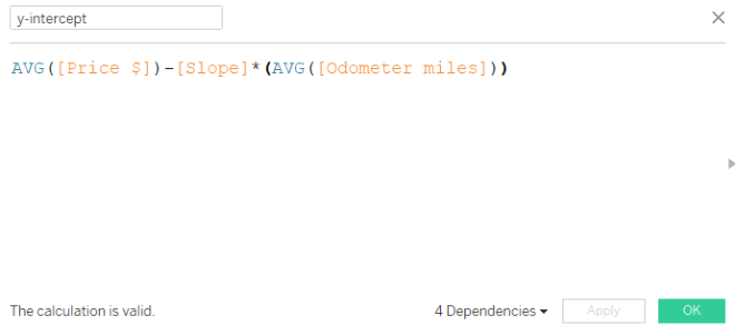
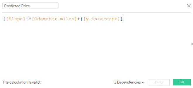
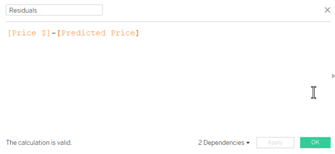
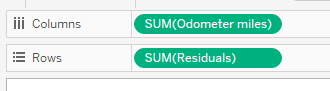
I highly recommend looking at the residual plot (from webinar 1) to determine if your linear model is a good overall fit, keeping in mind the assumptions above. Here is a guide to creating a residual plot using Tableau.

marky mark

How to Create a Residual Plot in Tableau

In this BrightTalk webinar with Eva Murray and Andy Kriebel, I discussed how to use residual plots to help determine the fit of your linear regression model. Since residuals show the remaining error after the line of best fit is calculated, plotting residuals gives you an overall picture of how well the model fits the data and, ultimately, its ability to predict.

residual 4runner
In the most common residual plots, residuals are plotted against the independent variable.

For simplicity, I hard-coded the residuals in the webinar by first calculating “predicted” values using Tableau’s least-squares regression model. Then, I created another calculated field for “residuals” by subtracting the observed and predicted y-values. Another option would use Tableau’s built in residual exporter. But what if you need a dynamic residual plot without constantly exporting the residuals?

Note: “least-squares regression model” is merely a nerdy way of saying “line of best fit”.

How to create a dynamic residual plot in Tableau

In this post I’ll show you how to create a dynamic residual plot without hard-coding fields or exporting residuals.

Step 1: Always examine your scatterplot first, observing form, direction, strength and any unusual features.

scatterplot 4Runner

Step 2: Calculated field for slope

The formula for slope: [correlation] * ([std deviation of y] / [std deviation of x])

  • correlation doesn’t mind which order you enter the variables (x,y) or (y,x)
  • y over x in the calculation because “rise over run”
  • be sure to use the “sample standard deviation”

slope 4runner

Step 3: Calculated field for y-intercept

The formula for y-intercept: Avg[y variable] – [slope] * Avg[x variable]

y-intercept 4runner

Step 4: Calculated field for predicted dependent variable

The formula for predicted y-variable = {[slope]} * [odometer miles] + {[y-intercept]}

  • Here, we are using the linear equation, y = mx + b where
    • y is the predicted dependent variable (output: predicted price)
    • m is the slope
    • x is the observed independent variable (input: odometer miles)
    • b is the y-intercept
  • Since the slope and y-intercept will not change value for each odometer mile, but we need a new predicted output (y) for each odometer mile input (x), we use a level of detail calculation. Luckily the curly brackets tell Tableau to hold the slope and y-intercept values at their constant level for each odometer mile.

equation 4runner

Step 5: Create calculated field for residuals

The formula for residuals: observed y – predicted y

Residual calc

Step 6: Drag the independent variable to columns, residuals to rows

pills 4runber

Step 7: Inspect your residual plot.

Don’t forget to inspect your residual plot for clear patterns, large residuals (possible outliers) and obvious increases or decreases to variation around the center horizontal line. Decide if the model should be used for prediction purposes.

  • The horizontal line in the middle is the least-squares regression line, shown in relation to the observed points.
  • The residual plot makes it easier to see the amount of error in your model by “zooming in” on the liner model and the scatter of the points around/on it.
  • Any obvious pattern observed in the residual plot indicates the linear model is not the best model for the data.

In the plot below, the residuals increase moving left to right. This means the error in predicting 4Runner price gets larger as the number of miles on the odometer increase. And this makes sense because we know more variables are affecting the price of the vehicle, especially as mileage increases. Perhaps this model is not effective in predicting vehicle price above 60K miles on the odometer.

residual 4runner

To recap, here are the basic equations we used above:

equations

For more on residual plots, check out The Minitab Blog.

Webinar Reflection: Stats for Data Visualization Part 1

Thank you to Makeover Monday‘s Eva Murray and Andy Kriebel for allowing me to grace their BrightTALK air waves with my love language of statistics yesterday! If you missed it, check out the recording.

webinar 1

With 180 school days and 5 classes (plus seminar once/week), you can imagine a typical U.S. high school math teacher has the opportunity to instruct/lead between 780 and 930 lectures each year. After 14 years teaching students in Atlanta-area schools (plus those student-teaching hours, and my time as a TA at LSU), I’ve instructed somewhere in the ballpark of 12,000 to 13,500 lessons in my lifetime.

So let’s be honest. Yesterday I was nervous to lead my very first webinar. After all, I depend on my gift of crowd-reading to determine the pace (and the tone) of a presentation. Luckily, I’m an expert at laughing at my own jokes so after the first few slides (and figuring out the delay), I felt comfortable. So Andy and Eva, I am ready for the next webinar on December 20th — Audience, y’all can sign up here.

Fun Fact: In 6th grade I was in the same math class as Andy Kriebel’s sister-in-law. It was also the only year I ever served time in in-school suspension (but remember, correlation doesn’t imply causation).

Webinar Questions and Answers

I was unable to get to all the questions asked on the webinar but rest assured I will do my best to field those here.

  1. Q: Can you provide the dataset? A: Here’s a link to the 4Runner data I used for most of the webinar. Let me know if you’d like any others.
  2. Q: Do you have the data that produced the cartoon in the beginning slide? A: A surprising number of people reproduced the data and the curves from the cartoon within hours of its release. Here is one person’s reproduction in R from this blog post 
  3. Q: Do you have any videos on the basics of statistics? A: YES! My new favorite is Mr. Nystrom on YouTube, we use similar examples and he looks like he loves his job. For others, Google the specific topic along with the words “AP Statistics” for some of the best tutorials out there.
  4. Q: Could you explain about example A with r value -0.17, it seems as 0. A: The picture when r = -.17 is slightly negative — only slightly. This one is very tricky because we tend to think r = 0 if it’s not linear. But remember correlation is on a continuous scale of weak to positive – which means r = -.17 is still really, realAly weak. r = 0 is probably not very likely to be observed in real data unless the data creates a perfect square or circle, for example.
  5. Q: Question for Anna, does she also use Python, R, other stats tools? A: I am learning R! R-studio makes it easier. When I coach doctoral candidates on dissertation defense I use SPSS and Excel; one day I will learn Python. Of course, I am an expert on the TI-84. Stop laughing.TI84

6. Q: So with nonlinear regression [is it] better to put the prediction on the y-axis? A: With linear and nonlinear regression, the variable you want to predict will always be your y-axis (dependent) variable. That variable is always depicted with a y with a caret on top : y hatAnd it’s called “y-hat”

Other Helpful Links

If you haven’t had time to go through Andy’s Visual Vocabulary, take a look at the correlation section.

At the end of the webinar I recommended Bora Beran’s blog for fantastic explanations on Tableau’s modeling features. He has a statistics background and explains the technical in a clear, easy-to-understand format.

Don’t  forget to learn about residual plots if you are using regression to predict.

ice cube quote