From Data to a Story

Photo by Markus Spiske on Pexels.com

To be fair, there are probably thousands of people more qualified to write about Data Storytelling than I. Though since it’s a topic I love and a topic I teach I will do my best to cover a few points for the curious in this post – especially the overlooked step of FINDING the data story.

What is Data?

You can Google the definition of data and find a slew of different answers, but one simplistic way to think about data is how my favorite Statistics textbook defines the term: “Data are usually numbers, but they are not ‘just numbers.’ Data are numbers with context.” (Yates, et al. The Practice of Statistics 3rd Edition.) So when we pull quantitative variables and qualitative (categorical) variables together, we are essentially giving meaning to what was otherwise a set of lonely numerical values.

I received some great answers to this tweet here.

What is Data Storytelling?

In my humble opinion, data storytelling takes the data (aka numbers in context) and, not only translates it into consumable information, but creates a connection between the audience and the insights to drive some action. That action might be a business decision or a “wow, I now appreciate this topic” response, depending on the context and audience.

A Short Guide to Data Storytelling

There are a few steps to telling a data story, and they could get complicated depending on your data type and analysis. And since your and your audience’s interests, background, and ability to draw conclusions plays into your storytelling, this process of finding and telling a data story could easily detour and fall into rabbit holes. Here I will map out a few general steps for both exploratory and explanatory analysis to help you simplify the complex both in process and in message.

1. Define Your Audience and Determine Their Objectives

This is important. And you’ll need to continue circling back to your audience throughout all of the steps below. If you know your audience’s goals, you can more easily cancel out the noise in your data and define the right questions and metrics along the way.

2. Find the Data Story: Exploratory Analysis

a) Make a Picture

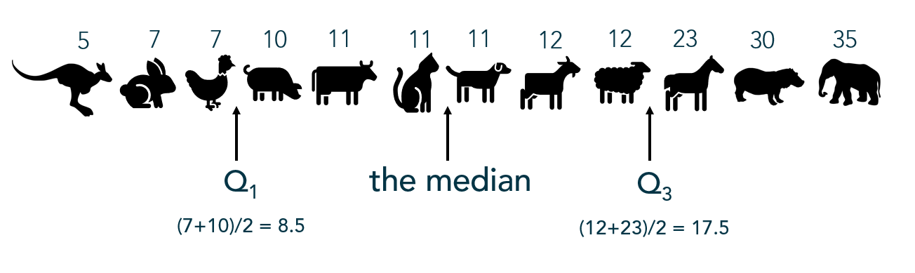
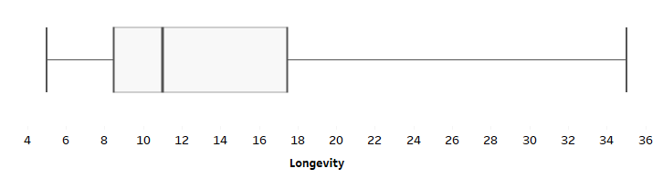
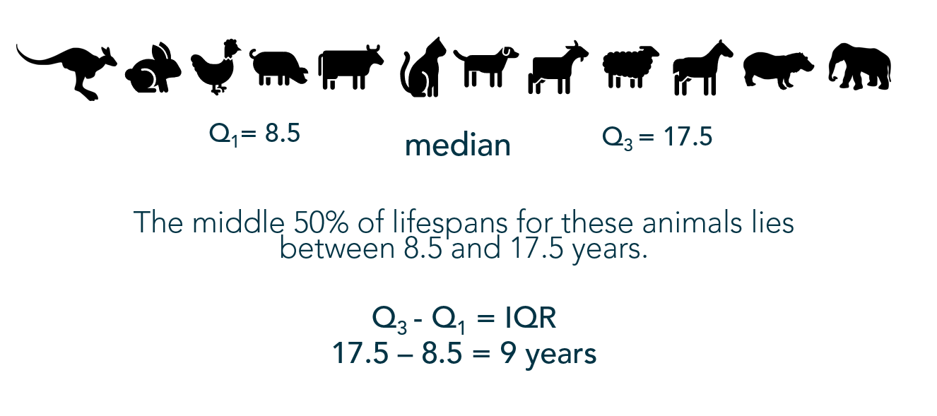
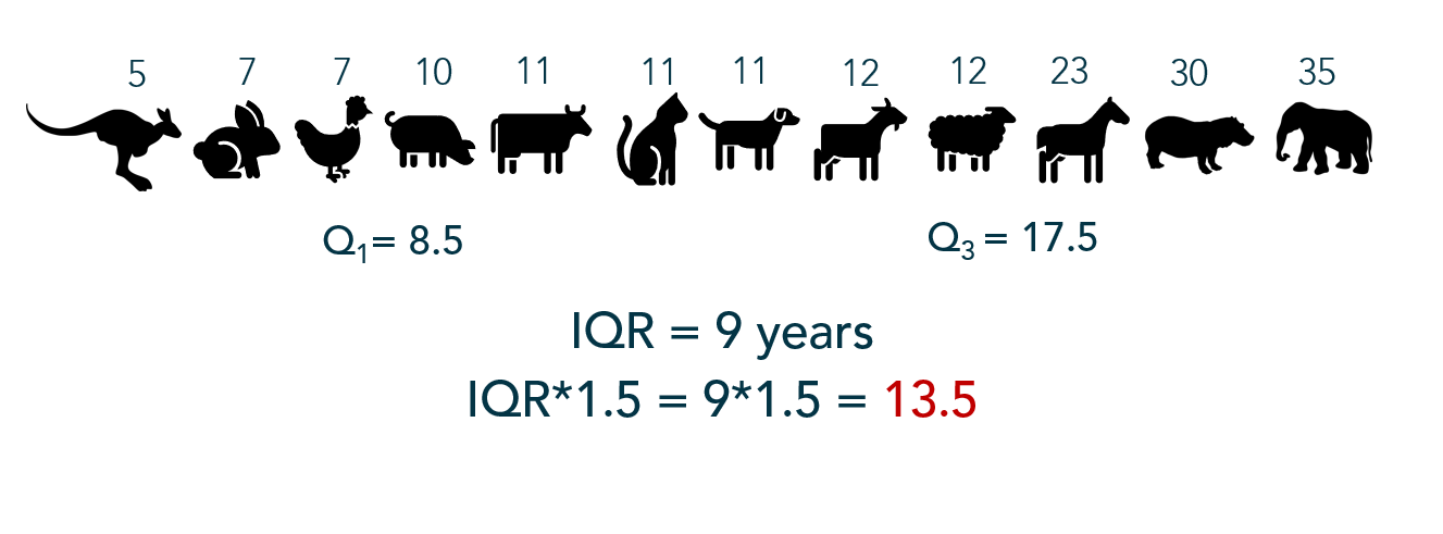
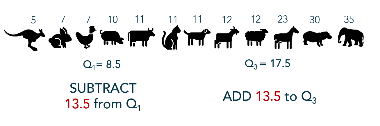
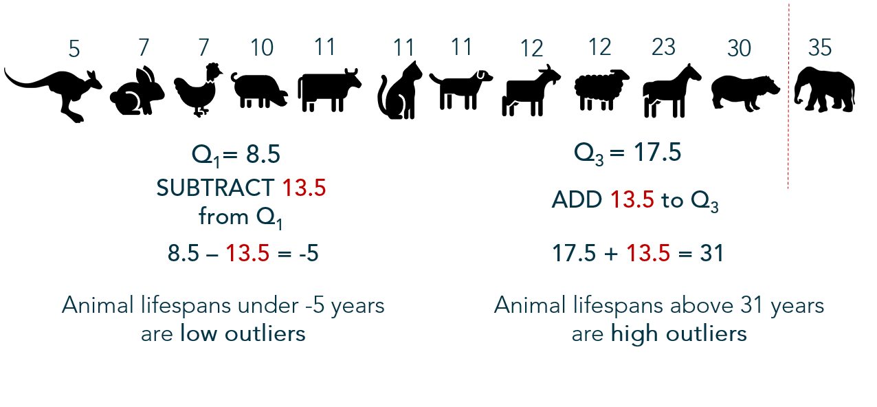
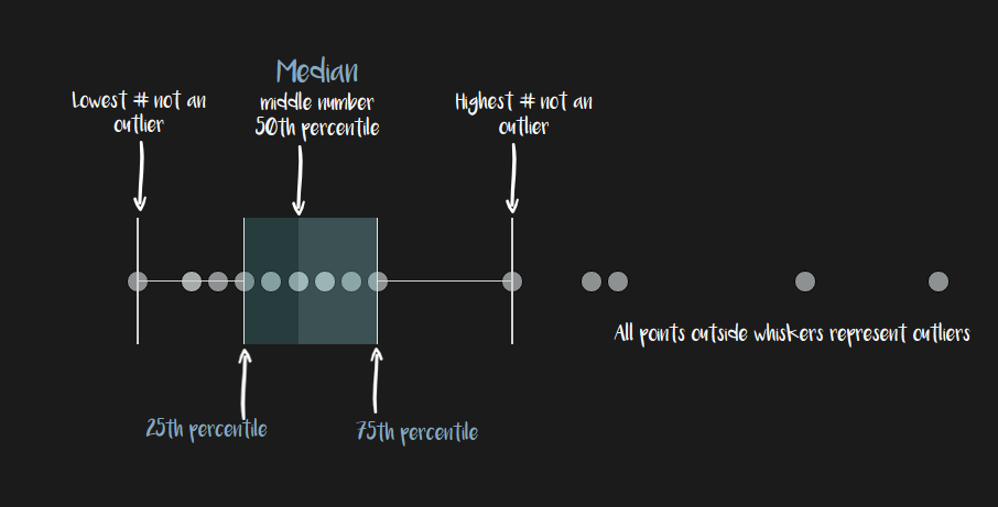
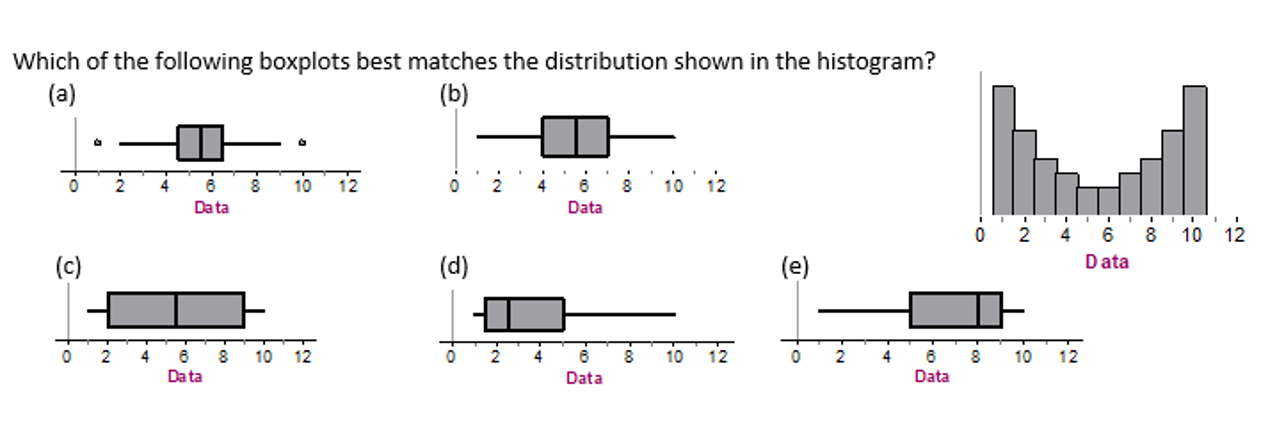
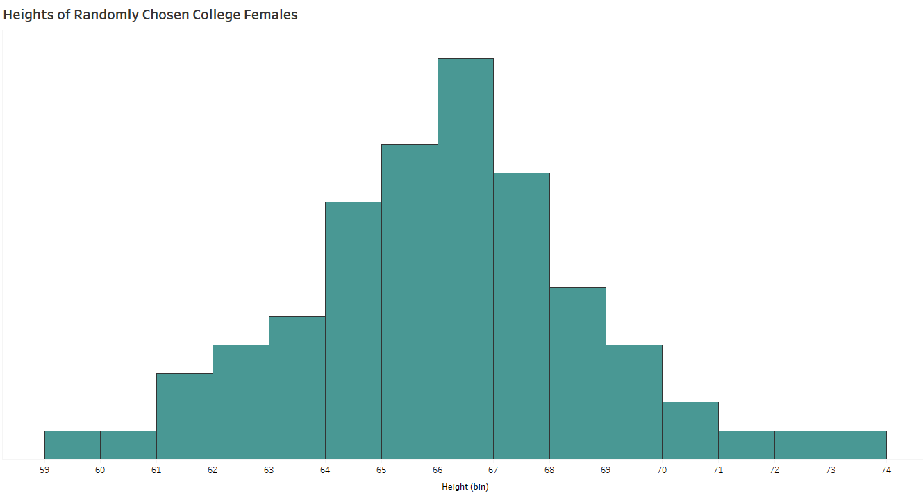
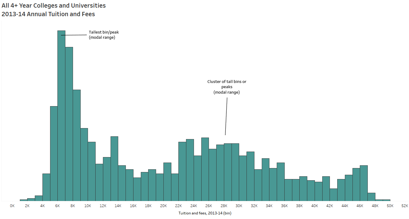
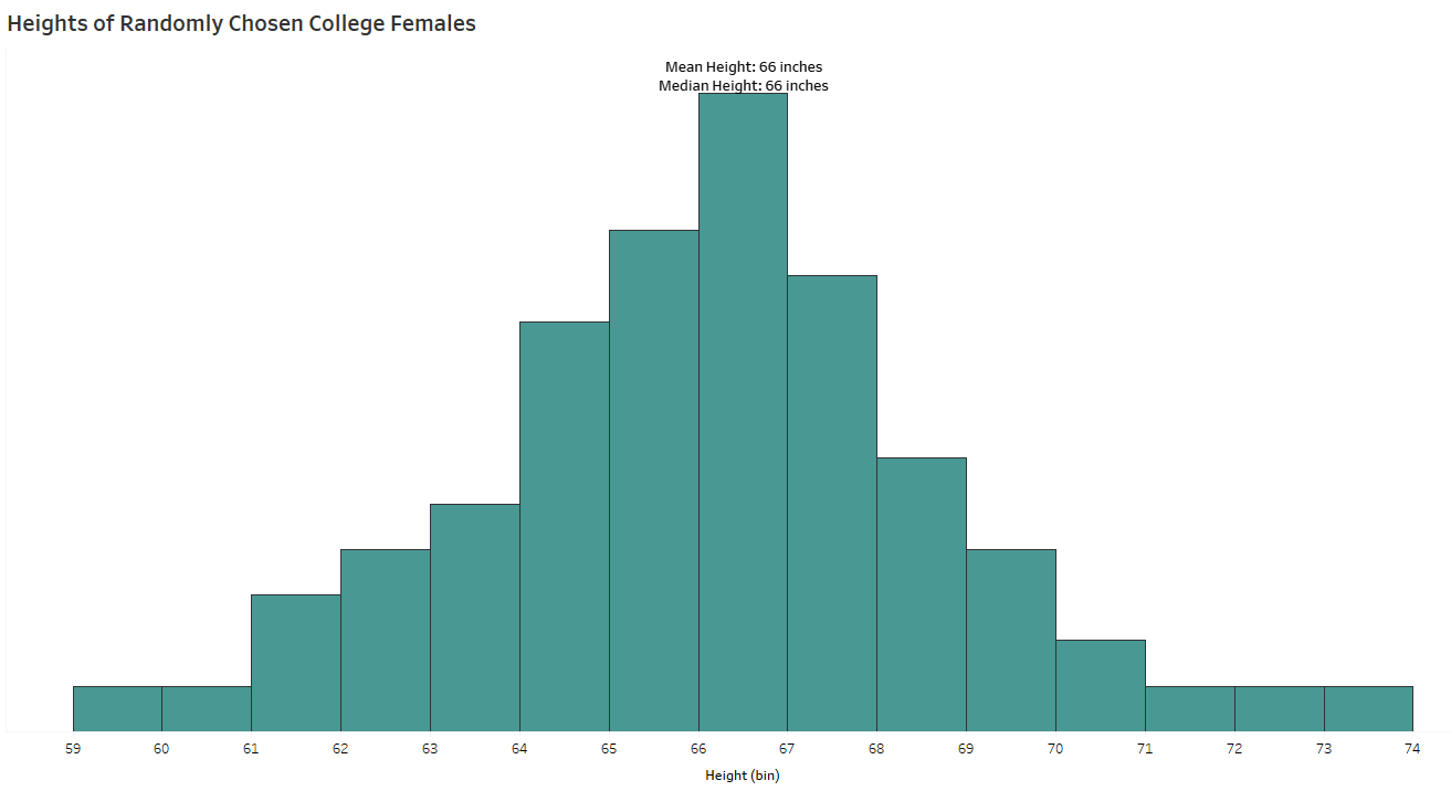
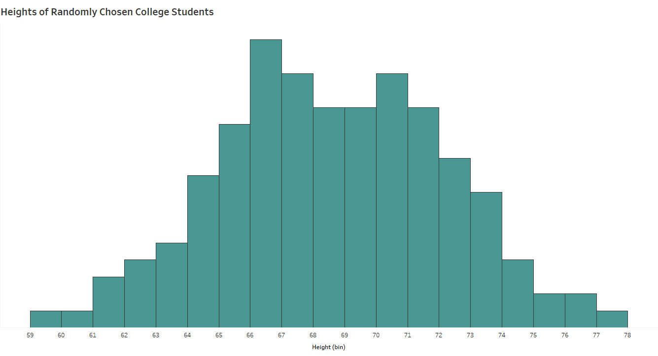
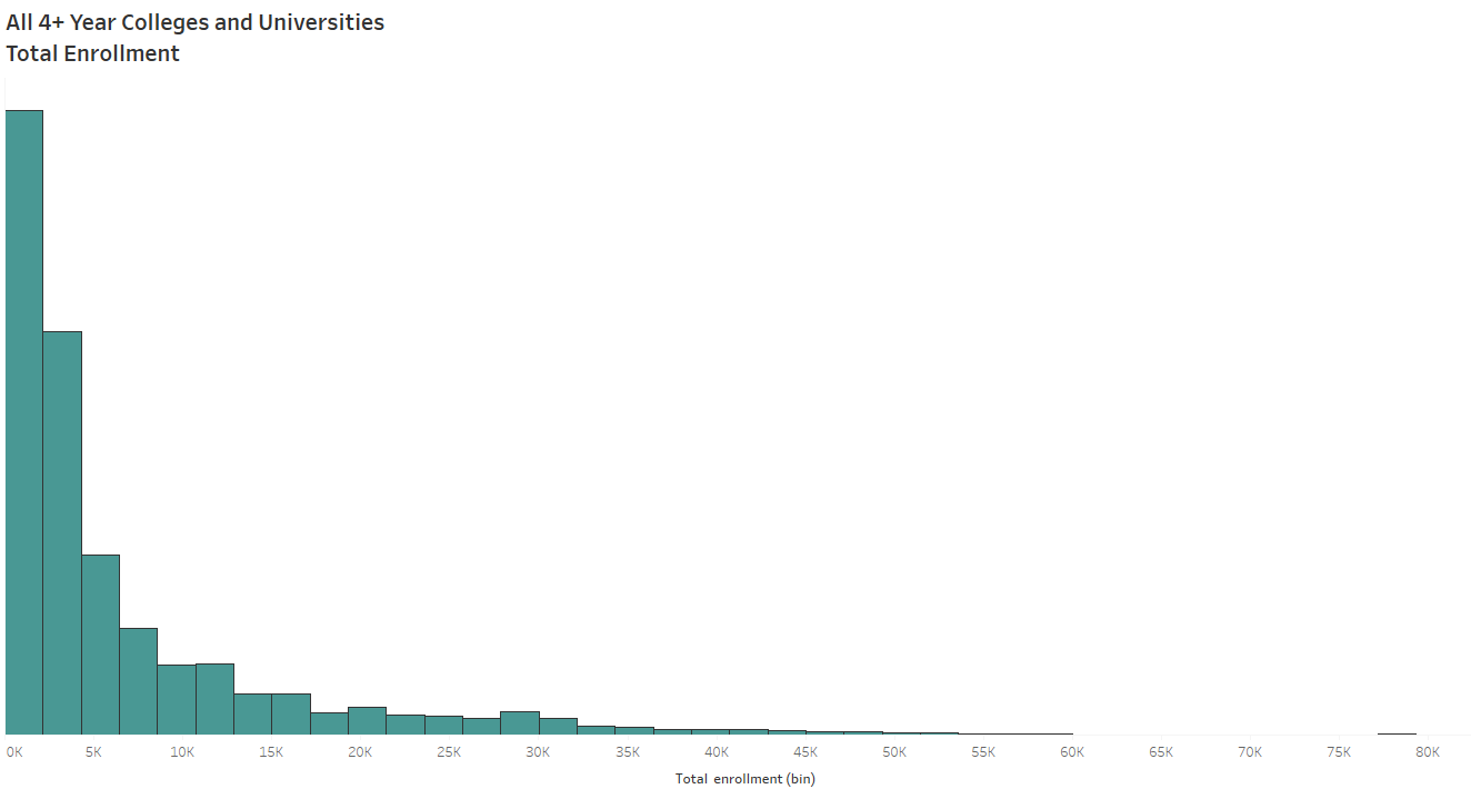
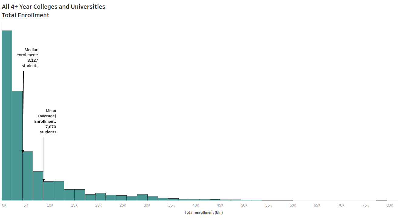
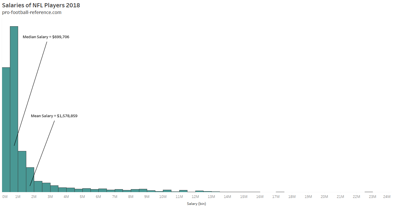
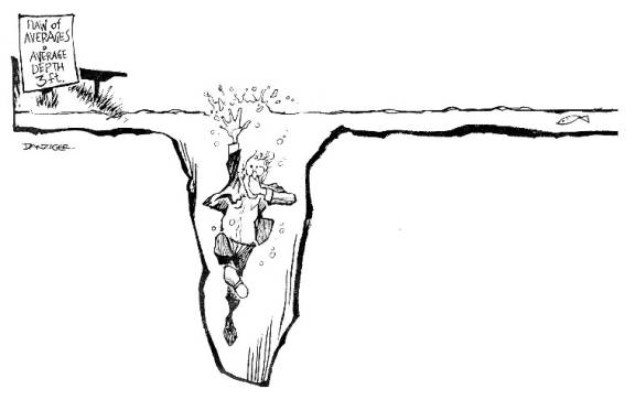
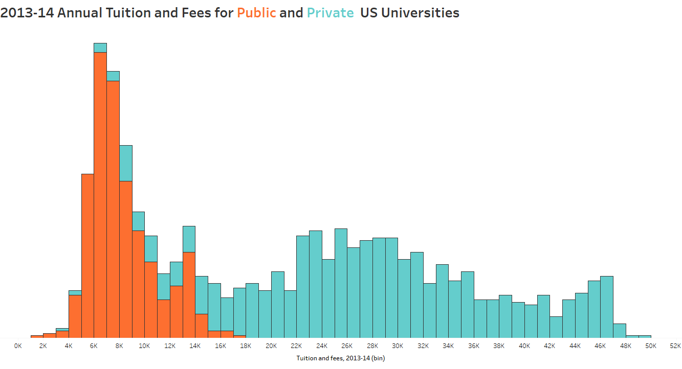
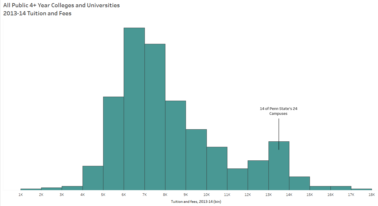
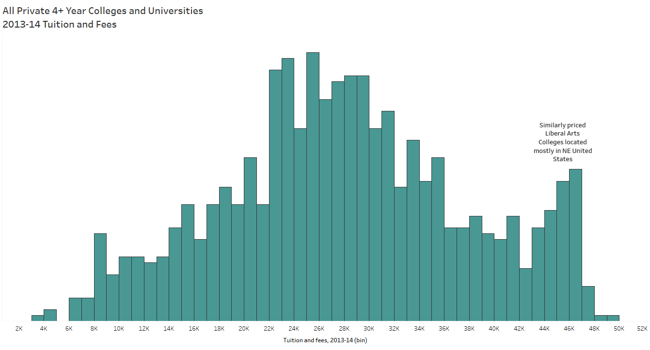
To tell a data story, you have to find the data story. And that begins with the exploratory analysis of your dataset – which should always begin with exploring your data visually. When I taught AP Stats I told the students the same thing I tell you now: When you get your hands on a set of data, MAKE A PICTURE. There are so many things a chart or graph (or multiple charts and graphs) can tell you about the data that tables and summary statistics cannot (including errors). See Anscombe’s Quartet for a demonstration of WHY.

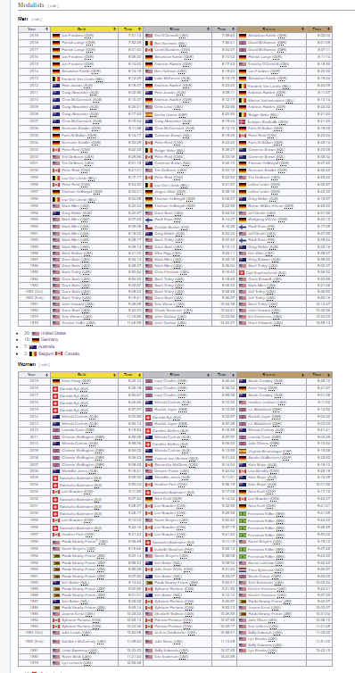
Here I have a dataset from Wikipedia – Ironman World Championship Medalists. I must give credit to Eva Murray and Andy Kriebel for putting this data into .csv form for a 2019 Makeover Monday challenge .

What story can we tell about this data from this format? It’s possible to draw some conclusions based on patterns we might be able to pull with our eyes; however, nothing exact and nothing conclusive. Instead, you might use data visualization tools to create charts and graphs — something like Tableau or Excel, or if you have time on your hands, a whiteboard and dry erase markers — to tease out a story.

b) Ask Questions. And Keep Asking Questions.

So where do you start? I always start with questions. Like, “Which countries have had the most medals in the Ironman Championship?”

We can also ask, “Which countries are the fastest, on average?” I’ve sorted low to high to reflect the fastest countries on top (faster = shorter duration):

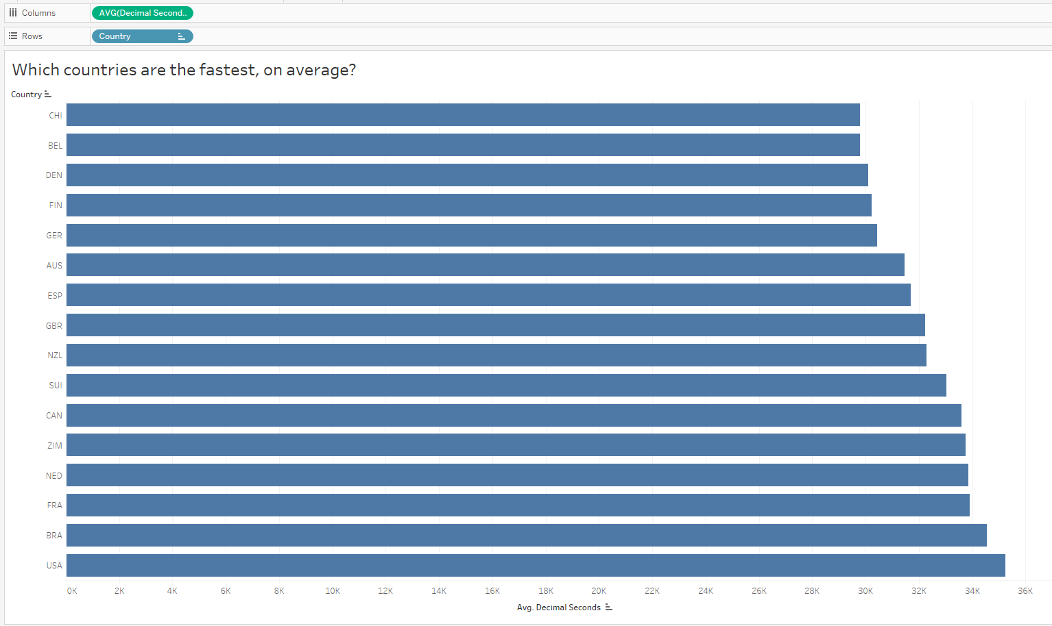
Oh that is interesting – I did not expect to see the US at the bottom of the list given they have the most medals in the dataset. But since I looked at all medals and did not only consider GOLD medals, I might now want to compare countries with the most gold medals. It’s possible the US won mostly bronze, right?

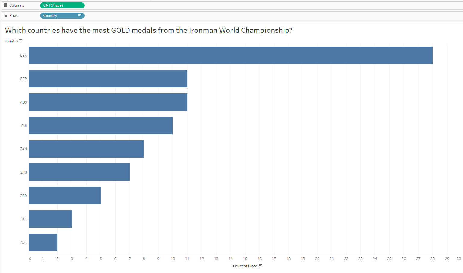
Interesting! I did NOT expect to see the US at the top of this chart after my last analysis. Hmmmm…

c) Don’t Assume, Ask “Why?”

And as you continue to ask questions, you’ll pull out more interesting insights. Since the distribution of gold medals looks similar to the distribution of all medals, I’m still quite curious why the average times for the US is higher than other countries when they have an overwhelmingly large number of gold medals (and gold medals = fastest times). There MUST be some other variable confounding this comparison. So now I’ll slice the data by other variables — now I’ll look at gender, and compare the overall average finish times of males vs females:

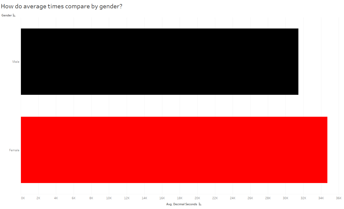
So if males are, on average, faster than females then maybe we should look at the breakdown of males vs females among countries. Is it possible the distribution of males and females differ by country?

Note: Since this is a stacked bar chart, it may appear that the graph is unsorted; however, when there are two genders present, the length of the bar represents the sum of both the overall average male finish times and overall average female finish times. The chart is still sorted by overall average time, as you see 2 charts above.

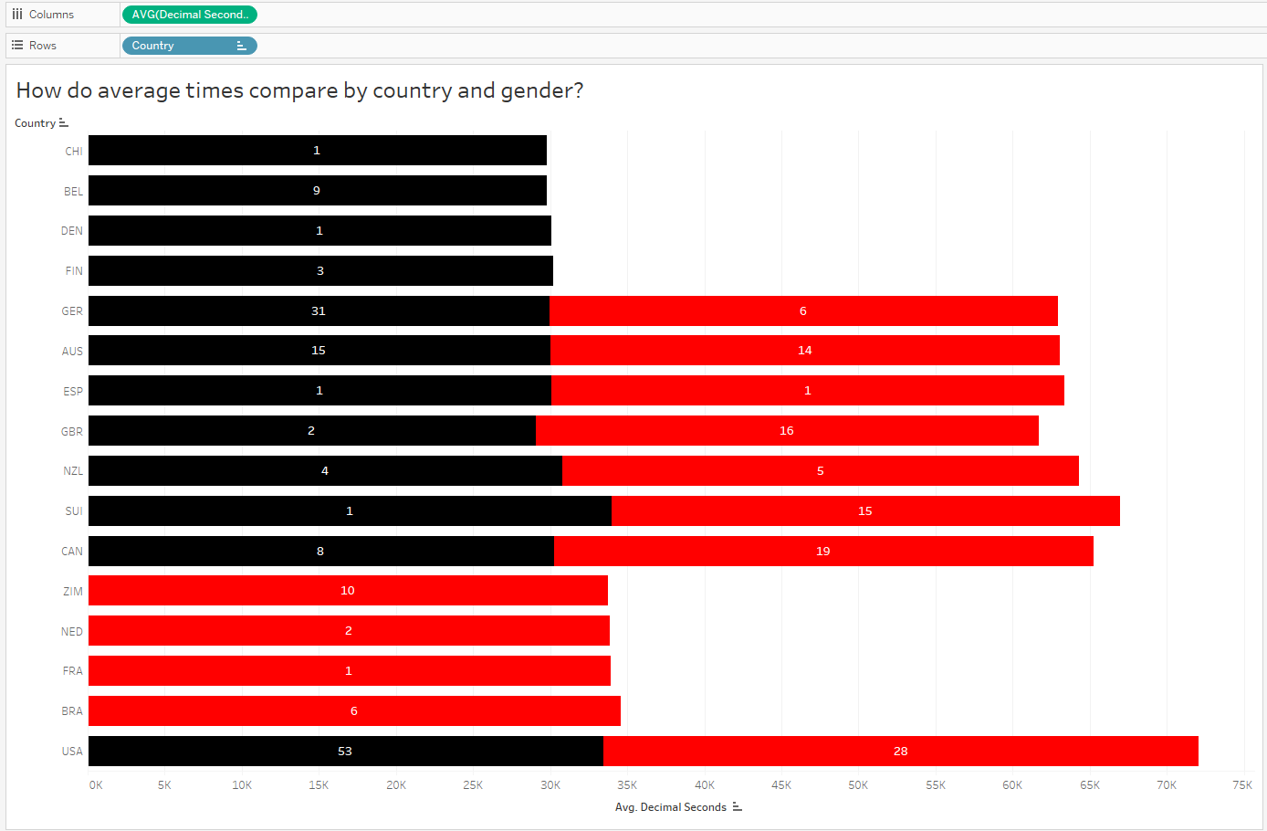
Hmmm, it looks like the top countries, by average time, are represented by male athletes only. Meanwhile, females, whose times are slightly slower than males, make up a large proportion of the remaining countries.

Since the above chart is comparing average race times, let’s bring in some counts to compare the number (and ultimately proportion) of male vs female athletes in each country.

Alright, so now it makes sense that the overall average time for countries with a large proportion of female medalists will appear slightly longer than those with only males. Next I’d like to compare male and female finish times for ONLY gold medalists:

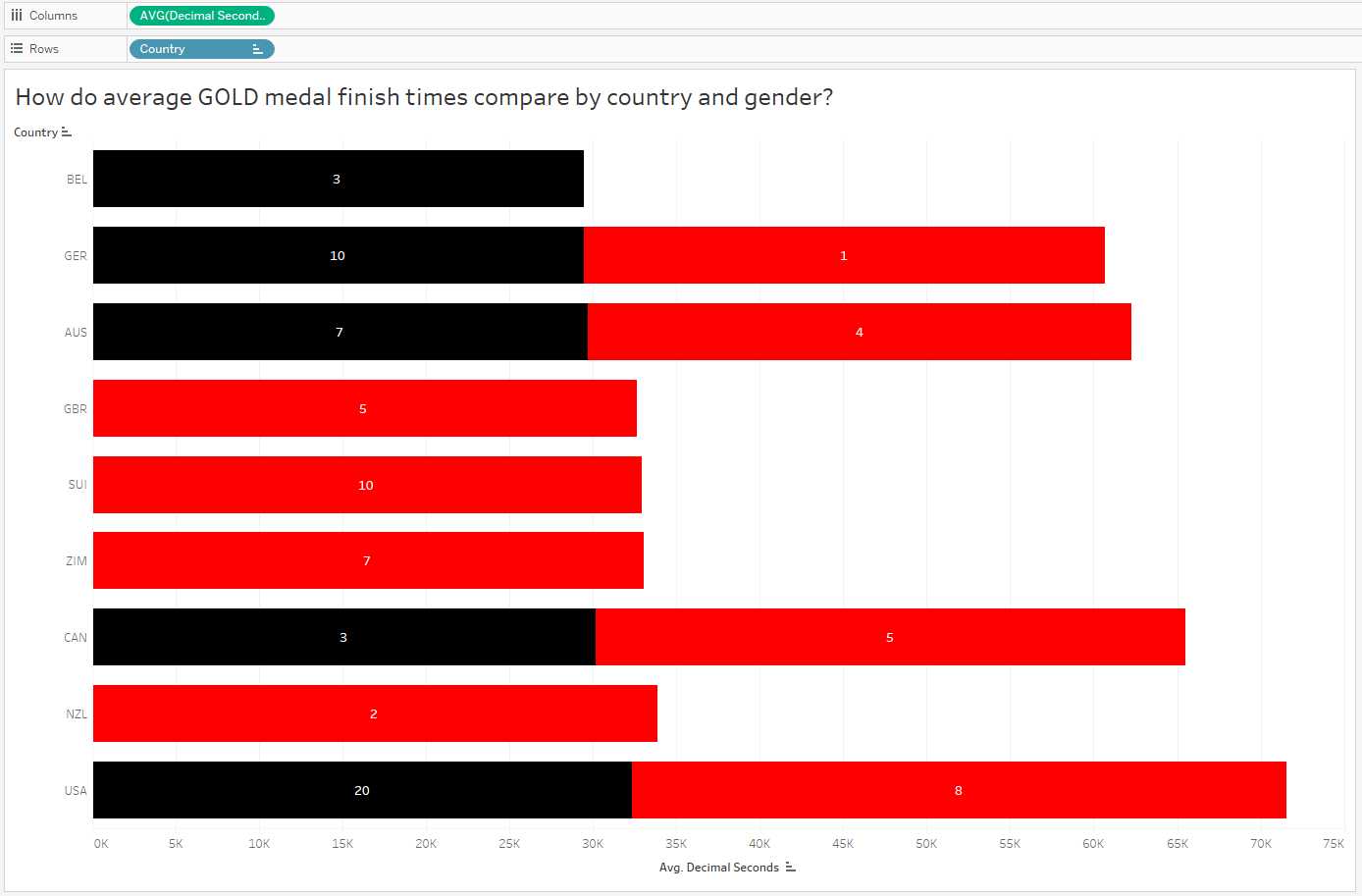
Wow, interesting! Of the 9 countries with gold medals, 8 of them have female representation on the 1st place podium. And 4 of those 9 countries ONLY have female representation at gold. But this doesn’t explain why the US has taken home so many more gold medals than other countries, while the overall average finish times for US finishers (and gold medalists too) are slower! What’s going on?

Is the YEAR a factor? When did the US win gold medals?

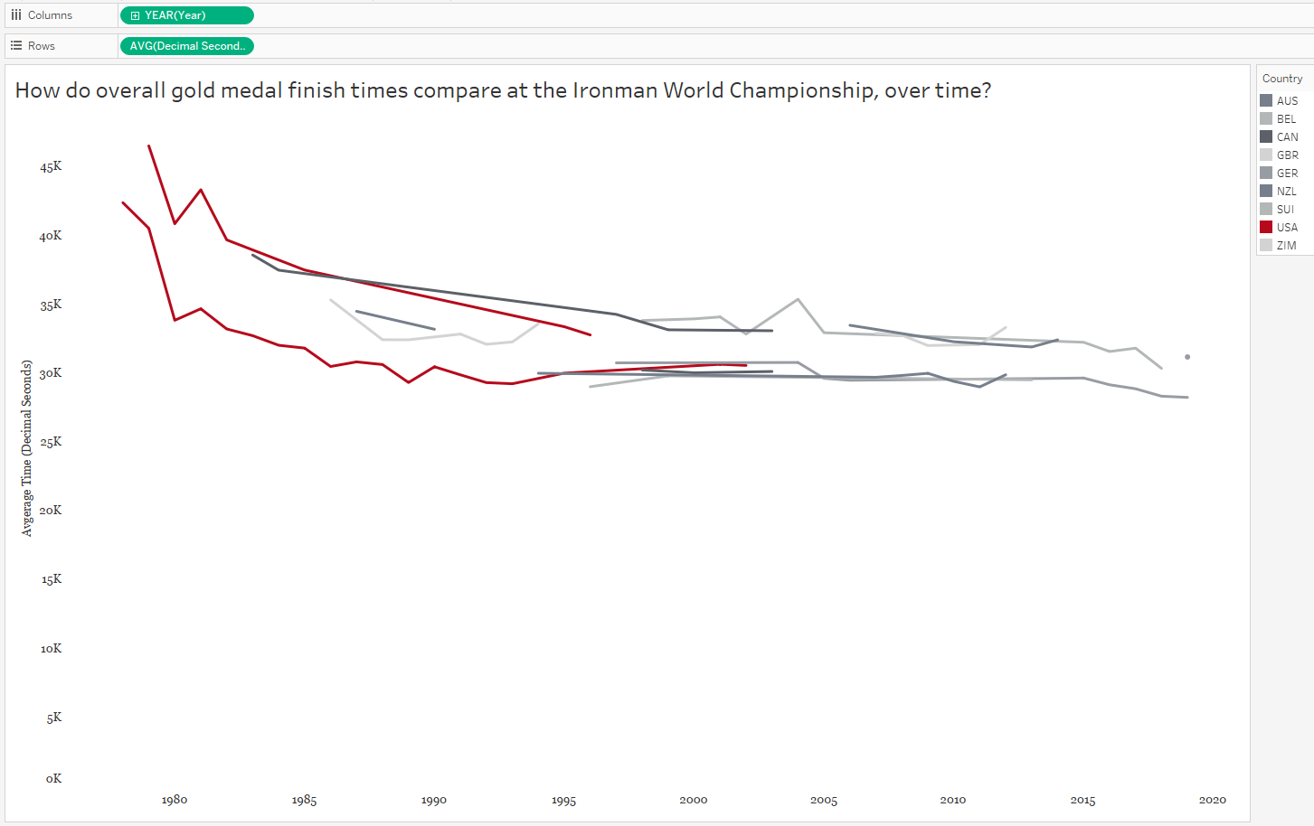
In the above graph, each country is now represented by a line graph (or two lines, if they both females and males won gold medals for that country). But I’ve changed the red color to highlight the US and shades of gray to put the other countries in the background. Looking at the above graph, we can see the overall finish times have decreased over time. AND we can see the US, for both males AND females, haven’t won gold medals in over a decade. So the two confounding variables we found for the race time paradox, as we could call it, were both gender AND year.

d) Focus on One Story

At this point I need to narrow down my context and define what questions I want to ask and which metrics will answer those questions. It’s hard to listen to someone’s story when it has a million tangents, right? So don’t tell those meandering stories with data, either. Pick a topic – and don’t forget to consider your audience. I’ve decided to step away from the specific countries, and compare only those GOLD MEDAL race times by gender over time. I’m curious to learn more about WHY those finish times fell over time!

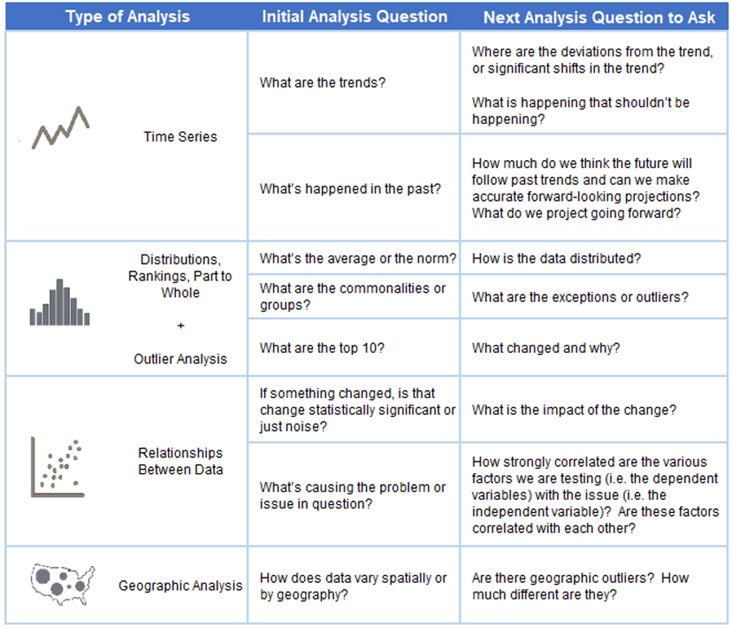
e) Find the Right Analysis for Your Story

Once you determine which variables are involved in your analysis, you can choose the appropriate chart to dig deeper into the insights. Because I chose to focus on gold medal finish times over the years, a time series analysis is appropriate. Here is a great reference tool for matching your analysis to your questions:

Let’s bring in years and create a timeline:

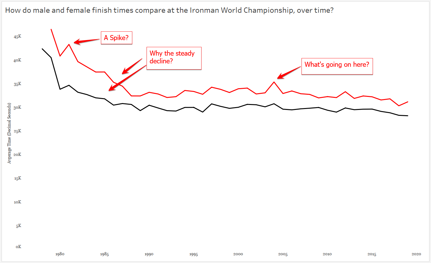
And clearly there is more to investigate here – like why, if I stick with Tableau’s default aggregation of SUM do I see a spike here? After some Googling – ah, that year TWO separate Ironman Championships were held. So even though I’m looking only at times for the male and female gold medal times, there’s one year that’s doubled because there are two gold medal times per gender. Easy fix, let’s change the aggregation to AVERAGE, which will only affect this one year. Now let’s tease out our big story by looking at our chart and asking more questions :

3. Explanatory Analysis

Once you’ve explored the data and you’ve asked and (tried to) answer questions arising from the analysis, you’re ready to pull the story together for your audience.

a) Design with the Audience in Mind

Without calling attention to it, I began this step above. As you can see, I changed up the colors in my charts when I brought in the variable of gender. I did this for you, my audience, so you could easily pick out the differences in the race times for males and females. This is called “leveraging pre-attentive attributes“, which basically means here I’ve used color to help you see the differences without consciously thinking about it. In my final version I will need to make sure the difference in gender is clear and easy to compare (more on this later).

Color also needs to be chosen with the audience in mind. Not only do the colors need to make sense (here I chose the Iron Man brand colors to distinguish gender), they also need to be accessible for all viewers. For example the colors chosen need to have enough contrast for people with color vision deficiency. (For more in-depth information about the use of color, Lisa Charlotte Rost has an excellent resource in her blog Data Wrapper.) Too much of a good thing is never a good thing, so I chose to keep all other colors in the chart neutral so other elements of the story do not compete for the audience’s attention.

Also, without telling you, I’ve stripped away some of the unnecessary “clutter” in my chart by dumping grid lines and axis lines. When in doubt, leave white space in your charts to maximize the “data-to-ink ratio” – save your ink for the data and skip the background noise when possible.

Finally, I’m sticking with my old standard font (Georgia) for the axes and (eventually in the final version, the title). A serif typeface, Georgia is easy to read on small screens or screens with low resolution.

b) Call Attention to the Story/Insights/Action

Here I’ve answered a couple of questions that arose from the data, and you, my audience, never had to switch tabs to go looking for answers. (Re-reading my words I feel like I must sound like Grover in The Monster at the End of the Book.)

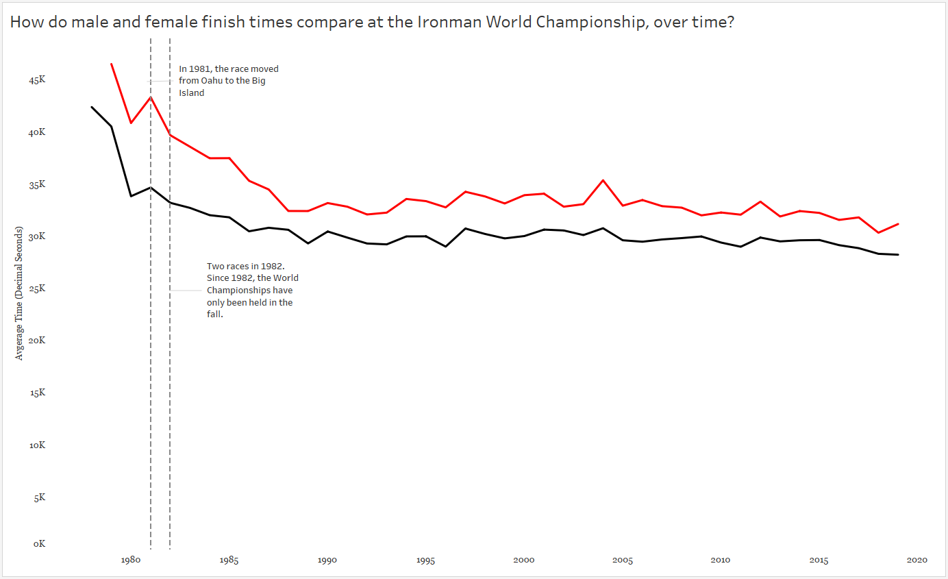
That increase in race time in 1981? A course change! Only a slight increase in time for males, but a big slow down for the females.

Also note I included an annotation for the two races in 1982.

It’s interesting to see the steady decline in finish times throughout the 1980s — what might have caused this decline? And remember, a decline in finish times means GOLD MEDALISTS GOT FASTER.

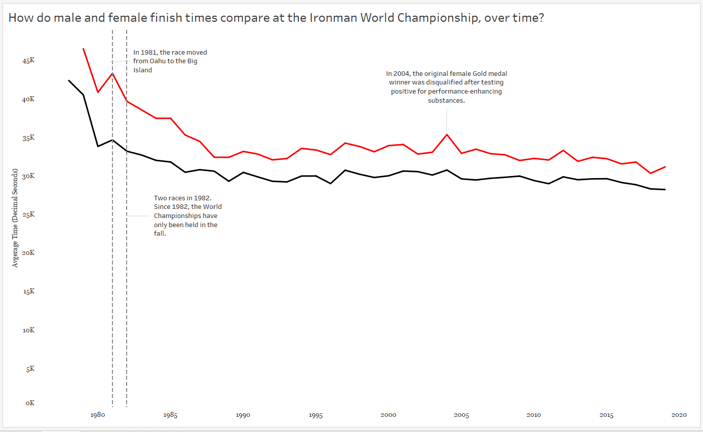
And finally, I called attention to the spike in 2004. Apparently the gold medal finisher was DQ’ed for doping…which makes me wonder about the sharp decline in the 1980’s.

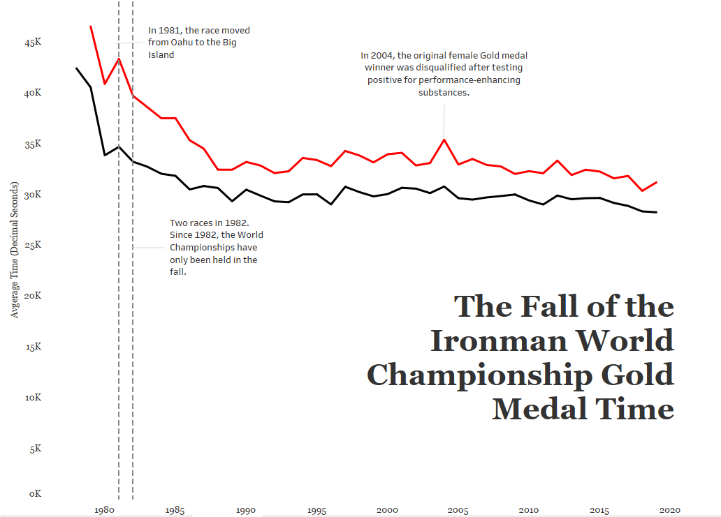
c) Leverage the Title

In the words of Kurt Vonnegut, Pity the Readers. Be as clear and concise and don’t assume they understand your big words and complicated jargon. Keep it simple! One thing I left out of my original title was the very specific use of ONLY gold medal data here. Without that information, the reader might think we were averaging all of the medalist’s times each year!

But is it clear what the red and black colors mean? And are there any additional insights I can throw into my title without being verbose?

Color legends take up dashboard space and I’m a bit keen on the white space I’ve managed to leave in my view. In my final version, I’ve colored the words MALE and FEMALE in the subtitle to match the colors used in the chart, serving as a simple color legend.

A subtitle can help guide the audience to a specific insight, in this case the overall decline in gold medal times by both males and females since the first Ironman World Championship in 1978.

Other Considerations

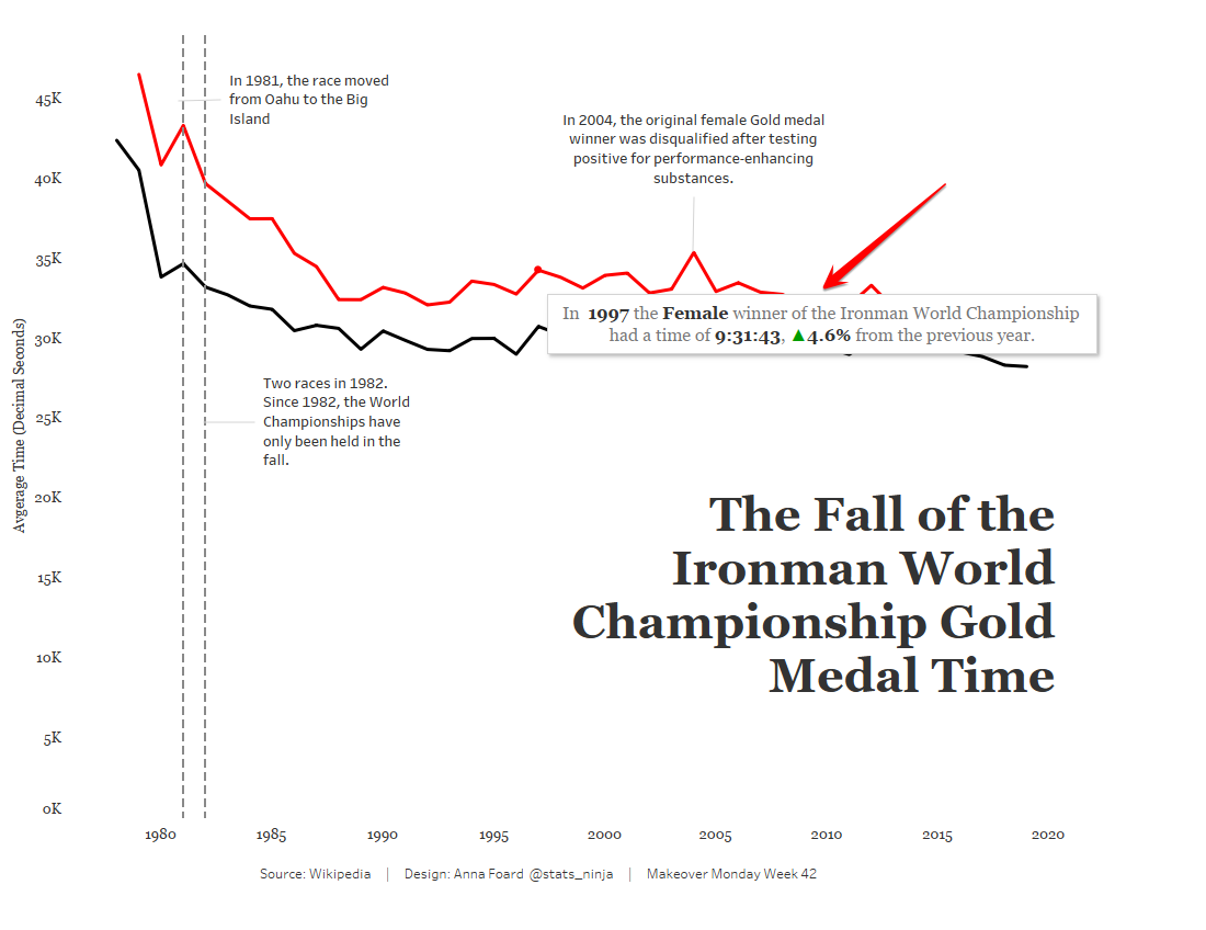
My final version is interactive, as you can see here. I’ve added notes to the tooltip to display the percent change in winning times by gender each year when the audience interacts with the chart:

If you’re using multiple charts for your data story, you’ll also want to consider layout and how the audience will likely consume that information. Tableau has an excellent article on eye-tracking studies to help data story designers create a flow with minimal cognitive load and maximum impact.

Other Data Storytelling Resources

Storytelling with Data – Cole Nussbaumer Knaflic

Info we Trust – RJ Andrews

Data Storytelling: The Ultimate Collection of Resources

Struggling with Uncertainty : The Role of Variability

“Uncertainty is the only certainty there is, and knowing how to live with insecurity is the only security.”
― John Allen Paulos

What is Uncertainty and Why Does it Matter?

At a high level, “uncertainty” is the unknown. You might believe it’s as abstract as chaos, but in fact a truth does exist – a “true” value, or parameter is out there – we just don’t know it. In fact, uncertainty is a certainty when working with data. We use samples of data in time to make decisions on the current and future state of business. And to look for truths in data, we often estimate or use probability to attempt to capture that value, or ranges of values, based on known data/observations.

I teach people how to work with, understand, and garner insights from data. What I’ve also noticed there are two kinds of clients I’ve come across in the consulting world:

  1. Those who would like to learn HOW to visualize, measure, and understand uncertainty to help make better organizational decisions.
  2. Those who have never considered the impact of uncertainty on organizational decisions.

As I suggested above, working with uncertainty starts with working with sample sets of data – whatever we can get our hands on. From our observed data, we can make generalizations about a phenomenon or event that may impact our organization by estimating the probability they will occur. We do this with point estimates, intervals, or broad language. For example:

  • Mr. X has a 40% chance of becoming the new CEO.
  • The proportion of revenue expected to come from our small business division this quarter is approximately 54%, with a 3% margin of error.
  • The Pacific Region will likely merge with the North Pacific Region next year.

Building probability models to uncover these predictions is another conversation for another day; however, it is possible to take a baby step towards understanding uncertainty and working with probabilities. In my opinion, the first step on that journey is learning more about how we interpret variation/variability in data. Why? Because accuracy and precision in measuring a probability depends on how well we’ve measured and contained the variability in the data. How we interpret probabilities depends on how we understand the difference between significance, and natural variation.

Variation

From Merriam-Webster:

Definition of variation 

  1. the act or process of varying the state or fact of being varied
  2. an instance of varying
  3. the extent to which or the range in which a thing varies

Ah. Isn’t that helpful?

kevin hart

Google, save me!

Variation:

  1. A change or difference in condition, amount, or level, typically with certain limits
  2. A different or distinct form or version of something

Variability:

lack of consistency or fixed pattern; liability to vary or change.

Why Does Variation Matter?

Here’s the thing — there’s no need to study/use data when everything is identical. It’s the differences in everything around us that creates this need to use, understand, and communicate data. Our minds like patterns, but a distinction between natural and meaningful variation is not intuitive – yet it is important.

Considering how often we default to summary statistics in reporting, it’s not surprising that distinguishing between significant insights and natural variation is difficult. Not only is it foreign, the game changes depending on your industry and context.

What’s So Complicated About Variation?

Let’s set the stage to digest the concept of variation by identifying why it’s not an innate concept.

At young ages, kids are taught to look for patterns, describe patterns, predict the next value in a pattern. They are also asked, “which one of these is not like the other?”

But this type of thinking generally isn’t cultivated or expanded. Let’s look at some examples:

1) Our brains struggle with relative magnitudes of numbers.

large numbers

We have a group of 2 red and 2 blue blocks. Then we start adding more blue blocks. At what point do we say there are more blue blocks? Probably when there are 3 blue, 2 red, right?

Instead, what if we started with 100 blocks? Or 1000? 501 red/499 still seems the same, right? Understanding how the size of the group modifies the response is learned – as sample/population size increases, variability ultimately decreases.

Something to ponder: When is $300 much different from $400? When is it very similar?

“For example, knowing that it takes only about eleven and a half days for a million seconds to tick away, whereas almost thirty-two years are required for a billion seconds to pass, gives one a better grasp of the relative magnitudes of these two common numbers.”
― John Allen Paulos, Innumeracy: Mathematical Illiteracy and Its Consequences

We understand that 100 times 10 is 1000. And mathematically, we understand that 1 Million times 1000 is 1 Billion. What our brains fail to recognize is the difference between 1000 and 100 is only 900, but the difference between 1 million and 1 billion is 999,000,000! We have trouble with these differences in magnitudes:

magnitudes

We kind of “glaze” over these concepts in U.S. math classes. But they are not intuitive!

2) We misapply the Law of Large Numbers

My favorite example misapplying the Law of Large Numbers is called The Gambler’s Fallacy, or Monte Carlo Fallacy. Here’s an easy example:

Supposed I flip a fair coin 9 times in a row and it comes up heads all 9 times, what is your prediction for the 10th coin flip? If you said tails because you think tails is more likely, you just fell for the Gambler’s Fallacy. In fact, the probability for each coin flip is exactly the same each time AND each flip is independent of another. The fact that the coin came up heads 9 times in a row is not known to the coin, or gravity for that matter. It is natural variation in play.

The Law of Large Numbers does state that as the number of coin flips increase (n>100, 1000, 10000, etc), the probability of heads gets closer and closer to 50%. However, the Law of Large numbers does NOT play out this way in the short run — and casinos cash in on this fallacy.

Oh, and if you thought the 10th coin flip would come up heads again because it had just come up heads 9 times before, you are charged with a similar fallacy, called the Hot Hand Fallacy.

3) We rely too heavily on summary statistics

stats-cartoon

Once people start learning “summary statistics”, variation is usually only brought in as a discussion as a function of range. Sadly, range only considers minimum and maximum values and ignores any other variation within the data. Learning beyond “range” as a measure of variation/spread also helps hone in on differences between mean and median and when to use each.

Standard deviation and variance also measure variation; however, the calculation relies on the mean (average) and when there is a lack of normality to the data (e.g. the data is strongly skewed), standard deviation and variance can be an inaccurate measure of the spread of the data.

In relying on summary statistics, we find ourselves looking for that one number – that ONE source of truth to describe the variation in the data. Yet, there is no ONE number that clearly describes variability – which is why you’ll see people using the 5-number summary and interquartile range. But the lack of clarity in all summary statistics makes the argument for visualizing the data.

When working with any kind of data, I always recommend visualizing the variable(s) of interest first. A simple histogram, dot plot, or box-and-whisker plot can be useful in visualizing and understanding the variation present in the data.

quartiles

Start Simple: Visualize Variation

Before calculating and visualizing uncertainty with probabilities, start with visualizing variation by looking at the data one variable at a time at a granular or dis-aggregated level.

Box-and-whisker can, not only give show you outliers, these charts can also give a comparison of consistency within a variable:

variation box and whiskers

Simple control charts can capture natural variation for high-variability organizational decision-making, such as staffing an emergency room:

variation control chart

Think of histograms as a bar graph for continuous metrics. Histograms show the distribution of the variable (here, diameters of tortillas) over a set of bins of the same width. The width of the bar is determined by the “bin size” – smaller sets of ranges of tortilla diameters – and the height of the bar measures the frequency, or how many tortillas measured within that range. For example, the tallest bar indicates there are 26 tortillas measuring between (approximately) 6.08 and 6.10 cm.

I can’t stress enough the importance of changing the bin size to explore the variation further.

variation histograms

Notice the histogram with the wider bin size (below) can hide some of the variation you see above. In fact, the tortillas sampled for this process came from two separate production lines- which you can conclude from the top histogram but not below, thus emphasizing the importance of looking at variability from a more granular level.

variation histogram wide

Resources

Recently, Storytelling with Data blogged about visualizing variability. I’m also a fan of Nathan Yau’s Flowing Data post about visualizing uncertainty.

Brittany Fong has a great post about disaggregated data, as well as Steve Wexler’s post on Jitter Plots.

I plan a follow-up post diving more into probabilities and uncertainty. For now, I’m going to leave you with this cartoon from XKCD, called “Certainty.

certainty

How to be the Life of the Party Part 3: Permutations and Combinations

(and why your locker combination is actually a permutation)

Welcome to the third installment of my Cheat Sheet for Stats. Be sure to check out Part 1 and Part 2.

Permutations and combinations are useful to someone interested in determining the total number of items from a set or group. This is especially helpful in probability when calculating a denominator and/or numerator.

The difference between a permutation and a combination is simple to understand – if you pay close attention to how the items/objects/people are chosen (and ignore semantics). In this post I’ll give you definitions, formulas, and examples of both permutations and combinations. But first, I’ll discuss the Fundamental Counting Principle and factorials.

The Fundamental Counting Principle

Also known as the multiplication counting rule, this principle says to multiply all possible events together to find the total number of outcomes.

A simple example starts with packing for a vacation. Say you pack 4 shirts, 3 pairs of pants, and 2 pairs of shoes. How many possible outfits can you make? (Assume they all match, or you are 5 years old and don’t give a flip.)

The fundamental counting principle says you now have:

4 * 3 * 2 = 24 possible outfits

Here’s another example. Let’s say your company requires a 5-value verification code consisting of 3 numerical values and 2 alphabetic values (in that order and case sensitive). How many possible verification codes can be produced?

Sometimes it helps to see what is going on:

And visualize the values in each position:

There are 10 total digits to consider (0 – 9) and 26 letters in the alphabet – 52 if case-sensitive. The trick is to multiply to find the total possible outcomes:

= 2,704,000 different verification codes

And what if the requirement changed to 3 numbers and 2 letters (same order), but no repeats? We’d have to take away the number of options for each digit/letter as they are used:

= 1,909,440 different verification codes

There is a little more math involved if you can put these values in any order and I won’t cover that in this post.

Factorials

At first glance, a factorial looks like a very excited number. For instance, 5! might appear to be yelling, “FIVE!” (Silly teacher joke – works better in person.) The exclamation point is actually an operator telling us to multiply that number by all integers less than that number down to 1.

Image result for factorial meme

Permutations

Permutations apply the Fundamental Counting Principle to determine the number of ways you can arrange members of a group. The permutation formula calculates the number of arrangements of n objects taken r at a time:

For example, let’s say you and 29 other people are in the running for 3 distinct prizes. Your names are in a hat and prizes are only given to the first, second, and third names drawn (the best prize being first). The number of ways 30 people can take first, second, and third prize is called a permutation. In a permutation, the order in which the items or people are arranged “matters”. (And by matters, you could say the order is noted, or apparent.)

don’t judge my looks, I just ran a 5K in 25:36. the first place winner didn’t show up for her prize so a nice lady held the sign so we didn’t look like chumps.

For the prize example, you can calculate this using the formula for permutations:

And this goes back to the fundamental counting principle since a portion of the numerator cancels with the denominator:

Simplifying the expression to 30*29*28 = 24,360 ways 3 individuals can be awarded first, second, and third prize from a group of 30 in a random drawing. If we were merely drawing 3 names all at once with no difference in prizes, it would NOT be considered a permutation.

Luckily you really don’t need to know the formula to calculate a permutation. The Excel function for permutations is PERMUT:

Note: There is another Excel function for permutations with repetitions – that one is PERMUTATIONA. For this example, you would use that if we drew names for the three prizes and each time the name was returned to the hat, making it possible for the same person to win all 3 times.

Combinations

Now suppose you and 29 other individuals are in the running for 3 prizes, all with the same value. Your names are in a hat and all three names are drawn at once. Because no order or arrangement is involved, this type of counting technique is called a combination. The combination formula also calculates n objects taken r at a time:

notice the denominator is different – and since you’re dividing by a larger number you can see that a combination will produce fewer possible groups than will a permutation

For the newest version of our prize example, we are taking 3 names from the hat at one time and there is no difference between prizes. Here is that calculation:

Once the 27! in the numerator and denominator cancel, we are left with the 24,360 in the numerator, but still divide by 3! (which is 3*2 = 6):

Which results in only 4060 possible combinations.

The Excel function for combinations is COMBIN:

A Locker Combination is Actually a Permutation

Combination Padlock, Not Resettable Center-Dial Location, 3/4" Shackle Height

Now consider locker combinations. Let’s assume a typical dial lock (Right, left, right) in which there are 39 numbers on the dial and your code has 3 numbers. Does order matter? Absolutely! If you try to open the lock using your 3 number code but in a different order, the locker will not open. So how many possible codes does this locker have?

If numbers couldn’t repeat, we’d have P(39,3) = 54,834 different codes (or what we call “combinations”). But if numbers could repeat, there are 39*39*39 = 59,319 possible codes – to include repeatable values, apply the PERMUTATIONA function in Excel.

You Try!

Based on what you just learned, can you spot the difference between a combination and permutation? Bonus points if you can calculate the result. (Answers at the end of the post.)

  1. A board of directors consists of 13 people. In how many ways can a chief executive officer, a director, and a treasurer be selected?
  2. How many ways can a jury of 12 people be selected from a group of 40 people?
  3. A GM from a restaurant chain must select 8 restaurants from 14 for a promotional program. How many different ways can this selection be done?
  4. At Waffle House hash browns can be ordered 18 different ways. How possible orders can be made by choosing only 3 of the 18?
  5. A locker can have a 4-digit code. How many different codes can we have if there are 25 different numbers and numbers cannot repeat in any given code?

Answers:

  1. Permutation. P(13,3) = 1716
  2. Combination. C(40,12) = 5,586,853,480 order isn’t important here
  3. Combination. C(14,8) = 3003
  4. Combination. C(18,3) = 816
  5. Permutation. P(25,4) = 303,600 (Repeating numbers within a code would give 390,625 different codes.)

How to be the Life of the Party Part 2: Measures of Position

Welcome to Part 2 of my Cheat Sheet for Stats series, sure to make you the life of the party! In case you missed it, Part 1 covered measures of center and spread. In Part 2 we’ll dive into measures of position and location within a dataset – specifically how to calculate, apply, and interpret them.

Measures of Position

Comparing month to month sales volume or current housing prices within your neighborhood are easy to make without involving additional calculations. However, sometimes metrics aren’t exactly comparable in absolute terms. For example, sales volume from 1989 versus 2015. Or current housing prices in Atlanta versus San Francisco. So we typically “normalize” these metrics by adjusting for inflation or cost of living so we can compare relative values.

Another way of comparing considers relative position. Percentiles, quantiles, and z-scores measure the location of a value in relation to other values in a dataset. Once you know the price of a house in Atlanta relative to the rest of the Atlanta housing market, and the price of a house in San Francisco relative to the rest of the San Francisco housing market, you can see how those two housing prices compare to each other.

Percentiles

Percentiles describe the position of a data point relative to the rest of the dataset using a percent. That’s the percent of the rest of the dataset that falls below the particular data point.

Finding an Unknown Percentile

Example: Pretend you’re the 2nd oldest out of a group of 20 people. To find your percentile, count the number of people YOUNGER than you (18) and divide by the total number of people:

18/20 = 0.9, or the 90th percentile

(Note: By calculating percentile using the “percent less than” formula above, the computation disallows a 100th percentile (which is not a valid percentile); however, it forces the lowest value to the 0 percentile (which is also invalid). Another popular variation on this calculation computes the percent less than AND equal to: There are 19 people at your age or younger, so 19/20 is 95th percentile. This version of the calculation fixes the “0 percentile” problem but allows the possibility for an invalid 100th percentile. Both versions of the percentile calculation are acceptable and there is no universally “correct” computation.)

Finding a Given Percentile

Example: You want to determine what height marks the 58th percentile of the 20 people. You’ll multiply the 20 people by 58%, or 20*(0.58) = 11.6. This number is called the index. Round to the nearest whole number 12 – therefore, the 12th height in your group of 20 people roughly falls at the 58th percentile.

A cumulative relative frequency chart, used to locate percentiles

Quantiles

Quantiles break the dataset up into an equal number of n pieces. They signal reference points (or positions) in the dataset to which individual data points can be compared. Specific examples of quantiles are deciles (slicing the data into 10 equal pieces), terciles (3 equal pieces), and quartiles (4 equal pieces). I’ll elaborate using quartiles, but all quantiles follow the same logic:

Quartiles

Quartiles break the dataset up into 4 equal pieces so data points can be compared within the dataset relative to the four quarters of data.

I love watching football, which is broken up into four quarters. If I turn the TV on and the game has already started, I know how far the game has progressed in time relative to the quarter displayed on the screen.

For data:

  • Lower Quartile (Q1) – Roughly the 25th percentile. 25% of the data falls below this point and 75% lies above.
  • Median (Q2) – Roughly the 50th percentile, marks the position of the middle value where half fall above and half fall below this point
  • Upper Quartile (Q3) – Roughly the 75th percentile. 75% of the data falls below this point and 25% lies above.

Quartiles are found using these steps:

  1. Arrange the data from least to greatest.
  2. Find the median, the middle number. (If there are two numbers in the middle, find the average of the two.)
  3. Using the median as the midpoint, the data is now split in half. Now find the middle value in the bottom half of values (this is Q1).
  4. Lastly, find the middle number of the top half of values (this is Q3).

Example: The following values represent the lifespan of a sample of animals. What values break these lifespans into quartiles?

Often quartiles are displayed visually with a box-and-whisker plot:

Full blog post on box-and-whisker plots HERE

Z-Scores

A z-score indicates how many standard deviations a value falls above or below the mean (average). A value with a positive z-score lies above the mean while a value with a negative z-score falls below the mean. Z-scores are a way of standardizing values in order to compare them using relative position.

To calculate a z-score, subtract the average of the population/dataset (mean) from the data point (observation), then divide by the standard deviation of the population/dataset:

Example:

In 1927, Babe Ruth made history hitting 60 home runs in one Major League Baseball season. Only four people have been able to break Ruth’s record (though Mark McGwire and Sammy Sosa have broken that record 2 and 3 times, respectively). In 2001, Barry Bonds set the most recent record, hitting 73 home runs in a single season.

But just how does Barry’s home run performance compare to Babe’s? Many outside factors such as bat quality and pitcher performance could impact the number of homeruns hit by a MLB player. So how did these athletes compare to their peers of the time?

The 1927 league home run average was 7.2 home runs with a standard deviation of 9.7 home runs. While the 2001 league average was an astounding 21.4 home runs, with a standard deviation of 13.2 home runs.

To properly compare these heavy hitters, we need to determine how they preformed relative to the peers of their era by standardizing their absolute HR numbers into z-scores:

Babe Ruth’s performance of 60 HRs lies 5.44 standard deviations above the mean number of HRs hit in 1927
Barry Bond’s performance of 73 HRs lies 3.91 standard deviations above the mean number of HRs hit in 2001

While both athletes displayed phenomenal performances, Babe Ruth could still argue his status of home run champion when comparing in relative terms.

If you automatically think of a bell-shaped, normal curve when you hear “z-score”, you’re not alone. That’s a common connection because of the way we initially introduce z-scores in stats courses:

But z-scores can apply to ANY distribution because they are a way to compare data values using relative position. That is, z-scores “standardize” the data values from absolute to relative metrics.

The Altman Z-score

The Altman z-score is used to predict the liklihood a company will go bankrupt. The Altman z-score applies a weighted calculation based on specific predictors of bankruptcy. This article gives an excellent overview for those interested in calculating and interpreting Altman z-scores.

Next up in Part 3: Counting principles, including permutations and combinations. Because the combination for your combination lock is actually a permutation.

How to be the Life of the Party Part 1: A Cheat Sheet to Summary Statistics

Statistics: What are they good for?

Statistics are values or calculations that attempt to summarize a sample of data. If you’re talking about a population of data, you’re usually dealing with parameters. (Easy to remember: Statistics and Samples start with the letter S, and Populations and Parameters start with the letter P.)

And if you know all there is to know about a population, then you wouldn’t be concerned with statistics. However, we almost never know about an entire population of anything, which is why we focus on studying samples and the statistics that describe those samples.

Statistics and summary statistics, as I mentioned, help us summarize a sample of data so that we can wrap our mind around the entire dataset. Some statistics are better than others, and which statistic you choose to summarize a dataset depends entirely upon the type of data you’re working with and your end goals.

Here, I will briefly discuss the different types, definitions, calculations, and uses of basic summary statistics known as “Measures of Central Tendency” and “Measures of Variation.”

Measures of Central Tendency

Measures of central tendency summarize your dataset into one “typical”, central value. It’s best to look at the shape of your data and your ultimate goals before choosing one measure of central tendency.

Mean

The mean, or average is affected by extreme (outlying) measures since, mathematically, it takes into account all values in the dataset.

Suppose you want to find the mean, or average, of 5 runners on your running team:

The average function in Excel is AVERAGE.

Symbols:

x-bar is the mean of the sample
mu is the mean of the population

Median

Instead of taking the value of the numbers into account, the median considers which value(s) take the middle position. Outliers do NOT affect the value of the median.

The median function in Excel is MEDIAN.

Mode

The most common value, category, or quality is the mode. The mode measures “typical” for categorical data.

In quantitative data, we look for modal ranges to help us dig deeper and segment the dataset. I wrote a blog post recently that dives a little deeper into this concept, as well as visualizing measures of central tendency.

The mode function in Excel is MODE.

Weighted Mean

A weighted mean is helpful when all values in the dataset do not contribute to the average in the same way. For example, course grades are weighted based on what the type of assignment (test, quiz, project, etc). A test might count more towards your final grade than a homework assignment.

Weighted means are also applied when calculating the expected value of an outcome, such as in gambling and actuarial science. An expected value in gambling is what you’d expect to lose (because you’re gonna lose) over the long-run (many, many trials). To calculate this, a probability is applied to each possible outcome and then multiplied by the value of the outcome — pretty much the same way you calculated your grade back in high school:

Note: Weighted Means and Expected Values will reappear in a later post discussing discrete probability distributions.

I wrote a more extensive blog post about “other” means, including Geometric and Harmonic means, in case you’re curious.

Measures of Variation

The middle number of the dataset is only one statistic used the summarize the dataset — the spread of the data is also extremely important to understanding what is happening within your data. Measures of variation tell us how the data varies from end to end and/or within the middle of the dataset and because of this, some measures of spread help in identifying outliers.

For the following examples I took a non-random sample of animal lifespans, put them in order from shortest to longest lifespan. You’ll see the median is 11 years:

Range

The range only considers the variation from the smallest to largest value in the dataset. Here, the animal’s lifespans range 30 years (or, 35 – 5 years). Unfortunately, range doesn’t give us much information about the variation within the datset.

Interquartile Range

Interquartile range, or IQR, is the range of the middle 50% of the dataset. In this situation, it represents the middle 50% of animal lifespans.

To find the IQR, the values in the dataset must first be ordered least to greatest with the median identified (as I did above). Since the median cuts the dataset in half, we then look for the middle value of the bottom half of the dataset (that is, the middle lifespan between the kangaroo and the cat). That represents the lower quartile, or Q1. Then look for the middle value of the top of the dataset, (that is, the middle value between the dog and the elephant). The second number represents the upper quartile, or Q3.

The interquartile range is found by subtracting Q3 – Q1, or 17.5 – 8.5 = 9 which tells me that the middle 50% of these animals’ lifespans range by 9 years. Unfortuantely, IQR only gives information about the spread of the middle of the dataset.

You can calculate the IQR in Excel using the QUARTILE function to find the first quartile and the third quartile, then subtracting like in the above example.

Ever build a box-and-whisker plot (boxplot)? The “box” portion represents the IQR. Here’s a how-to with more information.

Outliers

One common method for calculating an outlier threshold in a dataset depends on the IQR. Once the IQR is calculated, it is then multiplied by 1.5. Find the low outlier threshold by subtracting the IQR*1.5 from Q1. Find upper outlier threshold by adding the IQR*1.5 to Q3. This is the method used to show outliers in box-and-whisker plots.

Standard Deviation

s is the standard deviation of the sample

Standard deviation measures the typical departure, or distance, of each data point from the mean. (Recall, the “mean” is just the average.) So ultimately, the calculation for standard deviation relies on the value of the mean.

The formula below specifically calculates the standard deviation of the sample. I wouldn’t worry too much about using this formula; however, understanding how standard deviation is calculated might help you understand what it calculates, so I’ll walk you through it:

sigma is the standard deviation of the population
  1. In the numerator within the parentheses, the mean is subtracted from each data point. As you can imagine, the mean is the center of the data so half of the resulting differences are negative (or 0), and the other half are positive (or 0). (Adding these differences up will always result in 0.)
  2. Those differences are then squared (making all values positive).
  3. The Greek uppercase letter Sigma in front of the parentheses means, “sum” — so all the squared differences are added up.
  4. Divide that value by the samples size (n) MINUS 1. Your resulting answer is the variance of the dataset.
  5. Since the variance is a squared measure, take the square root at the end. Now you have the standard deviation.

An easier way, of course, is to use Excel’s standard deviation functions for samples: STDEV or STDEV.S

Just like the mean, standard deviation is easily affected by outlying (extreme) values.

the MEDIAN is to INTERQUARTILE RANGE as MEAN is to STANDARD DEVIATION

– The Stats Ninja

Outliers

Several approaches are used to calculating the outlier threshold using standard deviations – which method is employed typically depends on the use case. Many software packages default to 3 standard deviations. If the outlier threshold is calculated using IQR (from above), 2.67 standard deviations mark that boundary.

Next Up: How to be the Life of the Party Part 2 breaks down measures of position, including percentiles and z-scores!

How Laser Tag Helped Students Learn About Data

How do you get a group of 15 to 18-year-old students interested in data prep and analysis? Why, you take them to play laser tag, of course!

That’s right, on a cold January day I loaded up two buses of teens and piloted them to an adventure at our local Stars and Strikes. And this is no small feat — this particular trip developed out of months of planning, and after years proclaiming that I will never ever ever ever EVER coordinate my own field trip for high school kids. I mean, you should SEE the stack of paperwork. And the level of responsibility itself made me anxious.

I’m a parent so I get it. And from a teacher’s point of view, many field trips aren’t worth the hassle.

So there I was, field trip money in one hand, clipboard in another: Imagine a caffeinated Tracy Flick. But thanks to the help of two parent chaperones and the AP Psychology teacher (Coach B), we ran the smoothest data-related field trip modern education has ever known.

What Does Laser Tag Have to do With Statistics?

Statistics textbooks are full of canned examples and squeaky clean data that often have no bearing on a students’ interests. For example, there is an oh-so-relatable exercise computing standard error for D-glucose contained in a sample of cockroach hindguts. In my experience I’ve learned when students can connect to the data, they are able to connect to the concept. We’re all like that, actually — to produce/collect our own data enables us to see what we otherwise would have missed.

(I can assure you confidence intervals constructed from D-glucose in coachroach hindguts did little for understanding standard error.)

The real world is made up of messy data. It’s full of unknowns, clerical errors, bias, unnecessary columns, confusing date formats, missing values; the list goes on. Laser Tag was suggested to me as a way to collect a “large” amount of data in a relatively short amount of time. And because of the size of the dataset, it required the student to input their own data — creating their own version of messy data complete with clerical errors. From there they’d have to make sense of the data, look for patterns, form hypotheses.

The Project

  • Students entered their data into a Google doc — you can find the complete data here.
  • Each partner team developed two questions for the data: One involving 1-variable analysis, another requiring bivariate analysis.
  • The duos then had to explore, clean, and analyze all 47 rows and 48 columns. At this point in the school year, students had been exposed to data up to about 50 rows, but never had they experienced “wide” data.
  • Analyses and presentations required a visualization, either using Excel or Tableau.

Partner projects lend to fantastic analyses, with half the grading

Playing the Games

Methodology: Each student was randomly assigned to a team using a random number generator. Teams of 5 played each other twice during the field trip. The teams were paired to play each other randomly. If, by chance, a team was chosen to play the same team twice, that choice would be ignored and another random selection would be made until a new team was chosen.

Before each game, I recorded which student wore which laser tag vest number. From the set-up room (see above picture), I could view which vest numbers were leading the fight and which team had the lead. It was entertaining. As the students (and Coach B — we needed one more player for even teams) finished their games, score cards were printed and I handed each student their own personal results. The words, “DON’T lose this” exited my lips often.

Upon our return to school (this only took a few hours, to the students’ dismay), results were already pouring the into the Google doc I’d set up ahead of time.

Teaching Tableau and Excel Skills

The AP Statistics exam is held every year in May, hosted by The College Board. On the exam, students are expected to use a graphing calculator but have no access to a computer or Google. Exactly the opposite of the real world.

Throughout the course, I taught all analysis first by hand, or using the TI-83/84. As students became proficient, I added time in the computer lab to teach basic skills using Excel and Tableau (assignments aligned to the curriculum while teaching skills in data analysis). It was my goal for students to have a general understanding of how to use these “real world” analytics tools while learning and applying AP Statistics curriculum.

After the field trip, we spent three days in the computer lab – ample time to work in Tableau and Excel with teacher guidance. Students spent time exploring the 48-column field trip dataset with both Excel and Tableau. They didn’t realize it, but by deciding which chart type to use for different variables, they were actually reviewing content from earlier in the year.

When plotting bivariate quantitative data, a scatterplot is often the go-to chart

Most faculty members had never heard of Tableau. At lunch one day I sat down with Coach B to demonstrate Tableau’s interface with our field trip dataset.

“What question would you ask this set of data?” I asked.

“A back shot is a cheap shot. I wonder who is more likely to take a cheap shot, males or females?”

So I proceeded to pull up a comparison and used box-and-whiskers plots to look for outliers. Within seconds, a large outlier was staring back at us within the pool of male students:

“Ha. I wonder who that was.” – Coach B

“That’s YOU.” – Me

From there, I created a tongue-in-cheek competitive analysis from the data:

Full color version found here.

Student Response

I’ve been teaching since 2004. Over the years, this was probably the most successful project I’ve seen come through my classroom. By “successful”, I’m talking the proportion of students who were able to walk outside of their comfort zone and into a challenging set of data, perform in-depth analyses, then communicate clear conclusions was much higher than in all previous years.

At the end of the year, after the AP Exam, after grades were all but inked on paper, students still talked excitedly about the project. I’d like to think it was the way I linked a fun activity to real-world analysis, though it most likely has to do with getting out of school for a few hours. Either way, they learned something valuable.

Univariate Analysis

One student, Abby, gave me permission to share her work adding, “This is the project that tied it all together. This was the moment I ‘got’ statistics.”

Interestingly, students were less inclined to suggest the female outlier of 2776 shots was a clerical mistake (which it was). I found there were two camps: Students who didn’t want to hurt feelings, and students who think outliers in the wild need no investigation. Hmmm.

Bivariate Analysis

For a group of kids new to communicating stats, I thought this was pretty good. We tweaked their wording (to be more contextual) as we dove into more advanced stats, but their analysis was well thought through.

What I Learned

When you teach, you learn.
Earlier I said the project was a success based on the students’ results. That’s only partially true; it was also a success because I grew as an educator. After years of playing by the rules I realized that sometimes you need to get outside your comfort zone. For me that was two-fold: 1) Sucking it up and planning a field trip and 2) Losing the old, tired TI-83 practice problems and teaching real-world analytics tools.

The Box-and-Whisker Plot For Grown-Ups: A How-to

Author’s note: This post is a follow-up to the webinar, Percentiles and How to Interpret a Box-and-Whisker Plot, which I created with Eva Murray and Andy Kriebel. You can read more on the topic of percentiles in my previous posts.

No, You Aren’t Crazy.

That box-and-whisker plot (or, boxplot) you learned to read/create in grade school probably IS different from the one you see presented in the adult world.

versions

The boxplot on the top originated as the Range Bar, published by Mary Spear in the 1950’s. While the boxplot on the bottom was a modification created by John Tukey to account for outliers. Source: Hadley Wickham

As a former math and statistics teacher, I can tell you that (depending on your state/country curriculum and textbooks, of course) you most likely learned how to read and create the former boxplot (or, “range bar”) in school for simplicity. Unless you took an upper-level stats course in grade school or at University, you may have never encountered Tukey’s boxplot in your studies at all.

You see, teachers like to introduce concepts in small chunks. While this is usually a helpful strategy, students lose when the full concept is never developed. In this post I walk you through the range bar AND connect that concept to the boxplot, linking what you’ve learned in grade school to the topics of the present.

The Kid-Friendly Version: The Range Bar

In this example, I’m comparing the lifespans of a small, non-random set of animals. I chose this set of animals based solely on convenience of icons. Meaning, conclusions can only be drawn on animals for which Anna Foard has an icon. I note this important detail because, when dealing with this small, non-random sample, one cannot infer conclusions on the entire population of all animals.

1) Find the quartiles, starting with the median

Quartiles break the dataset into 4 quarters. Q1, median, Q3 are (approximately) located at the 25th, 50th, and 75th percentiles, respectively.

Finding the median requires finding the middle number when values are ordered from least to greatest. When there is an even number of data points, the two numbers in the middle are averaged.

median
Here the median is the average of the cat and dog’s longevity. NOTE: If, with an even set of values the two in the middle were different, the lower of the two values would be in the 50th percentile and would not be the same measure as the median.

Once the median has been located, find the other quartiles in the same way: The middle value in the bottom set of values (Q1), then the middle value in the top set (Q3).

quartiles
Here we can easily see when quartiles don’t match up exactly with percentiles: Even thought Q1 = 8.5, the duck (7) is in the 25th percentile while the pig is above the 25th percentile. And the sheep is in the 75th percentile despite the value of 17.5 at Q3.

2) Use the Five Number Summary to create the Range Bar

The first and third quartiles build the “box”, with the median represented by a line inside the box. The “whiskers” extend to the minimum and maximum values in the dataset:

range bar

But without the points:

animal box no points

The Range Bar probably looks similar to the first box-and-whisker plot you created in grade school. If you have children, it is most likely the first version of the box-and-whisker plot that they will encounter.

school example
from elementary school Pinterest

Suggestion:

Since the kid’s version of the boxplot does not show outliers, I propose teachers call this version, “The Range Bar” as it was originally dubbed, to not confuse those reading the chart. After all, someone looking at this version of a boxplot may not realize it does not account for outliers and may draw the wrong conclusion.

The Adult Version: The Boxplot

The only difference between the range bar and the boxplot is the view of outliers. Since this version requires a basic understanding of the concept of outliers and a stronger mathematical literacy, it is generally introduced in a high school or college statistics course.

1) Calculate the IQR

The interquartile range is the difference, or spread, between the third and first quartile reflecting the middle 50% of the dataset. The IQR builds the “box” portion of the boxplot.

IQR 2

2) Multiply the IQR by 1.5

IQR

3) Determine a threshold for outliers – the “fences”

1.5*IQR is then subtracted from the lower quartile and added to the upper quartile to determine a boundary or “fences” between non-outliers and outliers.

IQR 1

4) Consider values beyond the fences outliers

outliers

Since no animals’ lifespans are below -5 years, it is not possible for a low-value outlier in this particular set of data; however, one animal in this dataset lives beyond 31 years – an outlier in higher values.

5) Build the boxplot

Here we find the modification on the “range bar” – the whiskers only extend as far as non-outlier values. Outliers are denoted by a dot (or star).

boxplot 12
The adult version also allows us to apply technology, so I left the points in the view to enhance the distribution’s view.

Advantage: Boxplot

In an academic setting, I use boxplots a great deal. When teaching AP Statistics, they are helpful to visualize the data quickly by hand as they only require summary statistics (and outliers). They also help students compare and visualize center, spread, and shape (to a degree).

When we get into the inference portion of AP Stats, students must verify assumptions for certain inference procedures — often those procedures require data symmetry and/or absence of outliers in a sample. The boxplot is a quick way for a student to verify assumptions by hand, under time constraints. When coaching doctoral candidates through the dissertation stats, similar assumptions are verified to check for outliers — using boxplots.

TI83plus
My portable visualization tool

Boxplot Advantages:

  • Summarizes variation in large datasets visually
  • Shows outliers
  • Compares multiple distributions
  • Indicates symmetry and skewness to a degree
  • Simple to sketch
  • Fun to say

laser tag competitive analysis
I took my students on a field trip to play laser tag. Here, boxplots help compare the distributions of tags by type AND compare how Coach B measures up to the students.


So What Could Go Wrong?

Unfortunately, boxplots have their share of disadvantages as well.

Consider:

A boxplot may show summary statistics well; however, clusters and multimodality are hidden.

In addition, a consumer of your boxplot who isn’t familiar with the measures required to construct one will have difficulty making heads or tails of it. This is especially true when your resulting boxplot looks like this:

example q2 and q3 equal
The median value is equal to the upper quartile. Would someone unfamiliar recognize this?

Or this:

example no upper
The upper quartile is the maximum non-outlier value in this set of data.

Or what about this?

example no whiskers
No whiskers?! Dataset values beyond the quartiles are all outliers.


Boxplot Disadvantages:

  • Hides the multimodality and other features of distributions
  • Confusing for some audiences
  • Mean often difficult to locate
  • Outlier calculation too rigid – “outliers” may be industry-based or case-by-case

Variations

Over the course of the years, multiple boxplot variations have been created to display parts (or all) of the distribution’s shape and features.

no whisker
No Whisker Box Plot Source: Andy Kriebel

Going For It

Box-and-whisker plots may be helpful for your specific use case, though not intuitive for all audiences. It may be helpful to include a legend or annotations to help the consumer understand the boxplot.

boxplot overview

Check Yourself: Ticket out the Door

No cheating! Without looking back through this post, check your own understanding of boxplots. Answer can be found on the #MakeoverMonday webinar I recorded with Eva Murray a couple weeks ago.

data quiz

Cartoon Source: xkcd

How to Build a Cumulative Frequency Distribution in Tableau

When my oldest son was born, I remember the pediatrician using a chart similar to the one below to let me know his height and weight percentile. That is, how he measured up relative to other babies his age. This is a type of cumulative relative frequency distribution. These charts help determine relative position of one data point to the rest of the dataset, showing an accumulating percent of observations for each value. In this case, the chart helps determine how a child is growing relative to other babies his age.


boys percentile
Source: CDC

I decided to figure out how to create one in Tableau. Based on the types of cumulative frequency distributions I was used to when I taught AP Stats, I first determined I wanted the value of interest on the horizontal axis and the percents on the vertical axis.

Make a histogram

Using a simple example – US President age at inauguration – I started with a histogram so I could look at the overall shape of the distribution:

histogram pills

age of presidents histogram

Adjust bin size appropriately

From here I realized I already had what I needed in my view – discrete ages on the x-axis and counts of ages on the y-axis. For a wider range of values I would want a wider bin size, but in this situation I needed to resize bins to 1, representing each individual age.

age bins

age of presidents histogram bin 1

Change the marks from bars to a line

age line

Create a table calculation

Click on the green pill on the rows (the COUNT) and add a table calculation.

table calc freq dist

Actually, TWO table calculations

First choose “Running Total”, then click on the box “add secondary calculation”:

table calcs 1

Next, choose “percent of total” as the secondary calculation:

table calcs

Polish it up

Add drop lines…

drop lines

…and CTRL drag the COUNT (age in years) green pill from the rows to labels. Click on “Label” on the marks card and change the marks to label from “all” to “selected”.

label


And there you have it.

full graph 2

Interpreting percentiles

Percentiles describe the position of a data point relative to the rest of the dataset using a percent. That’s the percent of the rest of the dataset that falls below the particular data point. Using the baby weights example, the percentile is the percent of all babies of the same age and gender weighing less than your baby.

Back to the US president example.

Since I know Barack Obama was 47 when inaugurated, let’s look at his age relative to the other US presidents’ ages at inauguration:

obama point
13.3% of US presidents were younger than Barack Obama when inaugurated.                           Source: The Practice of Statistics, 5th Edition

And another way to look at this percentile: 87% of US presidents were older than Barack Obama when inaugurated.

Thank you for reading and have an amazing day!

-Anna

The Ways of Means

As a follow-up to last week’s webinar with Andy Kriebel and Eva Murray, I’ve put together just a few common examples of means other than the ubiquitous arithmetic mean. A great deal of work on each of these topics can be found throughout the interwebs if your Googling fingers get itchy.

The Weighted Mean

My favorite of all the means. Sometimes called expected value, or the mean of a discrete random variable.

Grades

When computing a course grade or overall GPA, the weighted mean takes into account each possible outcome and how often that outcome occurs in a dataset. A weight is applied to each possible outcome — for example, each type of grade in a course — then added together to return the overall weighted mean. And since Econ was my favorite course in college…

syllabus

If you have an exam average of 80, quiz/homework average of 65 and lab average of 78, what is your final grade? (Hint: Don’t forget to change percentages to decimals.)

grades
If your professor’s software is forgiving, that’s a 76.

Vegas

Weighted means are also effective for assessing risk in insurance or gambling. Also known as the expected value, it considers all possible outcomes of an event and the probability of each possible outcome. Expected values reflect a long-term average. Meaning, over the long run, you would expect to win/lose this amount. A negative expected value indicates a house advantage and a positive expected value indicates the player’s advantage (and unless you have skills in the poker room, the advantage is never on the player’s side). An expected value of $0 indicates you’ll break even in the long-run.

I’ll admit my favorite casino game is American roulette:

Casino complete table with roulette and chips, 3d render

As you can see, the “inside” of the roulette table contains numbers 1-36 (18 of which are red, the other 18 black). But WAIT! Here’s how they fool you — see the numbers “0” and “00”? 0 and 00 are neither red nor black, though they do count towards the 38 total outcomes on the roulette board. When the dealer spins the wheel, a ball bounces around and chooses from numbers 1 thru 36, 0 AND 00 — that’s 38 possible outcomes.

Let’s say you wager $1 on “black”. And if the winning number is, in fact, black, you get your original dollar AND win another (putting you “up” $1). Unsuspecting victims new to the roulette table think they have a 50/50 shot at black; however, the probability of “black” is actually 18/38 and the probability of “not black” is 20/38″.

Here’s how it breaks down for you:

roulette table math

Just as in the grading example, each outcome (dollars made or lost) is first multiplied by its weight, where the weight here is the theoretical probability assigned to that outcome. After multiplying, add each product (outcome times probability) together. Note: Don’t divide at the end like you’d do for the arithmetic mean – it’s a common mistake, but easy to remedy if you check your work.

Some Gambling Advice: The belief that casino games adhere to some “law of averages” in the short run is called the Gambler’s Fallacy. Just because the ball on the roulette wheel landed on 5 red numbers in a row doesn’t mean it’s time for a black number on the next spin! I watched a guy lose $300 on three spins of the wheel because, as he exclaimed, “Every number has been red It’s black’s turn! It’s the law of averages!”

The Geometric Mean

A Geometric mean is useful when you’re looking to average a factor (multiplier) applied over time – like investment growth or compound interest.

investments

I enjoyed my finance classes in school, especially the part about how compound interest works. If you think about compound interest over time, you may recall the growth is exponential, not linear. And exponential growth indicates that in order to grow from one value to the next, a constant was multiplied (not added).

As a basic example, let’s say you invest $100,000 at the beginning of 4 years. For simplicity, let’s say the growth rate followed the pattern +40%, -40%, +40%, -40% over the 4 years. At the end of 4 years, you’ve got $70,560 left.

excel growth

So you know your 4-year return on the investment is: (70,560 – 100,000)/100,000 = -.2944 or -29.44%. But if you averaged out the 4 growth rates using the arithmetic mean, you’d have 0%. Which is why the arithmetic mean doesn’t make sense here.

Instead, apply the geometric mean:

geometric mean calc
Note: Multiplying by .4 (or -.4) only returns the amount gained (or lost). Multiplying by 1.4 (or .6) returns the total amount, including what was gained (or lost).

The Harmonic Mean

You drive 60 mph to grandma’s house and 40 mph on the return trip. What was your average speed?

grandma

Let’s dust off that formula from physics class: speed = distance/time

Since the speed you drive plays into the time it takes to cover a certain distance, that formula may clue you in as to why you can’t just take an arithmetic mean of the two speeds. So before I introduce the formula for harmonic mean, I’ll combine those two trips using the formula for speed to determine the average speed.

The set-up Distance doesn’t matter here so we’ll use 1 mile. Feel free to use a different distance to verify, but you’d be reducing fractions a good bit along the way and I’m all about efficiency. Use a distance of 1 mile for each leg of the journey and the two speeds of 40mph and 60 mph.

First determine the time it takes to go 1 mile by reworking the speed formula:

harmonic mean calcs 1

To determine the average speed, we’ll combine the two legs of the trip using the speed formula (which will return the overall, or average, speed of the entire trip):

harmonic mean calcs 2
If, instead of driving equal distances, you were looking for the average speed it took you to drive two equal amounts of time, the arithmetic mean WOULD be useful.

The formula for the harmonic mean looks like this:

harmonic mean

Where n is the number of 1-mile trips, in this example, and the rates are 40 and 60 mph:

harmonic mean calcs 3

If you scroll up and check out that last step using the speed formula (above), you’ll see the harmonic mean formula was merely a clean shortcut.

qed.jpeg

If you want more information about measures of center, check out the previous blog post — Mean, Median, and Mode: How Visualizations Help Measure What’s Typical

If your organization is looking to expand its data strategy, fix its data architecture, implement data visualization, and/or optimize using machine learning, check out Velocity Group.

Mean, Median, and Mode: How Visualizations Help Find What’s “Typical”

I was a high school math and statistics teacher for 14 years. And my stats course always began by visualizing the distribution of a variable using a simple chart or graph. One variable at a time we’d focus on creating, interpreting, and describing appropriate graphs. For quantitative variables, we’d use histograms or dot plots to discuss the distribution’s specific physical features. Why? Data visualization helps students draw conclusions about a population using sample data than summary statistics alone.

This post aims to review the basics of how measures of central tendency — mean, median, and mode — are used to measure what’s typical. Specifically, I’ll show you how to inspect distributions of variables visually and dissect how mean, median, and mode behave, in addition to common ways they are used. Ultimately it may be difficult, impossible, or misleading to describe a set of data using one number; however, I hope this journey of data exploration helps you understand how different types of data can effect how we describe what’s typical.

Remember Middle School?

Fair enough — I too try to forget the teased hair and track suit years. But I do recall learning to calculate mean, median, mode, and range for a set of numbers with no context and no end game. The math was simple, yet painfully boring. And I never fully realized we were playing a game of Which One of These is Not Like the Other.

worksheet
middle school worksheet, recreated…why range tho?

It wasn’t until my first college stats course that I realized descriptive statistics serve a purpose – to attempt to summarize important features of a variable or dataset. And mean, median, mode – the measures of central tendency – attempt to summarize the typical value of a variable. These measures of typical may help us draw conclusions about a specific group or compare different groups using one numerical value.

To check off that middle school homework, here’s what we were programmed to do:

Mean: Add the numbers up, divide by the total number of values in the set. Also known as the arithmetic mean and informally called the “average”.

Median: Put the numbers in order from least to greatest (ugh, the worst part) and find the middle number. Oh, there’s two middle numbers? Average them. Did you leave out a number? Start over.

Mode: The number(s) that appear the most.

Repeat until you finish the worksheet.

Because we arrive at mean, median, and mode using different calculations, they summarize typical in different ways. The types of variables measured, the shape of the distribution, the context, and even the size of the set of data can alter the interpretation of each measure of central tendency.

Visually Inspecting Measures of Typical

What do You Mean When You Say, “Mean”?

We’re programmed to think in terms of an arithmetic mean, often dubbed the average; however, the geometric and harmonic means are extremely useful and worth your time to learn. Furthermore, when you want to weigh certain values in a dataset more than others, you’ll calculate a weighted mean. But for simplicity of this post, I will only use the arithmetic mean when I refer to the “mean” of a set of values.

Think of the mean as the balancing point of a distribution. That is, imagine you have a solid histogram of values and you must balance it on one finger. Where would you hold it? For all symmetric distributions the balancing point – the mean – is directly in the center.

female heights
I completely made these up

The Median

Just like the median in the road (or, “neutral ground” if you’re from Louisiana), the median represents that middle value, cutting the set of values in half — 50% of the data values fall below and 50% lie above the median. No matter the shape of the distribution, the median is the measure of central tendency reflecting the middle position of the data values.

The Mode(s)

The mode describes the value or category in a set of data that appears the most often. The mode is specifically useful when asking questions about categorical (qualitative) variables. In fact, mode is the only appropriate measure of typical for categorical variables. For example: What is the most common college mascot? What type of food do college students typically eat? Where are most 4+ Year colleges and universities located?

most colleges labelled
Note: Bar charts don’t have a “shape”, though it is easy to confuse a bar chart with a histogram at first glance. Source: US Dept of Education

Modes are also used to describe features of a distribution. In large sets of quantitative data, values are binned to create histograms. The taller “peaks” of the histogram indicate where more common data values cluster, called modes. A cluster of tall bins is sometimes called a modal range. A histogram having one tall peak is called unimodal while two peaks is referred to as bimodal. Multiple peaks = multimodal.

tuition modes
Example of a bimodal, possibly multimodal, distribution. Source: US Department of Education, 2013

You may notice multiple tall peaks of varying heights in one histogram — despite some bins (and clusters of bins) containing fewer values, they are often described as modes or modal ranges since they contain local maximums.

When the Mean and the Median are Similar

female heights labeled
The shape of this distribution of female’s heights is symmetric and unimodal. Often called bell-shaped, Gaussian, or approximately normal.

The histogram above shows a distribution of heights for a sample of college females. The mean, median, and mode of this distribution are equal at about 66.5 inches. When the shape of the distribution is symmetric and unimodal, the mean, median, and mode are equal.

Now I want to see what happens when I add male heights into the histogram:

all college heights
This distribution of heights of college students is symmetric and bimodal.

This histogram shows the distribution of heights of both male and female college students. It is symmetric, so the mean and median are equal at about 68.5 inches. But you’ll notice two peaks, indicating two modal ranges — one from 66 – 67 inches and another from 70 – 71 inches.

Do the mean and median represent the typical college student height when we are dealing with two distinctly different groups of students?

When the Mean and the Median Differ

In a skewed distribution, the median remains the center of the values; however, the mean is pulled away from the median from extreme values and outliers.

enrollment
The distribution of enrollment for all 4+ year U.S. colleges and universities is strongly skewed to the right. Source: US Dept of Education, 2013

For example, the histogram above shows the distribution of college enrollment numbers in the United States from 2013. The shape of the distribution is skewed to the right — that is, most colleges reported enrollment below 5,000 students. However, the “tail” of the distribution is created by a small number of larger universities reporting much higher enrollment. These extreme outlying values pull the mean enrollment to the right of the median enrollment. 

enrollment labelled
A skewed right distribution – the mean is pulled away from the median, to the right.

Reporting an average enrollment of 7,070 students for colleges in 2013 exaggerates the typical college enrollment since most US colleges and universities reported enrollment under 5,000 students.

The median, on the other hand, is resistant to outliers since it is based on position relative to the rest of the data. The median helps you conclude that half of all colleges enrolled fewer than 3,127 students and half of the colleges enrolled more than 3,127 students.

Depending on your end goal and context, median may provide a better measure of typical for skewed set of data. Medians are typically used to report salaries and housing prices since these distributions include mostly moderate values and fewer on the extremely high end. Take a look at the salaries of NFL players, for example:

nfl salaries with labels
The salary distribution of NFL players in 2018 is strongly skewed to the right.

Are we to only report medians for skewed distributions?

  • The median is not a good description of typical for a very small dataset (eg, n<10, depending on context).
  • The median is helpful when you want to ignore (or lessen effects of) outliers. Of course, as Daniel Zvinca* points out, your data could contain significant outliers that you don’t want to ignore.

average cartoon 2

In school, our grades are reported as means. However, students’ grade distributions can be symmetric or skewed. Let’s say you’re a student with three test grades, 65, 68, 70. Then you make a 100 on the fourth test. The distribution of those 4 grades is skewed to the right with a mean of 75.8 and median of 69. Despite the shape of the distribution, you may argue for the mean in this situation. On the other hand, if you scored a 30 on the fourth test instead of 100, you’d argue for the median. With only 4 data points, the median is not a good description of typical so here’s hoping you have a teacher who understands the effects of outliers and drops your lowest test score.

Inserting my opinion: As a former teacher, I recognize that when averaging all student grades from an assignment or test, the result is often misleading. In this case, I believe the median is a better description of the typical student’s performance because extreme values usually exist in a class set of grades (very high or very low) and will affect the calculation of the mean. After each test in AP statistics, I would post the mean, median, 5 number summary and standard deviation for each class. It didn’t take long for students to draw the same conclusion.

Ultimately, context can guide you in this decision of mean versus median but consider the existence of outliers and the distribution shape.

Using Modality to Find the Story

By investigating a distribution’s physical features, students are able to connect the numbers with a story in the data. In quantitative data, unusual features can include outliers, clusters, gaps and “peaks”. Specifically, identifying causes of the multimodality of a distribution can build context behind the metrics you report.

all tuition
This histogram of college tuition for all 4+ year colleges in 2013 two distinct “peaks”. Although the peaks are not equal in height, they tell a story. Source: US Dept of Education

When I investigated the distribution of college tuition, I expected the shape to appear skewed. I did not expect to find the smaller peak in the middle. So I filtered the data by type of college (public or private) and found two almost symmetric distributions of tuition:

public tuition
Tuition for public colleges and universities in 2013

private tuition
Tuition for private colleges and universities in 2013


The existence of the modes in this data makes it difficult to find a typical US college tuition; however, they did point to the existence of two different types of colleges mixed into the same data.

tuition all schools labelled
Notice how different the means and medians of the data subsets (public schools and private schools, separated) are from the mean and median of the entire dataset!

all tuition by color
The shape of the distribution makes a bit more sense to me now

Now I’m not confident that one number would represent the typical college tuition in the U.S., though I can say, “The typical tuition for 4+ year colleges in the US for the 2013-14 school year was about $7,484 for public schools and $27,726 for private schools.”

Oh and did you notice the slight peaks on the right side of both private and public tuition distributions? Me too. Which prompted me to look deeper:

public tuition annotated
Did you know Penn State has 24 campuses? I didn’t!

private tuition annotated
Several Liberal Arts schools in the Northeast are competitively priced between $43K and $47K per year

Measuring what’s Typical

So here’s the thing: Summarizing a set of values for a variable with one numerical description of “center” can help simplify a reporting process and aid in comparisons of large sets of data. However, sometimes finding this measure proves difficult, impossible, or even misleading.

As I suggest to my students, visualizing the distribution of the variable, considering its context and exploring its physical features will add value to your overall analysis and possibly help you find an appropriate measure of typical.

80s
I have no pictures of myself in middle school, so please enjoy this re-creation of the 80s before a Bon Jovi concert.


*Special thank you to Daniel Zvinca for providing feedback for this post with his domain knowledge and extensive industry expertise.