In this BrightTalk webinar with Eva Murray and Andy Kriebel, I discussed how to use residual plots to help determine the fit of your linear regression model. Since residuals show the remaining error after the line of best fit is calculated, plotting residuals gives you an overall picture of how well the model fits the data and, ultimately, its ability to predict.

For simplicity, I hard-coded the residuals in the webinar by first calculating “predicted” values using Tableau’s least-squares regression model. Then, I created another calculated field for “residuals” by subtracting the observed and predicted y-values. Another option would use Tableau’s built in residual exporter. But what if you need a dynamic residual plot without constantly exporting the residuals?
Note: “least-squares regression model” is merely a nerdy way of saying “line of best fit”.
How to create a dynamic residual plot in Tableau
In this post I’ll show you how to create a dynamic residual plot without hard-coding fields or exporting residuals.
Step 1: Always examine your scatterplot first, observing form, direction, strength and any unusual features.

Step 2: Calculated field for slope
The formula for slope: [correlation] * ([std deviation of y] / [std deviation of x])
- correlation doesn’t mind which order you enter the variables (x,y) or (y,x)
- y over x in the calculation because “rise over run”
- be sure to use the “sample standard deviation”

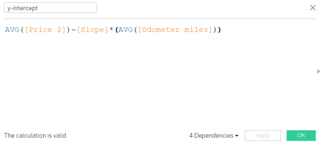
Step 3: Calculated field for y-intercept
The formula for y-intercept: Avg[y variable] – [slope] * Avg[x variable]
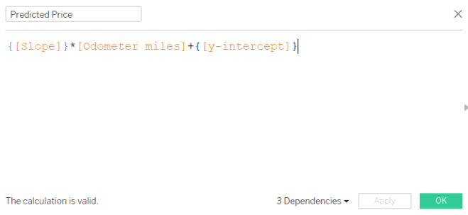
Step 4: Calculated field for predicted dependent variable
The formula for predicted y-variable = {[slope]} * [odometer miles] + {[y-intercept]}
- Here, we are using the linear equation, y = mx + b where
- y is the predicted dependent variable (output: predicted price)
- m is the slope
- x is the observed independent variable (input: odometer miles)
- b is the y-intercept
- Since the slope and y-intercept will not change value for each odometer mile, but we need a new predicted output (y) for each odometer mile input (x), we use a level of detail calculation. Luckily the curly brackets tell Tableau to hold the slope and y-intercept values at their constant level for each odometer mile.
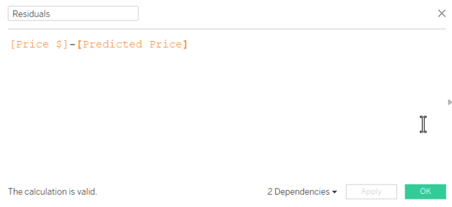
Step 5: Create calculated field for residuals
The formula for residuals: observed y – predicted y
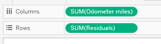
Step 6: Drag the independent variable to columns, residuals to rows
Step 7: Inspect your residual plot.
Don’t forget to inspect your residual plot for clear patterns, large residuals (possible outliers) and obvious increases or decreases to variation around the center horizontal line. Decide if the model should be used for prediction purposes.
- The horizontal line in the middle is the least-squares regression line, shown in relation to the observed points.
- The residual plot makes it easier to see the amount of error in your model by “zooming in” on the liner model and the scatter of the points around/on it.
- Any obvious pattern observed in the residual plot indicates the linear model is not the best model for the data.
In the plot below, the residuals increase moving left to right. This means the error in predicting 4Runner price gets larger as the number of miles on the odometer increase. And this makes sense because we know more variables are affecting the price of the vehicle, especially as mileage increases. Perhaps this model is not effective in predicting vehicle price above 60K miles on the odometer.

To recap, here are the basic equations we used above:

For more on residual plots, check out The Minitab Blog.

I don’t normally comment but I gotta tell appreciate it for the post on this great one : D.
LikeLike
I greatly appreciate this post. It helped me greatly!
LikeLike
hi – great calculation, although it does seem to apply the whole data set. How can I adjust these formula so the calculations only apply to the filtered data set?
LikeLike
How are you filtering it? The table-scoped calculation does apply before a dimension filter; however, if you put the filter on context in Tableau, the calculation will apply on to the filtered data.
LikeLike