In this BrightTalk webinar with Eva Murray and Andy Kriebel, I discussed how to use residual plots to help determine the fit of your linear regression model. Since residuals show the remaining error after the line of best fit is calculated, plotting residuals gives you an overall picture of how well the model fits the data and, ultimately, its ability to predict.
In the most common residual plots, residuals are plotted against the independent variable.
For simplicity, I hard-coded the residuals in the webinar by first calculating “predicted” values using Tableau’s least-squares regression model. Then, I created another calculated field for “residuals” by subtracting the observed and predicted y-values. Another option would use Tableau’s built in residual exporter. But what if you need a dynamic residual plot without constantly exporting the residuals?
Note: “least-squares regression model” is merely a nerdy way of saying “line of best fit”.
How to create a dynamic residual plot in Tableau
In this post I’ll show you how to create a dynamic residual plot without hard-coding fields or exporting residuals.
Step 1: Always examine your scatterplot first, observing form, direction, strength and any unusual features.
Step 2: Calculated field for slope
The formula for slope: [correlation] * ([std deviation of y] / [std deviation of x])
correlation doesn’t mind which order you enter the variables (x,y) or (y,x)
y over x in the calculation because “rise over run”
be sure to use the “sample standard deviation”
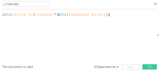
Step 3: Calculated field for y-intercept
The formula for y-intercept: Avg[y variable] – [slope] * Avg[x variable]
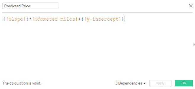
Step 4: Calculated field for predicted dependent variable
The formula for predicted y-variable = {[slope]} * [odometer miles] + {[y-intercept]}
Here, we are using the linear equation, y = mx + b where
y is the predicted dependent variable (output: predicted price)
m is the slope
x is the observed independent variable (input: odometer miles)
b is the y-intercept
Since the slope and y-intercept will not change value for each odometer mile, but we need a new predicted output (y) for each odometer mile input (x), we use a level of detail calculation. Luckily the curly brackets tell Tableau to hold the slope and y-intercept values at their constant level for each odometer mile.
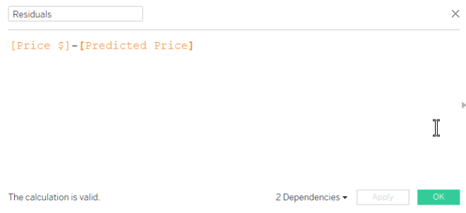
Step 5: Create calculated field for residuals
The formula for residuals: observed y – predicted y
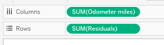
Step 6: Drag the independent variable to columns, residuals to rows
Step 7: Inspect your residual plot.
Don’t forget to inspect your residual plot for clear patterns, large residuals (possible outliers) and obvious increases or decreases to variation around the center horizontal line. Decide if the model should be used for prediction purposes.
The horizontal line in the middle is the least-squares regression line, shown in relation to the observed points.
The residual plot makes it easier to see the amount of error in your model by “zooming in” on the liner model and the scatter of the points around/on it.
Any obvious pattern observed in the residual plot indicates the linear model is not the best model for the data.
In the plot below, the residuals increase moving left to right. This means the error in predicting 4Runner price gets larger as the number of miles on the odometer increase. And this makes sense because we know more variables are affecting the price of the vehicle, especially as mileage increases. Perhaps this model is not effective in predicting vehicle price above 60K miles on the odometer.
To recap, here are the basic equations we used above:
Thank you to Makeover Monday‘s Eva Murray and Andy Kriebel for allowing me to grace their BrightTALK air waves with my love language of statistics yesterday! If you missed it, check out the recording.
With 180 school days and 5 classes (plus seminar once/week), you can imagine a typical U.S. high school math teacher has the opportunity to instruct/lead between 780 and 930 lectures each year. After 14 years teaching students in Atlanta-area schools (plus those student-teaching hours, and my time as a TA at LSU), I’ve instructed somewhere in the ballpark of 12,000 to 13,500 lessons in my lifetime.
So let’s be honest. Yesterday I was nervous to lead my very first webinar. After all, I depend on my gift of crowd-reading to determine the pace (and the tone) of a presentation. Luckily, I’m an expert at laughing at my own jokes so after the first few slides (and figuring out the delay), I felt comfortable. So Andy and Eva, I am ready for the next webinar on December 20th — Audience, y’all can sign up here.
Fun Fact: In 6th grade I was in the same math class as Andy Kriebel’s sister-in-law. It was also the only year I ever served time in in-school suspension (but remember, correlation doesn’t imply causation).
Webinar Questions and Answers
I was unable to get to all the questions asked on the webinar but rest assured I will do my best to field those here.
Q: Can you provide the dataset? A: Here’s a link to the 4Runner data I used for most of the webinar. Let me know if you’d like any others.
Q: Do you have the data that produced the cartoon in the beginning slide? A: A surprising number of people reproduced the data and the curves from the cartoon within hours of its release. Here is one person’s reproduction in R from this blog post
Q: Do you have any videos on the basics of statistics? A: YES! My new favorite is Mr. Nystrom on YouTube, we use similar examples and he looks like he loves his job. For others, Google the specific topic along with the words “AP Statistics” for some of the best tutorials out there.
Q: Could you explain about example A with r value -0.17, it seems as 0. A: The picture when r = -.17 is slightly negative — only slightly. This one is very tricky because we tend to think r = 0 if it’s not linear. But remember correlation is on a continuous scale of weak to positive – which means r = -.17 is still really, really weak. r = 0 is probably not very likely to be observed in real data unless the data creates a perfect square or circle, for example.
Q: Question for Anna, does she also use Python, R, other stats tools? A: I am learning R! R-studio makes it easier. When I coach doctoral candidates on dissertation defense I use SPSS and Excel; one day I will learn Python. Of course, I am an expert on the TI-84. Stop laughing.
6. Q: So with nonlinear regression [is it] better to put the prediction on the y-axis? A: With linear and nonlinear regression, the variable you want to predict will always be your y-axis (dependent) variable. That variable is always depicted with a y with a caret on top : And it’s called “y-hat”
Other Helpful Links
If you haven’t had time to go through Andy’s Visual Vocabulary, take a look at the correlation section.
At the end of the webinar I recommended Bora Beran’s blog for fantastic explanations on Tableau’s modeling features. He has a statistics background and explains the technical in a clear, easy-to-understand format.
Don’t forget to learn about residual plots if you are using regression to predict.
You may find Part 1 and Part 2 interesting before heading into part 3, below.
Interpreting Statistical Output and P-Values
To recap, you own Pearson’s Pizza and you’ve hired your nephew Lloyd to run the establishment. And since Lloyd is not much of a math whiz, you’ve decided to help him learn some statistics based on pizza prices.
When we left off, you and Lloyd realized that, despite a strong correlation and high R-Squared value, the residual plot suggests that predicting pizza prices from toppings will become less and less accurate as the number of toppings increase:
A clear, distinct pattern in a residual plot is a red flag
Looking back at the original scatterplot and software output, Lloyd protests, “But the p-value is significant. It’s less than 0.0001.”
watch this
The original software output. What does it all mean?
Doesn’t a small p-value imply that our model is a go?
A crash course on hypothesis testing
In Pearson Pizza’s back room, you’ve got two pool tables and a couple of slot machines (which may or may not be legal). One day, a tall, serious man saunters in, slaps down 100 quid and challenges (in an British accent), “My name is Ronnie O’Sullivan. That’s right. THE. Ronnie O’Sullivan.”
You throw the name into the Google and find out the world’s best snooker player just challenged you to a game of pool.
Then something interesting happens. YOU win.
Suddenly, you wonder, is this guy really who he says he is?
Because the likelihood of you winning this pool challenge to THE Ronnie O’Sullivan is slim to none IF he is, indeed, THE Ronnie O’Sullivan (the world’s best snooker player).
Beating this guy is SIGNIFICANT in that it challenges the claim that he is who he claims he is:
You aren’t SUPPOSED to beat THE Ronnie O’Sullivan – you can’t even beat Lloyd.
But you did beat this guy, whoever he claims to be.
So, in the end, you decide this man was an impostor, NOT Ronnie O’Sullivan.
In this scenario:
The claim (or “null hypothesis”): “This man is Ronnie O’Sullivan” you have no reason to question him – you’ve never even heard of snooker
The alternative claim (or “alternative hypothesis”): “This man is NOT Ronnie O’Sullivan”
The p-value: The likelihood you beat the world’s best snooker player assuming he is, in fact, the real Ronnie O’Sullivan.
Therefore, the p-value is the likelihood an observed outcome (at least as extreme) would occur if the claim were true. A small p-value can cast doubt on the legitimacy of the claim – chances you could beat Ronnie O’Sullivan in a game of pool are slim to none so it is MORE likely he is not Ronnie O’Sullivan. Still puzzled? Here’s a clever video explanation.
Some mathy stuff to consider
The intention of this post is to tie the meaning of this p-value to your decision, in the simplest terms I can find. I am leaving out a great deal of theory behind the sampling distribution of the regression coefficients – but I would be happy to explain it offline. What you do need to understand, however, is your data set is just a sample, a subset, from an unknown population. The p-value output is based on your observed sample statistics in this one particular sample while the variation is tied to a distribution of all possible samples of the same size (a theoretical model). Another sample would indeed produce a different outcome, and therefore a different p-value.
The hypothesis our software is testing
The output below gives a great deal of insight into the regression model used on the pizza data. The statistic du jour for the linear model is the p-value you always see in a Tableau regression output: The p-value testing the SLOPE of the line.
Therefore, a significant or insignificant p-value is tied to the SLOPE of your model.
Recall, the slope of the line tells you how much the pizza price changes for every topping ordered. Slope is a reflection of the relationship of the variables you’re studying. Before you continue reading, you explain to Lloyd that a slope of 0 means, “There is no relationship/association between the number of toppings and the price of the pizza.”
Zoom into that last little portion – and look at the numbers in red below:
Panes
Line
Coefficients
Row
Column
p-value
DF
Term
Value
StdErr
t-value
p-value
Pizza Price
Toppings
< 0.0001
19
Toppings
1.25
0.0993399
12.5831
< 0.0001
intercept
15
0.362738
41.3521
< 0.0001
In this scenario:
The claim: “There is no association between number of toppings ordered and the price of the pizza.” Or, the slope is zero (0).
The alternative claim: “There is an association between the number of toppings ordered and the price of the pizza.” In this case, the slope is not zero.*
The p-value = Assuming there is no relationship between number of toppings and price of pizza, the likelihood of obtaining a slope of at least $1.25 per topping is less than .01%.
The p-value is very small** — A slope of at least $1.25 would happen only .01% of the time just by chance. This small p-value means you have evidence of a relationship between number of toppings and the price of a pizza.
What the P-Value is NOT
The p-value is not the probability the null hypothesis is false – it is not the likelihood of a relationship between number of toppings and the price of pizza.
The p-value is not evidence we have a good linear model – remember, it’s only testing a relationship between the two variables (slope) based on one sample.
A high p-value does not necessarily mean there is no relationship between pizza price and number of toppings – when dealing in samples, chance variability (differences) and bias is present, leading to erroneous conclusions.
A statistically significant p-value does not necessarily mean the slope of the population data is not 0 – see the last bullet point. By chance, your sample data may be “off” from the full population data.
The P-Value is Not a Green Light
The p-value here gives evidence of a relationship between the number of toppings ordered and the price of the pizza – which was already determined in part 1. (If you want to get technical, the correlation coefficient R is used in the formula to calculate slope.)
Applying a regression line for prediction requires the examination of all parts of the model. The p-value given merely reflects a significant slope — recall there is additional error (residuals) to consider and outside variables acting on one or both of the variables.
Ultimately, Pearson’s Pizza CAN apply the linear model to predict pizza prices from number of toppings. But only within reason. You decide not to predict for pizza prices when more than 5 toppings are chosen because, based on the residual plot, the prediction error is too great and the variation may ultimately hurt long-term budget predictions.
In a real business use case, the p-value, R-Squared, and residual plots can only aid in logical decision-making. Lloyd now realizes, thanks to your expertise, that using data output just to say he’s “data-driven” without proper attention to detail and common sense is unwise.
Statistical methods can be powerful tools for uncovering significant conclusions; however, with great power comes great responsibility.
Note: This cartoon uses sarcasm to poke fun at blindly following p-values.
—Anna Foard is a Business Development Consultant at Velocity Group
*Note this is an automatic 2-tailed test. Technically it is testing for a slope at least $1.25 AND at most -$1.25. For a 1-tailed test (looking only for greater than $1.25, for example) divide the p-value output by 2. For more information on the t-value, df, and standard error I’ve included additional notes and links at the bottom of this post.
**How small is small? Depends on the nature of what you are testing and your tolerance for “false negatives” or “false positives”. It is generally accepted practice in social sciences to consider a p-value small if it is under 0.05, meaning an observation at least as extreme would occur 5% of the time by chance if the claim were true.
More information on t-value, df:
For those curious about the t-value, this statistic is also called the “critical value” or “test statistic”. This value is like a z-score, but relies on the Student’s t-distribution. In other words, the t-value is a standardized value indicating how far a slope of “1.25” will fall from the hypothesized mean of 0, taking into account sample size and variation (standard error).
In t-tests for regression, degrees of freedom (df) is calculated by subtracting the number of parameters being estimated from the sample size. In this example, there are 21 – 2 degrees of freedom because we started with 21 independent points, and there are two parameters to estimate, slope and y-intercept.
Degrees of freedom (df) represents the amount of independent information available. For this example, n = 21 because we had 21 pieces of independent information. But since we used one piece of information to calculate slope and another to calculate the y-intercept, there are now n – 2 or 19 pieces of information left to calculate the variation in the model, and therefore the appropriate t-value.
You are the sole proprietor of Pearson’s Pizza, a local pizza shop. Out of nepotism and despite his weak math skills, you’ve hired your nephew Lloyd to run the joint. And because you want your business to succeed, you decide this is a good time to strengthen your stats knowledge while you teach Lloyd – after all,
“In learning you will teach, and in teaching you will learn.”
– Latin Proverb and Phil Collins
Your pizzas are priced as follows:
Cheese pizza (no toppings): $15
Additional toppings: $1/each for regular, $1.50 for premium
When we left off, you and Lloyd were exploring the relationship between the number of toppings to the pizza price using a sample of possible scenarios.
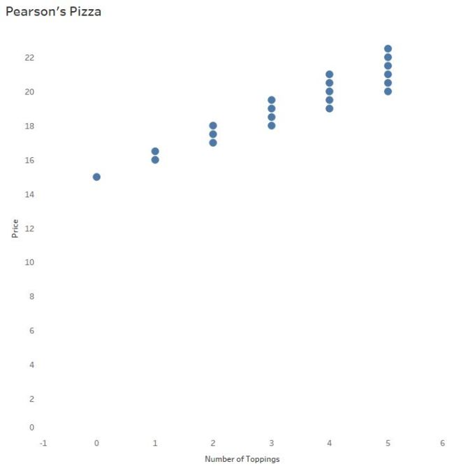
The scatterplot of Pizza Price vs. Number of Toppings: As the number of toppings increase, price of the pizza increases.
The Purpose(s) of a “Regression” Line
When investigating data sets of two continuous, numerical variables, a scatterplot is the typical go-to graph of choice. (See Daniel Zvinca’s article for more on this, and other options.)
So. When do we throw in a “line of best fit”? The answer to that question may surprise you:
A “line of best” fit, a regression line, is used to: (1) assess the relationship between two continuous variables that may respond or interact with each other (2) predict the value of y based on the value of x.
In other words, a regression line may not add value to Lloyd’s visualization if it won’t help him predict pizza prices from the number of toppings ordered.
The equation: pizza price = 1.25*Toppings +15
Recall the slope of the line above says that for every additional topping ordered the price of the pizza will increase by $1.25.
In the last post you discussed some higher-order concepts with Lloyd, like the correlation coefficient (R) and R-Squared. Using the data above, you said, “89.3% of the variability (differences) in pizza prices can be explained by the number of toppings.” Which also means 10.7% of the variability can be explained by other variables, in this case the two types of toppings.
Since there is a high R-Squared value, does Pearson’s Pizza have a solid model for prediction purposes? Before you answer, consider the logic behind “least-squares regression.”
Least-Squares Regression
You and Lloyd now understand that “trend lines”, “lines-of-best-fit”, and “regression lines” are all different ways of saying, “prediction lines.”
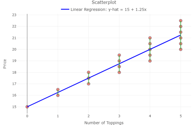
The least-squaresregression line, the most common type of prediction line, uses regression to minimize the sum of the squared vertical distances from each observation (each point) to the regression line. These vertical distances, called residuals, are found simply by subtracting the predicted pizza price from the actual pizza price for each observed pizza purchase.
The magnitude of each residual indicates how much you’ve over- or under- predicted the pizza price, or prediction error.
Note the green lines in the plot below:
The residuals, or vertical distances, are shown here in green. (Created in Shiny)
Lloyd learns about residuals
Recall, the least-squares regression equation:
pizza price = 1.25(toppings) + 15
Lloyd says he can predict the price of a pizza with 12 toppings:
pizza price =1.25*12 + 15
pizza price = $30
Sure, it’s easy to take the model and run with it. But what if the customer ordered 12 PREMIUM toppings? Logic says that’s (1.50)*12 + 15 = $33.
You explain to Lloyd that the residual here is 33 – 30, or $3. When a customer orders a pizza with 12 premium toppings, the model UNDER predicts the price of the pizza by $3.
How valuable is THIS model for prediction purposes? Answer: It depends how much error is acceptable to your business and to your customer.
Why the Residuals Matter
To determine if a linear model is appropriate, protocol* says to create a residual plot and check the graph of residuals. That is, graph all x-values (# of toppings) against the residuals and look for any obvious patterns. Create a residual plot with your own data here.
Ideally, the graph will show a cloud of points with no pattern. Patterns in residual plots suggest a linear model may NOT be suitable for prediction purposes.
I spy a pattern. Or, how I bubbled my answers in Sociology class.
You notice from the residual plot above, as the number of toppings increase, the residuals increase. You realize the prediction error increases as we predict for more toppings. For Pearson’s Pizza, the least-squares regression line may not be very helpful for predicting price from toppings as the number of toppings increases.
Is a residual plot necessary? Not always. The residual plot merely “zooms in” on the pattern surrounding the prediction line. Becoming more aware of residuals and the part they play in determining model fit helps you look for these patterns in the original plots. In larger data sets with more variability, however, patterns may be difficult to find.
Lloyd says, “But the p-value is significant. It’s < 0.0001. Why look at the visualization of the residual plot when the p-value is so low?”
Is Lloyd correct?! Find out in Part 3 of this series.
Summary
Today Lloyd learned a regression line has adds little to no value to his visualization if it won’t help him predict pizza prices from the number of toppings ordered.
As the owner of a prestigious pizza joint, you realize the importance of visualizing both the scatterplot and the residual plot instead of flying blind with correlation, R-Squared, and p-values alone.
Understanding residuals is one key to determining the success of your regression model. When you decide to use a regression line, keep your ultimate business goals in mind – apply the model, check the residual plot, calculate specific residuals to judge prediction error. Use context to decide how much faith to place in the magical maths.
*Full list of assumptions to be checked for the use of linear regression and how to check them here.
Let’s say you own Pearson’s Pizza, a local pizza joint. You hire your nephew Lloyd to run the place, but you don’t exactly trust Lloyd’s math skills. So, to make it easier on the both of you, you price pizza at $15 and each topping at $1.
On a scatterplot you see a positive, linear pattern:
Since the price of the pizza increases by $1 for each additional topping, that $1 per topping is quite literally the slope of the line of best fit.
Interpreting Software Output
Trend lines are used for prediction purposes (more on that later). In this example, you wouldn’t need a trend line to determine the cost of a pizza with, say, 10 toppings. But let’s say Lloyd needs some math help and you dabble in the black art of statistics.
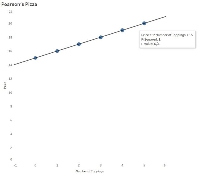
Most software calculates this line of best fit using a method to minimize the squared vertical distances from the points to that line (called least-squares regression). In the pizza parlor example, little is needed to find the line of best fit since the points line up perfectly.
The Equation of the Trend Line…
…may take you back to 9th grade Algebra
y = mx +b
Price = 1*NumberofToppings + 15
The price of the pizza (y) depends on the the number of toppings ordered (x). The independent (x) variable is always multiplied by the slope of the line. Here, the slope is $1. For every additional topping, the price of the pizza is predicted to increase by $1.
The price of the pizza without any toppings is $15. In the equation above, 15 is the y-intercept –The price of a cheese pizza, to be more specific to the example.
We’ll also refer to this equation as the “linear model.”
R and R-Squared (or, The Coefficients of Confusion)
The second value listed is called R-squared. But before you interpret R-squared (R^2) for Lloyd, you need to give him an idea of R since R-Squared is based on R.
R has many names: Pearson’s Coefficient, Pearson’s R, Pearson’s Product Moment, Correlation Coefficient
Why R? Pearson begins with a P…
No, Pearson wasn’t a Pirate. The Greek letter Ρ is called “Rho,” and translates to English as an “R”.
Pearson’s R measures correlation – the strength and direction of a linear relationship. Emphasis on LINEAR.
Since R-Squared = 1, you’ve probably figured out R = √1, or ±1. Positive 1 here, since there is a positive association between number of toppings and price. There is a perfect positive correlation between the number of toppings ordered and the price of the pizza.
Since the price of pizza goes up as the number of toppings increases, the slope is positive and therefore the correlation coefficient is positive (there is a mathematical relationship between the two – not going to bore you with the calculations). It is interesting to note the calculation for correlation does not distinguish between independent and dependent variables — that means, mathematically, correlation does not imply causation*.
The p-value of this output tells you the significance of the association between the two variables – specifically, the slope. Did the slope of 1 happen by chance? No, not at all. It’s significant because the two variables are associated in a perfectly linear pattern. This particular software gives “N/A” in this situation, but other software will give p < 0.000000. (P-values deserve their own blog post – no room here.)
R-Squared has another name: The coefficient of determination
Often you’ll hear R-Squared reported as a %. In this case, R-Squared = 100%. So why is R-Squared 100% here? Look at the graph – no points stray from the line! There is absolutely no variability (differences) whatsoever between the actual points and the linear model! Which makes it easy to understand the interpretation of R-Squared here:
100% of the variability (differences) in pizza prices can be explained by the different number of toppings.
Hearing this, you tell Lloyd that R-Squared tells us how useful this linear equation is for predicting pizza prices from number of toppings.
But in real life…R-Squared is NOT 100%.
Business Complications
Problem: Your customers start asking for “gourmet” toppings. And to profit, you’ll have to charge $1.50 for these gourmet toppings. You’ll still offer the $1 “regular” toppings as well.
Now, the relationship between a pizza’s price and number of toppings could vary substantially:
Lloyd is gonna freak.
As the number of toppings increase, there is more and more dispersion of points along the line. That’s because the combination of regular and gourmet toppings differs more with as number of toppings increase.
Lloyd says a customer wants 4 toppings. He forgot to write down exactly which toppings. Four regular toppings will come to $19. But 4 gourmet toppings is a little pricier at $21. The prediction line says it’s $20. We’re only within a couple dollars, but that’s a good bit of variability. Over time, Pearson’s Pizza may lose money or piss off customers (losing more money) if Lloyd chooses the prediction line over getting the order right.
R-Squared (Again):
It’s all about VARIABILITY – the differences between the actual points and the line. And this is why predicting with a trend line is to be done with caution:
89.29% of the variability (differences) in pizza prices can be explained by the different number of toppings. Other reasons (like the type of topping chosen) cause the price differences, not just the number of toppings.
What R-Squared isn’t:
And that doesn’t mean the model will get it right 89.29% of the time (it’s not a probability). R-Squared also doesn’t tell us the percent of the points the line goes through (a common misunderstanding).
Non-linear Models – 3 Warnings
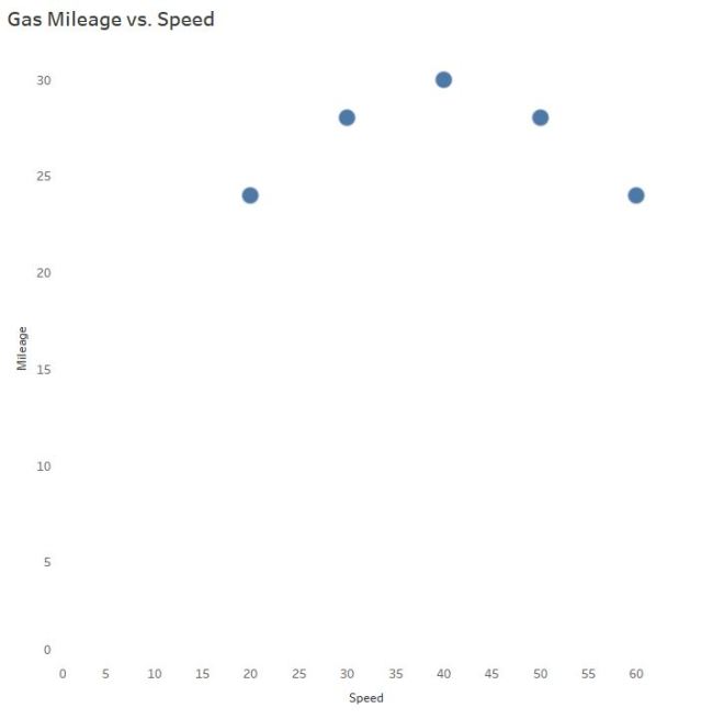
How does gas mileage change as your car speed increases?
Even though we can see the points are not linear, let’s slap a trend line on there to make certain, for LOLs:
Hint: Horizontal trend lines tell you NOTHING. If slope = 0, R = 0.
And now you also understand why the R-squared value is equal to 0:
0% of the variability in gas mileage can be explained by the change in speed of the vehicle.
Wait a second…
CLEARLY there is a relationship! AKA, Why we visualize our data and don’t trust the the naked stats.
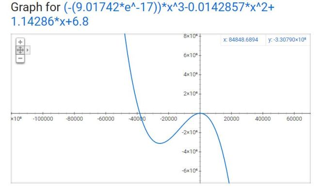
Mathematically, the trick is to “transform” the curve into a line to find the appropriate model. It typically involves logarithms, square roots, or the reciprocal of a predictor variable.
I won’t do that here.
As you can see, technology is amazing and created this model from a 3rd degree polynomial…
Warning #1
Which is TOTALLY FINE if you’re going to interpolate – predict for mileage only between the speeds of 20 and 60 mph. In case you are wondering why you wouldn’t extrapolate – predict for speeds outside the 20 – 60 mph range, I brought in a special guest.
Third degree polynomials have 2 turns:
The full gas mileage vs. speed model. This is not the model you thought you were dating.
The R-Squared value here is 0.9920 – this value is based on the transformed data (when the software temporarily made it linear behind your back). Remember the part about R (and therefore R-Squared) describing only LINEAR models? The R-Squared is still helpful in determining a model fit, but context changes a bit to reflect the mathematical operations used to make the fit. So use R-Squared as a guide, but the interpretation isn’t going to make sense in the context of the original variables anymore. Though no need to worry about all that if you stick to interpolation!
Warnings #2 and #3
What if my software uses nonlinear regression?
This can get confusing so I’ll keep it brief. Full disclosure: I thought nonlinear regression and curve-fitting with linear regression yielded the same interpretation until Ben Jones pointed out my mistake!
R-Squared does NOT make sense for nonlinear regression. R-Squared is mathematically inaccurate for nonlinear models and can lead to erroneous conclusions. Many statistical software packages won’t include R-Squared for nonlinear models – please ignore it if your software kicks it out to you.
Consequently, ignore the p-value for nonlinear regression models as well – the p-value is based on an association using Pearson’s R, which is robust for linear relationships only.
The explanation of warnings 2 and 3 are beyond the scope of this post – but if you’d like to learn more about the “why,” let me know!
Thanks for sticking around until the end. Send me a message if you have a suggestion for the next topic!
*Even though number of toppings does cause the price to increase in this use case, we cannot apply that logic to correlation universally. Since correlation does not differentiate between the independent and dependent variables, the correlation value itself could erroneously suggest pizza prices cause the number of toppings to increase.


 ly weak. r = 0 is probably not very likely to be observed in real data unless the data creates a perfect square or circle, for example.