The Basics
Let’s say you own Pearson’s Pizza, a local pizza joint. You hire your nephew Lloyd to run the place, but you don’t exactly trust Lloyd’s math skills. So, to make it easier on the both of you, you price pizza at $15 and each topping at $1.
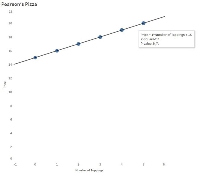
On a scatterplot you see a positive, linear pattern:

Interpreting Software Output
Trend lines are used for prediction purposes (more on that later). In this example, you wouldn’t need a trend line to determine the cost of a pizza with, say, 10 toppings. But let’s say Lloyd needs some math help and you dabble in the black art of statistics.
Most software calculates this line of best fit using a method to minimize the squared vertical distances from the points to that line (called least-squares regression). In the pizza parlor example, little is needed to find the line of best fit since the points line up perfectly.
The Equation of the Trend Line…
…may take you back to 9th grade Algebra
y = mx +b
Price = 1*NumberofToppings + 15
The price of the pizza (y) depends on the the number of toppings ordered (x). The independent (x) variable is always multiplied by the slope of the line. Here, the slope is $1. For every additional topping, the price of the pizza is predicted to increase by $1.
The price of the pizza without any toppings is $15. In the equation above, 15 is the y-intercept –The price of a cheese pizza, to be more specific to the example.
We’ll also refer to this equation as the “linear model.”
R and R-Squared (or, The Coefficients of Confusion)
The second value listed is called R-squared. But before you interpret R-squared (R^2) for Lloyd, you need to give him an idea of R since R-Squared is based on R.
R has many names: Pearson’s Coefficient, Pearson’s R, Pearson’s Product Moment, Correlation Coefficient
Why R? Pearson begins with a P…
No, Pearson wasn’t a Pirate. The Greek letter Ρ is called “Rho,” and translates to English as an “R”.
Pearson’s R measures correlation – the strength and direction of a linear relationship. Emphasis on LINEAR.

Since R-Squared = 1, you’ve probably figured out R = √1, or ±1. Positive 1 here, since there is a positive association between number of toppings and price. There is a perfect positive correlation between the number of toppings ordered and the price of the pizza.
Since the price of pizza goes up as the number of toppings increases, the slope is positive and therefore the correlation coefficient is positive (there is a mathematical relationship between the two – not going to bore you with the calculations). It is interesting to note the calculation for correlation does not distinguish between independent and dependent variables — that means, mathematically, correlation does not imply causation*.
The p-value of this output tells you the significance of the association between the two variables – specifically, the slope. Did the slope of 1 happen by chance? No, not at all. It’s significant because the two variables are associated in a perfectly linear pattern. This particular software gives “N/A” in this situation, but other software will give p < 0.000000. (P-values deserve their own blog post – no room here.)
R-Squared has another name: The coefficient of determination
Often you’ll hear R-Squared reported as a %. In this case, R-Squared = 100%. So why is R-Squared 100% here? Look at the graph – no points stray from the line! There is absolutely no variability (differences) whatsoever between the actual points and the linear model! Which makes it easy to understand the interpretation of R-Squared here:
100% of the variability (differences) in pizza prices can be explained by the different number of toppings.
Hearing this, you tell Lloyd that R-Squared tells us how useful this linear equation is for predicting pizza prices from number of toppings.
But in real life…R-Squared is NOT 100%.
Business Complications
Problem: Your customers start asking for “gourmet” toppings. And to profit, you’ll have to charge $1.50 for these gourmet toppings. You’ll still offer the $1 “regular” toppings as well.
Now, the relationship between a pizza’s price and number of toppings could vary substantially:

Lloyd is gonna freak.
As the number of toppings increase, there is more and more dispersion of points along the line. That’s because the combination of regular and gourmet toppings differs more with as number of toppings increase.
Lloyd says a customer wants 4 toppings. He forgot to write down exactly which toppings. Four regular toppings will come to $19. But 4 gourmet toppings is a little pricier at $21. The prediction line says it’s $20. We’re only within a couple dollars, but that’s a good bit of variability. Over time, Pearson’s Pizza may lose money or piss off customers (losing more money) if Lloyd chooses the prediction line over getting the order right.
R-Squared (Again):
It’s all about VARIABILITY – the differences between the actual points and the line. And this is why predicting with a trend line is to be done with caution:
89.29% of the variability (differences) in pizza prices can be explained by the different number of toppings. Other reasons (like the type of topping chosen) cause the price differences, not just the number of toppings.
What R-Squared isn’t:
And that doesn’t mean the model will get it right 89.29% of the time (it’s not a probability). R-Squared also doesn’t tell us the percent of the points the line goes through (a common misunderstanding).
Non-linear Models – 3 Warnings
How does gas mileage change as your car speed increases?
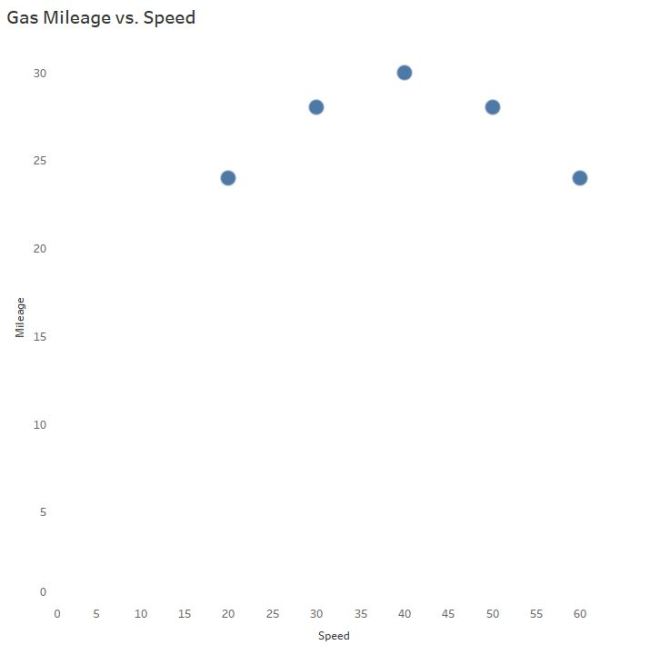
Even though we can see the points are not linear, let’s slap a trend line on there to make certain, for LOLs:

Hint: Horizontal trend lines tell you NOTHING. If slope = 0, R = 0.
And now you also understand why the R-squared value is equal to 0:
0% of the variability in gas mileage can be explained by the change in speed of the vehicle.
Wait a second…
CLEARLY there is a relationship! AKA, Why we visualize our data and don’t trust the the naked stats.
Mathematically, the trick is to “transform” the curve into a line to find the appropriate model. It typically involves logarithms, square roots, or the reciprocal of a predictor variable.

I won’t do that here.

As you can see, technology is amazing and created this model from a 3rd degree polynomial…
Warning #1
Which is TOTALLY FINE if you’re going to interpolate – predict for mileage only between the speeds of 20 and 60 mph. In case you are wondering why you wouldn’t extrapolate – predict for speeds outside the 20 – 60 mph range, I brought in a special guest.

Third degree polynomials have 2 turns:
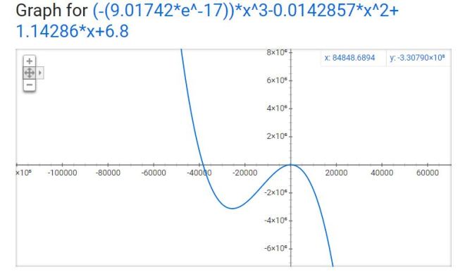
The R-Squared value here is 0.9920 – this value is based on the transformed data (when the software temporarily made it linear behind your back). Remember the part about R (and therefore R-Squared) describing only LINEAR models? The R-Squared is still helpful in determining a model fit, but context changes a bit to reflect the mathematical operations used to make the fit. So use R-Squared as a guide, but the interpretation isn’t going to make sense in the context of the original variables anymore. Though no need to worry about all that if you stick to interpolation!
Warnings #2 and #3
What if my software uses nonlinear regression?
This can get confusing so I’ll keep it brief. Full disclosure: I thought nonlinear regression and curve-fitting with linear regression yielded the same interpretation until Ben Jones pointed out my mistake!
R-Squared does NOT make sense for nonlinear regression. R-Squared is mathematically inaccurate for nonlinear models and can lead to erroneous conclusions. Many statistical software packages won’t include R-Squared for nonlinear models – please ignore it if your software kicks it out to you.
Consequently, ignore the p-value for nonlinear regression models as well – the p-value is based on an association using Pearson’s R, which is robust for linear relationships only.
The explanation of warnings 2 and 3 are beyond the scope of this post – but if you’d like to learn more about the “why,” let me know!
Thanks for sticking around until the end. Send me a message if you have a suggestion for the next topic!
*Even though number of toppings does cause the price to increase in this use case, we cannot apply that logic to correlation universally. Since correlation does not differentiate between the independent and dependent variables, the correlation value itself could erroneously suggest pizza prices cause the number of toppings to increase.
—Anna Foard is a Business Development Consultant at Velocity Group