Tableau Reference Lines: When Averages Mean Something You Don’t

Statistically Funny: More Than Average Confusion About What Mean Means Mean

Haha! Get it?! Average? MEAN? Okay okay, this is a quick lesson on how Tableau calculates reference lines for averages “under the hood”, depending on the aggregations in your view.

Verifying Default Settings

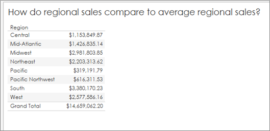
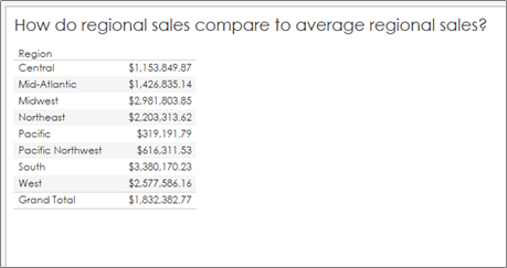
Something we’ve all needed at some point is a reference line to show the audience what is “average” in a given situation so we can compare overall values to an average. As an example, I’m going to use a generic Superstore Dataset and compare regional sales to an overall average:

Note: I’ve formatted the values to return US dollars and cents so we can check all of our numbers down to the penny. But how do we check that this is the true average regional sales?

Here I have two methods:

#1: In a Table (if you trust the totals)

  1. Start with the sum of sales in the table, add in grand totals:

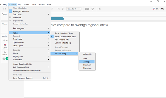
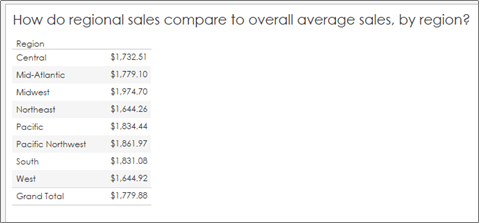
2. Change the total calculation from SUM to AVERAGE:

3. Compare your values to your original chart:

#2: In a Calculation

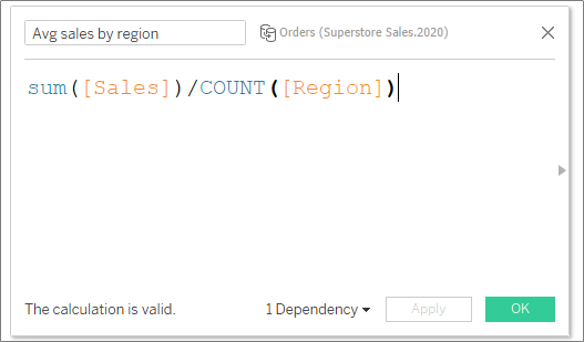
  1. Create a FIXED LOD to sum up all regional sales first, then changed the pill’s aggregation to an average (to divide by the number of regions). In other words, this calculation adds up all regional sales, then averages by the number of orders (or rows) per region:

2. Format the pill to currency and voila!

Taking a Closer Look

Okay, so why am I spending my time on this topic? Great question! I’ve found that Tableau’s aggregations might not be doing what you think they are doing. I won’t go as far as say as Tableau’s defaults are wrong necessarily, but you do need to know how Tableau is calculating to ensure your analysis is accurate.

Average Lines on Averages

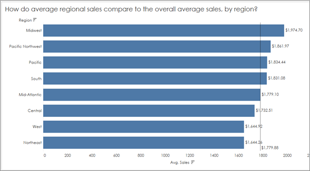
In my experience, I see this common mistake all too many times – we want to compare AVERAGE sales by region (or some other dimension), and then drop in an average line to show how each region compares to the “Average average sales”:

How do we know what Tableau is doing here? How is it calculating “average” using this reference line? Is it adding up the total sales and dividing by the number of regions? Or is it adding up all of the average sales and dividing by the number of regions? And does it even matter?

Let’s answer each question separately:

How is Tableau calculating the average line when our aggregation is set to “average”?

Answer: According to the editing pane for this reference line, the default aggregation for any average line is set to (surprise!) AVERAGE!

How is it calculating “average” using this reference line? Is it adding up the overall sales and dividing by the number of regions? Or is it adding up all of the average sales and dividing by the number of regions?

Answer: As in the last example, I’ll give you two methods for answering this question:

  1. Using a table, I changed the Sum([Sales]) aggregation to average and had Tableau tell me the overall average (by region). And low and behold, I got a DIFFERENT overall average value:

2. Using a basic calculated field, I calculated the total sum of sales and divided by the number of regions. That is, I summed the data at a row level and divided by the number of regions:

And I found a result that agreed with the table check, but not the original reference line in the visualization!

Does it even matter? Glad you asked.

Answer: It absolutely matters. Because when you take an average of an averaged calculation, you ignore the number of rows (in this case, orders) that were used to calculate that average. Meaning, the average of an average assumes each region had the same number of orders because it adds up all of the averages and divides by the number of regions. This calculation does not result in overall average sales, but rather a number that could be slightly or extremely off, depending on how different your original regional sales regions looked.

So what are we to do if we want to compare average regional sales to overall average sales, by region? Here’s a quick fix:

Change the aggregation in the editing pane for the reference line from “Average” to Total:

This will tell Tableau that you want the reference line to reflect the average sales (by dimension in your view) of the TOTAL sales, not just the average of averages.

Averaging Percents: Don’t Do It!

You don’t want to average percents for the same reason as above. Percents are calculated from ratio, just like averages, so the mistake is the same — the total number of rows used for each individual regional percent (in this case profit ratio) differ because there are a different number of orders (rows) in each region.

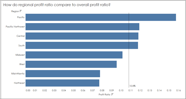
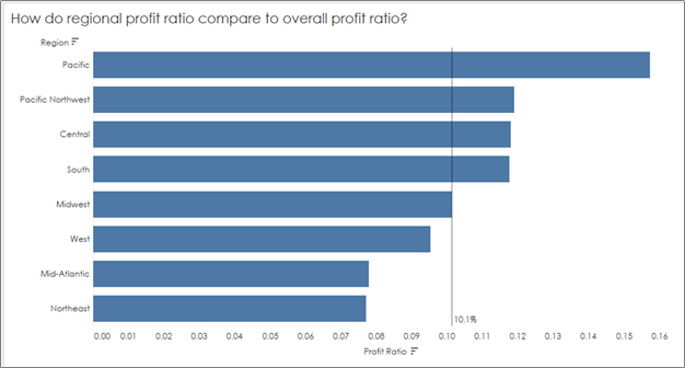
So the workaround is the same — you’ll want to create a reference line based on overall profit ratio (or “total”), not an average of the percents in your view to get the correct value for your reference line:

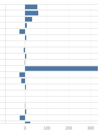
You’ll see a big jump now from the incorrect overall profit ratio of 10.8%, which was calculated as an average of the profit ratios in our view, to the correct overall profit ratio of 10.1%:

Hope this helps as you navigate all of the self-service goodies Tableau has to offer without fumbling the analysis.

Using Tableau to Improve Individual Student Learning

Fact: Educators must use student data to increase student learning.

Fact: Educators must produce data evidence that they did, in fact, attempt to increase student learning.

Fact: Educators compare class averages (means) on summative assessments to determine test reliability and student learning.

Fact: Test validity is rarely discussed.

Fact: Most data sets (class size) are small sample sizes with huge variations in classroom demographics between classes (even period to period with the same teacher)

This article is dated; however, these are present and real problems within school districts.

As you know, adults are resistant to change. Teachers are asked to produce data but given minimal training outside of “compare average test scores”. And without a math background, this may even make sense to those educators and superintendents. Therefore, when it’s easier to compare a mean and it cleans up the mandatory paperwork faster, this is the way things are done.
Question: How will (only) comparing averaging actually help individual student learning?
Question: If teachers lack a background of statistics and, even more frustrating for the educator, lack the time to learn the basics, how will they begin to leverage their own student data to improve learning? Ultimately, it is what they WANT to do. But how?
Solution: Educators need to answer deeper questions about their students using data without additional statistical training all while using their time efficiently. It must also be priced for teachers: free. And it’s here. It’s called Tableau. It’s data visualization. Instead of looking at a sea of numbers, Tableau produces pictures. Without a math background, anyone can look for trends and draw conclusions. And it’s free to educators.
 Data 4
Tableau allows teachers to import student gradebook data (most gradebooks export as a .CSV). Once the educator is in the Tableau workbook, one can merely hold down the CTRL key, click on whatever variables they would like to compare/explore. A “show me” set of suggested graphs pops up (if it doesn’t automatically pop up, after taking fingers off the keyboard, CTRL+1 will do the trick). You can also just drag and drop into the workbook. Drag and drop students to color. Play with it. And sometimes an ID will need to be set to a string (so the software knows you’re talking people, not calculations) and sometimes you’ll need to switch columns and rows for a better visual. I recommend sorting students by whatever measure (assessment? assignment? overall grade?) you are asking your data to compare. Playing with the visualization is a fun way of learning how to use the software. It won’t take long.
My first visualization

Unit 3 Tableau
Only a subset of the full visualization for 63 students. The bars show the student’s overall AP Stats performance through this unit.

This graphic sorts messy data from Unit 3 (The Linear Regression unit) into a clean, organized dashboard to help me compare my students’ formative and summative assessments (sorted on Unit Test score, ascending).
I was shocked to see the overall trend in the formative to summative scores: They went DOWN. And they shouldn’t. And that’s a validity problem from my end. But this was not so evident in looking at the aggregate data. A t-test would tell me there is “no significant difference” between quiz and test scores. But we’re talking individuals, my students. And my job is to GROW them. By looking within the data, I found trends about which types of students, for example, lost traction from quiz to test. And my ultimate conclusion was to take ownership on my end. (This could be another post for another day.)
After playing with Tableau some more, I realized rows worked better than columns for the above visualization.
And did you know that approximately 8 percent of men and 0.5 percent of women are red/green colorblind?
So my next 2 units looked more like this:
Unit 5 Tableau
To support our school’s mission and vision, I began teaching other teachers how to leverage student data within their PLCs to draw meaningful conclusions about teacher methods and student learning with Tableau. And these teachers are excited to identify trends and answer deeper student needs questions – to ultimately help and grow each individual student.
It is time teachers stop looking only to aggregate data and averages. We need the tools to find trends within each student’s learning patterns in order to provide them with the best “differentiated” learning experience for them. Unfortunately, I have found there is a huge gap between what districts want and what teachers are asked to do.
Some school districts have already figured this out. – Yes, that includes Atlanta Public Schools. Teachers have access to their student data through dashboards with a click of a button. And not only do they use it, they find value in the data visualization.
Eventually, data dashboards that ultimately give teachers a visualization of their current student data, including growth and achievement data, is the future of education. Right now teachers who want this will have to figure out the software (thankfully, Tableau is easy to use for simple visualizations.) But ultimately, data visualization through dashboards are the next step in the journey.
The beginnings of my data dashboard:
data 1
data 2
data 3