Teaching statistics year after year prepped me for the most common misinterpretations of confidence intervals and confidence levels. Confusion such as:
- Incorrectly interpreting a 99% interval as having a “99% probability of containing the true population parameter”
- Finding significance because “the sample mean is contained in the interval”
- Applying a confidence interval to samples that do not meet specific assumptions
What are Confidence Intervals?
Confidence intervals are like fishing nets to an analyst looking to capture the actual measure of a population in a pond of uncertainty. The margin of error dictates the width of the “net”. But unlike fishing scenarios, whether or not the confidence interval actually captures the true population measure typically remains uncertain. Confidence intervals are not intuitive, yet they are logical once you understand where they start.

So what EXACTLY, are we confident about? Is it the underlying data? Is it the result? Is it the sample? The confidence is actually in the procedures used to obtain the sample that was used to create the interval — and I’ll come back to this big idea at the end of the post. First, let’s paint the big picture in three parts: The data, the math, and the interpretation.
The Data
As I mentioned, a confidence interval captures a “true” (yet unknown) measure of a population using sample data. Therefore, you must be working with sample data to apply a confidence interval — you’re defeating the purpose if you’re already working with population data for which the metrics of interest are known.
Sampling Bias
It’s important to investigate how the sample was taken and determine if the sample represents the entire population. Sampling bias means a certain group has been under- or over- represented in a sample – in which case, the sample does not represent the entire population. A common misconception is that you can offset bias by increasing the sample size; however, once bias has been introduced to the sample, a larger sample using the same procedure will ensure the sample is much different from the population. Which is NOT a representative sample.
Examples of sampling bias:
- Excluding a group who cannot be reached or does not respond
- Only sampling groups of people who can be conveniently reached
- Changing sampling techniques during the sampling process
- Contacting people not chosen for sample
Statistic vs Parameter
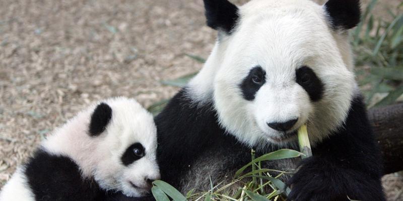
A statistic describes a sample. A parameter describes a population. For example, if a sample of 50 adult female pandas weigh an average of 160 pounds, the sample mean of 160 is known as the statistic. Meanwhile, we don’t actually know the average of all adult female pandas. But if we did, that average (mean) of the population of all female pandas would be the parameter. Statistics are used to estimate parameters. Since we don’t typically know the details of an entire population, we rely heavily on statistics.
Mental Tip: Look at the first letters! A Statistic describes a Sample and a Parameter describes a Population
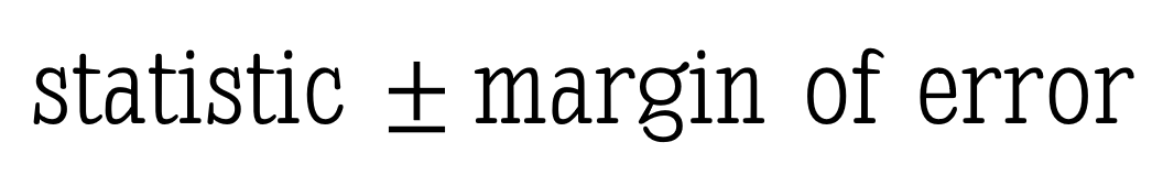
The Math
All confidence intervals take the form:
A common example here is polling reports — “The exit polls show John Cena has 46% of the vote, with a margin of error of 3 points.” Most people without a statistics background can draw the conclusion: “John Cena likely has between 43% and 49% of the vote.”
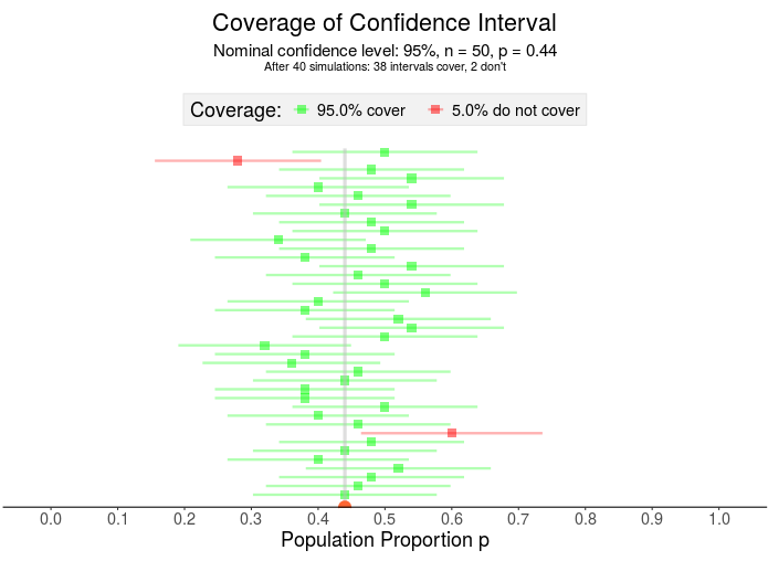
What if John Cena actually has 44% of the vote? Here, I’ve visualized 40 samples for which 38 contain that 44% Notice the confidence interval has two parts – the square in the middle represents the sample proportion and the horizontal line is the margin of error.
The Statistic, AKA “The Point Estimate”
The “statistic” is merely our estimate of the true parameter.
The statistic in the voting example is the sample percent from exit polls — the 46%. The actual percent of the population voting for John Cena – the parameter – is unknown until the polls close, so forecasters rely on sample values.
A sample mean is another example of a statistic – like the mean weight of an adult female panda. Using this statistic helps researchers avoid the hassle of traveling the world weighing all adult female pandas.
The Margin of Error
With confidence intervals, there’s a trade off between precision and accuracy: A wider interval may capture the true mean accurately, but it’s also less precise than a more narrow interval.
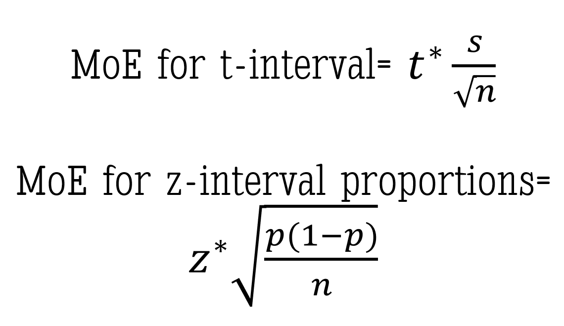
The width of the interval is decided by the margin of error because, mathematically, it is the piece that is added to and subtracted from the statistic to build the entire interval.
How do we calculate the margin of error? You have two main components — a t or z value derived from the confidence level,and the standard error. Unless you have control over the data collection on the front end, the confidence level is the only component you’ll be able to determine and adjust on the back end.
The confidence level
“Why can’t we just make it 100% confidence?” Great question! And one I’ve heard many times. Without going into the details of sampling distributions and normal curves, I’ll give you an example:
Assume the “average” adult female panda weighs “around 160 pounds.” To be 100% confident that we’ve created an interval that includes the TRUE mean weight, we’d have to use a range that includes all possible values of mean weights. This interval might be from, say 100 to 400 pounds – maybe even 50 to 1000 pounds. Either way, that interval would have to be ridiculously large to be 100% confident you’ve estimated the true mean. And with a range that wide, have you actually delivered any insightful message?

Again consider a confidence interval like a fishing net, the width of the net determined by the margin of error – more specifically, the confidence level (since that’s about all you have control over once a sample has been taken). This means a LARGER confidence level produces a WIDER net and a LOWER confidence level produces a more NARROW net (everything else equal).
For example: A 99% confidence interval fishing net is wider than a 95% confidence interval fishing net. The wider net catches more fish in the process.
But if the purpose of the confidence interval is to narrow down our search for the population parameter, then we don’t necessarily want more values in our “net”. We must strike a balance between precision (meaning fewer possibilities) and confidence.

Once a confidence level is established, the corresponding t* or z* value — called an upper critical value — is used in the calculation for the margin of error. If you’re interested in how to calculate the z* upper critical value for a 95% z-interval for proportions, check out this short video using the Standard Normal Distribution.
The standard error
This is the part of the margin of error you most likely won’t get to control.
Keeping with the panda example, if we are interested in the true mean weight for the adult female panda then the standard error is the standard deviation of the sampling distribution of sample mean weights. Standard error, a measure of variability, is based on a theoretical distribution of all possible sample means. I won’t get into the specifics in this post but here is a great video explaining the basics of the Central Limit Theorem and the standard error of the mean.

If you’re using proportions, such as in our John Cena election example, here is my favorite video explaining the sampling distribution of the sample proportion (p-hat).
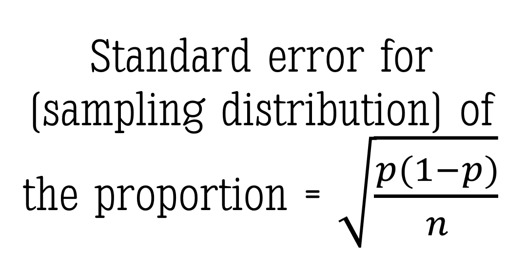
As I mentioned, you will most likely NOT have much control over the standard error portion of the margin of error. But if you did, keep this PRO TIP in your pocket: a larger sample size (n) will reduce the width of the margin of error without sacrificing the level of confidence.
The Interpretation
Back to the panda weights example here. Let’s assume we used a 95% confidence interval to estimate the true mean weight of all adult female pandas:
Interpreting the Interval
Typically the confidence interval is interpreted something like this: “We are 95% confident the true mean weight of an adult female panda is between 150 and 165 pounds.”
Notice I didn’t use the word probability. At all. Let’s look at WHY:
Interpreting the Level
The confidence level tells us:, “If we took samples of this same size over and over again (think: in the long run) using this same method, we would expect to capture the true mean weight of an adult female panda 95% of the time.” Notice this IS a probability. A 95% probability of capturing the true mean exists BEFORE taking the sample. Which is why I did NOT reference the actual interval values. A different sample would produce a different interval. And as I said in the beginning of this post, we don’t actually know if the true mean is in the interval we calculated.
Well then, what IS the probability that my confidence interval – the one I calculated between the values of 150 and 165 pounds – contains the true mean weight of adult female pandas? Either 1 or 0. It’s either there, or it isn’t. Because — and here’s the tricky part — the sample was already collected before we did the math. NOTHING in the math can change the fact that we either did or didn’t collect a representative sample of the population. OUR CONFIDENCE IS IN THE DATA COLLECTION METHOD – not the math.
The numbers in the confidence interval would be different using a different sample.
Visualizing the Confidence Interval
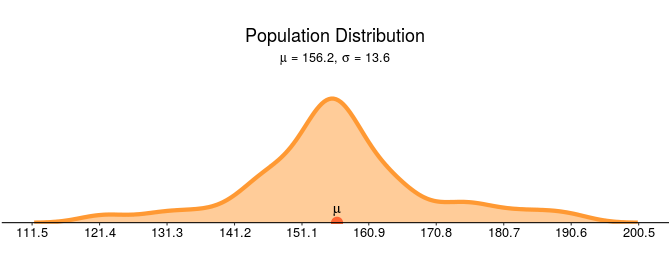
Let’s assume the density curve below represents the actual population mean weights of all adult female pandas. In this made up example the mean weight of all adult pandas is 156.2 pounds with a population standard deviation of 13.6 pounds.
Beneath the population distribution are the simulation results of 300 samples of n = 20 pandas (sampled using an identical sampling method each time). Notice that roughly 95% of the intervals cover the true mean — capturing 156.2 within the interval (the green intervals) while close to 5% of intervals do NOT capture the 156.2 (the red intervals).
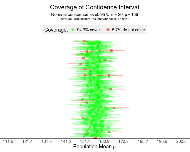
Pay close attention to the points made by the visualization above:
- Each horizontal line represents a confidence interval constructed from a different sample
- The green lines “capture” or “cover” the true (unknown) mean while the red lines do NOT cover the mean.
- If this was a real situation, you would NOT know if your interval contained the true mean (green) or did not contain the true mean (red).
The logic of confidence intervals is based on long-run results — frequentist inference. Once the sample is drawn, the resulting interval either does or doesn’t contain the true population parameter — a probability of 1 or 0, respectively. Therefore, the confidence level does not imply the probability the parameter is contained in the interval. In the LONG run, after many samples, the resulting intervals will contain the mean C% of the time (where C is your confidence level).
So in what are we placing our confidence when we use confidence intervals? Our confidence is in the procedures used to find our sample. Any sampling bias will affect the results – which is why you don’t want to use confidence intervals with data that may not represent the population.