When my oldest son was born, I remember the pediatrician using a chart similar to the one below to let me know his height and weight percentile. That is, how he measured up relative to other babies his age. This is a type of cumulative relative frequency distribution. These charts help determine relative position of one data point to the rest of the dataset, showing an accumulating percent of observations for each value. In this case, the chart helps determine how a child is growing relative to other babies his age.

I decided to figure out how to create one in Tableau. Based on the types of cumulative frequency distributions I was used to when I taught AP Stats, I first determined I wanted the value of interest on the horizontal axis and the percents on the vertical axis.
Make a histogram
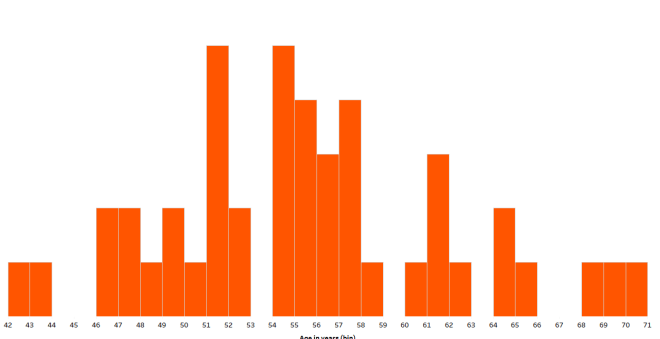
Using a simple example – US President age at inauguration – I started with a histogram so I could look at the overall shape of the distribution:


Adjust bin size appropriately
From here I realized I already had what I needed in my view – discrete ages on the x-axis and counts of ages on the y-axis. For a wider range of values I would want a wider bin size, but in this situation I needed to resize bins to 1, representing each individual age.

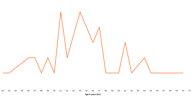
Change the marks from bars to a line
Create a table calculation
Click on the green pill on the rows (the COUNT) and add a table calculation.

Actually, TWO table calculations
First choose “Running Total”, then click on the box “add secondary calculation”:

Next, choose “percent of total” as the secondary calculation:

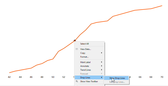
Polish it up
Add drop lines…
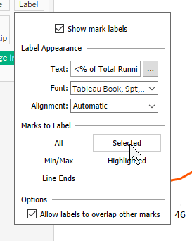
…and CTRL drag the COUNT (age in years) green pill from the rows to labels. Click on “Label” on the marks card and change the marks to label from “all” to “selected”.
And there you have it.

Interpreting percentiles
Percentiles describe the position of a data point relative to the rest of the dataset using a percent. That’s the percent of the rest of the dataset that falls below the particular data point. Using the baby weights example, the percentile is the percent of all babies of the same age and gender weighing less than your baby.
Back to the US president example.
Since I know Barack Obama was 47 when inaugurated, let’s look at his age relative to the other US presidents’ ages at inauguration:

And another way to look at this percentile: 87% of US presidents were older than Barack Obama when inaugurated.
Thank you for reading and have an amazing day!
-Anna

One thought on “How to Build a Cumulative Frequency Distribution in Tableau”