Author’s note: This post is a follow-up to the webinar, Percentiles and How to Interpret a Box-and-Whisker Plot, which I created with Eva Murray and Andy Kriebel. You can read more on the topic of percentiles in my previous posts.
No, You Aren’t Crazy.
That box-and-whisker plot (or, boxplot) you learned to read/create in grade school probably IS different from the one you see presented in the adult world.

The boxplot on the top originated as the Range Bar, published by Mary Spear in the 1950’s. While the boxplot on the bottom was a modification created by John Tukey to account for outliers. Source: Hadley Wickham
As a former math and statistics teacher, I can tell you that (depending on your state/country curriculum and textbooks, of course) you most likely learned how to read and create the former boxplot (or, “range bar”) in school for simplicity. Unless you took an upper-level stats course in grade school or at University, you may have never encountered Tukey’s boxplot in your studies at all.
You see, teachers like to introduce concepts in small chunks. While this is usually a helpful strategy, students lose when the full concept is never developed. In this post I walk you through the range bar AND connect that concept to the boxplot, linking what you’ve learned in grade school to the topics of the present.
The Kid-Friendly Version: The Range Bar
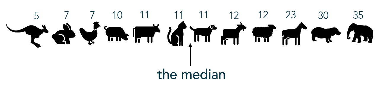
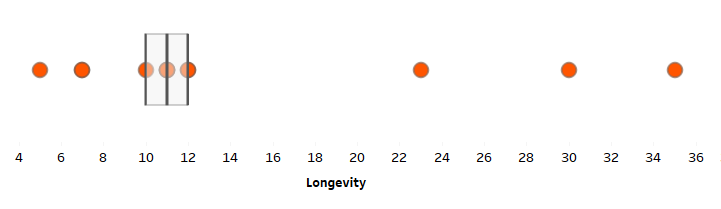
In this example, I’m comparing the lifespans of a small, non-random set of animals. I chose this set of animals based solely on convenience of icons. Meaning, conclusions can only be drawn on animals for which Anna Foard has an icon. I note this important detail because, when dealing with this small, non-random sample, one cannot infer conclusions on the entire population of all animals.
1) Find the quartiles, starting with the median
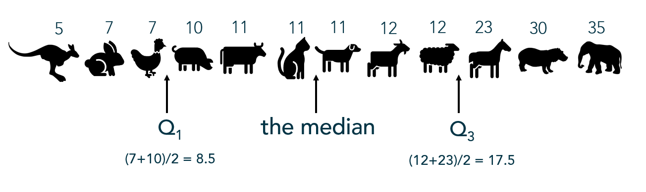
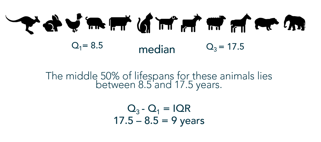
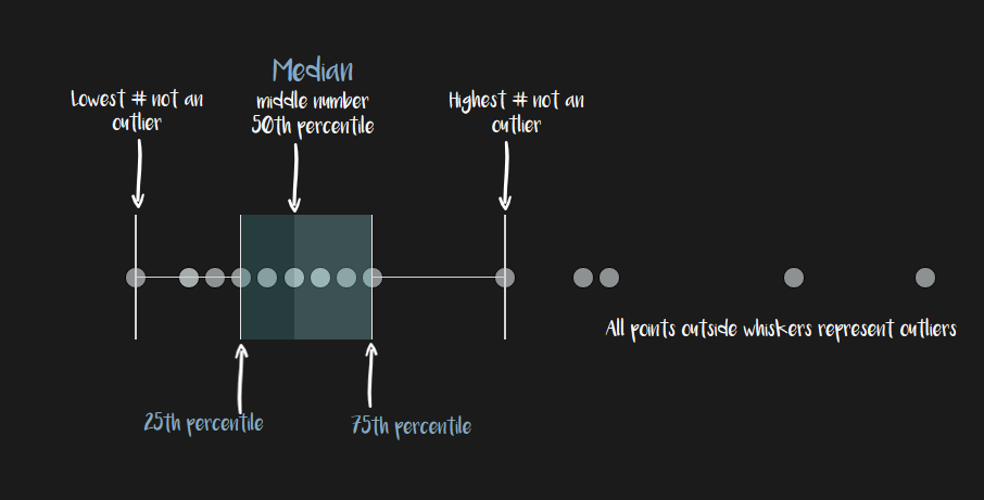
Quartiles break the dataset into 4 quarters. Q1, median, Q3 are (approximately) located at the 25th, 50th, and 75th percentiles, respectively.
Finding the median requires finding the middle number when values are ordered from least to greatest. When there is an even number of data points, the two numbers in the middle are averaged.
Once the median has been located, find the other quartiles in the same way: The middle value in the bottom set of values (Q1), then the middle value in the top set (Q3).
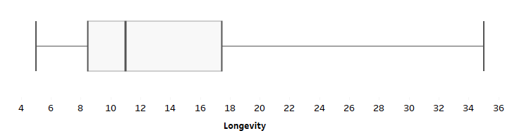
2) Use the Five Number Summary to create the Range Bar
The first and third quartiles build the “box”, with the median represented by a line inside the box. The “whiskers” extend to the minimum and maximum values in the dataset:

But without the points:
The Range Bar probably looks similar to the first box-and-whisker plot you created in grade school. If you have children, it is most likely the first version of the box-and-whisker plot that they will encounter.

Suggestion:
Since the kid’s version of the boxplot does not show outliers, I propose teachers call this version, “The Range Bar” as it was originally dubbed, to not confuse those reading the chart. After all, someone looking at this version of a boxplot may not realize it does not account for outliers and may draw the wrong conclusion.
The Adult Version: The Boxplot
The only difference between the range bar and the boxplot is the view of outliers. Since this version requires a basic understanding of the concept of outliers and a stronger mathematical literacy, it is generally introduced in a high school or college statistics course.
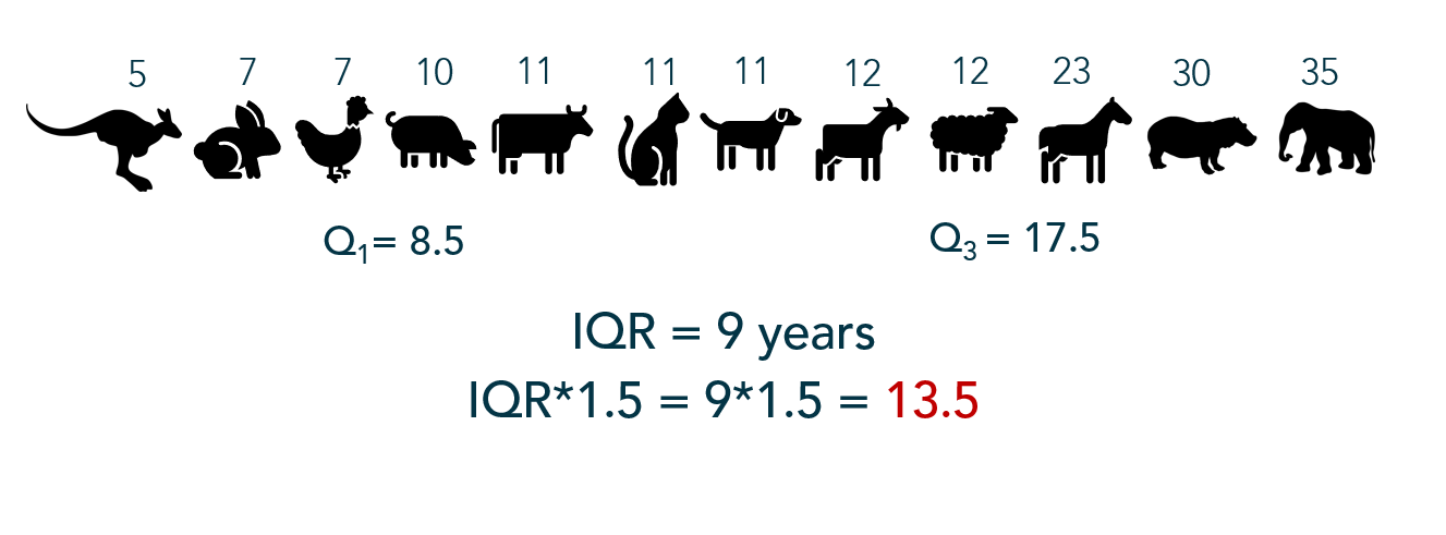
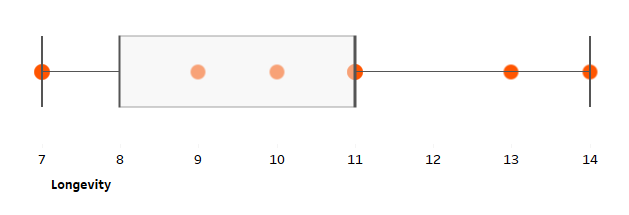
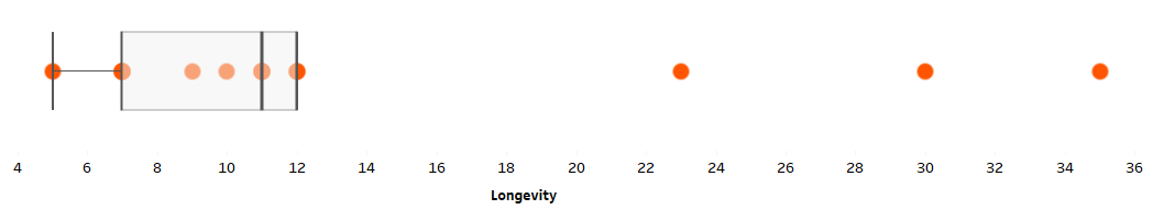
1) Calculate the IQR
The interquartile range is the difference, or spread, between the third and first quartile reflecting the middle 50% of the dataset. The IQR builds the “box” portion of the boxplot.
2) Multiply the IQR by 1.5
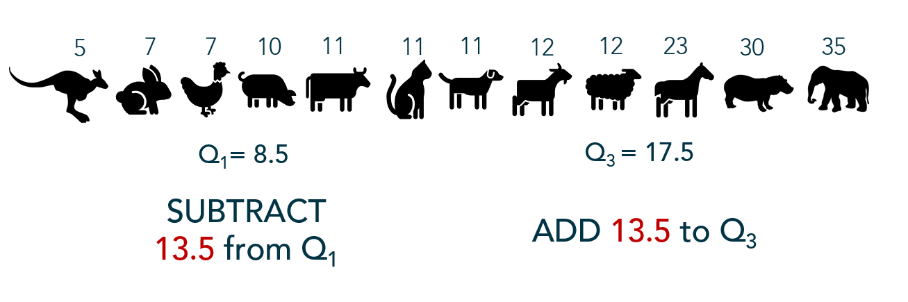
3) Determine a threshold for outliers – the “fences”
1.5*IQR is then subtracted from the lower quartile and added to the upper quartile to determine a boundary or “fences” between non-outliers and outliers.
4) Consider values beyond the fences outliers
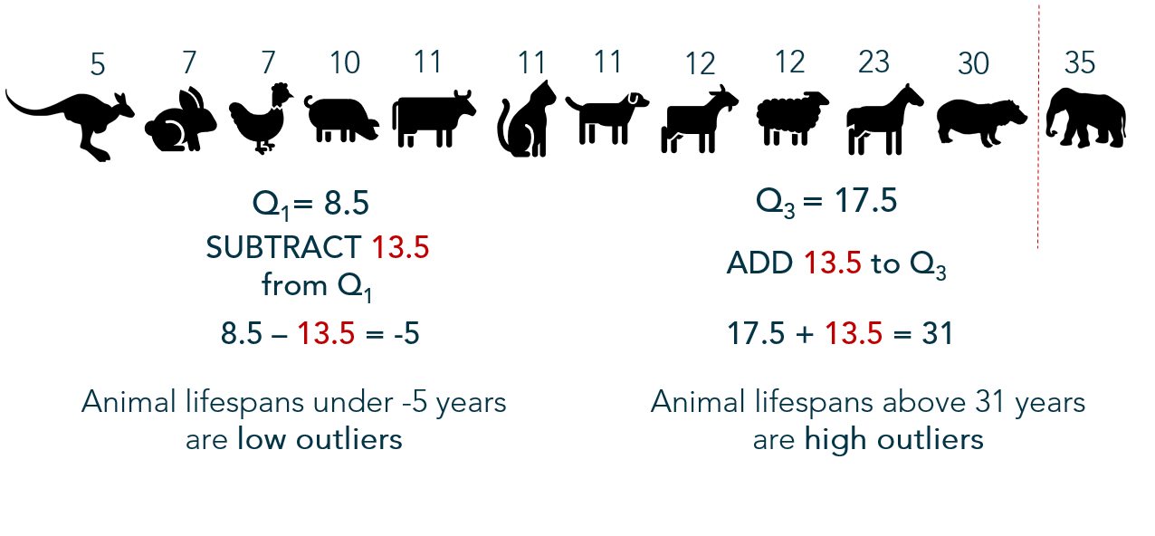
Since no animals’ lifespans are below -5 years, it is not possible for a low-value outlier in this particular set of data; however, one animal in this dataset lives beyond 31 years – an outlier in higher values.
5) Build the boxplot
Here we find the modification on the “range bar” – the whiskers only extend as far as non-outlier values. Outliers are denoted by a dot (or star).

Advantage: Boxplot
In an academic setting, I use boxplots a great deal. When teaching AP Statistics, they are helpful to visualize the data quickly by hand as they only require summary statistics (and outliers). They also help students compare and visualize center, spread, and shape (to a degree).
When we get into the inference portion of AP Stats, students must verify assumptions for certain inference procedures — often those procedures require data symmetry and/or absence of outliers in a sample. The boxplot is a quick way for a student to verify assumptions by hand, under time constraints. When coaching doctoral candidates through the dissertation stats, similar assumptions are verified to check for outliers — using boxplots.

Boxplot Advantages:
- Summarizes variation in large datasets visually
- Shows outliers
- Compares multiple distributions
- Indicates symmetry and skewness to a degree
- Simple to sketch
- Fun to say
So What Could Go Wrong?
Unfortunately, boxplots have their share of disadvantages as well.
Consider:
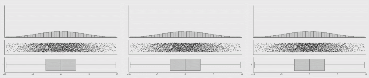
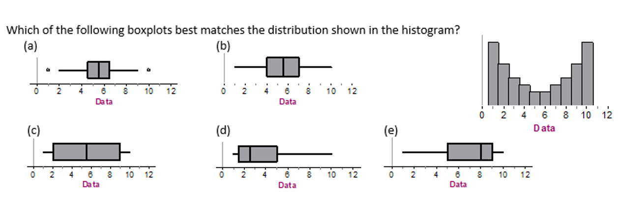
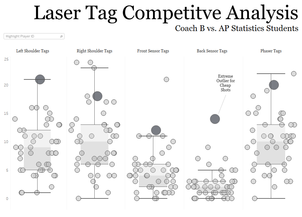
A boxplot may show summary statistics well; however, clusters and multimodality are hidden.
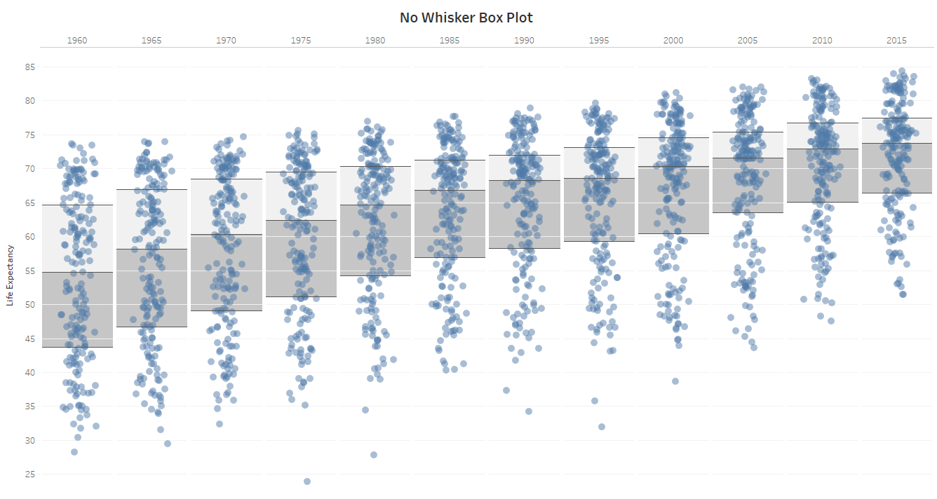
In addition, a consumer of your boxplot who isn’t familiar with the measures required to construct one will have difficulty making heads or tails of it. This is especially true when your resulting boxplot looks like this:
Or this:
Or what about this?

Boxplot Disadvantages:
- Hides the multimodality and other features of distributions
- Confusing for some audiences
- Mean often difficult to locate
- Outlier calculation too rigid – “outliers” may be industry-based or case-by-case
Variations
Over the course of the years, multiple boxplot variations have been created to display parts (or all) of the distribution’s shape and features.

Going For It
Box-and-whisker plots may be helpful for your specific use case, though not intuitive for all audiences. It may be helpful to include a legend or annotations to help the consumer understand the boxplot.
Check Yourself: Ticket out the Door
No cheating! Without looking back through this post, check your own understanding of boxplots. Answer can be found on the #MakeoverMonday webinar I recorded with Eva Murray a couple weeks ago.