How do you get a group of 15 to 18-year-old students interested in data prep and analysis? Why, you take them to play laser tag, of course!
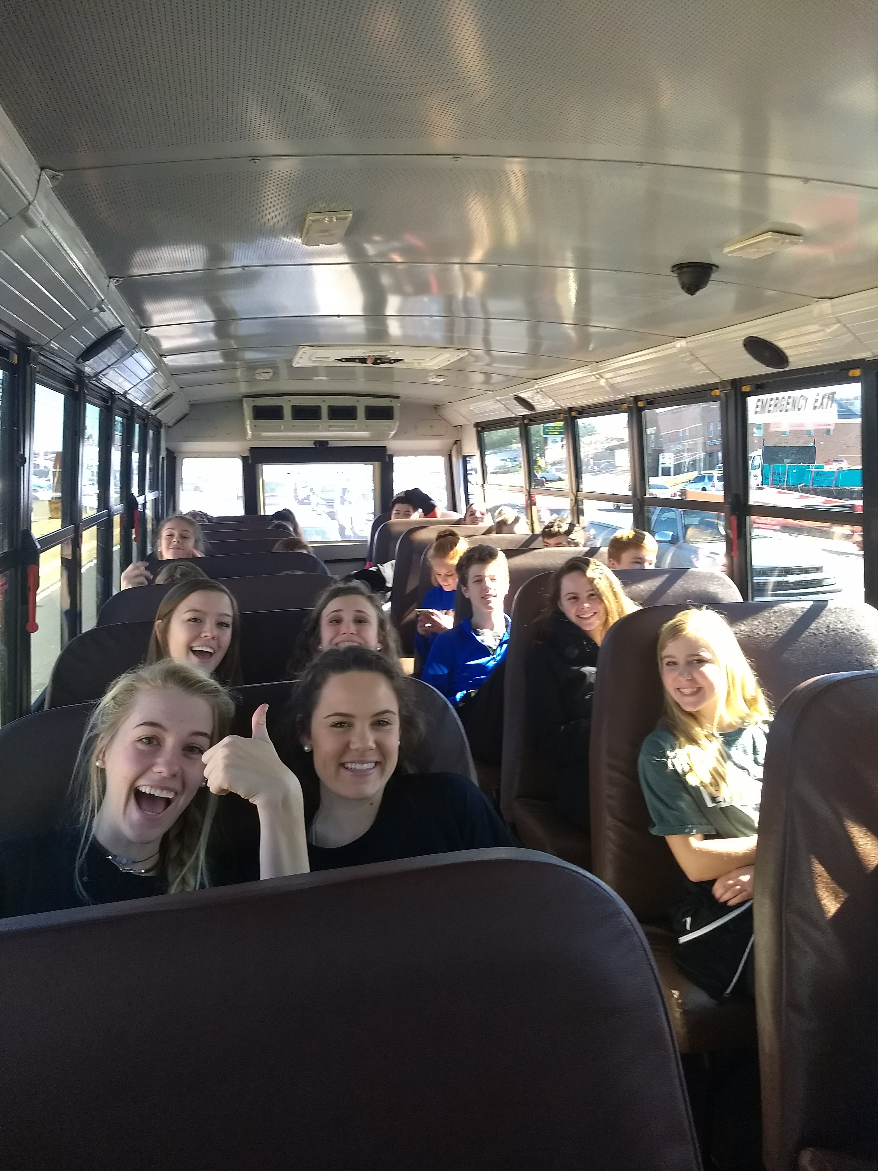
That’s right, on a cold January day I loaded up two buses of teens and piloted them to an adventure at our local Stars and Strikes. And this is no small feat — this particular trip developed out of months of planning, and after years proclaiming that I will never ever ever ever EVER coordinate my own field trip for high school kids. I mean, you should SEE the stack of paperwork. And the level of responsibility itself made me anxious.
So there I was, field trip money in one hand, clipboard in another: Imagine a caffeinated Tracy Flick. But thanks to the help of two parent chaperones and the AP Psychology teacher (Coach B), we ran the smoothest data-related field trip modern education has ever known.
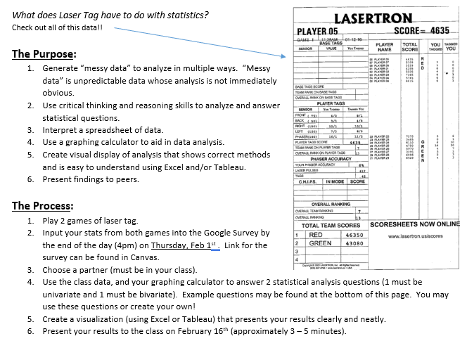
What Does Laser Tag Have to do With Statistics?
Statistics textbooks are full of canned examples and squeaky clean data that often have no bearing on a students’ interests. For example, there is an oh-so-relatable exercise computing standard error for D-glucose contained in a sample of cockroach hindguts. In my experience I’ve learned when students can connect to the data, they are able to connect to the concept. We’re all like that, actually — to produce/collect our own data enables us to see what we otherwise would have missed.
(I can assure you confidence intervals constructed from D-glucose in coachroach hindguts did little for understanding standard error.)
The real world is made up of messy data. It’s full of unknowns, clerical errors, bias, unnecessary columns, confusing date formats, missing values; the list goes on. Laser Tag was suggested to me as a way to collect a “large” amount of data in a relatively short amount of time. And because of the size of the dataset, it required the student to input their own data — creating their own version of messy data complete with clerical errors. From there they’d have to make sense of the data, look for patterns, form hypotheses.
The Project
- Students entered their data into a Google doc — you can find the complete data here.
- Each partner team developed two questions for the data: One involving 1-variable analysis, another requiring bivariate analysis.
- The duos then had to explore, clean, and analyze all 47 rows and 48 columns. At this point in the school year, students had been exposed to data up to about 50 rows, but never had they experienced “wide” data.
- Analyses and presentations required a visualization, either using Excel or Tableau.
Partner projects lend to fantastic analyses, with half the grading
Playing the Games
Methodology: Each student was randomly assigned to a team using a random number generator. Teams of 5 played each other twice during the field trip. The teams were paired to play each other randomly. If, by chance, a team was chosen to play the same team twice, that choice would be ignored and another random selection would be made until a new team was chosen.
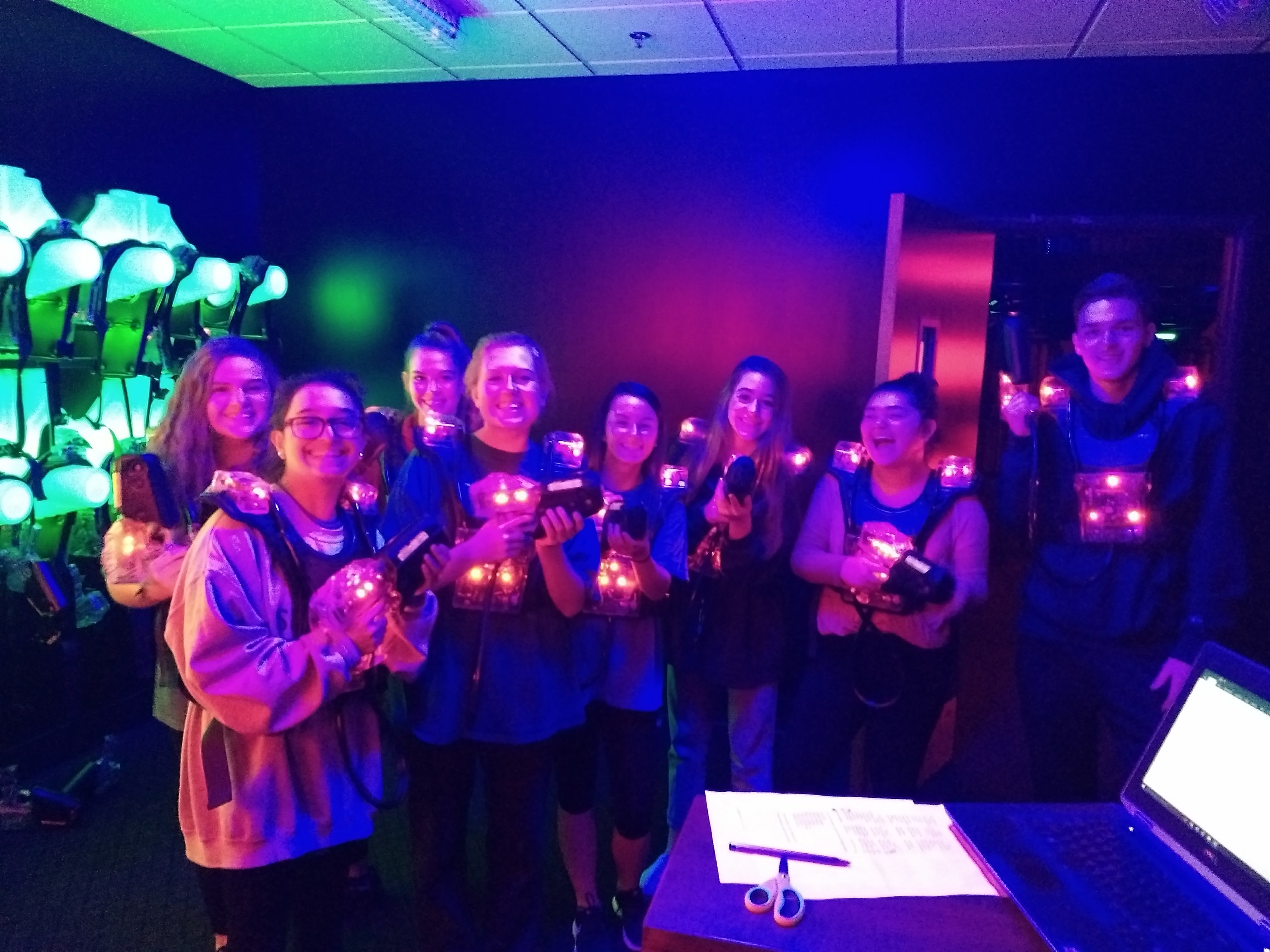
Before each game, I recorded which student wore which laser tag vest number. From the set-up room (see above picture), I could view which vest numbers were leading the fight and which team had the lead. It was entertaining. As the students (and Coach B — we needed one more player for even teams) finished their games, score cards were printed and I handed each student their own personal results. The words, “DON’T lose this” exited my lips often.
Upon our return to school (this only took a few hours, to the students’ dismay), results were already pouring the into the Google doc I’d set up ahead of time.
Teaching Tableau and Excel Skills
The AP Statistics exam is held every year in May, hosted by The College Board. On the exam, students are expected to use a graphing calculator but have no access to a computer or Google. Exactly the opposite of the real world.
Throughout the course, I taught all analysis first by hand, or using the TI-83/84. As students became proficient, I added time in the computer lab to teach basic skills using Excel and Tableau (assignments aligned to the curriculum while teaching skills in data analysis). It was my goal for students to have a general understanding of how to use these “real world” analytics tools while learning and applying AP Statistics curriculum.
After the field trip, we spent three days in the computer lab – ample time to work in Tableau and Excel with teacher guidance. Students spent time exploring the 48-column field trip dataset with both Excel and Tableau. They didn’t realize it, but by deciding which chart type to use for different variables, they were actually reviewing content from earlier in the year.
Most faculty members had never heard of Tableau. At lunch one day I sat down with Coach B to demonstrate Tableau’s interface with our field trip dataset.
“What question would you ask this set of data?” I asked.
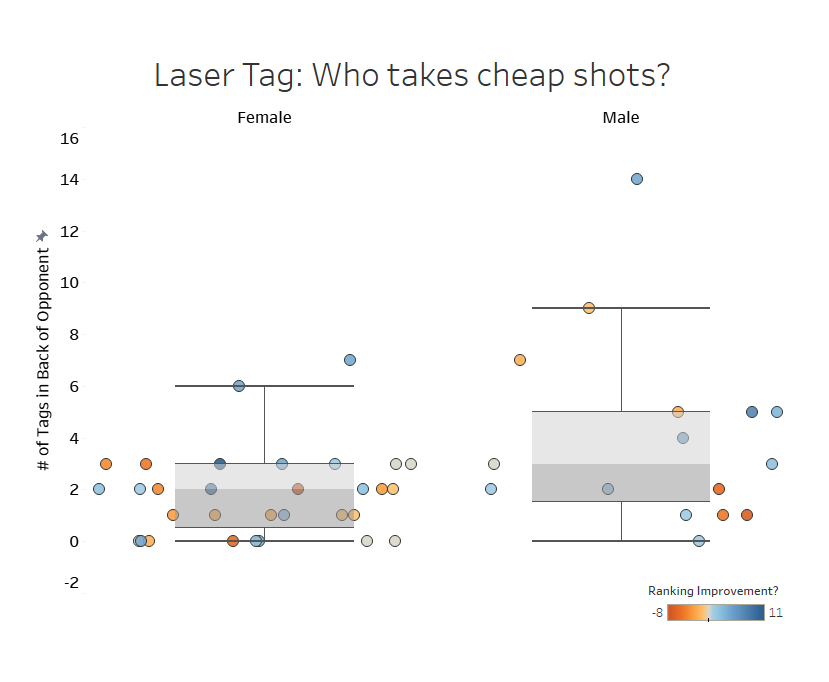
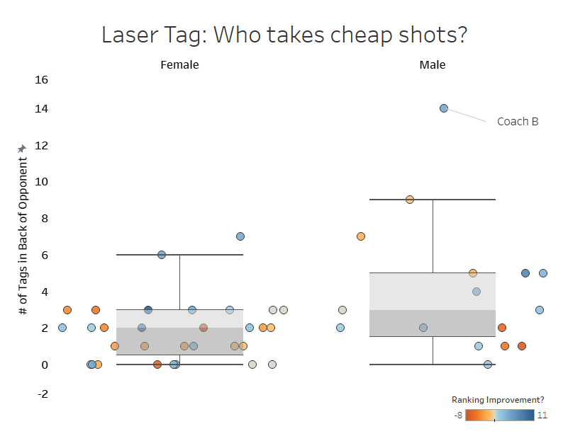
“A back shot is a cheap shot. I wonder who is more likely to take a cheap shot, males or females?”
So I proceeded to pull up a comparison and used box-and-whiskers plots to look for outliers. Within seconds, a large outlier was staring back at us within the pool of male students:
“Ha. I wonder who that was.” – Coach B
“That’s YOU.” – Me
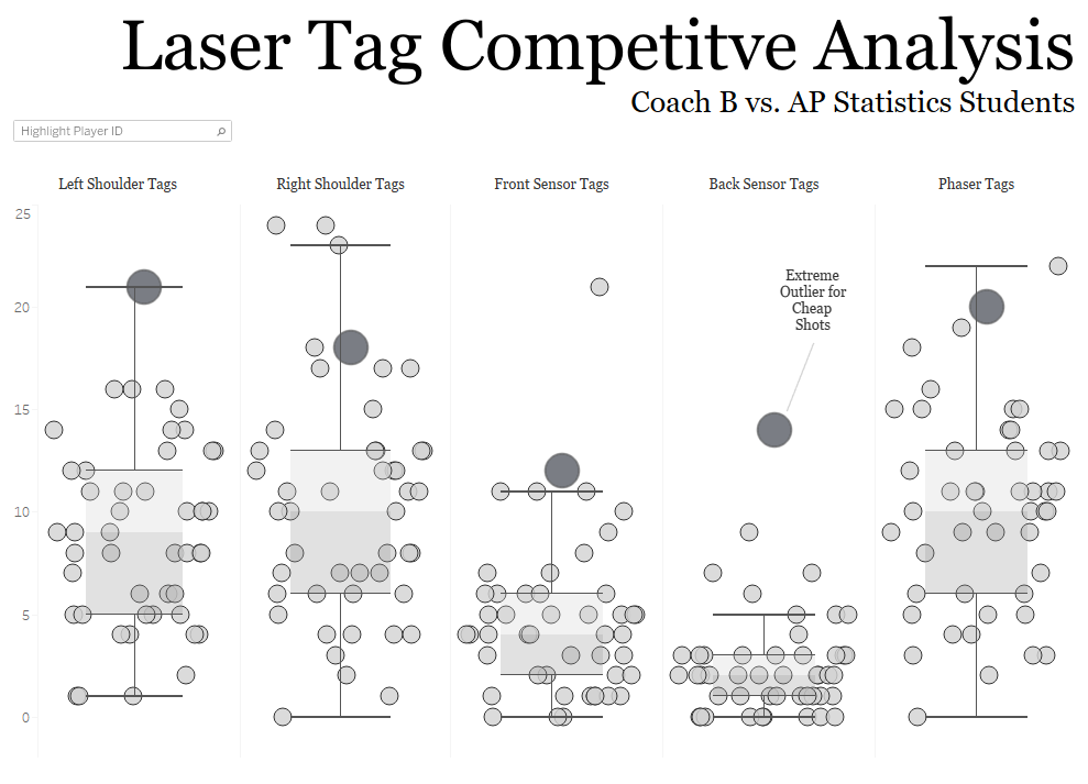
From there, I created a tongue-in-cheek competitive analysis from the data:
Student Response
I’ve been teaching since 2004. Over the years, this was probably the most successful project I’ve seen come through my classroom. By “successful”, I’m talking the proportion of students who were able to walk outside of their comfort zone and into a challenging set of data, perform in-depth analyses, then communicate clear conclusions was much higher than in all previous years.
At the end of the year, after the AP Exam, after grades were all but inked on paper, students still talked excitedly about the project. I’d like to think it was the way I linked a fun activity to real-world analysis, though it most likely has to do with getting out of school for a few hours. Either way, they learned something valuable.
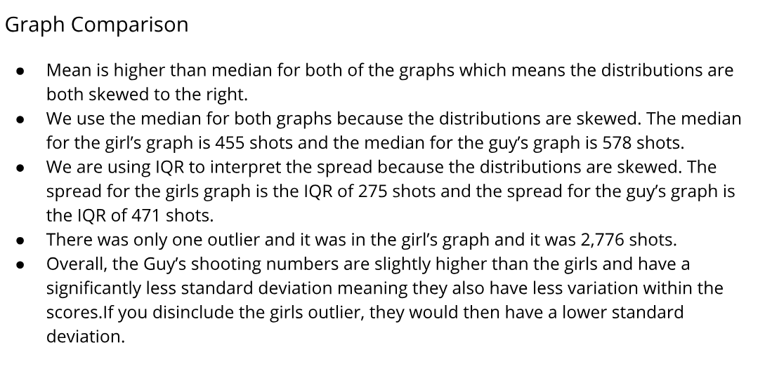
Univariate Analysis
One student, Abby, gave me permission to share her work adding, “This is the project that tied it all together. This was the moment I ‘got’ statistics.”
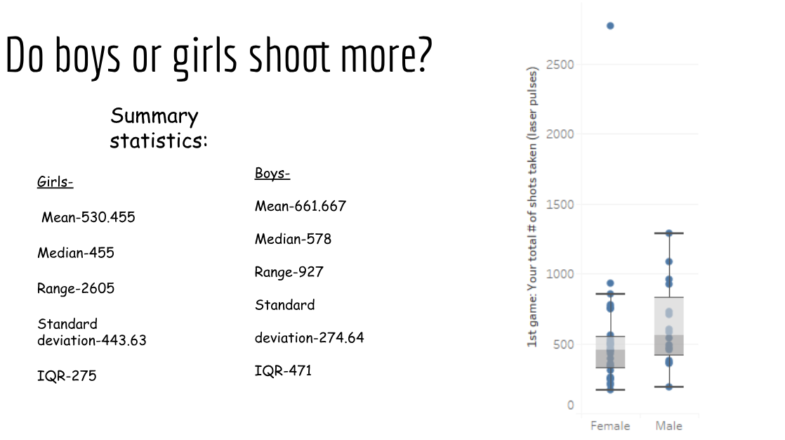
Interestingly, students were less inclined to suggest the female outlier of 2776 shots was a clerical mistake (which it was). I found there were two camps: Students who didn’t want to hurt feelings, and students who think outliers in the wild need no investigation. Hmmm.
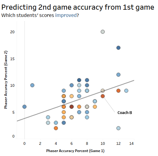
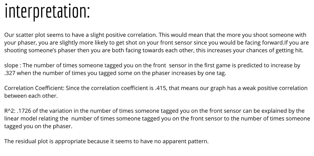
Bivariate Analysis

What I Learned
When you teach, you learn.
Earlier I said the project was a success based on the students’ results. That’s only partially true; it was also a success because I grew as an educator. After years of playing by the rules I realized that sometimes you need to get outside your comfort zone. For me that was two-fold: 1) Sucking it up and planning a field trip and 2) Losing the old, tired TI-83 practice problems and teaching real-world analytics tools.

Wow, as a statistics teacher myself and a cofounder of the globally second-largest lasertag brand, I find this to be absolutely brilliant. Hahaha, very cool! Love your blog, Maarten, Leiden, The Netherlands
LikeLike