I was a high school math and statistics teacher for 14 years. And my stats course always began by visualizing the distribution of a variable using a simple chart or graph. One variable at a time we’d focus on creating, interpreting, and describing appropriate graphs. For quantitative variables, we’d use histograms or dot plots to discuss the distribution’s specific physical features. Why? Data visualization helps students draw conclusions about a population using sample data than summary statistics alone.
This post aims to review the basics of how measures of central tendency — mean, median, and mode — are used to measure what’s typical. Specifically, I’ll show you how to inspect distributions of variables visually and dissect how mean, median, and mode behave, in addition to common ways they are used. Ultimately it may be difficult, impossible, or misleading to describe a set of data using one number; however, I hope this journey of data exploration helps you understand how different types of data can effect how we describe what’s typical.
Remember Middle School?
Fair enough — I too try to forget the teased hair and track suit years. But I do recall learning to calculate mean, median, mode, and range for a set of numbers with no context and no end game. The math was simple, yet painfully boring. And I never fully realized we were playing a game of Which One of These is Not Like the Other.

It wasn’t until my first college stats course that I realized descriptive statistics serve a purpose – to attempt to summarize important features of a variable or dataset. And mean, median, mode – the measures of central tendency – attempt to summarize the typical value of a variable. These measures of typical may help us draw conclusions about a specific group or compare different groups using one numerical value.
To check off that middle school homework, here’s what we were programmed to do:
Mean: Add the numbers up, divide by the total number of values in the set. Also known as the arithmetic mean and informally called the “average”.
Median: Put the numbers in order from least to greatest (ugh, the worst part) and find the middle number. Oh, there’s two middle numbers? Average them. Did you leave out a number? Start over.
Mode: The number(s) that appear the most.
Repeat until you finish the worksheet.
Because we arrive at mean, median, and mode using different calculations, they summarize typical in different ways. The types of variables measured, the shape of the distribution, the context, and even the size of the set of data can alter the interpretation of each measure of central tendency.
Visually Inspecting Measures of Typical
What do You Mean When You Say, “Mean”?
We’re programmed to think in terms of an arithmetic mean, often dubbed the average; however, the geometric and harmonic means are extremely useful and worth your time to learn. Furthermore, when you want to weigh certain values in a dataset more than others, you’ll calculate a weighted mean. But for simplicity of this post, I will only use the arithmetic mean when I refer to the “mean” of a set of values.
Think of the mean as the balancing point of a distribution. That is, imagine you have a solid histogram of values and you must balance it on one finger. Where would you hold it? For all symmetric distributions the balancing point – the mean – is directly in the center.
The Median
Just like the median in the road (or, “neutral ground” if you’re from Louisiana), the median represents that middle value, cutting the set of values in half — 50% of the data values fall below and 50% lie above the median. No matter the shape of the distribution, the median is the measure of central tendency reflecting the middle position of the data values.
The Mode(s)
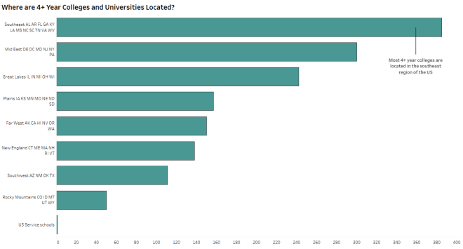
The mode describes the value or category in a set of data that appears the most often. The mode is specifically useful when asking questions about categorical (qualitative) variables. In fact, mode is the only appropriate measure of typical for categorical variables. For example: What is the most common college mascot? What type of food do college students typically eat? Where are most 4+ Year colleges and universities located?
Modes are also used to describe features of a distribution. In large sets of quantitative data, values are binned to create histograms. The taller “peaks” of the histogram indicate where more common data values cluster, called modes. A cluster of tall bins is sometimes called a modal range. A histogram having one tall peak is called unimodal while two peaks is referred to as bimodal. Multiple peaks = multimodal.

You may notice multiple tall peaks of varying heights in one histogram — despite some bins (and clusters of bins) containing fewer values, they are often described as modes or modal ranges since they contain local maximums.
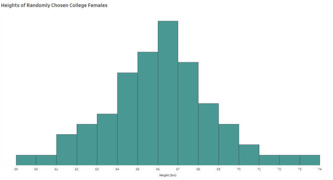
When the Mean and the Median are Similar
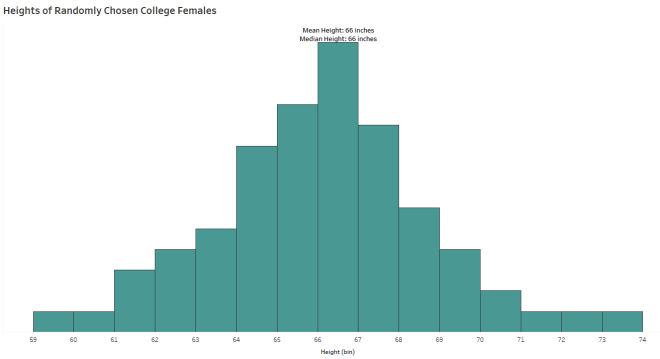
The histogram above shows a distribution of heights for a sample of college females. The mean, median, and mode of this distribution are equal at about 66.5 inches. When the shape of the distribution is symmetric and unimodal, the mean, median, and mode are equal.
Now I want to see what happens when I add male heights into the histogram:
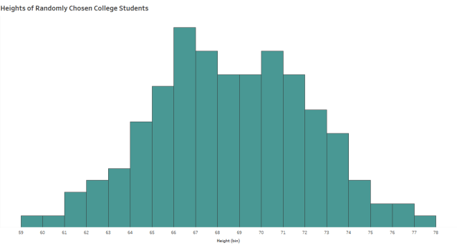
This histogram shows the distribution of heights of both male and female college students. It is symmetric, so the mean and median are equal at about 68.5 inches. But you’ll notice two peaks, indicating two modal ranges — one from 66 – 67 inches and another from 70 – 71 inches.
Do the mean and median represent the typical college student height when we are dealing with two distinctly different groups of students?
When the Mean and the Median Differ
In a skewed distribution, the median remains the center of the values; however, the mean is pulled away from the median from extreme values and outliers.
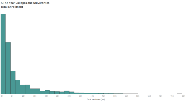
For example, the histogram above shows the distribution of college enrollment numbers in the United States from 2013. The shape of the distribution is skewed to the right — that is, most colleges reported enrollment below 5,000 students. However, the “tail” of the distribution is created by a small number of larger universities reporting much higher enrollment. These extreme outlying values pull the mean enrollment to the right of the median enrollment.
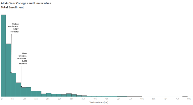
Reporting an average enrollment of 7,070 students for colleges in 2013 exaggerates the typical college enrollment since most US colleges and universities reported enrollment under 5,000 students.
The median, on the other hand, is resistant to outliers since it is based on position relative to the rest of the data. The median helps you conclude that half of all colleges enrolled fewer than 3,127 students and half of the colleges enrolled more than 3,127 students.
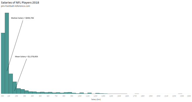
Depending on your end goal and context, median may provide a better measure of typical for skewed set of data. Medians are typically used to report salaries and housing prices since these distributions include mostly moderate values and fewer on the extremely high end. Take a look at the salaries of NFL players, for example:
Are we to only report medians for skewed distributions?
- The median is not a good description of typical for a very small dataset (eg, n<10, depending on context).
- The median is helpful when you want to ignore (or lessen effects of) outliers. Of course, as Daniel Zvinca* points out, your data could contain significant outliers that you don’t want to ignore.

In school, our grades are reported as means. However, students’ grade distributions can be symmetric or skewed. Let’s say you’re a student with three test grades, 65, 68, 70. Then you make a 100 on the fourth test. The distribution of those 4 grades is skewed to the right with a mean of 75.8 and median of 69. Despite the shape of the distribution, you may argue for the mean in this situation. On the other hand, if you scored a 30 on the fourth test instead of 100, you’d argue for the median. With only 4 data points, the median is not a good description of typical so here’s hoping you have a teacher who understands the effects of outliers and drops your lowest test score.
Inserting my opinion: As a former teacher, I recognize that when averaging all student grades from an assignment or test, the result is often misleading. In this case, I believe the median is a better description of the typical student’s performance because extreme values usually exist in a class set of grades (very high or very low) and will affect the calculation of the mean. After each test in AP statistics, I would post the mean, median, 5 number summary and standard deviation for each class. It didn’t take long for students to draw the same conclusion.
Ultimately, context can guide you in this decision of mean versus median but consider the existence of outliers and the distribution shape.
Using Modality to Find the Story
By investigating a distribution’s physical features, students are able to connect the numbers with a story in the data. In quantitative data, unusual features can include outliers, clusters, gaps and “peaks”. Specifically, identifying causes of the multimodality of a distribution can build context behind the metrics you report.

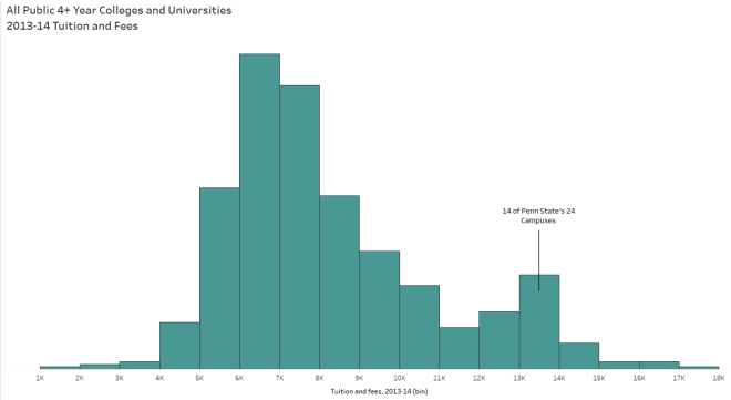
When I investigated the distribution of college tuition, I expected the shape to appear skewed. I did not expect to find the smaller peak in the middle. So I filtered the data by type of college (public or private) and found two almost symmetric distributions of tuition:


The existence of the modes in this data makes it difficult to find a typical US college tuition; however, they did point to the existence of two different types of colleges mixed into the same data.


Now I’m not confident that one number would represent the typical college tuition in the U.S., though I can say, “The typical tuition for 4+ year colleges in the US for the 2013-14 school year was about $7,484 for public schools and $27,726 for private schools.”
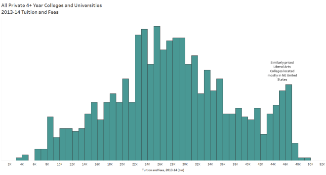
Oh and did you notice the slight peaks on the right side of both private and public tuition distributions? Me too. Which prompted me to look deeper:
Measuring what’s Typical
So here’s the thing: Summarizing a set of values for a variable with one numerical description of “center” can help simplify a reporting process and aid in comparisons of large sets of data. However, sometimes finding this measure proves difficult, impossible, or even misleading.
As I suggest to my students, visualizing the distribution of the variable, considering its context and exploring its physical features will add value to your overall analysis and possibly help you find an appropriate measure of typical.

*Special thank you to Daniel Zvinca for providing feedback for this post with his domain knowledge and extensive industry expertise.

Thank you
LikeLike
Great work mam, Statistics in school become a lot more formula based but your blog helps a lot to understand the differences between the 3 measures of central tendency. Lots of love and power to you.
LikeLike
That was really interesting to read. I always love to visualize the new concepts I learn, and you did this fantastically!
LikeLiked by 1 person
Thank you for your feedback!
LikeLike