Haha! Get it?! Average? MEAN? Okay okay, this is a quick lesson on how Tableau calculates reference lines for averages “under the hood”, depending on the aggregations in your view.
Verifying Default Settings
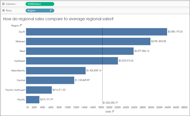
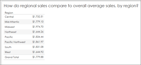
Something we’ve all needed at some point is a reference line to show the audience what is “average” in a given situation so we can compare overall values to an average. As an example, I’m going to use a generic Superstore Dataset and compare regional sales to an overall average:
Note: I’ve formatted the values to return US dollars and cents so we can check all of our numbers down to the penny. But how do we check that this is the true average regional sales?
Here I have two methods:
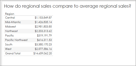
#1: In a Table (if you trust the totals)
- Start with the sum of sales in the table, add in grand totals:
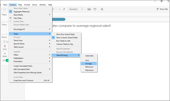
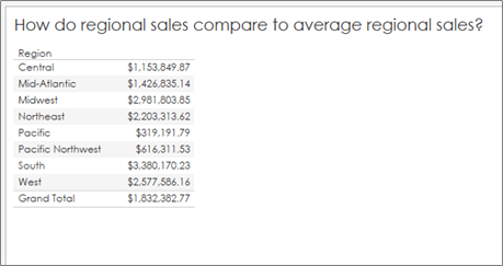
2. Change the total calculation from SUM to AVERAGE:
3. Compare your values to your original chart:
#2: In a Calculation
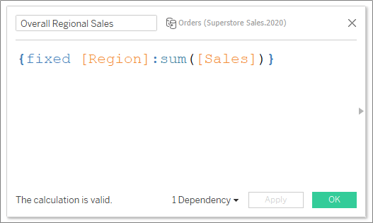
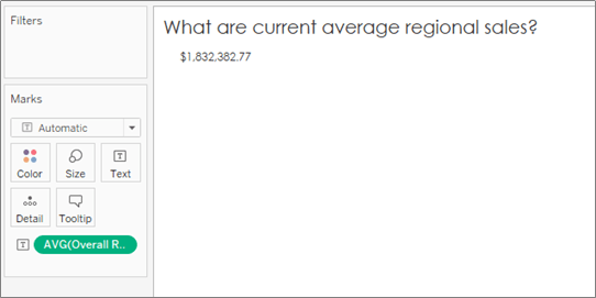
- Create a FIXED LOD to sum up all regional sales first, then changed the pill’s aggregation to an average (to divide by the number of regions). In other words, this calculation adds up all regional sales, then averages by the number of orders (or rows) per region:
2. Format the pill to currency and voila!
Taking a Closer Look
Okay, so why am I spending my time on this topic? Great question! I’ve found that Tableau’s aggregations might not be doing what you think they are doing. I won’t go as far as say as Tableau’s defaults are wrong necessarily, but you do need to know how Tableau is calculating to ensure your analysis is accurate.
Average Lines on Averages
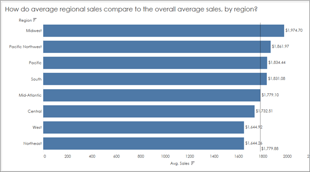
In my experience, I see this common mistake all too many times – we want to compare AVERAGE sales by region (or some other dimension), and then drop in an average line to show how each region compares to the “Average average sales”:
How do we know what Tableau is doing here? How is it calculating “average” using this reference line? Is it adding up the total sales and dividing by the number of regions? Or is it adding up all of the average sales and dividing by the number of regions? And does it even matter?
Let’s answer each question separately:
How is Tableau calculating the average line when our aggregation is set to “average”?
Answer: According to the editing pane for this reference line, the default aggregation for any average line is set to (surprise!) AVERAGE!
How is it calculating “average” using this reference line? Is it adding up the overall sales and dividing by the number of regions? Or is it adding up all of the average sales and dividing by the number of regions?
Answer: As in the last example, I’ll give you two methods for answering this question:
- Using a table, I changed the Sum([Sales]) aggregation to average and had Tableau tell me the overall average (by region). And low and behold, I got a DIFFERENT overall average value:
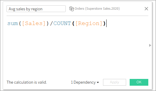
2. Using a basic calculated field, I calculated the total sum of sales and divided by the number of regions. That is, I summed the data at a row level and divided by the number of regions:
And I found a result that agreed with the table check, but not the original reference line in the visualization!
Does it even matter? Glad you asked.
Answer: It absolutely matters. Because when you take an average of an averaged calculation, you ignore the number of rows (in this case, orders) that were used to calculate that average. Meaning, the average of an average assumes each region had the same number of orders because it adds up all of the averages and divides by the number of regions. This calculation does not result in overall average sales, but rather a number that could be slightly or extremely off, depending on how different your original regional sales regions looked.
So what are we to do if we want to compare average regional sales to overall average sales, by region? Here’s a quick fix:
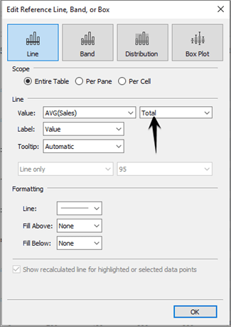
Change the aggregation in the editing pane for the reference line from “Average” to Total:
This will tell Tableau that you want the reference line to reflect the average sales (by dimension in your view) of the TOTAL sales, not just the average of averages.
Averaging Percents: Don’t Do It!
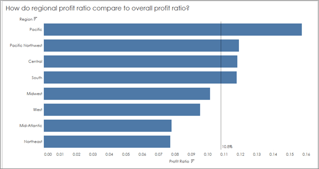
You don’t want to average percents for the same reason as above. Percents are calculated from ratio, just like averages, so the mistake is the same — the total number of rows used for each individual regional percent (in this case profit ratio) differ because there are a different number of orders (rows) in each region.
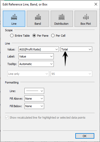
So the workaround is the same — you’ll want to create a reference line based on overall profit ratio (or “total”), not an average of the percents in your view to get the correct value for your reference line:
You’ll see a big jump now from the incorrect overall profit ratio of 10.8%, which was calculated as an average of the profit ratios in our view, to the correct overall profit ratio of 10.1%:
Hope this helps as you navigate all of the self-service goodies Tableau has to offer without fumbling the analysis.

