Haha! Get it?! Average? MEAN? Okay okay, this is a quick lesson on how Tableau calculates reference lines for averages “under the hood”, depending on the aggregations in your view.
Verifying Default Settings
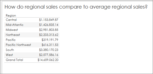
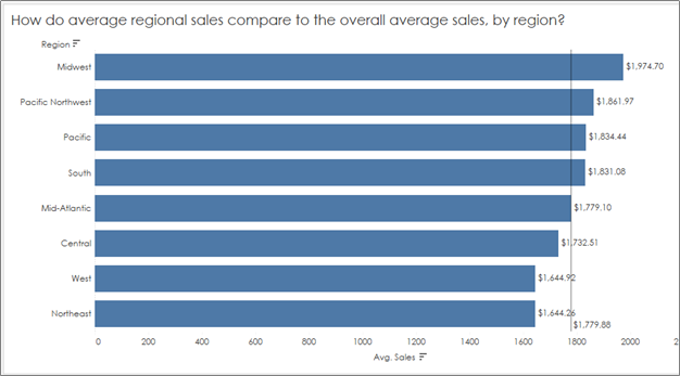
Something we’ve all needed at some point is a reference line to show the audience what is “average” in a given situation so we can compare overall values to an average. As an example, I’m going to use a generic Superstore Dataset and compare regional sales to an overall average:
Note: I’ve formatted the values to return US dollars and cents so we can check all of our numbers down to the penny. But how do we check that this is the true average regional sales?
Here I have two methods:
#1: In a Table (if you trust the totals)
Start with the sum of sales in the table, add in grand totals:
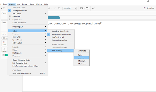
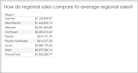
2. Change the total calculation from SUM to AVERAGE:
3. Compare your values to your original chart:
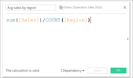
#2: In a Calculation
Create a FIXED LOD to sum up all regional sales first, then changed the pill’s aggregation to an average (to divide by the number of regions). In other words, this calculation adds up all regional sales, then averages by the number of orders (or rows) per region:
2. Format the pill to currency and voila!
Taking a Closer Look
Okay, so why am I spending my time on this topic? Great question! I’ve found that Tableau’s aggregations might not be doing what you think they are doing. I won’t go as far as say as Tableau’s defaults are wrong necessarily, but you do need to know how Tableau is calculating to ensure your analysis is accurate.
Average Lines on Averages
In my experience, I see this common mistake all too many times – we want to compare AVERAGE sales by region (or some other dimension), and then drop in an average line to show how each region compares to the “Average average sales”:
How do we know what Tableau is doing here? How is it calculating “average” using this reference line? Is it adding up the total sales and dividing by the number of regions? Or is it adding up all of the average sales and dividing by the number of regions? And does it even matter?
Let’s answer each question separately:
How is Tableau calculating the average line when our aggregation is set to “average”?
Answer: According to the editing pane for this reference line, the default aggregation for any average line is set to (surprise!) AVERAGE!
How is it calculating “average” using this reference line? Is it adding up the overall sales and dividing by the number of regions? Or is it adding up all of the average sales and dividing by the number of regions?
Answer: As in the last example, I’ll give you two methods for answering this question:
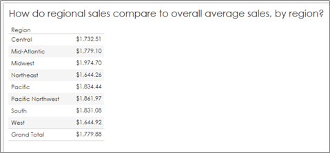
Using a table, I changed the Sum([Sales]) aggregation to average and had Tableau tell me the overall average (by region). And low and behold, I got a DIFFERENT overall average value:
2. Using a basic calculated field, I calculated the total sum of sales and divided by the number of regions. That is, I summed the data at a row level and divided by the number of regions:
And I found a result that agreed with the table check, but not the original reference line in the visualization!
Does it even matter? Glad you asked.
Answer: It absolutely matters. Because when you take an average of an averaged calculation, you ignore the number of rows (in this case, orders) that were used to calculate that average. Meaning, the average of an average assumes each region had the same number of orders because it adds up all of the averages and divides by the number of regions. This calculation does not result in overall average sales, but rather a number that could be slightly or extremely off, depending on how different your original regional sales regions looked.
So what are we to do if we want to compare average regional sales to overall average sales, by region? Here’s a quick fix:
Change the aggregation in the editing pane for the reference line from “Average” to Total:
This will tell Tableau that you want the reference line to reflect the average sales (by dimension in your view) of the TOTAL sales, not just the average of averages.
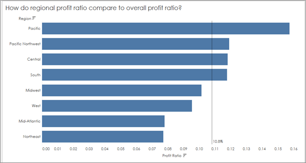
Averaging Percents: Don’t Do It!
You don’t want to average percents for the same reason as above. Percents are calculated from ratio, just like averages, so the mistake is the same — the total number of rows used for each individual regional percent (in this case profit ratio) differ because there are a different number of orders (rows) in each region.
So the workaround is the same — you’ll want to create a reference line based on overall profit ratio (or “total”), not an average of the percents in your view to get the correct value for your reference line:
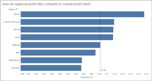
You’ll see a big jump now from the incorrect overall profit ratio of 10.8%, which was calculated as an average of the profit ratios in our view, to the correct overall profit ratio of 10.1%:
Hope this helps as you navigate all of the self-service goodies Tableau has to offer without fumbling the analysis.
To be fair, there are probably thousands of people more qualified to write about Data Storytelling than I. Though since it’s a topic I love and a topic I teach I will do my best to cover a few points for the curious in this post – especially the overlooked step of FINDING the data story.
What is Data?
You can Google the definition of data and find a slew of different answers, but one simplistic way to think about data is how my favorite Statistics textbook defines the term: “Data are usually numbers, but they are not ‘just numbers.’ Data are numbers with context.” (Yates, et al.The Practice of Statistics 3rd Edition.) So when we pull quantitative variables and qualitative (categorical) variables together, we are essentially giving meaning to what was otherwise a set of lonely numerical values.
In my humble opinion, data storytelling takes the data (aka numbers in context) and, not only translates it into consumable information, but creates a connection between the audience and the insights to drive some action. That action might be a business decision or a “wow, I now appreciate this topic” response, depending on the context and audience.
A Short Guide to Data Storytelling
There are a few steps to telling a data story, and they could get complicated depending on your data type and analysis. And since your and your audience’s interests, background, and ability to draw conclusions plays into your storytelling, this process of finding and telling a data story could easily detour and fall into rabbit holes. Here I will map out a few general steps for both exploratory and explanatory analysis to help you simplify the complex both in process and in message.
1. Define Your Audience and Determine Their Objectives
This is important. And you’ll need to continue circling back to your audience throughout all of the steps below. If you know your audience’s goals, you can more easily cancel out the noise in your data and define the right questions and metrics along the way.
2. Find the Data Story: Exploratory Analysis
a) Make a Picture
To tell a data story, you have to find the data story. And that begins with the exploratory analysis of your dataset – which should always begin with exploring your data visually. When I taught AP Stats I told the students the same thing I tell you now: When you get your hands on a set of data, MAKE A PICTURE. There are so many things a chart or graph (or multiple charts and graphs) can tell you about the data that tables and summary statistics cannot (including errors). See Anscombe’s Quartet for a demonstration of WHY.
What story can we tell about this data from this format? It’s possible to draw some conclusions based on patterns we might be able to pull with our eyes; however, nothing exact and nothing conclusive. Instead, you might use data visualization tools to create charts and graphs — something like Tableau or Excel, or if you have time on your hands, a whiteboard and dry erase markers — to tease out a story.
b) Ask Questions. And Keep Asking Questions.
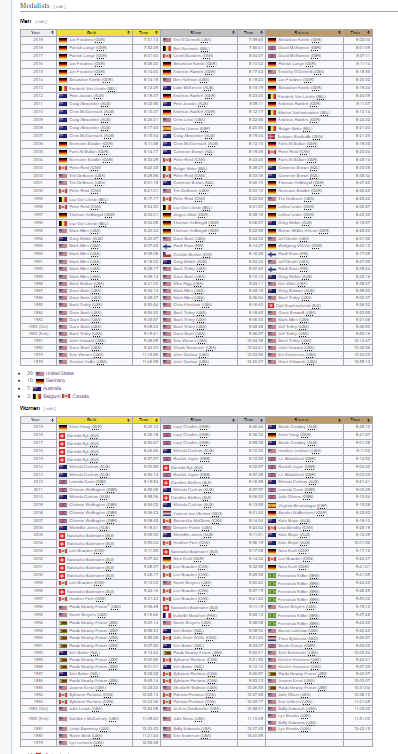
So where do you start? I always start with questions. Like, “Which countries have had the most medals in the Ironman Championship?”
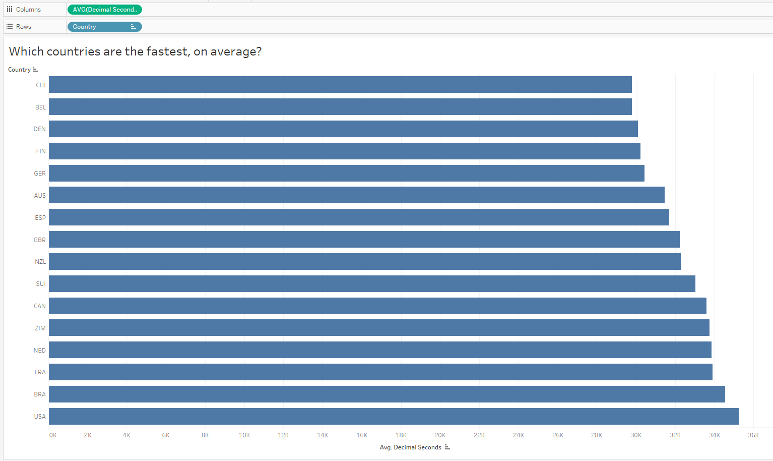
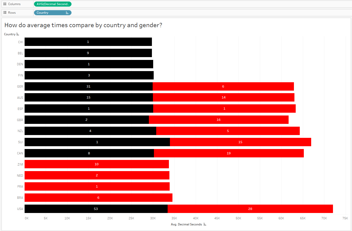
We can also ask, “Which countries are the fastest, on average?” I’ve sorted low to high to reflect the fastest countries on top (faster = shorter duration):
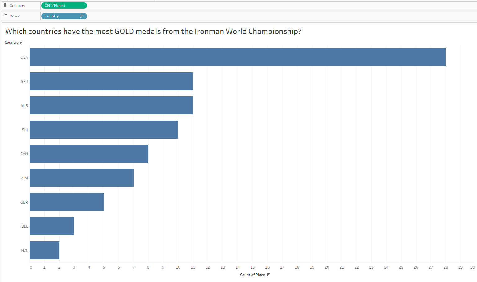
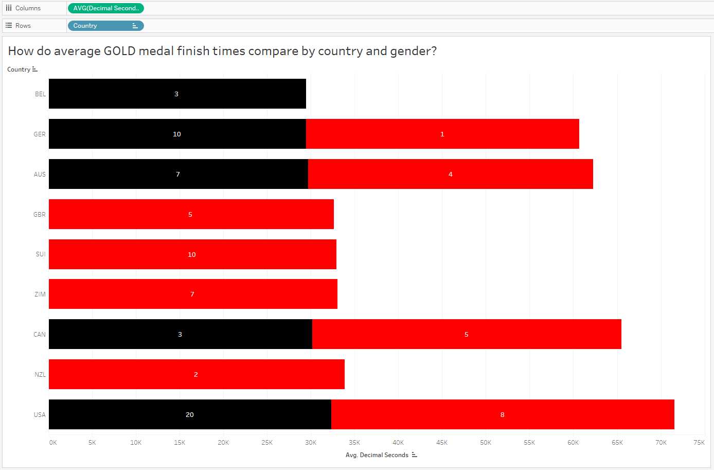
Oh that is interesting – I did not expect to see the US at the bottom of the list given they have the most medals in the dataset. But since I looked at all medals and did not only consider GOLD medals, I might now want to compare countries with the most gold medals. It’s possible the US won mostly bronze, right?
Interesting! I did NOT expect to see the US at the top of this chart after my last analysis. Hmmmm…
c) Don’t Assume, Ask “Why?”
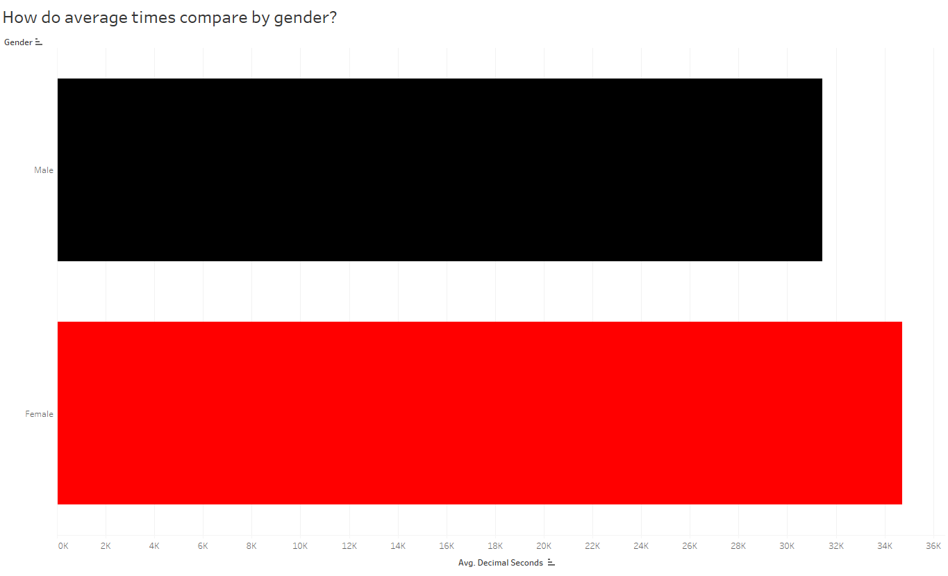
And as you continue to ask questions, you’ll pull out more interesting insights. Since the distribution of gold medals looks similar to the distribution of all medals, I’m still quite curious why the average times for the US is higher than other countries when they have an overwhelmingly large number of gold medals (and gold medals = fastest times). There MUST be some other variable confounding this comparison. So now I’ll slice the data by other variables — now I’ll look at gender, and compare the overall average finish times of males vs females:
So if males are, on average, faster than females then maybe we should look at the breakdown of males vs females among countries. Is it possible the distribution of males and females differ by country?
Note: Since this is a stacked bar chart, it may appear that the graph is unsorted; however, when there are two genders present, the length of the bar represents the sum of both the overall average male finish times and overall average female finish times. The chart is still sorted by overall average time, as you see 2 charts above.
Hmmm, it looks like the top countries, by average time, are represented by male athletes only. Meanwhile, females, whose times are slightly slower than males, make up a large proportion of the remaining countries.
Since the above chart is comparing average race times, let’s bring in some counts to compare the number (and ultimately proportion) of male vs female athletes in each country.
Alright, so now it makes sense that the overall average time for countries with a large proportion of female medalists will appear slightly longer than those with only males. Next I’d like to compare male and female finish times for ONLY gold medalists:
Wow, interesting! Of the 9 countries with gold medals, 8 of them have female representation on the 1st place podium. And 4 of those 9 countries ONLY have female representation at gold. But this doesn’t explain why the US has taken home so many more gold medals than other countries, while the overall average finish times for US finishers (and gold medalists too) are slower! What’s going on?
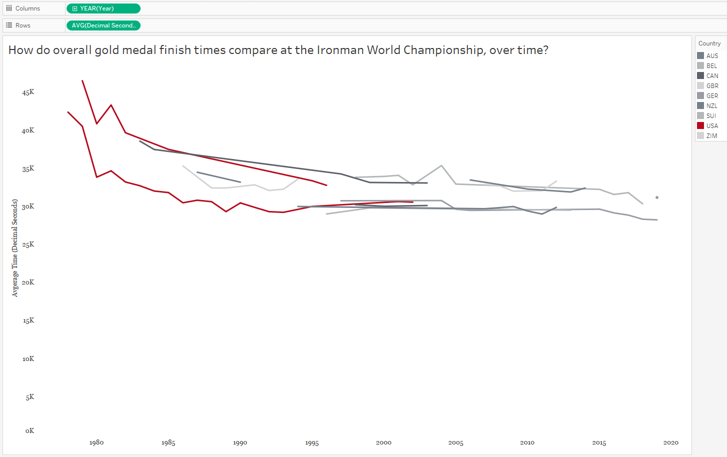
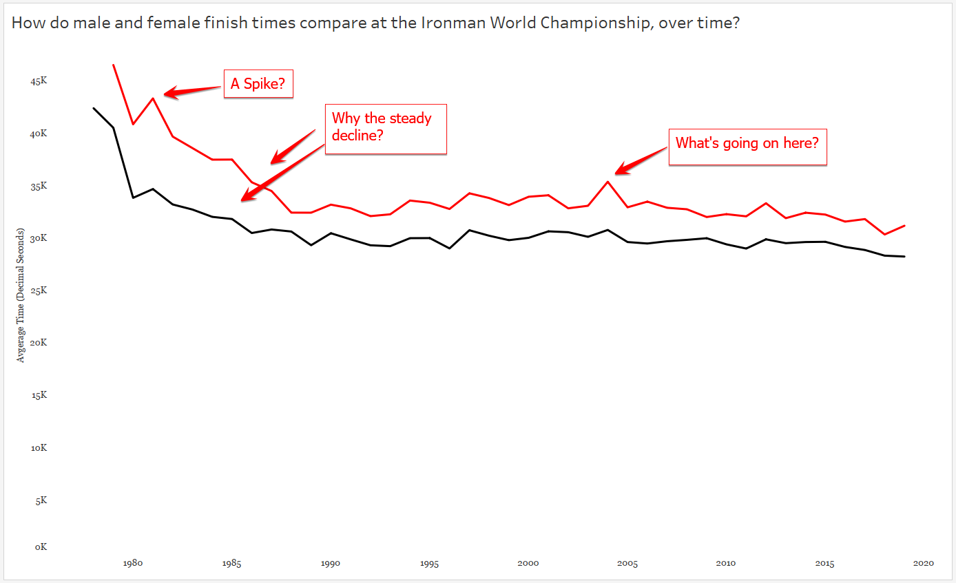
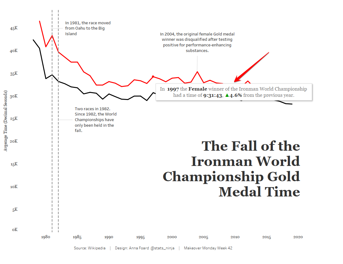
Is the YEAR a factor? When did the US win gold medals?
In the above graph, each country is now represented by a line graph (or two lines, if they both females and males won gold medals for that country). But I’ve changed the red color to highlight the US and shades of gray to put the other countries in the background. Looking at the above graph, we can see the overall finish times have decreased over time. AND we can see the US, for both males AND females, haven’t won gold medals in over a decade. So the two confounding variables we found for the race time paradox, as we could call it, were both gender AND year.
d) Focus on One Story
At this point I need to narrow down my context and define what questions I want to ask and which metrics will answer those questions. It’s hard to listen to someone’s story when it has a million tangents, right? So don’t tell those meandering stories with data, either. Pick a topic – and don’t forget to consider your audience. I’ve decided to step away from the specific countries, and compare only those GOLD MEDAL race times by gender over time. I’m curious to learn more about WHY those finish times fell over time!
e) Find the Right Analysis for Your Story
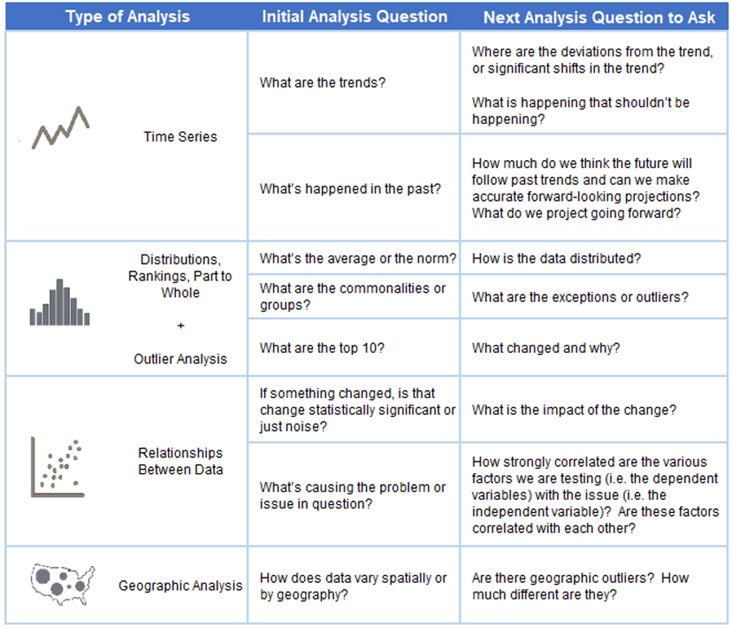
Once you determine which variables are involved in your analysis, you can choose the appropriate chart to dig deeper into the insights. Because I chose to focus on gold medal finish times over the years, a time series analysis is appropriate. Here is a great reference tool for matching your analysis to your questions:
And clearly there is more to investigate here – like why, if I stick with Tableau’s default aggregation of SUM do I see a spike here? After some Googling – ah, that year TWO separate Ironman Championships were held. So even though I’m looking only at times for the male and female gold medal times, there’s one year that’s doubled because there are two gold medal times per gender. Easy fix, let’s change the aggregation to AVERAGE, which will only affect this one year. Now let’s tease out our big story by looking at our chart and asking more questions :
3. Explanatory Analysis
Once you’ve explored the data and you’ve asked and (tried to) answer questions arising from the analysis, you’re ready to pull the story together for your audience.
a) Design with the Audience in Mind
Without calling attention to it, I began this step above. As you can see, I changed up the colors in my charts when I brought in the variable of gender. I did this for you, my audience, so you could easily pick out the differences in the race times for males and females. This is called “leveraging pre-attentive attributes“, which basically means here I’ve used color to help you see the differences without consciously thinking about it. In my final version I will need to make sure the difference in gender is clear and easy to compare (more on this later).
Color also needs to be chosen with the audience in mind. Not only do the colors need to make sense (here I chose the Iron Man brand colors to distinguish gender), they also need to be accessible for all viewers. For example the colors chosen need to have enough contrast for people with color vision deficiency. (For more in-depth information about the use of color, Lisa Charlotte Rost has an excellent resource in her blog Data Wrapper.) Too much of a good thing is never a good thing, so I chose to keep all other colors in the chart neutral so other elements of the story do not compete for the audience’s attention.
Also, without telling you, I’ve stripped away some of the unnecessary “clutter” in my chart by dumping grid lines and axis lines. When in doubt, leave white space in your charts to maximize the “data-to-ink ratio” – save your ink for the data and skip the background noise when possible.
Finally, I’m sticking with my old standard font (Georgia) for the axes and (eventually in the final version, the title). A serif typeface, Georgia is easy to read on small screens or screens with low resolution.
b) Call Attention to the Story/Insights/Action
Here I’ve answered a couple of questions that arose from the data, and you, my audience, never had to switch tabs to go looking for answers. (Re-reading my words I feel like I must sound like Grover in The Monster at the End of the Book.)
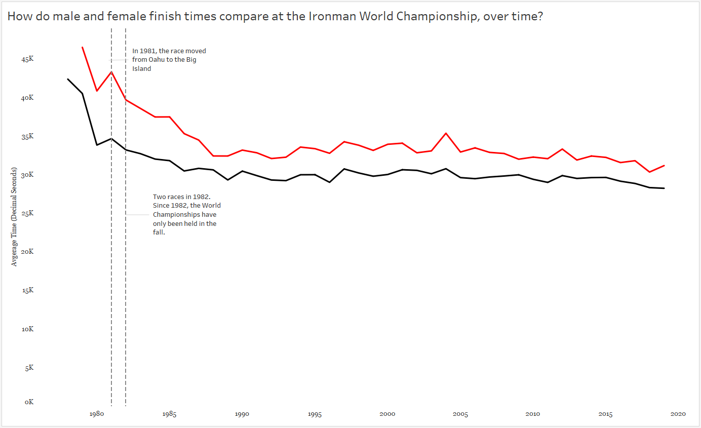
That increase in race time in 1981? A course change! Only a slight increase in time for males, but a big slow down for the females.
Also note I included an annotation for the two races in 1982.
It’s interesting to see the steady decline in finish times throughout the 1980s — what might have caused this decline? And remember, a decline in finish times means GOLD MEDALISTS GOT FASTER.
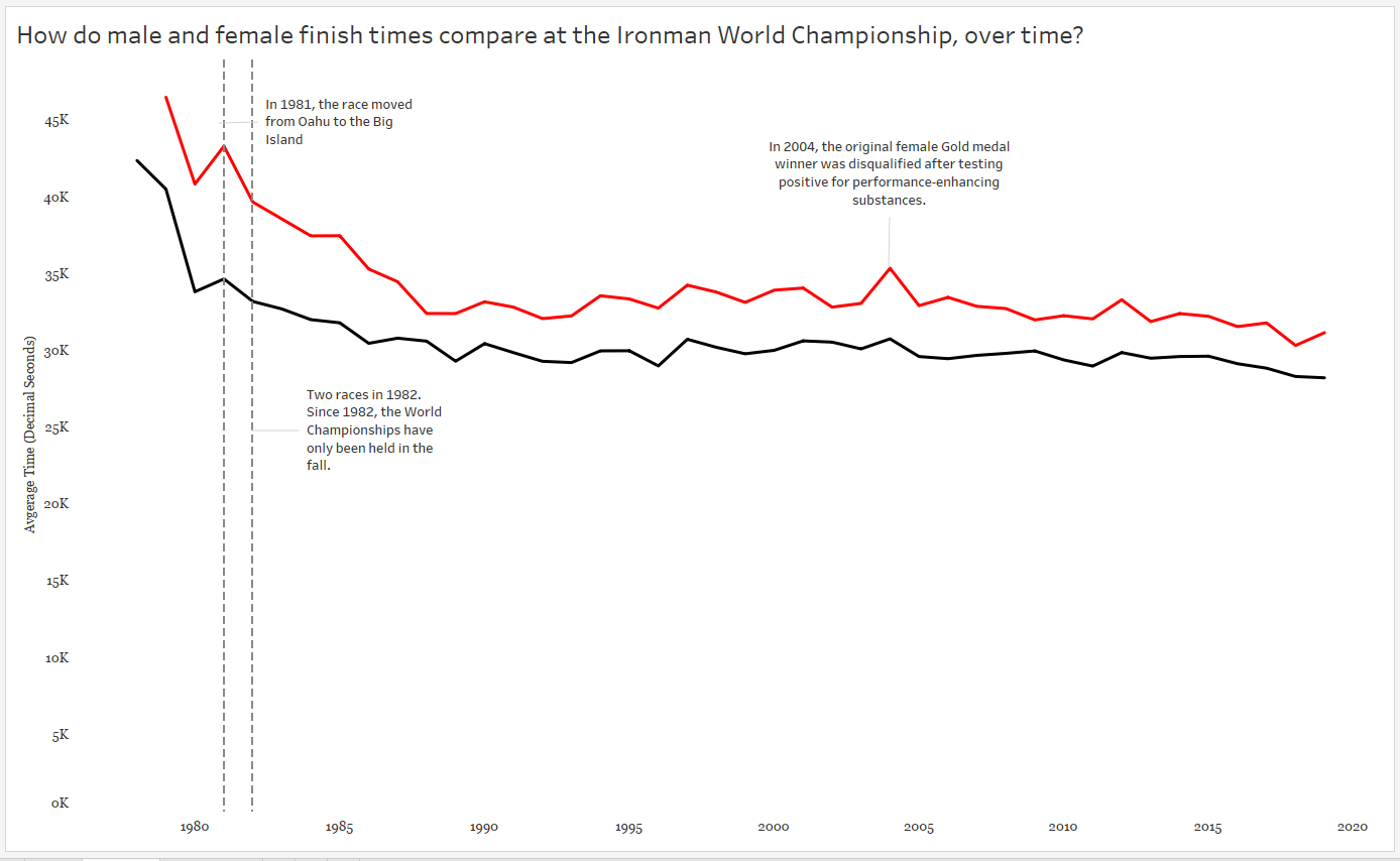
And finally, I called attention to the spike in 2004. Apparently the gold medal finisher was DQ’ed for doping…which makes me wonder about the sharp decline in the 1980’s.
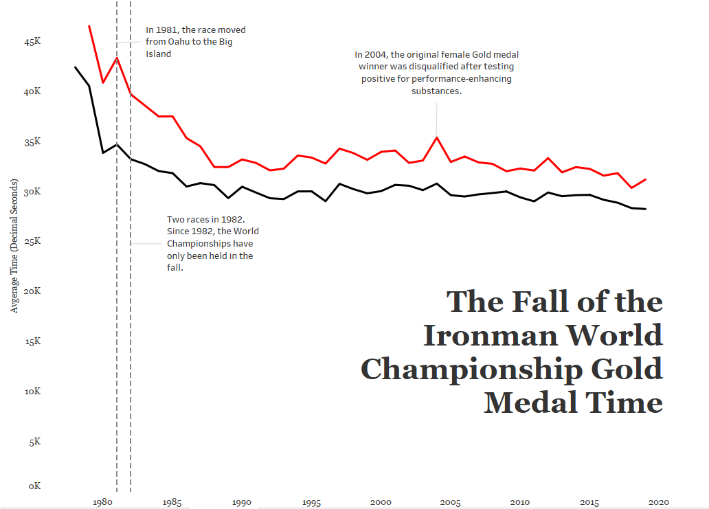
c) Leverage the Title
In the words of Kurt Vonnegut, Pity the Readers. Be as clear and concise and don’t assume they understand your big words and complicated jargon. Keep it simple! One thing I left out of my original title was the very specific use of ONLY gold medal data here. Without that information, the reader might think we were averaging all of the medalist’s times each year!
But is it clear what the red and black colors mean? And are there any additional insights I can throw into my title without being verbose?
Color legends take up dashboard space and I’m a bit keen on the white space I’ve managed to leave in my view. In my final version, I’ve colored the words MALE and FEMALE in the subtitle to match the colors used in the chart, serving as a simple color legend.
A subtitle can help guide the audience to a specific insight, in this case the overall decline in gold medal times by both males and females since the first Ironman World Championship in 1978.
Other Considerations
My final version is interactive, as you can see here. I’ve added notes to the tooltip to display the percent change in winning times by gender each year when the audience interacts with the chart:
One of the most influential mentors and leaders in my adult life is the spirited Keith Ball. Mr. Ball, or “KB” as he’s widely known, was the principal of the school at which I taught for 5 years (years 9 – 13 of my teaching career). I’ll never forget Keith’s messages on leadership, education, and responsibility. On repeat he’d remind us teachers that it is our job to BE ADAPTABLE.
E-instruction is VERY DIFFERENT from in-person instruction! And since many educators, including those of us in the L&D world, are now creating digital plans to deliver training, I thought I would compile (and update) resources from around the education, LMS, and L&D world in one place.
Even if you’re not completely new to e-instruction an instructional design, I recommend starting with this webinar from Karen Costa and Clea Mahoney. In addition to an outline of what it looks like to meet people where they are, improve presentation skills, tools for feedback, a lesson planning template and more!
Platforms
Personally, my experience with online learning platforms is limited to Zoom Meeting, GoToTraining, WebEx, and Canvas (Instructure). Each platform has its pros and cons, so look into what is important to you and your students before making this decision. See the bottom of this post for free webinars on the use of Zoom.
Be sure to teach your students how to use the platform you’re using before you get into the meat of your course! Don’t assume they know how to interact online.
Shifting to E-Instruction
I can’t stress enough how different digital instruction is to in-person teaching! You definitely have to plan it out in a similar way, but pacing, tone of voice, and even the activities you choose will be different from your typical delivery. Spending some time preparing using a lesson plan template to help organize your time and think through your essential questions, activities, and formative assessments.
Pacing
I spent some time on the phone this morning with one of my oldest and dearest friends. Rachel is a an instructional designer and a long-time digital instructor for Power School. I asked her if she’d help me with tips for instructors teaching virtually for the first time. At the moment I’m typing this, she’s still sending me texts as she thinks of more tips – so come back later and you’ll most likely find this list has grown:
Keep it moving, but not racing
Don’t leave dead time for hands-on activities. If it takes less time than you planned, get it moving.
Don’t navigate too quickly from one page to the next. There’s always a time lag and while you’re saying, “Click here, then there” and simultaneously doing that, people’s screens haven’t caught up.
Planning Activities
First determine what capabilities your learning platform provides. Break-out rooms, polls, chat boxes, and mini quizzes are just some of the possibilities, depending on the platform. Then use the lesson plan you’ve been using to determine which capabilities can be used to engage the learners. Examples:
At the beginning of the course, have every student write something in the chat box – something personal. For example, “Where are you located?” or “What is the nearest object to your left?” You’ll get a feel for the pulse of the room and set up expectations for an interactive learning environment from the beginning.
You’ve just taught the entire group a new use for a concept or tool we’ll call “X”. Use break-out rooms for participants of similar job functions to discuss one or two ways of how they can immediately implement X when they return to their desk. POP IN on the break out rooms and ask a question – you want to hold participants accountable.
Have participants share screens. But share the love, don’t ask the same person each time even if they are the only one willing.
Don’t forget to keep using the chat box to gauge the room.
Post polls (uploaded/created ahead of time). These can be used as immediate feedback for you and the participants if you create simple multiple choice questions “quizzing” them on a concept they just learned.
Have a white board in your office? Use it! Have a collaborative session where participants throw out ideas. Stand up, write them down on that white board! Just because you aren’t in the same room doesn’t mean you can’t move around like you would in a typical training room.
Kahoot! is a fun way to game your topic – and give the participants a break. While it’s free for educators, there is a charge for business. Setting up the quiz on the front end is simple and participants can play from their browser OR their phone.
During Instruction
More from Rachel Ogg:
Use a mouse cursor large enough for participants to see easily. Steer clear of that big, round, yellow highlight cursor. It can be distracting and, more importantly, it hides everything behind it.
When you ask learners questions, give them time to answer, especially if you’re asking them to chat their answers. It takes time to type. Also, if folks will only be chatting their answers (as opposed to speaking them aloud), try and ask questions that require short-ish responses.
Call on specific people to do something or show you something. This increases learner attention. Be sure to tell them from the outset you’ll be doing this.
Train the Trainer Resources
The Bob Pike Group offers training bootcamps to get your trainers up to speed on virtual delivery. Their website also provides multiple resources for e-instruction such as webinars, a blog, and guides.
The Association for Talent Development also provides multiple webinars for virtual interactions, including how to convert your classroom to a virtual environment and openers and checklists for facilitators.
“Uncertainty is the only certainty there is, and knowing how to live with insecurity is the only security.”
― John Allen Paulos
What is Uncertainty and Why Does it Matter?
At a high level, “uncertainty” is the unknown. You might believe it’s as abstract as chaos, but in fact a truth does exist – a “true” value, or parameter is out there – we just don’t know it. In fact, uncertainty is a certainty when working with data. We use samples of data in time to make decisions on the current and future state of business. And to look for truths in data, we often estimate or use probability to attempt to capture that value, or ranges of values, based on known data/observations.
I teach people how to work with, understand, and garner insights from data. What I’ve also noticed there are two kinds of clients I’ve come across in the consulting world:
Those who would like to learn HOW to visualize, measure, and understand uncertainty to help make better organizational decisions.
Those who have never considered the impact of uncertainty on organizational decisions.
As I suggested above, working with uncertainty starts with working with sample sets of data – whatever we can get our hands on. From our observed data, we can make generalizations about a phenomenon or event that may impact our organization by estimating the probability they will occur. We do this with point estimates, intervals, or broad language. For example:
Mr. X has a 40% chance of becoming the new CEO.
The proportion of revenue expected to come from our small business division this quarter is approximately 54%, with a 3% margin of error.
The Pacific Region will likely merge with the North Pacific Region next year.
Building probability models to uncover these predictions is another conversation for another day; however, it is possible to take a baby step towards understanding uncertainty and working with probabilities. In my opinion, the first step on that journey is learning more about how we interpret variation/variability in data. Why? Because accuracy and precision in measuring a probability depends on how well we’ve measured and contained the variability in the data. How we interpret probabilities depends on how we understand the difference between significance, and natural variation.
Variation
From Merriam-Webster:
Definition of variation
the act or process of varying : the state or fact of being varied
an instance of varying
the extent to which or the range in which a thing varies
Ah. Isn’t that helpful?
Google, save me!
Variation:
A change or difference in condition, amount, or level, typically with certain limits
A different or distinct form or version of something
Variability:
lack of consistency or fixed pattern; liability to vary or change.
Why Does Variation Matter?
Here’s the thing — there’s no need to study/use data when everything is identical. It’s the differences in everything around us that creates this need to use, understand, and communicate data. Our minds like patterns, but a distinction between natural and meaningful variation is not intuitive – yet it is important.
Considering how often we default to summary statistics in reporting, it’s not surprising that distinguishing between significant insights and natural variation is difficult. Not only is it foreign, the game changes depending on your industry and context.
What’s So Complicated About Variation?
Let’s set the stage to digest the concept of variation by identifying why it’s not an innate concept.
At young ages, kids are taught to look for patterns, describe patterns, predict the next value in a pattern. They are also asked, “which one of these is not like the other?”
But this type of thinking generally isn’t cultivated or expanded. Let’s look at some examples:
1) Our brains struggle with relative magnitudes of numbers.
We have a group of 2 red and 2 blue blocks. Then we start adding more blue blocks. At what point do we say there are more blue blocks? Probably when there are 3 blue, 2 red, right?
Instead, what if we started with 100 blocks? Or 1000? 501 red/499 still seems the same, right? Understanding how the size of the group modifies the response is learned – as sample/population size increases, variability ultimately decreases.
Something to ponder: When is $300 much different from $400? When is it very similar?
“For example, knowing that it takes only about eleven and a half days for a million seconds to tick away, whereas almost thirty-two years are required for a billion seconds to pass, gives one a better grasp of the relative magnitudes of these two common numbers.”
― John Allen Paulos, Innumeracy: Mathematical Illiteracy and Its Consequences
We understand that 100 times 10 is 1000. And mathematically, we understand that 1 Million times 1000 is 1 Billion. What our brains fail to recognize is the difference between 1000 and 100 is only 900, but the difference between 1 million and 1 billion is 999,000,000! We have trouble with these differences in magnitudes:
We kind of “glaze” over these concepts in U.S. math classes. But they are not intuitive!
2) We misapply the Law of Large Numbers
My favorite example misapplying the Law of Large Numbers is called The Gambler’s Fallacy, or Monte Carlo Fallacy. Here’s an easy example:
Supposed I flip a fair coin 9 times in a row and it comes up heads all 9 times, what is your prediction for the 10th coin flip? If you said tails because you think tails is more likely, you just fell for the Gambler’s Fallacy. In fact, the probability for each coin flip is exactly the same each time AND each flip is independent of another. The fact that the coin came up heads 9 times in a row is not known to the coin, or gravity for that matter. It is natural variation in play.
The Law of Large Numbers does state that as the number of coin flips increase (n>100, 1000, 10000, etc), the probability of heads gets closer and closer to 50%. However, the Law of Large numbers does NOT play out this way in the short run — and casinos cash in on this fallacy.
Oh, and if you thought the 10th coin flip would come up heads again because it had just come up heads 9 times before, you are charged with a similar fallacy, called the Hot Hand Fallacy.
3) We rely too heavily on summary statistics
Once people start learning “summary statistics”, variation is usually only brought in as a discussion as a function of range. Sadly, range only considers minimum and maximum values and ignores any other variation within the data. Learning beyond “range” as a measure of variation/spread also helps hone in on differences between mean and median and when to use each.
Standard deviation and variance also measure variation; however, the calculation relies on the mean (average) and when there is a lack of normality to the data (e.g. the data is strongly skewed), standard deviation and variance can be an inaccurate measure of the spread of the data.
In relying on summary statistics, we find ourselves looking for that one number – that ONE source of truth to describe the variation in the data. Yet, there is no ONE number that clearly describes variability – which is why you’ll see people using the 5-number summary and interquartile range. But the lack of clarity in all summary statistics makes the argument for visualizing the data.
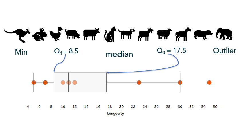
When working with any kind of data, I always recommend visualizing the variable(s) of interest first. A simple histogram, dot plot, or box-and-whisker plot can be useful in visualizing and understanding the variation present in the data.
Start Simple: Visualize Variation
Before calculating and visualizing uncertainty with probabilities, start with visualizing variation by looking at the data one variable at a time at a granular or dis-aggregated level.
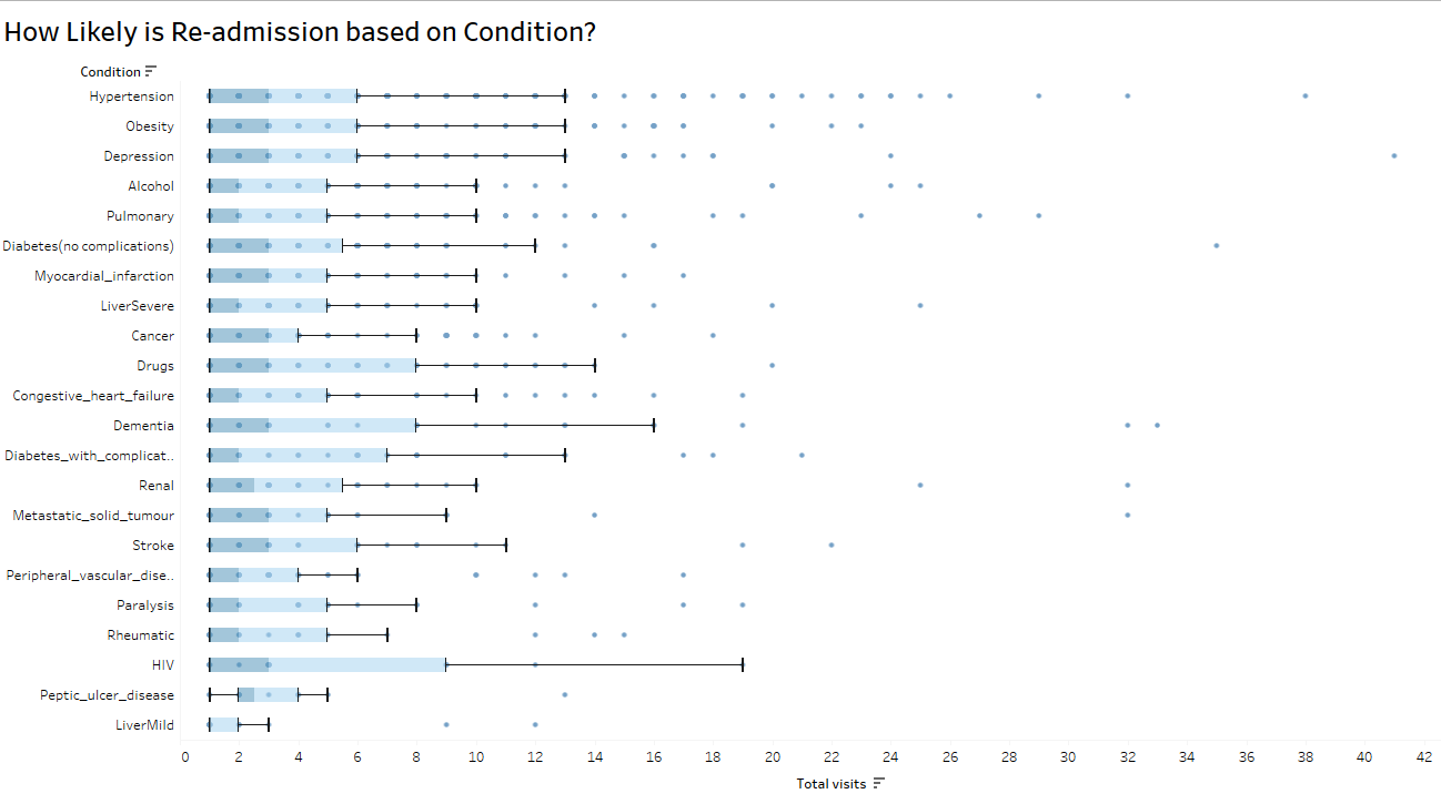
Box-and-whisker can, not only give show you outliers, these charts can also give a comparison of consistency within a variable:
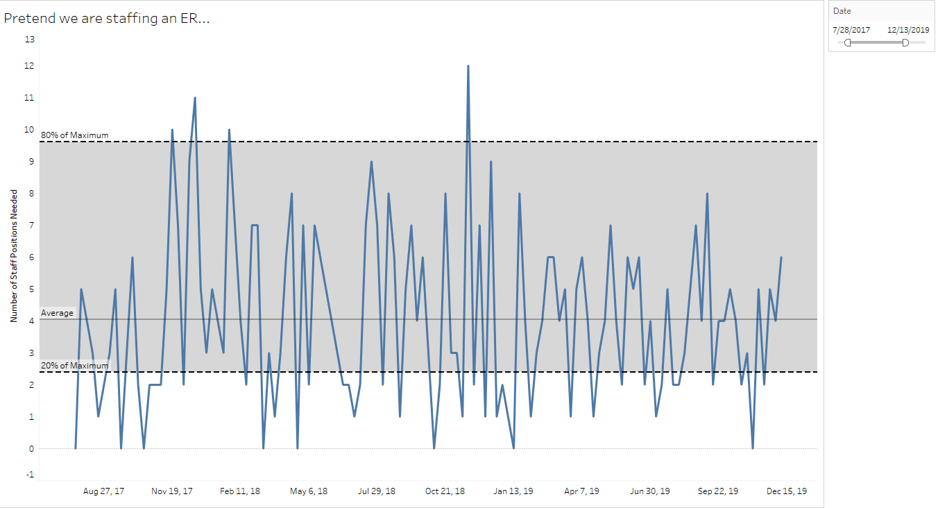
Simple control charts can capture natural variation for high-variability organizational decision-making, such as staffing an emergency room:
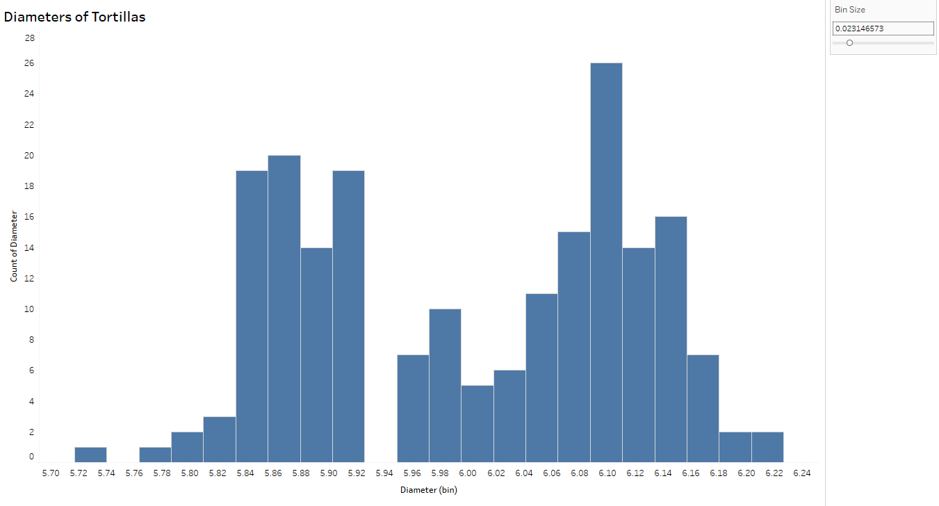
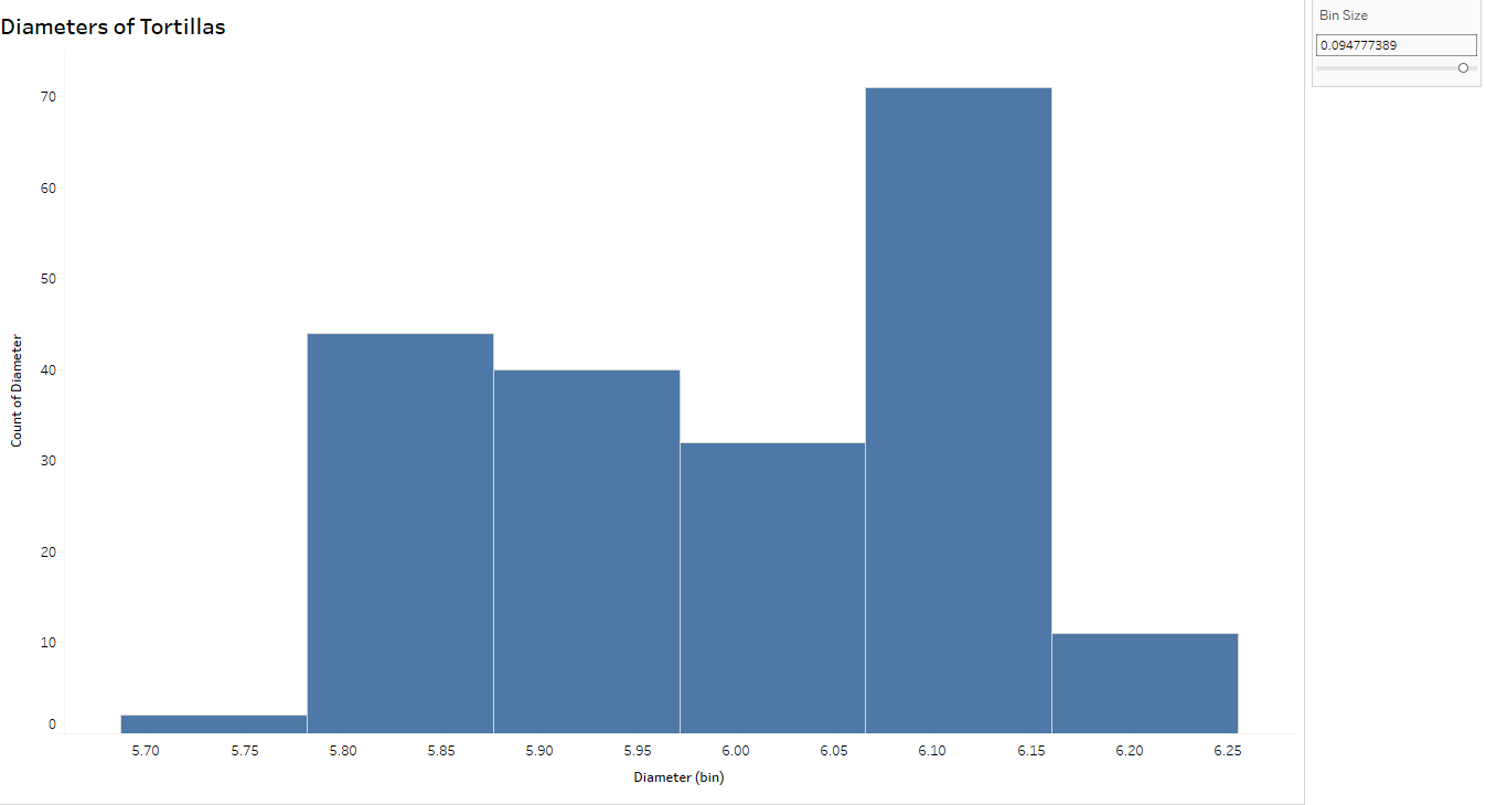
Think of histograms as a bar graph for continuous metrics. Histograms show the distribution of the variable (here, diameters of tortillas) over a set of bins of the same width. The width of the bar is determined by the “bin size” – smaller sets of ranges of tortilla diameters – and the height of the bar measures the frequency, or how many tortillas measured within that range. For example, the tallest bar indicates there are 26 tortillas measuring between (approximately) 6.08 and 6.10 cm.
I can’t stress enough the importance of changing the bin size to explore the variation further.
Notice the histogram with the wider bin size (below) can hide some of the variation you see above. In fact, the tortillas sampled for this process came from two separate production lines- which you can conclude from the top histogram but not below, thus emphasizing the importance of looking at variability from a more granular level.
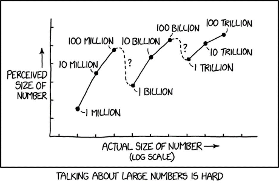
I plan a follow-up post diving more into probabilities and uncertainty. For now, I’m going to leave you with this cartoon from XKCD, called “Certainty.“
The year was 2002. It was the first time I ever stood in front of a classroom of “grown-ups”. The students didn’t know me or care who I was — a TA at LSU covering a College Algebra class. The topic was logarithms. Specifically, an introduction to logs as the inverse of an exponent. I may have been slightly older than the median age of those students and I was terrified, nervous, and profusely sweating.
Up until that moment, I thought deep content knowledge was the secret sauce of teaching. But in the 17 years of experiences that followed, I’ve learned how much MORE there is to teaching than merely knowing your stuff. Student buy-in is the key to student engagement and, ultimately, student learning.
As a corporate trainer I’ve found adults are no different from kids in how they learn and how they engage. It all depends on the trainer’s ability to read the room and adapt as needed.
I compiled the list below after 17 years of total instruction including college algebra and statistics, high school math and AP Statistics, and corporate training for data analysts. I’m sure I will update this list in the future, but at this point, reflecting on my own feedback and observing other trainers, these are the top points I find trainers miss.
Please note this list is not exhaustive and assumes you follow the basic tenants of instruction such as: knowing your audience, knowing your content, preparing x 10, taking breaks every 60 – 75 minutes, beginning promptly after a break, being approachable, avoiding excessive talk and rabbit holes, Rule of 3, minimizing powerpoint, summarizing major points, etc. So here you go – 5 ways to improve student engagement.
1. Be Adaptable.
“It is not the strongest of the species that survives, nor the most intelligent. It is the one that is most adaptable to change.”
– Charles Darwin
I’ve entered a classroom to discover the WiFi down. Many times. There have been a few unannounced fire drills, some medical emergencies, that time the projector bulb blew — all derailing my meticulously-planned lesson. But the show must go on!
If something goes wrong, keep calm but think on your feet. Focus on keeping the students engaged first. So if the students have working laptops and the only problem is a projector (or your laptop), get them started. Walk around the room teaching the concepts you’d planned to teach from the front. Ask the students questions, have them come up with solutions.
Tech completely down? Ask yourself, “What is the goal of this class?” It’s not easy to teach a tech-driven class with a whiteboard, but it can be done (and here’s hoping the WiFi will be up soon). In fact, if you teach a workshop using a software or only technology, I would urge you to get in the habit of adding in low-tech activities for those “just in case” moments.
Pro Tip: Oftentimes you can lead the students to an a-ha moment or two, then request IT support at the next break.
According to The Oxford Review, adaptability in the workplace is related to one’s emotional intelligence and emotional resilience. And, of course, mindset.
Lastly, being adapatable also means being coachable. Everyone gets frustrated from negative evaluations/feedback at times. But try to step back and ask yourself if you could have improved the delivery. Making tweaks to your performance based on student feedback can help YOU in the long run. Being coachable does NOT mean you give up confidence. You are the professional, but all great professionals learn from feedback and reflection.
2. Don’t Fake it.
It’s okay to admit you don’t know the answer to a question. Saying, “I’ll find out and get back to you” is not a weakness. What’s not okay is making up an answer. “Fake it til you make it” is NOT a mantra of teaching. Especially when you have Google.
“When you tell a lie, you steal someone’s right to the truth.”
– Khaled Hosseini
If you’re worried about questions, I recommend giving everyone sticky notes at the beginning of the class. Encourage students to ask questions. If a question comes up that is not relevant to the topic at hand OR if you don’t know the exact answer, ask the student to write down their question. Create a space on the wall for participants to stick these questions up (some trainers call this a “parking lot”) and on breaks, take some time to research and answer the questions. I would strongly recommend you DON’T take class time to do said research.
And oh the mistakes I’ve made when teaching. Some embarrassing. It happens. And it is important to own those mistakes, especially if you can turn it into a “teaching moment.” For example, I once observed a new math teacher square a binomial incorrectly. A COMMON mistake among students. So instead of (x+2)^2 = (x+2)*(x+2), she (without thinking about it) squared both terms, making (x+2)^2 = x^2 + 4. Whoops. A big mistake in the math world, but really not a big deal when she stopped herself, realizing her mistake, and laughed about it. Then explained that was an example of what NOT to do.
Squaring a binomial incorrectly may not be your mistake, but you will make one (probably many). But to err is human. And there is plenty of research out there to suggest an HONEST teacher is a TRUSTWORTHY teacher. People LIKE honest teachers, especially when it comes to their own flaws.
3. Use People’s Names.
“Go the extra mile. It’s never crowded.”
-Author Unknown
Names are powerful. Dale Carnegie once said, “A person’s name is, to him or her, the sweetest and most important sound in any language.” When someone takes the time to learn and use your name, you feel important. Which means using a person’s name in conversation is the quickest way to connect with them on a personal level — and therefore promotes positive classroom engagement.
Generally, people also enjoy talking about themselves. Which is a great way to learn their name. On the very first day, after I introduce myself, I give participants the opportunity to introduce themselves and say a few words. You probably already do this. And I use this as an opportunity to learn their name — I write it down then say their name aloud (so they hear it AND to help me remember). Creating a blank seating chart ahead of time is always helpful – this way I can jot down the name and an interesting fact while they speak, creating a reference for later in the course.
My friend and colleague Ryan Nokes remembers names much better than I do, impressing his classes by learning every name immediately! After preliminary introductions he says each person’s name, first to last person, and states their name (without notes). And then Ryan does it again at the start of the next day. People enjoy hearing their own names and are pleased when you remember them later
I teach hands-on courses and encourage constant interaction. When calling on students, I use their first name, careful not to just point to them. When talking to them one on one, I use their name. And by the way, please use the name they gave you. NOT their government name. FYI, I cringe when people call me, “Annamarie.”
Many articles have been published around the power of names. If you aren’t sure about the power of using a name, start here.
4. Move Around the Room.
“Nothing happens until something moves”
-Albert Einstein
Moving around the room, when done correctly, increases participant engagement.
When I teach, I rarely sit down. Moving around the room allows me to interact with each student one-on-one and check for their understanding. This proximity also allows the more reluctant talker/questioner to ask their burning question when they know the entire class won’t hear them. And, dare I say it: Moving around the room keeps you in control.
This is why you hear grade school teachers say they never sit down. K-12 teachers use physical proximity to manage their classrooms. Being interested in each student’s learning promotes positive behaviors and keep students on task. In the same way, walking around keeps adults out of their inbox. And you won’t ever hear me criticize a training participant about their email/phone use in class (despite it being a bit irritating — I mean, you DID sign up to be here) because when they expect me to move their direction, they self monitor and correct these behaviors themselves, often apologizing.
Note: I do try to give every group/person an equal amount of “attention” without lingering anywhere too long.
Educational research also promotes student movement around the room. So when delivering instruction, I like to create activities that make students/groups visualize data by hand – on a white board or big 3M sticky poster. Or even a post-it. “Around the room” activities could also include giving other groups positive feedback or presenting a new discovery in their data.
5. Seat People with Similar Experience-Levels Together.
When dealing with heterogeneous groups of participants.
“We are more powerful when we empower each other.”
-Unknown
After years of hoopla over the concept of “tracking students”, this tip might surprise you. How many times have you heard someone say, “Pair a low with a high?” And, while this strategy could work in certain courses and situations, it is, overall, an outdated practice.
Imagine. You have a grasp of the basics of a particular data visualization tool and use it weekly. A colleague in the same course has only installed the software that morning. Your instructor teams you up so you can “help” your colleague. How does this make you feel? At first, it might feel rewarding — you know the answers! However, in many situations the person doing the “helping” ends up feeling like they didn’t grow in their domain while the person being helped can eventually feel inadequate and frustrated.
No matter how well we market a course (“beginner”, “advanced”, etc) there will always be a heterogeneous group of abilities when I walk in to start instruction. And this is the way it always is — K12 or corporate training. So I can either roll my eyes and teach the outline as prescribed, pacing the middle of all abilities, or I can help all learners by differentiating my instruction a bit.
I’m not talking about group projects here — I only mean seating participants of like abilities near each other for an improved user experience. Of course in a training situation, this arrangement has more to do with experience levels — of which they can self-sort. I generally ask students “new” to the software to sit in the front, and others to sit behind them. That’s all that is usually needed.
But let’s look at the origins of this thought: When used appropriately, “flexible grouping” — pairing and grouping students based on need — can aid student learning on both ends of the experience spectrum. This can be homogeneous or heterogeneous groups. And how you utilize it matters. If you must pair high/low, do it only for a short time. (Because I’ve had students ask me, “Am I the dumb one or the smart one?”)
In the long run, research suggests pairing/seating students with similar abilities/experience in a domain (or software) engages all students. And if done correctly, actually improves their learning experience and accelerates their growth. How? If you’re already moving around the room (see #4 above), then it should make sense that you can tailor your instruction much easier to pairs/groups of similar background knowledge than if they are scattered around the room. Think about it — when you are helping a group of participants who are relatively new to the topic or software, you can give a “you try” practice problem to enrich or even accelerate the other group to work on their own, and vice versa. Peer pairing/grouping on similar experience levels also encourages those students to develop a deeper understanding of the topic together, rather than the back-and-forth waiting that occurs when unlike abilities are grouped.
Personally, I mix up my delivery — some whole group instruction, some partner work, maybe an activity in a group, and solo work. Pairing them up encourages dialog about the concepts while they work through a challenge. Groups can offer multiple points of view. Solo work helps the student think through the problem on their own. Since my classes are always hands-on I incorporate the process of I do, we do, you do. But I do start with seating like experience levels together.
Last Note
Being a teacher (or instructor, or coach) does require multiple skill sets including: entertainer, orchestra conductor, problem-solver, mind reader, therapist, referee, and cheerleader. However, promoting student engagement (teens and adults alike) goes beyond preparing a “fun lesson.” Student engagement results from student buy-in. And student buy-in results from the little things that create a positive atmosphere.
I’m going to add to this list over time. Do you have any suggestions on how you promote adult student engagement?
Beloit College creates a “Mindset List” every year for the entering college class. For the college class of 2014 (or, those of you who graduated from Centennial in May) the list has just been posted. Here are a few touchstones of your life: