How to be the Life of the Party Part 2: Measures of Position

Welcome to Part 2 of my Cheat Sheet for Stats series, sure to make you the life of the party! In case you missed it, Part 1 covered measures of center and spread. In Part 2 we’ll dive into measures of position and location within a dataset – specifically how to calculate, apply, and interpret them.

Measures of Position

Comparing month to month sales volume or current housing prices within your neighborhood are easy to make without involving additional calculations. However, sometimes metrics aren’t exactly comparable in absolute terms. For example, sales volume from 1989 versus 2015. Or current housing prices in Atlanta versus San Francisco. So we typically “normalize” these metrics by adjusting for inflation or cost of living so we can compare relative values.

Another way of comparing considers relative position. Percentiles, quantiles, and z-scores measure the location of a value in relation to other values in a dataset. Once you know the price of a house in Atlanta relative to the rest of the Atlanta housing market, and the price of a house in San Francisco relative to the rest of the San Francisco housing market, you can see how those two housing prices compare to each other.

Percentiles

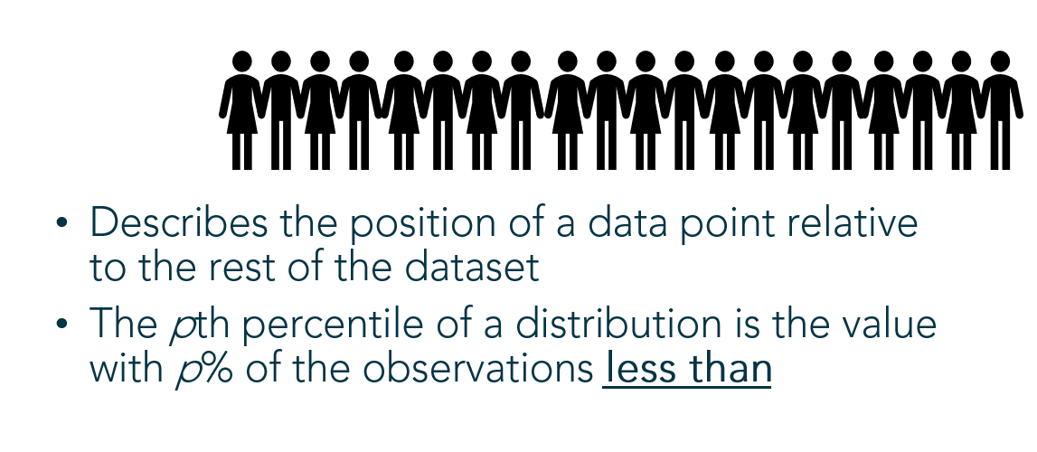
Percentiles describe the position of a data point relative to the rest of the dataset using a percent. That’s the percent of the rest of the dataset that falls below the particular data point.

Finding an Unknown Percentile

Example: Pretend you’re the 2nd oldest out of a group of 20 people. To find your percentile, count the number of people YOUNGER than you (18) and divide by the total number of people:

18/20 = 0.9, or the 90th percentile

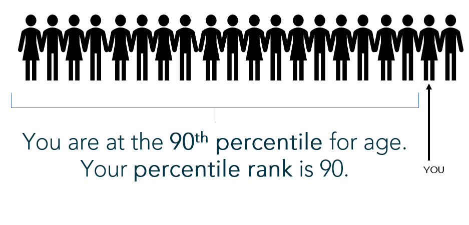
(Note: By calculating percentile using the “percent less than” formula above, the computation disallows a 100th percentile (which is not a valid percentile); however, it forces the lowest value to the 0 percentile (which is also invalid). Another popular variation on this calculation computes the percent less than AND equal to: There are 19 people at your age or younger, so 19/20 is 95th percentile. This version of the calculation fixes the “0 percentile” problem but allows the possibility for an invalid 100th percentile. Both versions of the percentile calculation are acceptable and there is no universally “correct” computation.)

Finding a Given Percentile

Example: You want to determine what height marks the 58th percentile of the 20 people. You’ll multiply the 20 people by 58%, or 20*(0.58) = 11.6. This number is called the index. Round to the nearest whole number 12 – therefore, the 12th height in your group of 20 people roughly falls at the 58th percentile.

A cumulative relative frequency chart, used to locate percentiles

Quantiles

Quantiles break the dataset up into an equal number of n pieces. They signal reference points (or positions) in the dataset to which individual data points can be compared. Specific examples of quantiles are deciles (slicing the data into 10 equal pieces), terciles (3 equal pieces), and quartiles (4 equal pieces). I’ll elaborate using quartiles, but all quantiles follow the same logic:

Quartiles

Quartiles break the dataset up into 4 equal pieces so data points can be compared within the dataset relative to the four quarters of data.

I love watching football, which is broken up into four quarters. If I turn the TV on and the game has already started, I know how far the game has progressed in time relative to the quarter displayed on the screen.

For data:

  • Lower Quartile (Q1) – Roughly the 25th percentile. 25% of the data falls below this point and 75% lies above.
  • Median (Q2) – Roughly the 50th percentile, marks the position of the middle value where half fall above and half fall below this point
  • Upper Quartile (Q3) – Roughly the 75th percentile. 75% of the data falls below this point and 25% lies above.

Quartiles are found using these steps:

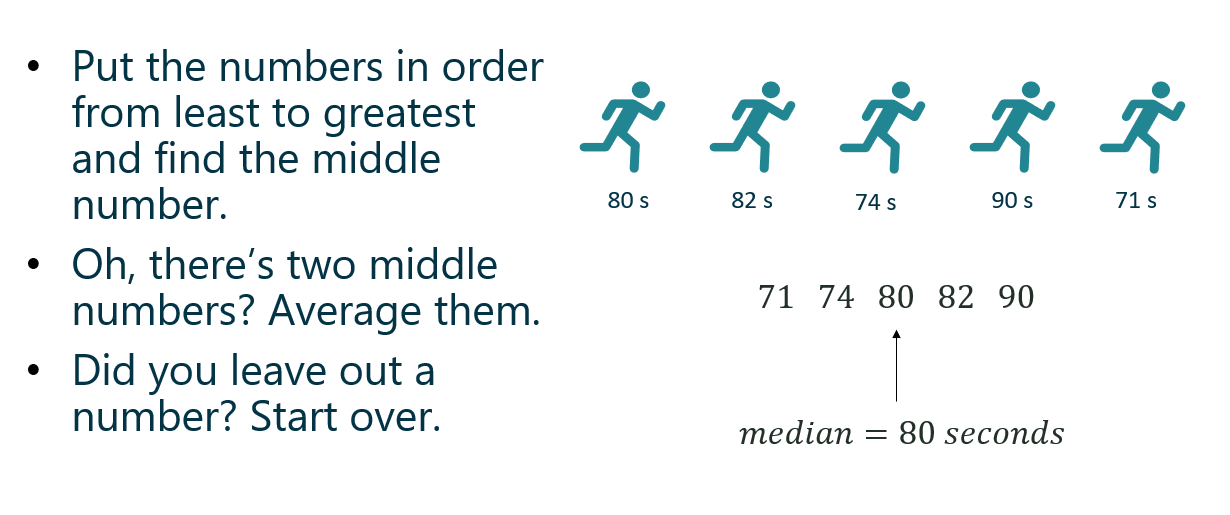
  1. Arrange the data from least to greatest.
  2. Find the median, the middle number. (If there are two numbers in the middle, find the average of the two.)
  3. Using the median as the midpoint, the data is now split in half. Now find the middle value in the bottom half of values (this is Q1).
  4. Lastly, find the middle number of the top half of values (this is Q3).

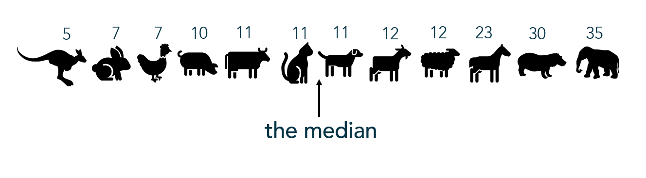
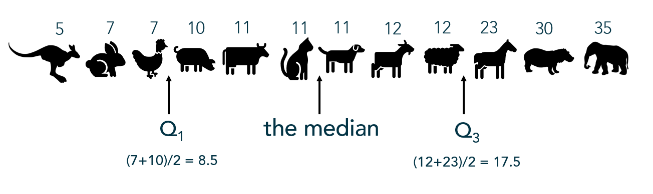
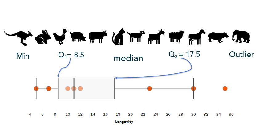
Example: The following values represent the lifespan of a sample of animals. What values break these lifespans into quartiles?

Often quartiles are displayed visually with a box-and-whisker plot:

Full blog post on box-and-whisker plots HERE

Z-Scores

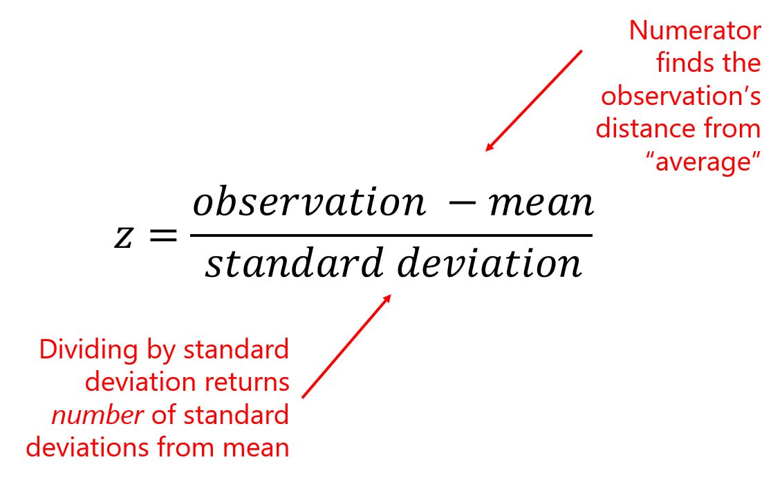
A z-score indicates how many standard deviations a value falls above or below the mean (average). A value with a positive z-score lies above the mean while a value with a negative z-score falls below the mean. Z-scores are a way of standardizing values in order to compare them using relative position.

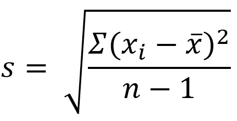
To calculate a z-score, subtract the average of the population/dataset (mean) from the data point (observation), then divide by the standard deviation of the population/dataset:

Example:

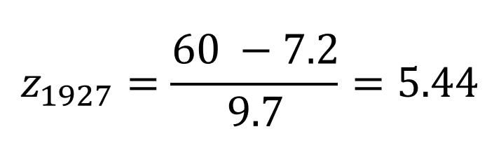
In 1927, Babe Ruth made history hitting 60 home runs in one Major League Baseball season. Only four people have been able to break Ruth’s record (though Mark McGwire and Sammy Sosa have broken that record 2 and 3 times, respectively). In 2001, Barry Bonds set the most recent record, hitting 73 home runs in a single season.

But just how does Barry’s home run performance compare to Babe’s? Many outside factors such as bat quality and pitcher performance could impact the number of homeruns hit by a MLB player. So how did these athletes compare to their peers of the time?

The 1927 league home run average was 7.2 home runs with a standard deviation of 9.7 home runs. While the 2001 league average was an astounding 21.4 home runs, with a standard deviation of 13.2 home runs.

To properly compare these heavy hitters, we need to determine how they preformed relative to the peers of their era by standardizing their absolute HR numbers into z-scores:

Babe Ruth’s performance of 60 HRs lies 5.44 standard deviations above the mean number of HRs hit in 1927
Barry Bond’s performance of 73 HRs lies 3.91 standard deviations above the mean number of HRs hit in 2001

While both athletes displayed phenomenal performances, Babe Ruth could still argue his status of home run champion when comparing in relative terms.

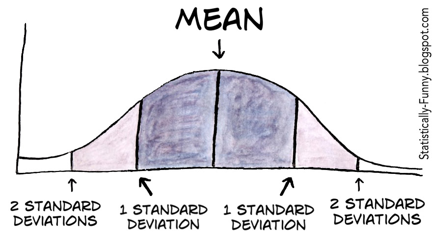
If you automatically think of a bell-shaped, normal curve when you hear “z-score”, you’re not alone. That’s a common connection because of the way we initially introduce z-scores in stats courses:

But z-scores can apply to ANY distribution because they are a way to compare data values using relative position. That is, z-scores “standardize” the data values from absolute to relative metrics.

The Altman Z-score

The Altman z-score is used to predict the liklihood a company will go bankrupt. The Altman z-score applies a weighted calculation based on specific predictors of bankruptcy. This article gives an excellent overview for those interested in calculating and interpreting Altman z-scores.

Next up in Part 3: Counting principles, including permutations and combinations. Because the combination for your combination lock is actually a permutation.

How to be the Life of the Party Part 1: A Cheat Sheet to Summary Statistics

Statistics: What are they good for?

Statistics are values or calculations that attempt to summarize a sample of data. If you’re talking about a population of data, you’re usually dealing with parameters. (Easy to remember: Statistics and Samples start with the letter S, and Populations and Parameters start with the letter P.)

And if you know all there is to know about a population, then you wouldn’t be concerned with statistics. However, we almost never know about an entire population of anything, which is why we focus on studying samples and the statistics that describe those samples.

Statistics and summary statistics, as I mentioned, help us summarize a sample of data so that we can wrap our mind around the entire dataset. Some statistics are better than others, and which statistic you choose to summarize a dataset depends entirely upon the type of data you’re working with and your end goals.

Here, I will briefly discuss the different types, definitions, calculations, and uses of basic summary statistics known as “Measures of Central Tendency” and “Measures of Variation.”

Measures of Central Tendency

Measures of central tendency summarize your dataset into one “typical”, central value. It’s best to look at the shape of your data and your ultimate goals before choosing one measure of central tendency.

Mean

The mean, or average is affected by extreme (outlying) measures since, mathematically, it takes into account all values in the dataset.

Suppose you want to find the mean, or average, of 5 runners on your running team:

The average function in Excel is AVERAGE.

Symbols:

x-bar is the mean of the sample
mu is the mean of the population

Median

Instead of taking the value of the numbers into account, the median considers which value(s) take the middle position. Outliers do NOT affect the value of the median.

The median function in Excel is MEDIAN.

Mode

The most common value, category, or quality is the mode. The mode measures “typical” for categorical data.

In quantitative data, we look for modal ranges to help us dig deeper and segment the dataset. I wrote a blog post recently that dives a little deeper into this concept, as well as visualizing measures of central tendency.

The mode function in Excel is MODE.

Weighted Mean

A weighted mean is helpful when all values in the dataset do not contribute to the average in the same way. For example, course grades are weighted based on what the type of assignment (test, quiz, project, etc). A test might count more towards your final grade than a homework assignment.

Weighted means are also applied when calculating the expected value of an outcome, such as in gambling and actuarial science. An expected value in gambling is what you’d expect to lose (because you’re gonna lose) over the long-run (many, many trials). To calculate this, a probability is applied to each possible outcome and then multiplied by the value of the outcome — pretty much the same way you calculated your grade back in high school:

Note: Weighted Means and Expected Values will reappear in a later post discussing discrete probability distributions.

I wrote a more extensive blog post about “other” means, including Geometric and Harmonic means, in case you’re curious.

Measures of Variation

The middle number of the dataset is only one statistic used the summarize the dataset — the spread of the data is also extremely important to understanding what is happening within your data. Measures of variation tell us how the data varies from end to end and/or within the middle of the dataset and because of this, some measures of spread help in identifying outliers.

For the following examples I took a non-random sample of animal lifespans, put them in order from shortest to longest lifespan. You’ll see the median is 11 years:

Range

The range only considers the variation from the smallest to largest value in the dataset. Here, the animal’s lifespans range 30 years (or, 35 – 5 years). Unfortunately, range doesn’t give us much information about the variation within the datset.

Interquartile Range

Interquartile range, or IQR, is the range of the middle 50% of the dataset. In this situation, it represents the middle 50% of animal lifespans.

To find the IQR, the values in the dataset must first be ordered least to greatest with the median identified (as I did above). Since the median cuts the dataset in half, we then look for the middle value of the bottom half of the dataset (that is, the middle lifespan between the kangaroo and the cat). That represents the lower quartile, or Q1. Then look for the middle value of the top of the dataset, (that is, the middle value between the dog and the elephant). The second number represents the upper quartile, or Q3.

The interquartile range is found by subtracting Q3 – Q1, or 17.5 – 8.5 = 9 which tells me that the middle 50% of these animals’ lifespans range by 9 years. Unfortuantely, IQR only gives information about the spread of the middle of the dataset.

You can calculate the IQR in Excel using the QUARTILE function to find the first quartile and the third quartile, then subtracting like in the above example.

Ever build a box-and-whisker plot (boxplot)? The “box” portion represents the IQR. Here’s a how-to with more information.

Outliers

One common method for calculating an outlier threshold in a dataset depends on the IQR. Once the IQR is calculated, it is then multiplied by 1.5. Find the low outlier threshold by subtracting the IQR*1.5 from Q1. Find upper outlier threshold by adding the IQR*1.5 to Q3. This is the method used to show outliers in box-and-whisker plots.

Standard Deviation

s is the standard deviation of the sample

Standard deviation measures the typical departure, or distance, of each data point from the mean. (Recall, the “mean” is just the average.) So ultimately, the calculation for standard deviation relies on the value of the mean.

The formula below specifically calculates the standard deviation of the sample. I wouldn’t worry too much about using this formula; however, understanding how standard deviation is calculated might help you understand what it calculates, so I’ll walk you through it:

sigma is the standard deviation of the population
  1. In the numerator within the parentheses, the mean is subtracted from each data point. As you can imagine, the mean is the center of the data so half of the resulting differences are negative (or 0), and the other half are positive (or 0). (Adding these differences up will always result in 0.)
  2. Those differences are then squared (making all values positive).
  3. The Greek uppercase letter Sigma in front of the parentheses means, “sum” — so all the squared differences are added up.
  4. Divide that value by the samples size (n) MINUS 1. Your resulting answer is the variance of the dataset.
  5. Since the variance is a squared measure, take the square root at the end. Now you have the standard deviation.

An easier way, of course, is to use Excel’s standard deviation functions for samples: STDEV or STDEV.S

Just like the mean, standard deviation is easily affected by outlying (extreme) values.

the MEDIAN is to INTERQUARTILE RANGE as MEAN is to STANDARD DEVIATION

– The Stats Ninja

Outliers

Several approaches are used to calculating the outlier threshold using standard deviations – which method is employed typically depends on the use case. Many software packages default to 3 standard deviations. If the outlier threshold is calculated using IQR (from above), 2.67 standard deviations mark that boundary.

Next Up: How to be the Life of the Party Part 2 breaks down measures of position, including percentiles and z-scores!