Statistics: What are they good for?
Statistics are values or calculations that attempt to summarize a sample of data. If you’re talking about a population of data, you’re usually dealing with parameters. (Easy to remember: Statistics and Samples start with the letter S, and Populations and Parameters start with the letter P.)
And if you know all there is to know about a population, then you wouldn’t be concerned with statistics. However, we almost never know about an entire population of anything, which is why we focus on studying samples and the statistics that describe those samples.
Statistics and summary statistics, as I mentioned, help us summarize a sample of data so that we can wrap our mind around the entire dataset. Some statistics are better than others, and which statistic you choose to summarize a dataset depends entirely upon the type of data you’re working with and your end goals.
Here, I will briefly discuss the different types, definitions, calculations, and uses of basic summary statistics known as “Measures of Central Tendency” and “Measures of Variation.”
Measures of Central Tendency
Measures of central tendency summarize your dataset into one “typical”, central value. It’s best to look at the shape of your data and your ultimate goals before choosing one measure of central tendency.
Mean
The mean, or average is affected by extreme (outlying) measures since, mathematically, it takes into account all values in the dataset.
Suppose you want to find the mean, or average, of 5 runners on your running team:
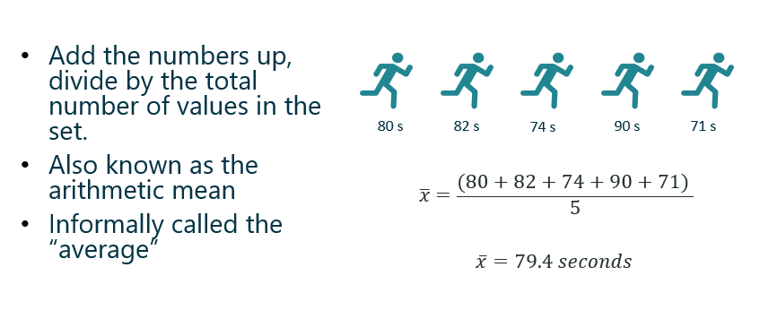
The average function in Excel is AVERAGE.
Symbols:


Median
Instead of taking the value of the numbers into account, the median considers which value(s) take the middle position. Outliers do NOT affect the value of the median.
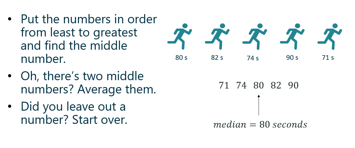
The median function in Excel is MEDIAN.
Mode
The most common value, category, or quality is the mode. The mode measures “typical” for categorical data.

In quantitative data, we look for modal ranges to help us dig deeper and segment the dataset. I wrote a blog post recently that dives a little deeper into this concept, as well as visualizing measures of central tendency.

The mode function in Excel is MODE.
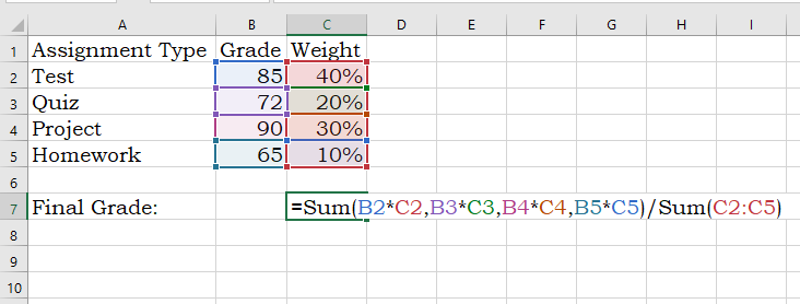
Weighted Mean
A weighted mean is helpful when all values in the dataset do not contribute to the average in the same way. For example, course grades are weighted based on what the type of assignment (test, quiz, project, etc). A test might count more towards your final grade than a homework assignment.

Weighted means are also applied when calculating the expected value of an outcome, such as in gambling and actuarial science. An expected value in gambling is what you’d expect to lose (because you’re gonna lose) over the long-run (many, many trials). To calculate this, a probability is applied to each possible outcome and then multiplied by the value of the outcome — pretty much the same way you calculated your grade back in high school:
Note: Weighted Means and Expected Values will reappear in a later post discussing discrete probability distributions.
Measures of Variation
The middle number of the dataset is only one statistic used the summarize the dataset — the spread of the data is also extremely important to understanding what is happening within your data. Measures of variation tell us how the data varies from end to end and/or within the middle of the dataset and because of this, some measures of spread help in identifying outliers.
For the following examples I took a non-random sample of animal lifespans, put them in order from shortest to longest lifespan. You’ll see the median is 11 years:
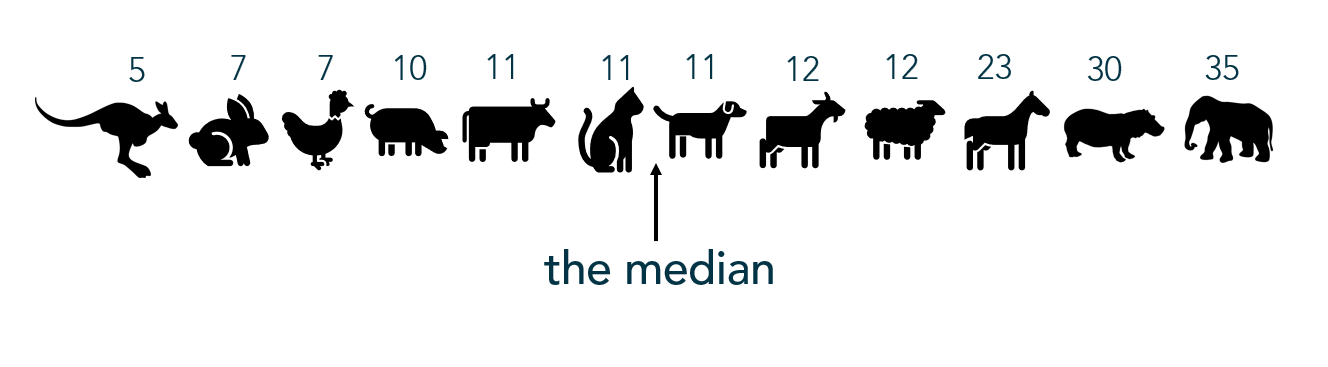
Range
The range only considers the variation from the smallest to largest value in the dataset. Here, the animal’s lifespans range 30 years (or, 35 – 5 years). Unfortunately, range doesn’t give us much information about the variation within the datset.
Interquartile Range
Interquartile range, or IQR, is the range of the middle 50% of the dataset. In this situation, it represents the middle 50% of animal lifespans.
To find the IQR, the values in the dataset must first be ordered least to greatest with the median identified (as I did above). Since the median cuts the dataset in half, we then look for the middle value of the bottom half of the dataset (that is, the middle lifespan between the kangaroo and the cat). That represents the lower quartile, or Q1. Then look for the middle value of the top of the dataset, (that is, the middle value between the dog and the elephant). The second number represents the upper quartile, or Q3.

The interquartile range is found by subtracting Q3 – Q1, or 17.5 – 8.5 = 9 which tells me that the middle 50% of these animals’ lifespans range by 9 years. Unfortuantely, IQR only gives information about the spread of the middle of the dataset.
You can calculate the IQR in Excel using the QUARTILE function to find the first quartile and the third quartile, then subtracting like in the above example.
Ever build a box-and-whisker plot (boxplot)? The “box” portion represents the IQR. Here’s a how-to with more information.
Outliers
One common method for calculating an outlier threshold in a dataset depends on the IQR. Once the IQR is calculated, it is then multiplied by 1.5. Find the low outlier threshold by subtracting the IQR*1.5 from Q1. Find upper outlier threshold by adding the IQR*1.5 to Q3. This is the method used to show outliers in box-and-whisker plots.
Standard Deviation

Standard deviation measures the typical departure, or distance, of each data point from the mean. (Recall, the “mean” is just the average.) So ultimately, the calculation for standard deviation relies on the value of the mean.
The formula below specifically calculates the standard deviation of the sample. I wouldn’t worry too much about using this formula; however, understanding how standard deviation is calculated might help you understand what it calculates, so I’ll walk you through it:

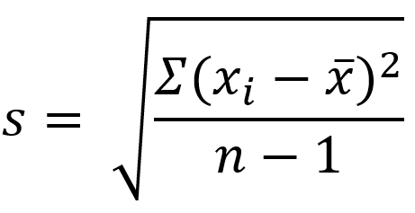
- In the numerator within the parentheses, the mean is subtracted from each data point. As you can imagine, the mean is the center of the data so half of the resulting differences are negative (or 0), and the other half are positive (or 0). (Adding these differences up will always result in 0.)
- Those differences are then squared (making all values positive).
- The Greek uppercase letter Sigma in front of the parentheses means, “sum” — so all the squared differences are added up.
- Divide that value by the samples size (n) MINUS 1. Your resulting answer is the variance of the dataset.
- Since the variance is a squared measure, take the square root at the end. Now you have the standard deviation.
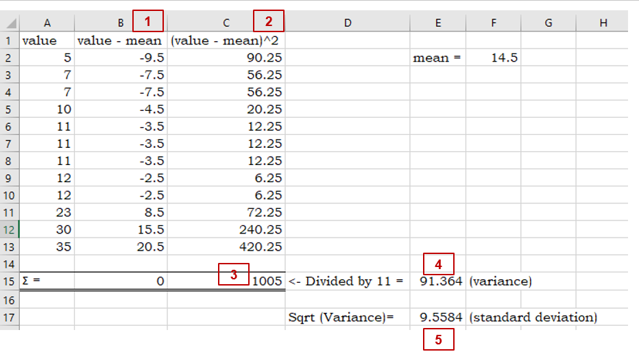
An easier way, of course, is to use Excel’s standard deviation functions for samples: STDEV or STDEV.S
Just like the mean, standard deviation is easily affected by outlying (extreme) values.
the MEDIAN is to INTERQUARTILE RANGE as MEAN is to STANDARD DEVIATION
– The Stats Ninja
Outliers
Several approaches are used to calculating the outlier threshold using standard deviations – which method is employed typically depends on the use case. Many software packages default to 3 standard deviations. If the outlier threshold is calculated using IQR (from above), 2.67 standard deviations mark that boundary.
Next Up: How to be the Life of the Party Part 2 breaks down measures of position, including percentiles and z-scores!
