Struggling with Uncertainty : The Role of Variability

“Uncertainty is the only certainty there is, and knowing how to live with insecurity is the only security.”
― John Allen Paulos

What is Uncertainty and Why Does it Matter?

At a high level, “uncertainty” is the unknown. You might believe it’s as abstract as chaos, but in fact a truth does exist – a “true” value, or parameter is out there – we just don’t know it. In fact, uncertainty is a certainty when working with data. We use samples of data in time to make decisions on the current and future state of business. And to look for truths in data, we often estimate or use probability to attempt to capture that value, or ranges of values, based on known data/observations.

I teach people how to work with, understand, and garner insights from data. What I’ve also noticed there are two kinds of clients I’ve come across in the consulting world:

  1. Those who would like to learn HOW to visualize, measure, and understand uncertainty to help make better organizational decisions.
  2. Those who have never considered the impact of uncertainty on organizational decisions.

As I suggested above, working with uncertainty starts with working with sample sets of data – whatever we can get our hands on. From our observed data, we can make generalizations about a phenomenon or event that may impact our organization by estimating the probability they will occur. We do this with point estimates, intervals, or broad language. For example:

  • Mr. X has a 40% chance of becoming the new CEO.
  • The proportion of revenue expected to come from our small business division this quarter is approximately 54%, with a 3% margin of error.
  • The Pacific Region will likely merge with the North Pacific Region next year.

Building probability models to uncover these predictions is another conversation for another day; however, it is possible to take a baby step towards understanding uncertainty and working with probabilities. In my opinion, the first step on that journey is learning more about how we interpret variation/variability in data. Why? Because accuracy and precision in measuring a probability depends on how well we’ve measured and contained the variability in the data. How we interpret probabilities depends on how we understand the difference between significance, and natural variation.

Variation

From Merriam-Webster:

Definition of variation 

  1. the act or process of varying the state or fact of being varied
  2. an instance of varying
  3. the extent to which or the range in which a thing varies

Ah. Isn’t that helpful?

kevin hart

Google, save me!

Variation:

  1. A change or difference in condition, amount, or level, typically with certain limits
  2. A different or distinct form or version of something

Variability:

lack of consistency or fixed pattern; liability to vary or change.

Why Does Variation Matter?

Here’s the thing — there’s no need to study/use data when everything is identical. It’s the differences in everything around us that creates this need to use, understand, and communicate data. Our minds like patterns, but a distinction between natural and meaningful variation is not intuitive – yet it is important.

Considering how often we default to summary statistics in reporting, it’s not surprising that distinguishing between significant insights and natural variation is difficult. Not only is it foreign, the game changes depending on your industry and context.

What’s So Complicated About Variation?

Let’s set the stage to digest the concept of variation by identifying why it’s not an innate concept.

At young ages, kids are taught to look for patterns, describe patterns, predict the next value in a pattern. They are also asked, “which one of these is not like the other?”

But this type of thinking generally isn’t cultivated or expanded. Let’s look at some examples:

1) Our brains struggle with relative magnitudes of numbers.

large numbers

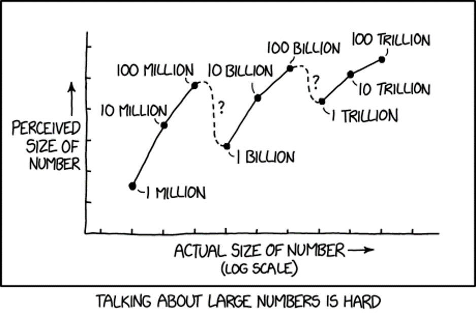
We have a group of 2 red and 2 blue blocks. Then we start adding more blue blocks. At what point do we say there are more blue blocks? Probably when there are 3 blue, 2 red, right?

Instead, what if we started with 100 blocks? Or 1000? 501 red/499 still seems the same, right? Understanding how the size of the group modifies the response is learned – as sample/population size increases, variability ultimately decreases.

Something to ponder: When is $300 much different from $400? When is it very similar?

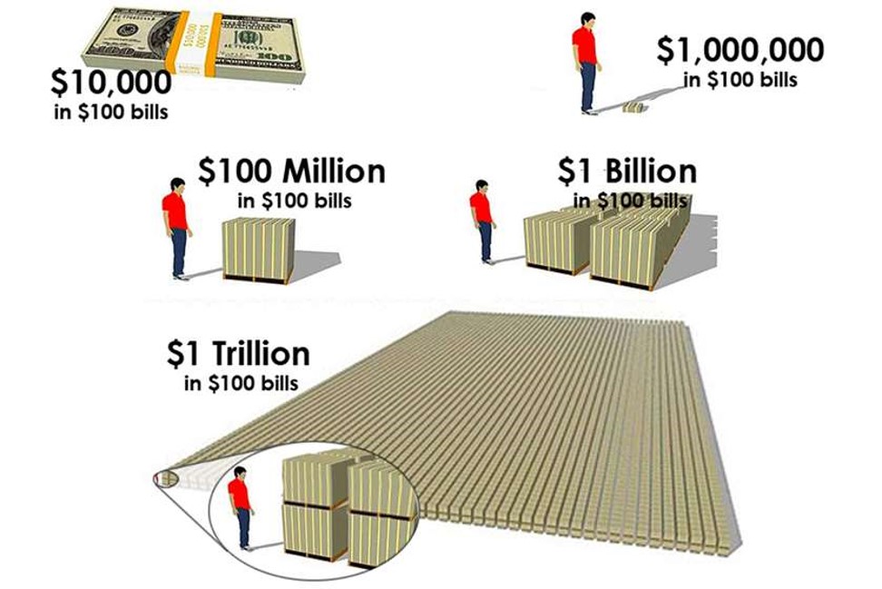
“For example, knowing that it takes only about eleven and a half days for a million seconds to tick away, whereas almost thirty-two years are required for a billion seconds to pass, gives one a better grasp of the relative magnitudes of these two common numbers.”
― John Allen Paulos, Innumeracy: Mathematical Illiteracy and Its Consequences

We understand that 100 times 10 is 1000. And mathematically, we understand that 1 Million times 1000 is 1 Billion. What our brains fail to recognize is the difference between 1000 and 100 is only 900, but the difference between 1 million and 1 billion is 999,000,000! We have trouble with these differences in magnitudes:

magnitudes

We kind of “glaze” over these concepts in U.S. math classes. But they are not intuitive!

2) We misapply the Law of Large Numbers

My favorite example misapplying the Law of Large Numbers is called The Gambler’s Fallacy, or Monte Carlo Fallacy. Here’s an easy example:

Supposed I flip a fair coin 9 times in a row and it comes up heads all 9 times, what is your prediction for the 10th coin flip? If you said tails because you think tails is more likely, you just fell for the Gambler’s Fallacy. In fact, the probability for each coin flip is exactly the same each time AND each flip is independent of another. The fact that the coin came up heads 9 times in a row is not known to the coin, or gravity for that matter. It is natural variation in play.

The Law of Large Numbers does state that as the number of coin flips increase (n>100, 1000, 10000, etc), the probability of heads gets closer and closer to 50%. However, the Law of Large numbers does NOT play out this way in the short run — and casinos cash in on this fallacy.

Oh, and if you thought the 10th coin flip would come up heads again because it had just come up heads 9 times before, you are charged with a similar fallacy, called the Hot Hand Fallacy.

3) We rely too heavily on summary statistics

stats-cartoon

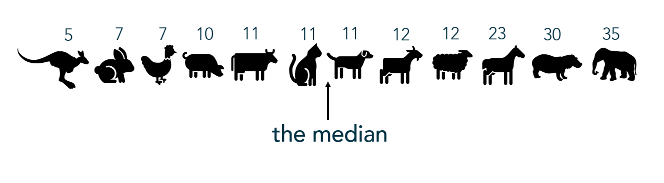
Once people start learning “summary statistics”, variation is usually only brought in as a discussion as a function of range. Sadly, range only considers minimum and maximum values and ignores any other variation within the data. Learning beyond “range” as a measure of variation/spread also helps hone in on differences between mean and median and when to use each.

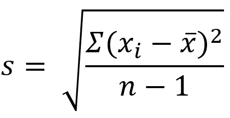
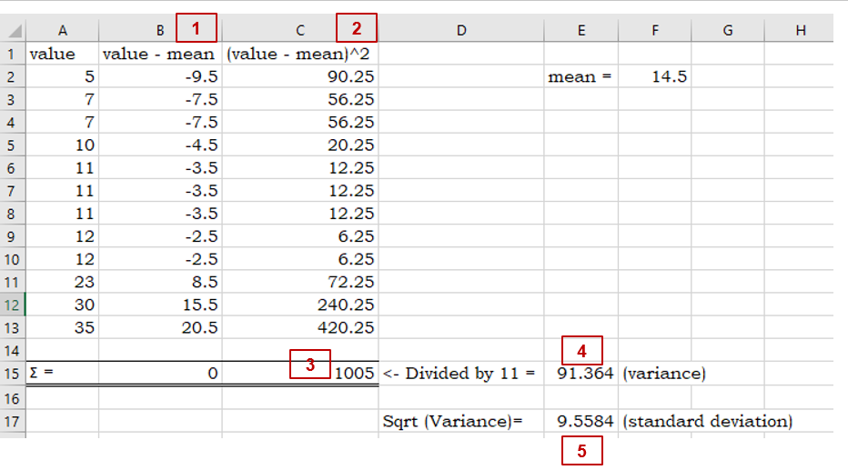
Standard deviation and variance also measure variation; however, the calculation relies on the mean (average) and when there is a lack of normality to the data (e.g. the data is strongly skewed), standard deviation and variance can be an inaccurate measure of the spread of the data.

In relying on summary statistics, we find ourselves looking for that one number – that ONE source of truth to describe the variation in the data. Yet, there is no ONE number that clearly describes variability – which is why you’ll see people using the 5-number summary and interquartile range. But the lack of clarity in all summary statistics makes the argument for visualizing the data.

When working with any kind of data, I always recommend visualizing the variable(s) of interest first. A simple histogram, dot plot, or box-and-whisker plot can be useful in visualizing and understanding the variation present in the data.

quartiles

Start Simple: Visualize Variation

Before calculating and visualizing uncertainty with probabilities, start with visualizing variation by looking at the data one variable at a time at a granular or dis-aggregated level.

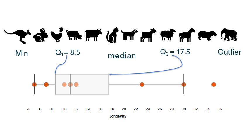
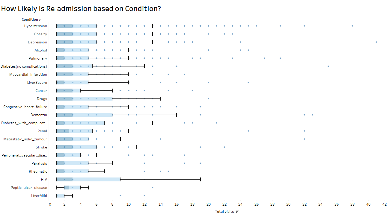
Box-and-whisker can, not only give show you outliers, these charts can also give a comparison of consistency within a variable:

variation box and whiskers

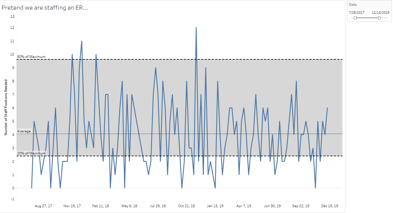
Simple control charts can capture natural variation for high-variability organizational decision-making, such as staffing an emergency room:

variation control chart

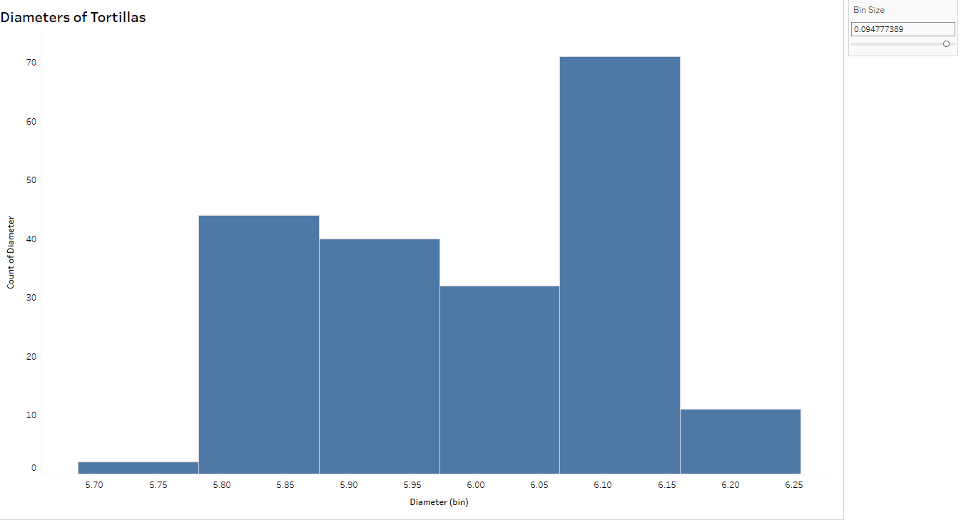
Think of histograms as a bar graph for continuous metrics. Histograms show the distribution of the variable (here, diameters of tortillas) over a set of bins of the same width. The width of the bar is determined by the “bin size” – smaller sets of ranges of tortilla diameters – and the height of the bar measures the frequency, or how many tortillas measured within that range. For example, the tallest bar indicates there are 26 tortillas measuring between (approximately) 6.08 and 6.10 cm.

I can’t stress enough the importance of changing the bin size to explore the variation further.

variation histograms

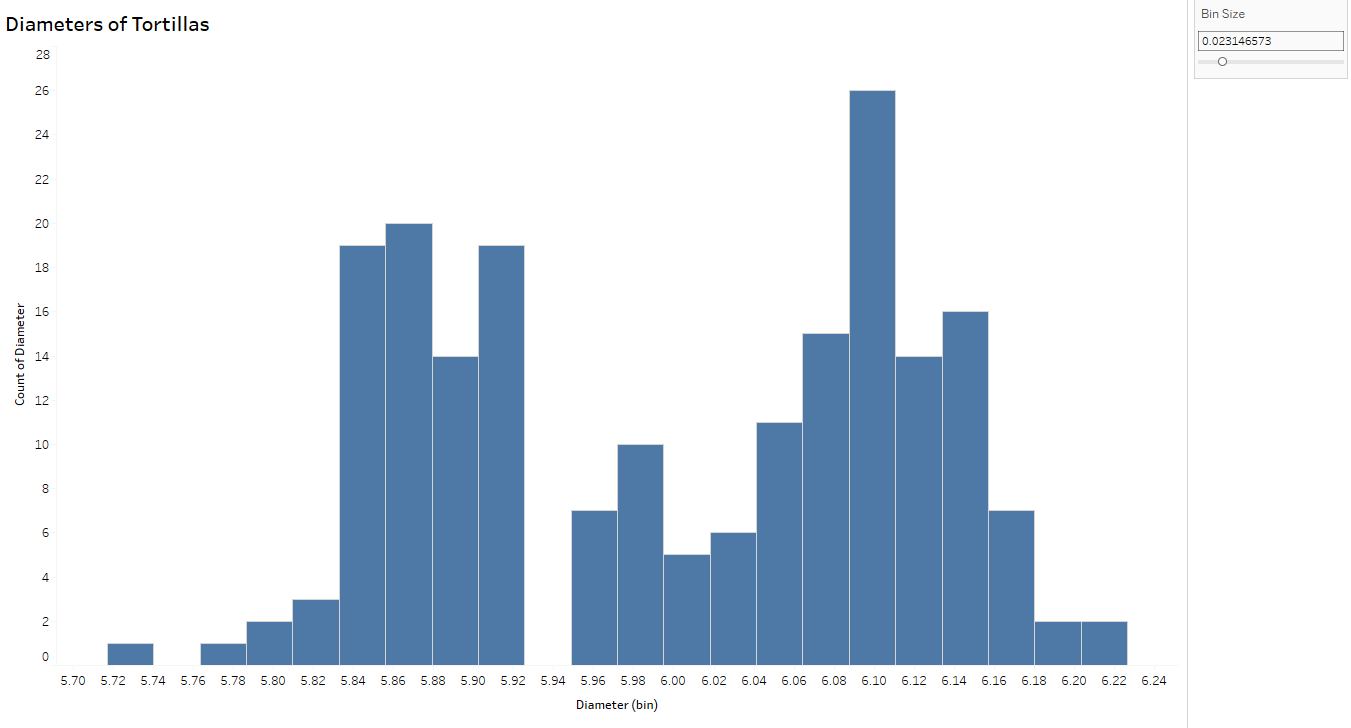
Notice the histogram with the wider bin size (below) can hide some of the variation you see above. In fact, the tortillas sampled for this process came from two separate production lines- which you can conclude from the top histogram but not below, thus emphasizing the importance of looking at variability from a more granular level.

variation histogram wide

Resources

Recently, Storytelling with Data blogged about visualizing variability. I’m also a fan of Nathan Yau’s Flowing Data post about visualizing uncertainty.

Brittany Fong has a great post about disaggregated data, as well as Steve Wexler’s post on Jitter Plots.

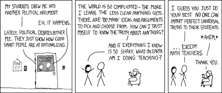
I plan a follow-up post diving more into probabilities and uncertainty. For now, I’m going to leave you with this cartoon from XKCD, called “Certainty.

certainty

How to be the Life of the Party Part 1: A Cheat Sheet to Summary Statistics

Statistics: What are they good for?

Statistics are values or calculations that attempt to summarize a sample of data. If you’re talking about a population of data, you’re usually dealing with parameters. (Easy to remember: Statistics and Samples start with the letter S, and Populations and Parameters start with the letter P.)

And if you know all there is to know about a population, then you wouldn’t be concerned with statistics. However, we almost never know about an entire population of anything, which is why we focus on studying samples and the statistics that describe those samples.

Statistics and summary statistics, as I mentioned, help us summarize a sample of data so that we can wrap our mind around the entire dataset. Some statistics are better than others, and which statistic you choose to summarize a dataset depends entirely upon the type of data you’re working with and your end goals.

Here, I will briefly discuss the different types, definitions, calculations, and uses of basic summary statistics known as “Measures of Central Tendency” and “Measures of Variation.”

Measures of Central Tendency

Measures of central tendency summarize your dataset into one “typical”, central value. It’s best to look at the shape of your data and your ultimate goals before choosing one measure of central tendency.

Mean

The mean, or average is affected by extreme (outlying) measures since, mathematically, it takes into account all values in the dataset.

Suppose you want to find the mean, or average, of 5 runners on your running team:

The average function in Excel is AVERAGE.

Symbols:

x-bar is the mean of the sample
mu is the mean of the population

Median

Instead of taking the value of the numbers into account, the median considers which value(s) take the middle position. Outliers do NOT affect the value of the median.

The median function in Excel is MEDIAN.

Mode

The most common value, category, or quality is the mode. The mode measures “typical” for categorical data.

In quantitative data, we look for modal ranges to help us dig deeper and segment the dataset. I wrote a blog post recently that dives a little deeper into this concept, as well as visualizing measures of central tendency.

The mode function in Excel is MODE.

Weighted Mean

A weighted mean is helpful when all values in the dataset do not contribute to the average in the same way. For example, course grades are weighted based on what the type of assignment (test, quiz, project, etc). A test might count more towards your final grade than a homework assignment.

Weighted means are also applied when calculating the expected value of an outcome, such as in gambling and actuarial science. An expected value in gambling is what you’d expect to lose (because you’re gonna lose) over the long-run (many, many trials). To calculate this, a probability is applied to each possible outcome and then multiplied by the value of the outcome — pretty much the same way you calculated your grade back in high school:

Note: Weighted Means and Expected Values will reappear in a later post discussing discrete probability distributions.

I wrote a more extensive blog post about “other” means, including Geometric and Harmonic means, in case you’re curious.

Measures of Variation

The middle number of the dataset is only one statistic used the summarize the dataset — the spread of the data is also extremely important to understanding what is happening within your data. Measures of variation tell us how the data varies from end to end and/or within the middle of the dataset and because of this, some measures of spread help in identifying outliers.

For the following examples I took a non-random sample of animal lifespans, put them in order from shortest to longest lifespan. You’ll see the median is 11 years:

Range

The range only considers the variation from the smallest to largest value in the dataset. Here, the animal’s lifespans range 30 years (or, 35 – 5 years). Unfortunately, range doesn’t give us much information about the variation within the datset.

Interquartile Range

Interquartile range, or IQR, is the range of the middle 50% of the dataset. In this situation, it represents the middle 50% of animal lifespans.

To find the IQR, the values in the dataset must first be ordered least to greatest with the median identified (as I did above). Since the median cuts the dataset in half, we then look for the middle value of the bottom half of the dataset (that is, the middle lifespan between the kangaroo and the cat). That represents the lower quartile, or Q1. Then look for the middle value of the top of the dataset, (that is, the middle value between the dog and the elephant). The second number represents the upper quartile, or Q3.

The interquartile range is found by subtracting Q3 – Q1, or 17.5 – 8.5 = 9 which tells me that the middle 50% of these animals’ lifespans range by 9 years. Unfortuantely, IQR only gives information about the spread of the middle of the dataset.

You can calculate the IQR in Excel using the QUARTILE function to find the first quartile and the third quartile, then subtracting like in the above example.

Ever build a box-and-whisker plot (boxplot)? The “box” portion represents the IQR. Here’s a how-to with more information.

Outliers

One common method for calculating an outlier threshold in a dataset depends on the IQR. Once the IQR is calculated, it is then multiplied by 1.5. Find the low outlier threshold by subtracting the IQR*1.5 from Q1. Find upper outlier threshold by adding the IQR*1.5 to Q3. This is the method used to show outliers in box-and-whisker plots.

Standard Deviation

s is the standard deviation of the sample

Standard deviation measures the typical departure, or distance, of each data point from the mean. (Recall, the “mean” is just the average.) So ultimately, the calculation for standard deviation relies on the value of the mean.

The formula below specifically calculates the standard deviation of the sample. I wouldn’t worry too much about using this formula; however, understanding how standard deviation is calculated might help you understand what it calculates, so I’ll walk you through it:

sigma is the standard deviation of the population
  1. In the numerator within the parentheses, the mean is subtracted from each data point. As you can imagine, the mean is the center of the data so half of the resulting differences are negative (or 0), and the other half are positive (or 0). (Adding these differences up will always result in 0.)
  2. Those differences are then squared (making all values positive).
  3. The Greek uppercase letter Sigma in front of the parentheses means, “sum” — so all the squared differences are added up.
  4. Divide that value by the samples size (n) MINUS 1. Your resulting answer is the variance of the dataset.
  5. Since the variance is a squared measure, take the square root at the end. Now you have the standard deviation.

An easier way, of course, is to use Excel’s standard deviation functions for samples: STDEV or STDEV.S

Just like the mean, standard deviation is easily affected by outlying (extreme) values.

the MEDIAN is to INTERQUARTILE RANGE as MEAN is to STANDARD DEVIATION

– The Stats Ninja

Outliers

Several approaches are used to calculating the outlier threshold using standard deviations – which method is employed typically depends on the use case. Many software packages default to 3 standard deviations. If the outlier threshold is calculated using IQR (from above), 2.67 standard deviations mark that boundary.

Next Up: How to be the Life of the Party Part 2 breaks down measures of position, including percentiles and z-scores!