The Analytics PAIN Part 2: Least-Squares Regression Lines and Residuals

Haven’t read Part One of this series? Click here.

The Context

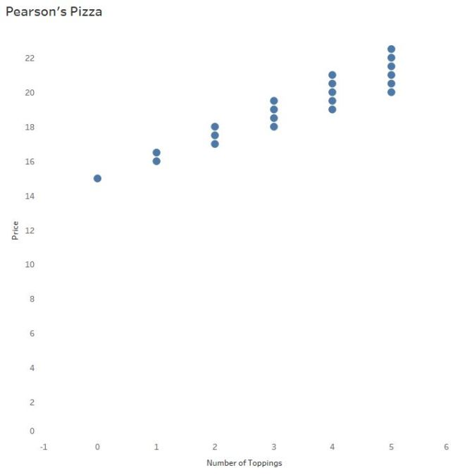
You are the sole proprietor of Pearson’s Pizza, a local pizza shop. Out of nepotism and despite his weak math skills, you’ve hired your nephew Lloyd to run the joint. And because you want your business to succeed, you decide this is a good time to strengthen your stats knowledge while you teach Lloyd – after all,

“In learning you will teach, and in teaching you will learn.”

– Latin Proverb and Phil Collins

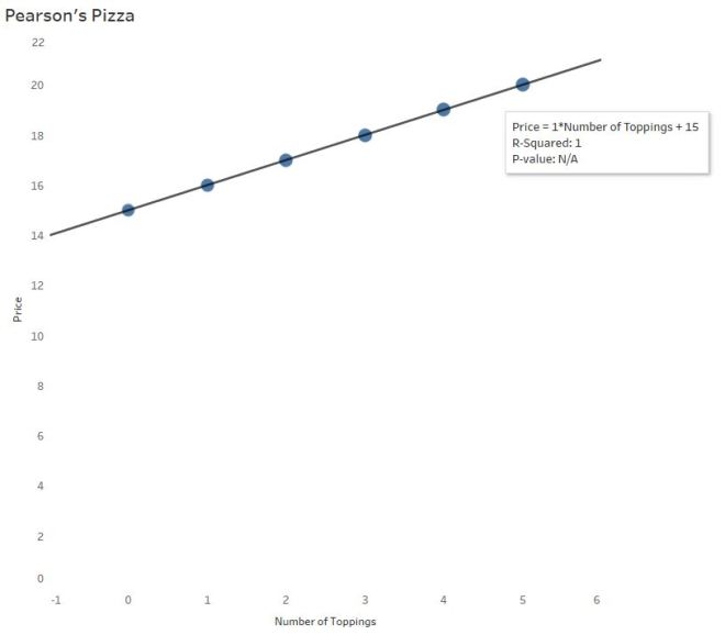
Your pizzas are priced as follows:

Cheese pizza (no toppings): $15

Additional toppings: $1/each for regular, $1.50 for premium

When we left off, you and Lloyd were exploring the relationship between the number of toppings to the pizza price using a sample of possible scenarios.

pizza scatter
The scatterplot of Pizza Price vs. Number of Toppings: As the number of toppings increase, price of the pizza increases.

The Purpose(s) of a “Regression” Line

When investigating data sets of two continuous, numerical variables, a scatterplot is the typical go-to graph of choice. (See Daniel Zvinca’s article for more on this, and other options.)

So. When do we throw in a “line of best fit”? The answer to that question may surprise you:

A “line of best” fit, a regression line, is used to: (1) assess the relationship between two continuous variables that may respond or interact with each other (2) predict the value of y based on the value of x.

In other words, a regression line may not add value to Lloyd’s visualization if it won’t help him predict pizza prices from the number of toppings ordered. 

pizza4

The equation: pizza price = 1.25*Toppings +15

Recall the slope of the line above says that for every additional topping ordered the price of the pizza will increase by $1.25.

In the last post you discussed some higher-order concepts with Lloyd, like the correlation coefficient (R) and R-Squared. Using the data above, you said, “89.3% of the variability (differences) in pizza prices can be explained by the number of toppings.” Which also means 10.7% of the variability can be explained by other variables, in this case the two types of toppings.

Since there is a high R-Squared value, does Pearson’s Pizza have a solid model for prediction purposes? Before you answer, consider the logic behind “least-squares regression.”

Least-Squares Regression

You and Lloyd now understand that “trend lines”, “lines-of-best-fit”, and “regression lines” are all different ways of saying, “prediction lines.”

The least-squares regression line, the most common type of prediction line, uses regression to minimize the sum of the squared vertical distances from each observation (each point) to the regression line. These vertical distances, called residuals, are found simply by subtracting the predicted pizza price from the actual pizza price for each observed pizza purchase.

The magnitude of each residual indicates how much you’ve over- or under- predicted the pizza price, or prediction error.

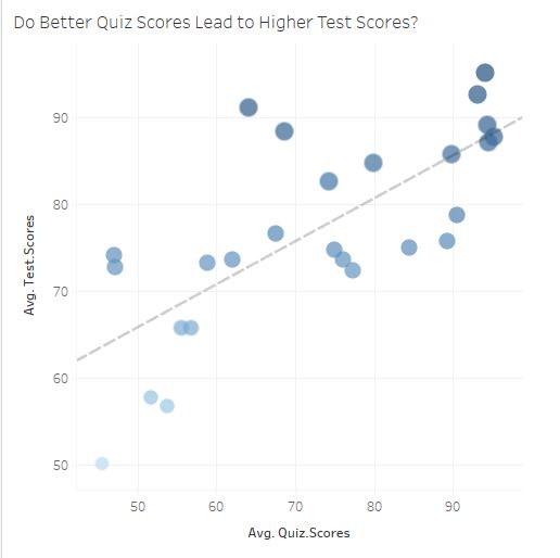
Note the green lines in the plot below:

Residuals
The residuals, or vertical distances, are shown here in green. (Created in Shiny)

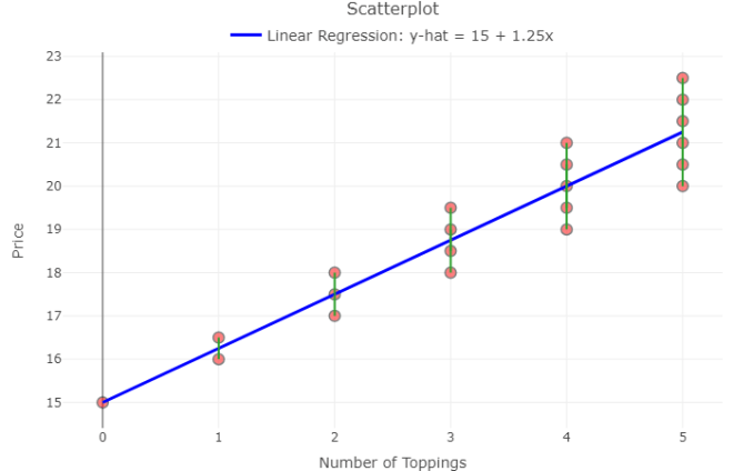
Lloyd learns about residuals

Recall, the least-squares regression equation:

pizza price = 1.25(toppings) + 15

Lloyd says he can predict the price of a pizza with 12 toppings:

pizza price =1.25*12 + 15

pizza price = $30

Sure, it’s easy to take the model and run with it. But what if the customer ordered 12 PREMIUM toppings? Logic says that’s (1.50)*12 + 15 = $33.

You explain to Lloyd that the residual here is 33 – 30, or $3. When a customer orders a pizza with 12 premium toppings, the model UNDER predicts the price of the pizza by $3. 

lloyd christmas

How valuable is THIS model for prediction purposes? Answer: It depends how much error is acceptable to your business and to your customer. 

Why the Residuals Matter

To determine if a linear model is appropriate, protocol* says to create a residual plot and check the graph of residuals. That is, graph all x-values (# of toppings) against the residuals and look for any obvious patterns. Create a residual plot with your own data here.

Ideally, the graph will show a cloud of points with no pattern. Patterns in residual plots suggest a linear model may NOT be suitable for prediction purposes.

Shiny Residual Plot 2
I spy a pattern. Or, how I bubbled my answers in Sociology class.

You notice from the residual plot above, as the number of toppings increase, the residuals increase. You realize the prediction error increases as we predict for more toppings. For Pearson’s Pizza, the least-squares regression line may not be very helpful for predicting price from toppings as the number of toppings increases.

Is a residual plot necessary? Not always. The residual plot merely “zooms in” on the pattern surrounding the prediction line. Becoming more aware of residuals and the part they play in determining model fit helps you look for these patterns in the original plots. In larger data sets with more variability, however, patterns may be difficult to find.

Lloyd says, “But the p-value is significant. It’s < 0.0001. Why look at the visualization of the residual plot when the p-value is so low?”

Is Lloyd correct?! Find out in Part 3 of this series.

Summary

Today Lloyd learned a regression line has adds little to no value to his visualization if it won’t help him predict pizza prices from the number of toppings ordered.

As the owner of a prestigious pizza joint, you realize the importance of visualizing both the scatterplot and the residual plot instead of flying blind with correlation, R-Squared, and p-values alone.

Understanding residuals is one key to determining the success of your regression model. When you decide to use a regression line, keep your ultimate business goals in mind – apply the model, check the residual plot, calculate specific residuals to judge prediction error. Use context to decide how much faith to place in the magical maths.

linear_regression cartoon

*Full list of assumptions to be checked for the use of linear regression and how to check them here.

Want to have your own least-squares fun? This Rossman-Chance applet provides hours of entertainment for your bivariate needs. 

—Anna Foard is a Business Development Consultant at Velocity Group

The Analytics PAIN: How to Interpret Trend Lines and Greek Letters

The Basics

Let’s say you own Pearson’s Pizza, a local pizza joint. You hire your nephew Lloyd to run the place, but you don’t exactly trust Lloyd’s math skills. So, to make it easier on the both of you, you price pizza at $15 and each topping at $1.

On a scatterplot you see a positive, linear pattern:

pizza1
Since the price of the pizza increases by $1 for each additional topping, that $1 per topping is quite literally the slope of the line of best fit.

Interpreting Software Output

Trend lines are used for prediction purposes (more on that later). In this example, you wouldn’t need a trend line to determine the cost of a pizza with, say, 10 toppings. But let’s say Lloyd needs some math help and you dabble in the black art of statistics.

Most software calculates this line of best fit using a method to minimize the squared vertical distances from the points to that line (called least-squares regression). In the pizza parlor example, little is needed to find the line of best fit since the points line up perfectly.

pizza3

The Equation of the Trend Line…

…may take you back to 9th grade Algebra

y = mx +b

Price = 1*NumberofToppings + 15

The price of the pizza (y) depends on the the number of toppings ordered (x). The independent (x) variable is always multiplied by the slope of the line. Here, the slope is $1. For every additional topping, the price of the pizza is predicted to increase by $1.

The price of the pizza without any toppings is $15. In the equation above, 15 is the y-intercept –The price of a cheese pizza, to be more specific to the example.

We’ll also refer to this equation as the “linear model.”

R and R-Squared (or, The Coefficients of Confusion)

The second value listed is called R-squared. But before you interpret R-squared (R^2) for Lloyd, you need to give him an idea of R since R-Squared is based on R.

R has many names: Pearson’s Coefficient, Pearson’s R, Pearson’s Product Moment, Correlation Coefficient

Why R? Pearson begins with a P…

No, Pearson wasn’t a Pirate. The Greek letter Ρ is called “Rho,” and translates to English as an “R”.

Pearson’s R measures correlation – the strength and direction of a linear relationship. Emphasis on LINEAR.

guideline-for-interpreting-correlation-coefficient-2-638

-From LinkedIn Learning 

Since R-Squared = 1, you’ve probably figured out R = √1, or ±1. Positive 1 here, since there is a positive association between number of toppings and price. There is a perfect positive correlation between the number of toppings ordered and the price of the pizza.

Since the price of pizza goes up as the number of toppings increases, the slope is positive and therefore the correlation coefficient is positive (there is a mathematical relationship between the two – not going to bore you with the calculations). It is interesting to note the calculation for correlation does not distinguish between independent and dependent variables — that means, mathematically, correlation does not imply causation*. 

The p-value of this output tells you the significance of the association between the two variables – specifically, the slope. Did the slope of 1 happen by chance? No, not at all. It’s significant because the two variables are associated in a perfectly linear pattern. This particular software gives “N/A” in this situation, but other software will give p < 0.000000. (P-values deserve their own blog post – no room here.)

R-Squared has another name: The coefficient of determination

Often you’ll hear R-Squared reported as a %. In this case, R-Squared = 100%. So why is R-Squared 100% here? Look at the graph – no points stray from the line! There is absolutely no variability (differences) whatsoever between the actual points and the linear model! Which makes it easy to understand the interpretation of R-Squared here:

100% of the variability (differences) in pizza prices can be explained by the different number of toppings.

Hearing this, you tell Lloyd that R-Squared tells us how useful this linear equation is for predicting pizza prices from number of toppings.

But in real life…R-Squared is NOT 100%.

Business Complications

Problem: Your customers start asking for “gourmet” toppings. And to profit, you’ll have to charge $1.50 for these gourmet toppings. You’ll still offer the $1 “regular” toppings as well.

Now, the relationship between a pizza’s price and number of toppings could vary substantially:

pizza4

Lloyd is gonna freak.

As the number of toppings increase, there is more and more dispersion of points along the line. That’s because the combination of regular and gourmet toppings differs more with as number of toppings increase.

Lloyd says a customer wants 4 toppings. He forgot to write down exactly which toppings. Four regular toppings will come to $19. But 4 gourmet toppings is a little pricier at $21. The prediction line says it’s $20. We’re only within a couple dollars, but that’s a good bit of variability. Over time, Pearson’s Pizza may lose money or piss off customers (losing more money) if Lloyd chooses the prediction line over getting the order right.

R-Squared (Again):

It’s all about VARIABILITY – the differences between the actual points and the line. And this is why predicting with a trend line is to be done with caution:

89.29% of the variability (differences) in pizza prices can be explained by the different number of toppings. Other reasons (like the type of topping chosen) cause the price differences, not just the number of toppings.

What R-Squared isn’t:

And that doesn’t mean the model will get it right 89.29% of the time (it’s not a probability). R-Squared also doesn’t tell us the percent of the points the line goes through (a common misunderstanding).

Non-linear Models – 3 Warnings

How does gas mileage change as your car speed increases?

Gas1

Even though we can see the points are not linear, let’s slap a trend line on there to make certain, for LOLs:

Gas2

Hint: Horizontal trend lines tell you NOTHING. If slope = 0, R = 0.

And now you also understand why the R-squared value is equal to 0:

0% of the variability in gas mileage can be explained by the change in speed of the vehicle.

Wait a second…

CLEARLY there is a relationship! AKA, Why we visualize our data and don’t trust the the naked stats.

Mathematically, the trick is to “transform” the curve into a line to find the appropriate model. It typically involves logarithms, square roots, or the reciprocal of a predictor variable.

kevin hart

I won’t do that here.


Gas3

As you can see, technology is amazing and created this model from a 3rd degree polynomial…

Warning #1

Which is TOTALLY FINE if you’re going to interpolate – predict for mileage only between the speeds of 20 and 60 mph. In case you are wondering why you wouldn’t extrapolate – predict for speeds outside the 20 – 60 mph range, I brought in a special guest.

bill nye


Third degree polynomials have 2 turns:


Gas5
The full gas mileage vs. speed model. This is not the model you thought you were dating.

The R-Squared value here is 0.9920 – this value is based on the transformed data (when the software temporarily made it linear behind your back). Remember the part about R (and therefore R-Squared) describing only LINEAR models? The R-Squared is still helpful in determining a model fit, but context changes a bit to reflect the mathematical operations used to make the fit. So use R-Squared as a guide, but the interpretation isn’t going to make sense in the context of the original variables anymore. Though no need to worry about all that if you stick to interpolation!

Warnings #2 and #3

What if my software uses nonlinear regression?

This can get confusing so I’ll keep it brief. Full disclosure: I thought nonlinear regression and curve-fitting with linear regression yielded the same interpretation until Ben Jones pointed out my mistake!

R-Squared does NOT make sense for nonlinear regression. R-Squared is mathematically inaccurate for nonlinear models and can lead to erroneous conclusions. Many statistical software packages won’t include R-Squared for nonlinear models – please ignore it if your software kicks it out to you.

Consequently, ignore the p-value for nonlinear regression models as well – the p-value is based on an association using Pearson’s R, which is robust for linear relationships only.

The explanation of warnings 2 and 3 are beyond the scope of this post – but if you’d like to learn more about the “why,” let me know!

Thanks for sticking around until the end. Send me a message if you have a suggestion for the next topic!

*Even though number of toppings does cause the price to increase in this use case, we cannot apply that logic to correlation universally. Since correlation does not differentiate between the independent and dependent variables, the correlation value itself could erroneously suggest pizza prices cause the number of toppings to increase.

Bonus Resource: An excellent video I found explaining R-squared using a similar pizza example! If what I said still leaves you confused, Mr. Nystrom will certainly give you pizza mind! 

—Anna Foard is a Business Development Consultant at Velocity Group

5 Things Teaching Taught Me


5 years of letters from students

159 days ago, I turned in my classroom keys, signed away by school ID badge, and left teaching.

159 days of growth and change. And though I won’t get into the “why” details here, I must emphasize my reasons for leaving the classroom after 14 years had nothing to do with the students or the teaching.

Today, I took some time to go through a pile of letters from my kids over the most recent 5 years and reflect on what these beautiful minds taught me.


1) Everyone has a back story. Be kind.

I’m starting with the hardest one first — but hear me out.

It’s easy to dislike people. People suck. Especially in groups. (But keep in mind, you probably have sucked once or twice in your life to someone else, too.) And it’s even easier to find contempt for people you don’t know.

IMG_20180524_190959620But EVERYONE has a story.

I’ve met kids from all walks of life. Some had already been incarcerated when I met them. Others are in prison now. I’ve been threatened within the inch of my life. I’ve been cursed at, spit at, and ignored. As I grew as a teacher I found my only play is respond with kindness and compassion.

Why?

Because everyone has a story. And when kids are angry or hurting, they respond in the way you’d expect them to respond – teeth clenched, ready to take you on. I can’t teach you the multiplicative inverse of π/4 if you’ve got something significant weighing on your mind. (I’ll get into specific stories in a bit.)

Teachers spend a considerable amount of time developing relationships, the actual “teaching” plays a minor role. You learn to love on the kids like they are your own, you give them a safe place, and you think about them when they’re out of your sight.

True story: I once let a girl shove me into a set of lockers to give my student enough time to run away from a fight.

I’ve only spent 159 days around adults so far this year so I am no expert in that field; however, I’ve found they respond surprisingly well to a smile. At times I’ve noticed kindness is not what folks expect, and it disarms their defensiveness. (Note: Manipulative people know this too, which makes it hard for the most cynical of cynics to trust kindness. But be kind anyway.)

img_20181030_181926848

2) Listen.

If the first thing I learned is everyone has a story, then the second thing I discovered is to listen to those stories – some unfold like an epic narrative, while others are short and comical.

But every individual has a unique perspective, a different life experience from you. They may have just walked down a road you don’t realize you’ll be on next week. Maybe they DO know something you don’t?

Over the past 159 days, I’ve met so many beautiful people and listened to their stories. Instead of relearning the business world by taking another business class, I met with friends and strangers, asking them questions about themselves and their day-to-day jobs.  Surprisingly, where I have ended up in my job has everything to do with the conversations I had along the way.

I learned how to listen from my students. Often they would come to me to externally process some high school situation. Other times, though, they needed a confidant. Every interaction has grown my knowledge in some positive way. Listening to students taught me how to deal with serious situations and how to connect someone else’s experiences to my own. Listening grew my empathy. And even negative interactions will develop your character if you allow yourself to grow from the challenge.


img_20181030_182026641

3) People want someone to believe in them.

I’ll never forget a particular student in my Geometry class from a couple years ago. He was behind in school, on probation, no parental support, and on the edge of getting expelled. I noticed he didn’t struggle in math, his struggle was with life. And deep down, this wasn’t the life he wanted. Following lesson #1, I gave him a little room to decompress when he’d had a rough day. I left him alone when he was angry (except, when no one was looking, I’d give him a nod). I praised his work, I let him challenge me, and when I eventually gained his trust, I challenged him back. During my planning period he took to stopping by room just to chat — he liked to drop some F-bombs just to see what I would do, other times he’d sit down and vent, but mostly just tell me how much he wanted to graduate.

He just wanted someone to listen.

I gave him more chances than most to make up tests so he could pass the class. I did. I totally broke the rules right there – and I don’t regret it. Because I believed in him. Again, it was his daily life, not his intelligence, keeping his grades low.

But one day, as I watched from the window, he left school, got on his motorcycle, and took off. The administrator there told me the student had just DROPPED OUT. “He’ll probably be dead in ten years,” the admin scoffed. (WTF.)

Fast forward a year and a half later: This student walked across the stage at graduation. He’d come back, made up all his classes, and graduated with his class on time. Luckily, I wasn’t the only person who’d believed in him and someone else led him through the finish line. I cried ugly tears on that graduation day, May 2018.

img_20181030_181856876

4. Relationships matter.

For those in the back: ABOVE ALL ELSE, it’s about the relationships

IMG_20180524_190813353

.

Ask any teacher worth their salt and they will echo my sentiment. This job is NOT about test scores – these kids are not data points. This job is not about winning sporting or academic events. Teaching is about forming bonds and making connections.

Over my 14-year tenure, I not only taught in a classroom, I also coached girls’ cross-country in my early years, then the academic bowl team. I spent the last 5 years I advising the senior class. 

One day, I may no longer have a job, a house, a Twitter following. I’m sure I’ll be fine. But if I am not surrounded by the people I love, I have failed those people. I refuse to allow myself to be measured by my job title or social standing. Instead I prefer to leave a legacy built on the relationships I’ve forged and inspired by the people who have influenced me.

img_20181030_181959253

5. Forgive yourself.

This one I’m still learning.

Nothing ever goes as planned in teaching. You’ve got to be flexible, stay on the ball. Whatever magic dance you dance the night before a high-stakes test never seems to yield the results the lawmakers/shareholders/naysayers want. And because the “squeaky wheel gets the grease,” those of us with the pedal to the metal are offered no encouragement from above. It’s disheartening to only hear negative from the adults in the room.

To top it off, I would leave work every day feeling guilty because I felt I hadn’t done enough for my students, and feeling even more guilt that I hadn’t yet picked my own children up from school.

But then the kids… The kids would walk in my classroom, tell me their stories of the day. If I had been absent, they asked where I’d been. They’d write me letters year in and year out. The kids. The kids encourage ME. The kids teach me I should go easy on myself.

159 days away from the classroom. As I said, this one I’m still learning. I’m only human.

img_20181030_181725216img_20181030_181937060

Using Tableau to Improve Individual Student Learning

Fact: Educators must use student data to increase student learning.

Fact: Educators must produce data evidence that they did, in fact, attempt to increase student learning.

Fact: Educators compare class averages (means) on summative assessments to determine test reliability and student learning.

Fact: Test validity is rarely discussed.

Fact: Most data sets (class size) are small sample sizes with huge variations in classroom demographics between classes (even period to period with the same teacher)

This article is dated; however, these are present and real problems within school districts.

As you know, adults are resistant to change. Teachers are asked to produce data but given minimal training outside of “compare average test scores”. And without a math background, this may even make sense to those educators and superintendents. Therefore, when it’s easier to compare a mean and it cleans up the mandatory paperwork faster, this is the way things are done.
Question: How will (only) comparing averaging actually help individual student learning?
Question: If teachers lack a background of statistics and, even more frustrating for the educator, lack the time to learn the basics, how will they begin to leverage their own student data to improve learning? Ultimately, it is what they WANT to do. But how?
Solution: Educators need to answer deeper questions about their students using data without additional statistical training all while using their time efficiently. It must also be priced for teachers: free. And it’s here. It’s called Tableau. It’s data visualization. Instead of looking at a sea of numbers, Tableau produces pictures. Without a math background, anyone can look for trends and draw conclusions. And it’s free to educators.
 Data 4
Tableau allows teachers to import student gradebook data (most gradebooks export as a .CSV). Once the educator is in the Tableau workbook, one can merely hold down the CTRL key, click on whatever variables they would like to compare/explore. A “show me” set of suggested graphs pops up (if it doesn’t automatically pop up, after taking fingers off the keyboard, CTRL+1 will do the trick). You can also just drag and drop into the workbook. Drag and drop students to color. Play with it. And sometimes an ID will need to be set to a string (so the software knows you’re talking people, not calculations) and sometimes you’ll need to switch columns and rows for a better visual. I recommend sorting students by whatever measure (assessment? assignment? overall grade?) you are asking your data to compare. Playing with the visualization is a fun way of learning how to use the software. It won’t take long.
My first visualization
Unit 3 Tableau
Only a subset of the full visualization for 63 students. The bars show the student’s overall AP Stats performance through this unit.
This graphic sorts messy data from Unit 3 (The Linear Regression unit) into a clean, organized dashboard to help me compare my students’ formative and summative assessments (sorted on Unit Test score, ascending).
I was shocked to see the overall trend in the formative to summative scores: They went DOWN. And they shouldn’t. And that’s a validity problem from my end. But this was not so evident in looking at the aggregate data. A t-test would tell me there is “no significant difference” between quiz and test scores. But we’re talking individuals, my students. And my job is to GROW them. By looking within the data, I found trends about which types of students, for example, lost traction from quiz to test. And my ultimate conclusion was to take ownership on my end. (This could be another post for another day.)
After playing with Tableau some more, I realized rows worked better than columns for the above visualization.
And did you know that approximately 8 percent of men and 0.5 percent of women are red/green colorblind?
So my next 2 units looked more like this:
Unit 5 Tableau
To support our school’s mission and vision, I began teaching other teachers how to leverage student data within their PLCs to draw meaningful conclusions about teacher methods and student learning with Tableau. And these teachers are excited to identify trends and answer deeper student needs questions – to ultimately help and grow each individual student.
It is time teachers stop looking only to aggregate data and averages. We need the tools to find trends within each student’s learning patterns in order to provide them with the best “differentiated” learning experience for them. Unfortunately, I have found there is a huge gap between what districts want and what teachers are asked to do.
Some school districts have already figured this out. – Yes, that includes Atlanta Public Schools. Teachers have access to their student data through dashboards with a click of a button. And not only do they use it, they find value in the data visualization.
Eventually, data dashboards that ultimately give teachers a visualization of their current student data, including growth and achievement data, is the future of education. Right now teachers who want this will have to figure out the software (thankfully, Tableau is easy to use for simple visualizations.) But ultimately, data visualization through dashboards are the next step in the journey.
The beginnings of my data dashboard:
data 1
data 2
data 3

For the CHS Class of 2010

Beloit College creates a “Mindset List” every year for the entering college class.  For the college class of 2014 (or, those of you who graduated from Centennial in May) the list has just been posted.  Here are a few touchstones of your life:

(from USA Today):

Image result for nirvana
Class of 2014 mostly unaware of the intersection of Nirvana and Foo Fighters in rock’s Venn diagram
  • Dr. Kevorkian has never been licensed to practice medicine.
  • Czechoslovakia has never existed.
  • Rock bands have always played at presidential inaugural parties.
  • Nirvana is on the classic oldies station.
  • American companies have always done business in Vietnam.
  • They’ve never recognized that pointing to their wrists is a request for the time of day.
  • Clint Eastwood is better known as a sensitive director than as Dirty Harry.

Click here for the full list

A New Twist on the Placebo Effect

A student brought this to my attention on Monday — as heard on NPR, the placebo effect is apparently getting stronger.

Well if you think about it, there’s a pill for everything these days, right?  The article suggests that people, when sick, go to the doctor, get a prescription, take a pill and get better (in general).  So maybe people are programmed to think they will get better?

But what does this mean to medical research?  What if a new medication significantly decreases, say, blood pressure — when tested against the placebo, will it fail?

Check out the article.

The Monty Hall Problem

Let's Make a Deal!

In class we discussed and debated the logic behind the ubiquitous “Monty Hall Problem“:

“Suppose you’re on a game show, and you’re given the choice of three doors:  Behind one door is a car; behind the others, goats. You pick a door, say No. 1, and the host, who knows what’s behind the doors, opens another door, say No. 3, which has a goat. He then says to you, “Do you want to pick door No. 2?” Is it to your advantage to switch your choice? (Parade Magazine, Whitaker 1990)

Here is a simulation and an explanation of the answer.

Statistics is So Hot Right Now

so hot right now
so hot right now

Here is an article from the NY Times entitled “For Today’s Graduate, Just One Word: Statistics” (dated August 5, 1009) highlighting the ever-growing field of statistics.  Organizations such as Google and IBM are looking for good statisticians as the demand for data analysis increases:

“We’re rapidly entering a world where everything can be monitored and measured,” said Erik Brynjolfsson, an economist and director of the Massachusetts Institute of Technology’s Center for Digital Business. “But the big problem is going to be the ability of humans to use, analyze and make sense of the data.”

Another interesting quote in the article: “I keep saying that the sexy job in the next 10 years will be statisticians,” said Hal Varian, chief economist at Google. “And I’m not kidding.”

So you see, you can be nerdy AND cool.

Draw a Picture? (or, Check out this data on metal bands)

What is the first thing you should do when you encounter a mess of data?this is legit.

Draw a….what? (It’s in your notes…)

Draw a PICTURE. A distribution. A graph.
LOOK AT IT.

But statistics doesn’t just revolve around histograms, boxplots and scatterplots. Statisticians have (marginally) grown personalities over the years and realize non-statisticians need something tangible to understand data trends. Enter: Nathan Yau of FlowingData.com, a PhD candidate in statistics who makes use of his background in computer science to explore and visualize data.

Since the word “data” sounds so dull…like “widgets” in economics…let’s look at a few examples Yau took from reality:

Evidence of “data-visualization” tools is very commonplace these days and you’ll find that many popular websites mix humor and/or pop-culture into their infographics (The Onion has been doing it for years). 

More:
Time Travel in Popular Film and TV
Movie Monster Comparison Chart

OR Make your own at Graphjam.com