How to Navigate Confidence Intervals With Confidence

Teaching statistics year after year prepped me for the most common misinterpretations of confidence intervals and confidence levels. Confusion such as:

  • Incorrectly interpreting a 99% interval as having a “99% probability of containing the true population parameter”
  • Finding significance because “the sample mean is contained in the interval”
  • Applying a confidence interval to samples that do not meet specific assumptions

What are Confidence Intervals?

Confidence intervals are like fishing nets to an analyst looking to capture the actual measure of a population in a pond of uncertainty. The margin of error dictates the width of the “net”. But unlike fishing scenarios, whether or not the confidence interval actually captures the true population measure typically remains uncertain. Confidence intervals are not intuitive, yet they are logical once you understand where they start.

So what EXACTLY, are we confident about? Is it the underlying data? Is it the result? Is it the sample? The confidence is actually in the procedures used to obtain the sample that was used to create the interval — and I’ll come back to this big idea at the end of the post. First, let’s paint the big picture in three parts: The data, the math, and the interpretation.

The Data

As I mentioned, a confidence interval captures a “true” (yet unknown) measure of a population using sample data. Therefore, you must be working with sample data to apply a confidence interval — you’re defeating the purpose if you’re already working with population data for which the metrics of interest are known.

Sampling Bias

It’s important to investigate how the sample was taken and determine if the sample represents the entire population. Sampling bias means a certain group has been under- or over- represented in a sample – in which case, the sample does not represent the entire population. A common misconception is that you can offset bias by increasing the sample size; however, once bias has been introduced to the sample, a larger sample using the same procedure will ensure the sample is much different from the population. Which is NOT a representative sample.

Examples of sampling bias:

  • Excluding a group who cannot be reached or does not respond
  • Only sampling groups of people who can be conveniently reached
  • Changing sampling techniques during the sampling process
  • Contacting people not chosen for sample

Statistic vs Parameter

A statistic describes a sample. A parameter describes a population. For example, if a sample of 50 adult female pandas weigh an average of 160 pounds, the sample mean of 160 is known as the statistic. Meanwhile, we don’t actually know the average of all adult female pandas. But if we did, that average (mean) of the population of all female pandas would be the parameter. Statistics are used to estimate parameters. Since we don’t typically know the details of an entire population, we rely heavily on statistics.

Mental Tip: Look at the first letters! A Statistic describes a Sample and a Parameter describes a Population

The Math

All confidence intervals take the form:

A common example here is polling reports — “The exit polls show John Cena has 46% of the vote, with a margin of error of 3 points.” Most people without a statistics background can draw the conclusion: “John Cena likely has between 43% and 49% of the vote.”
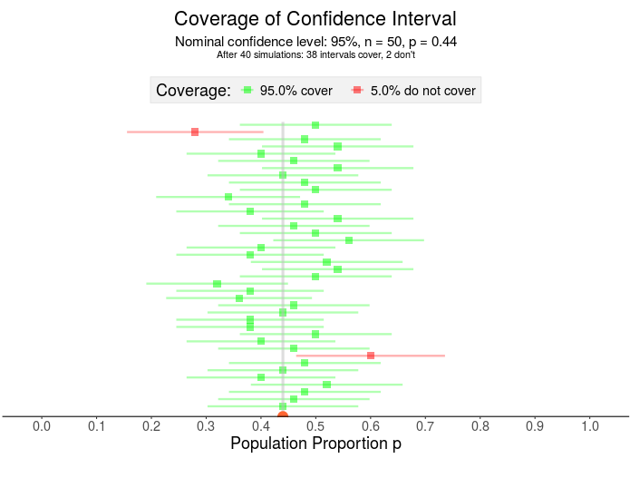

What if John Cena actually has 44% of the vote? Here, I’ve visualized 40 samples for which 38 contain that 44% Notice the confidence interval has two parts – the square in the middle represents the sample proportion and the horizontal line is the margin of error.

The Statistic, AKA “The Point Estimate”

The “statistic” is merely our estimate of the true parameter.

The statistic in the voting example is the sample percent from exit polls — the 46%. The actual percent of the population voting for John Cena – the parameter – is unknown until the polls close, so forecasters rely on sample values.

A sample mean is another example of a statistic – like the mean weight of an adult female panda. Using this statistic helps researchers avoid the hassle of traveling the world weighing all adult female pandas.

John Bazemore/AP

The Margin of Error

With confidence intervals, there’s a trade off between precision and accuracy: A wider interval may capture the true mean accurately, but it’s also less precise than a more narrow interval.

The width of the interval is decided by the margin of error because, mathematically, it is the piece that is added to and subtracted from the statistic to build the entire interval.

How do we calculate the margin of error? You have two main components — a t or z value derived from the confidence level,and the standard error. Unless you have control over the data collection on the front end, the confidence level is the only component you’ll be able to determine and adjust on the back end.
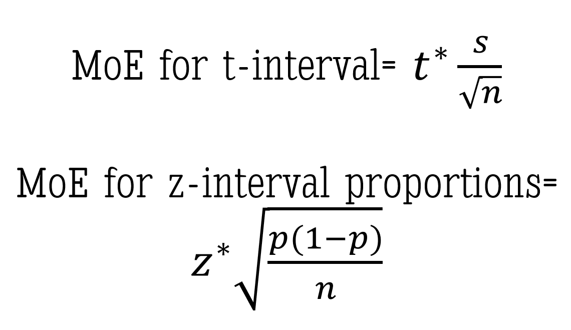
Two common Margin of Error (MoE) calculations

The confidence level

“Why can’t we just make it 100% confidence?” Great question! And one I’ve heard many times. Without going into the details of sampling distributions and normal curves, I’ll give you an example:

Assume the “average” adult female panda weighs “around 160 pounds.” To be 100% confident that we’ve created an interval that includes the TRUE mean weight, we’d have to use a range that includes all possible values of mean weights. This interval might be from, say 100 to 400 pounds – maybe even 50 to 1000 pounds. Either way, that interval would have to be ridiculously large to be 100% confident you’ve estimated the true mean. And with a range that wide, have you actually delivered any insightful message?

Again consider a confidence interval like a fishing net, the width of the net determined by the margin of error – more specifically, the confidence level (since that’s about all you have control over once a sample has been taken). This means a LARGER confidence level produces a WIDER net and a LOWER confidence level produces a more NARROW net (everything else equal).

For example: A 99% confidence interval fishing net is wider than a 95% confidence interval fishing net. The wider net catches more fish in the process.

But if the purpose of the confidence interval is to narrow down our search for the population parameter, then we don’t necessarily want more values in our “net”. We must strike a balance between precision (meaning fewer possibilities) and confidence.

Once a confidence level is established, the corresponding t* or z* value — called an upper critical value — is used in the calculation for the margin of error. If you’re interested in how to calculate the z* upper critical value for a 95% z-interval for proportions, check out this short video using the Standard Normal Distribution.

The standard error

This is the part of the margin of error you most likely won’t get to control.

Keeping with the panda example, if we are interested in the true mean weight for the adult female panda then the standard error is the standard deviation of the sampling distribution of sample mean weights. Standard error, a measure of variability, is based on a theoretical distribution of all possible sample means. I won’t get into the specifics in this post but here is a great video explaining the basics of the Central Limit Theorem and the standard error of the mean. 

If you’re using proportions, such as in our John Cena election example, here is my favorite video explaining the sampling distribution of the sample proportion (p-hat).
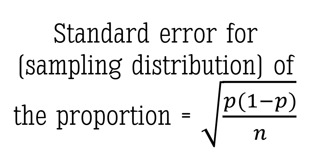
As I mentioned, you will most likely NOT have much control over the standard error portion of the margin of error. But if you did, keep this PRO TIP in your pocket: a larger sample size (n) will reduce the width of the margin of error without sacrificing the level of confidence.

The Interpretation

Back to the panda weights example here. Let’s assume we used a 95% confidence interval to estimate the true mean weight of all adult female pandas:

Interpreting the Interval

Typically the confidence interval is interpreted something like this: “We are 95% confident the true mean weight of an adult female panda is between 150 and 165 pounds.”

Notice I didn’t use the word probability. At all. Let’s look at WHY:

Interpreting the Level

The confidence level tells us:, “If we took samples of this same size over and over again (think: in the long run) using this same method, we would expect to capture the true mean weight of an adult female panda 95% of the time.” Notice this IS a probability. A 95% probability of capturing the true mean exists BEFORE taking the sample. Which is why I did NOT reference the actual interval values. A different sample would produce a different interval. And as I said in the beginning of this post, we don’t actually know if the true mean is in the interval we calculated.

Well then, what IS the probability that my confidence interval – the one I calculated between the values of 150 and 165 pounds – contains the true mean weight of adult female pandas? Either 1 or 0. It’s either there, or it isn’t. Because — and here’s the tricky part — the sample was already collected before we did the math. NOTHING in the math can change the fact that we either did or didn’t collect a representative sample of the population. OUR CONFIDENCE IS IN THE DATA COLLECTION METHOD – not the math.

The numbers in the confidence interval would be different using a different sample.

Visualizing the Confidence Interval

Let’s assume the density curve below represents the actual population mean weights of all adult female pandas. In this made up example the mean weight of all adult pandas is 156.2 pounds with a population standard deviation of 13.6 pounds.

Beneath the population distribution are the simulation results of 300 samples of n = 20 pandas (sampled using an identical sampling method each time). Notice that roughly 95% of the intervals cover the true mean — capturing 156.2 within the interval (the green intervals) while close to 5% of intervals do NOT capture the 156.2 (the red intervals).
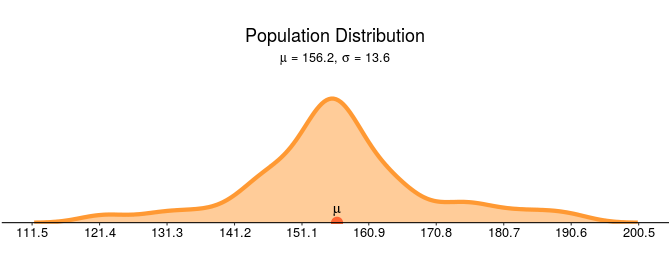
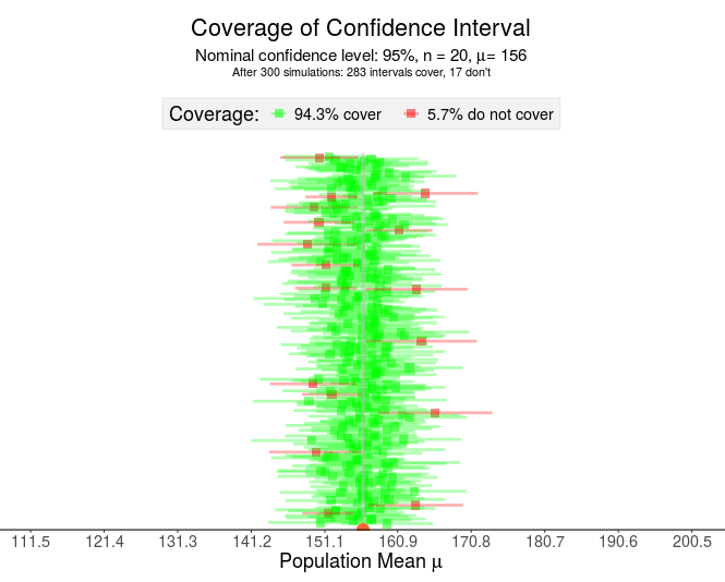
Pay close attention to the points made by the visualization above:

  • Each horizontal line represents a confidence interval constructed from a different sample
  • The green lines “capture” or “cover” the true (unknown) mean while the red lines do NOT cover the mean.
  • If this was a real situation, you would NOT know if your interval contained the true mean (green) or did not contain the true mean (red).

The logic of confidence intervals is based on long-run results — frequentist inference. Once the sample is drawn, the resulting interval either does or doesn’t contain the true population parameter — a probability of 1 or 0, respectively. Therefore, the confidence level does not imply the probability the parameter is contained in the interval. In the LONG run, after many samples, the resulting intervals will contain the mean C% of the time (where C is your confidence level).

So in what are we placing our confidence when we use confidence intervals? Our confidence is in the procedures used to find our sample. Any sampling bias will affect the results – which is why you don’t want to use confidence intervals with data that may not represent the population.

The Box-and-Whisker Plot For Grown-Ups: A How-to

Author’s note: This post is a follow-up to the webinar, Percentiles and How to Interpret a Box-and-Whisker Plot, which I created with Eva Murray and Andy Kriebel. You can read more on the topic of percentiles in my previous posts.

No, You Aren’t Crazy.

That box-and-whisker plot (or, boxplot) you learned to read/create in grade school probably IS different from the one you see presented in the adult world.

versions

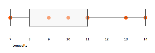
The boxplot on the top originated as the Range Bar, published by Mary Spear in the 1950’s. While the boxplot on the bottom was a modification created by John Tukey to account for outliers. Source: Hadley Wickham

As a former math and statistics teacher, I can tell you that (depending on your state/country curriculum and textbooks, of course) you most likely learned how to read and create the former boxplot (or, “range bar”) in school for simplicity. Unless you took an upper-level stats course in grade school or at University, you may have never encountered Tukey’s boxplot in your studies at all.

You see, teachers like to introduce concepts in small chunks. While this is usually a helpful strategy, students lose when the full concept is never developed. In this post I walk you through the range bar AND connect that concept to the boxplot, linking what you’ve learned in grade school to the topics of the present.

The Kid-Friendly Version: The Range Bar

In this example, I’m comparing the lifespans of a small, non-random set of animals. I chose this set of animals based solely on convenience of icons. Meaning, conclusions can only be drawn on animals for which Anna Foard has an icon. I note this important detail because, when dealing with this small, non-random sample, one cannot infer conclusions on the entire population of all animals.

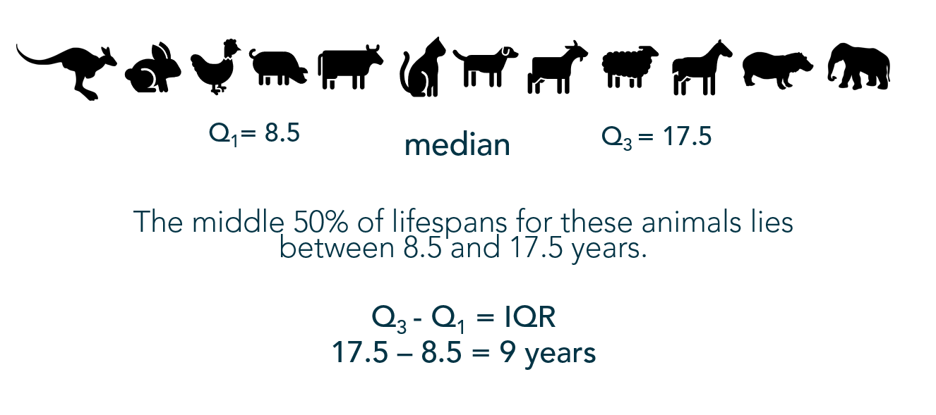
1) Find the quartiles, starting with the median

Quartiles break the dataset into 4 quarters. Q1, median, Q3 are (approximately) located at the 25th, 50th, and 75th percentiles, respectively.

Finding the median requires finding the middle number when values are ordered from least to greatest. When there is an even number of data points, the two numbers in the middle are averaged.

median
Here the median is the average of the cat and dog’s longevity. NOTE: If, with an even set of values the two in the middle were different, the lower of the two values would be in the 50th percentile and would not be the same measure as the median.

Once the median has been located, find the other quartiles in the same way: The middle value in the bottom set of values (Q1), then the middle value in the top set (Q3).

quartiles
Here we can easily see when quartiles don’t match up exactly with percentiles: Even thought Q1 = 8.5, the duck (7) is in the 25th percentile while the pig is above the 25th percentile. And the sheep is in the 75th percentile despite the value of 17.5 at Q3.

2) Use the Five Number Summary to create the Range Bar

The first and third quartiles build the “box”, with the median represented by a line inside the box. The “whiskers” extend to the minimum and maximum values in the dataset:

range bar

But without the points:

animal box no points

The Range Bar probably looks similar to the first box-and-whisker plot you created in grade school. If you have children, it is most likely the first version of the box-and-whisker plot that they will encounter.

school example
from elementary school Pinterest

Suggestion:

Since the kid’s version of the boxplot does not show outliers, I propose teachers call this version, “The Range Bar” as it was originally dubbed, to not confuse those reading the chart. After all, someone looking at this version of a boxplot may not realize it does not account for outliers and may draw the wrong conclusion.

The Adult Version: The Boxplot

The only difference between the range bar and the boxplot is the view of outliers. Since this version requires a basic understanding of the concept of outliers and a stronger mathematical literacy, it is generally introduced in a high school or college statistics course.

1) Calculate the IQR

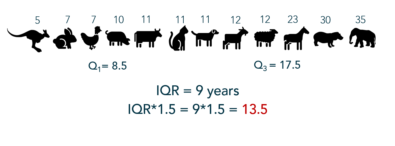
The interquartile range is the difference, or spread, between the third and first quartile reflecting the middle 50% of the dataset. The IQR builds the “box” portion of the boxplot.

IQR 2

2) Multiply the IQR by 1.5

IQR

3) Determine a threshold for outliers – the “fences”

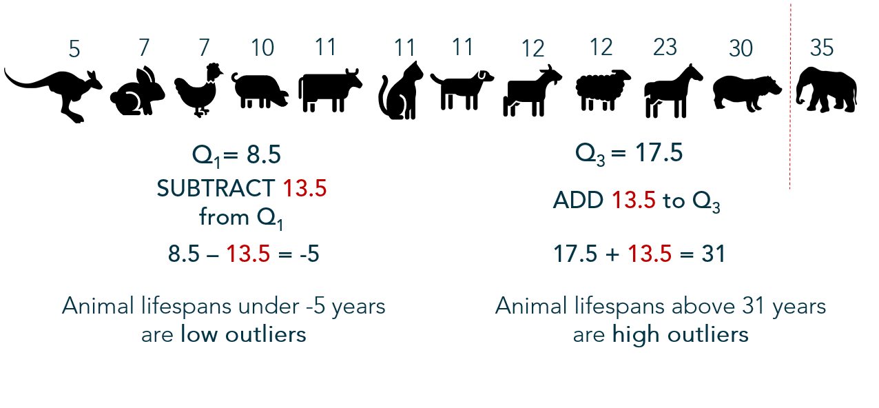
1.5*IQR is then subtracted from the lower quartile and added to the upper quartile to determine a boundary or “fences” between non-outliers and outliers.

IQR 1

4) Consider values beyond the fences outliers

outliers

Since no animals’ lifespans are below -5 years, it is not possible for a low-value outlier in this particular set of data; however, one animal in this dataset lives beyond 31 years – an outlier in higher values.

5) Build the boxplot

Here we find the modification on the “range bar” – the whiskers only extend as far as non-outlier values. Outliers are denoted by a dot (or star).

boxplot 12
The adult version also allows us to apply technology, so I left the points in the view to enhance the distribution’s view.

Advantage: Boxplot

In an academic setting, I use boxplots a great deal. When teaching AP Statistics, they are helpful to visualize the data quickly by hand as they only require summary statistics (and outliers). They also help students compare and visualize center, spread, and shape (to a degree).

When we get into the inference portion of AP Stats, students must verify assumptions for certain inference procedures — often those procedures require data symmetry and/or absence of outliers in a sample. The boxplot is a quick way for a student to verify assumptions by hand, under time constraints. When coaching doctoral candidates through the dissertation stats, similar assumptions are verified to check for outliers — using boxplots.

TI83plus
My portable visualization tool

Boxplot Advantages:

  • Summarizes variation in large datasets visually
  • Shows outliers
  • Compares multiple distributions
  • Indicates symmetry and skewness to a degree
  • Simple to sketch
  • Fun to say

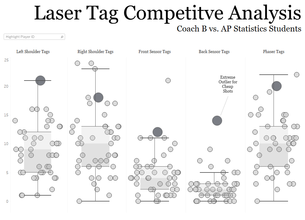
laser tag competitive analysis
I took my students on a field trip to play laser tag. Here, boxplots help compare the distributions of tags by type AND compare how Coach B measures up to the students.


So What Could Go Wrong?

Unfortunately, boxplots have their share of disadvantages as well.

Consider:

A boxplot may show summary statistics well; however, clusters and multimodality are hidden.

In addition, a consumer of your boxplot who isn’t familiar with the measures required to construct one will have difficulty making heads or tails of it. This is especially true when your resulting boxplot looks like this:

example q2 and q3 equal
The median value is equal to the upper quartile. Would someone unfamiliar recognize this?

Or this:

example no upper
The upper quartile is the maximum non-outlier value in this set of data.

Or what about this?

example no whiskers
No whiskers?! Dataset values beyond the quartiles are all outliers.


Boxplot Disadvantages:

  • Hides the multimodality and other features of distributions
  • Confusing for some audiences
  • Mean often difficult to locate
  • Outlier calculation too rigid – “outliers” may be industry-based or case-by-case

Variations

Over the course of the years, multiple boxplot variations have been created to display parts (or all) of the distribution’s shape and features.

no whisker
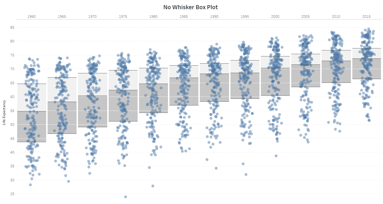
No Whisker Box Plot Source: Andy Kriebel

Going For It

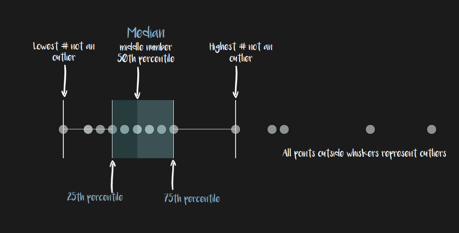
Box-and-whisker plots may be helpful for your specific use case, though not intuitive for all audiences. It may be helpful to include a legend or annotations to help the consumer understand the boxplot.

boxplot overview

Check Yourself: Ticket out the Door

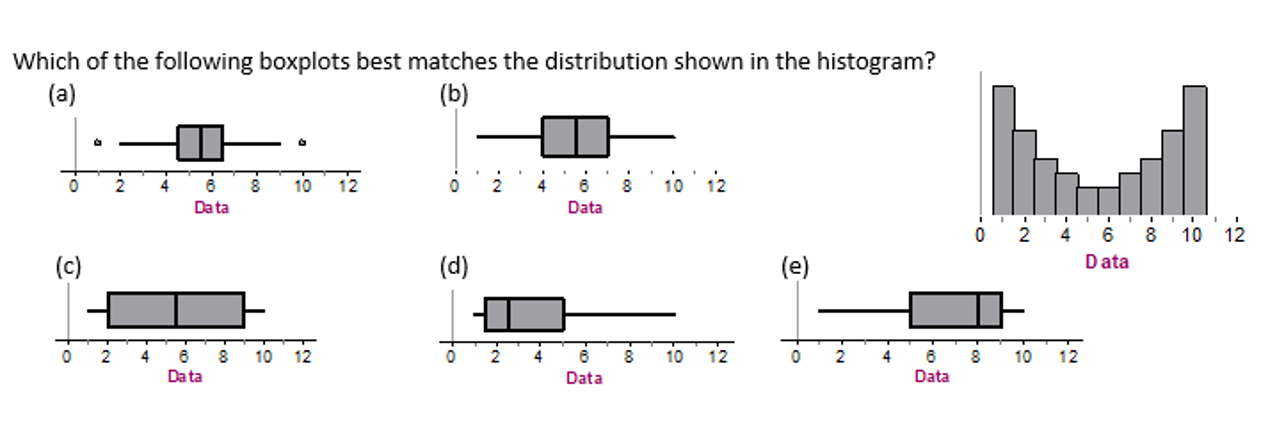
No cheating! Without looking back through this post, check your own understanding of boxplots. Answer can be found on the #MakeoverMonday webinar I recorded with Eva Murray a couple weeks ago.

data quiz

Cartoon Source: xkcd

How to Build a Cumulative Frequency Distribution in Tableau

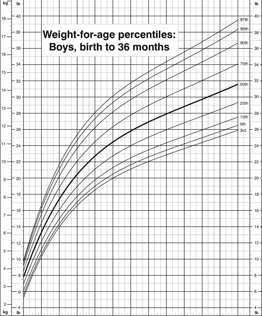
When my oldest son was born, I remember the pediatrician using a chart similar to the one below to let me know his height and weight percentile. That is, how he measured up relative to other babies his age. This is a type of cumulative relative frequency distribution. These charts help determine relative position of one data point to the rest of the dataset, showing an accumulating percent of observations for each value. In this case, the chart helps determine how a child is growing relative to other babies his age.


boys percentile
Source: CDC

I decided to figure out how to create one in Tableau. Based on the types of cumulative frequency distributions I was used to when I taught AP Stats, I first determined I wanted the value of interest on the horizontal axis and the percents on the vertical axis.

Make a histogram

Using a simple example – US President age at inauguration – I started with a histogram so I could look at the overall shape of the distribution:

histogram pills

age of presidents histogram

Adjust bin size appropriately

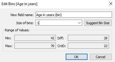
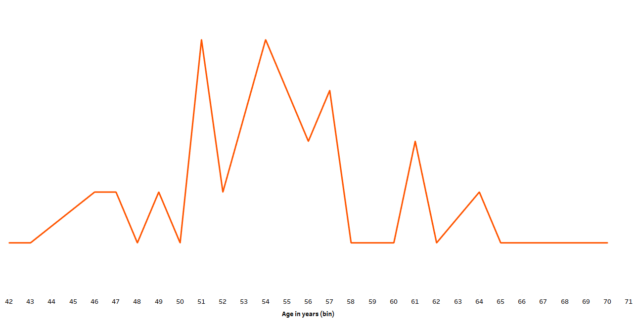
From here I realized I already had what I needed in my view – discrete ages on the x-axis and counts of ages on the y-axis. For a wider range of values I would want a wider bin size, but in this situation I needed to resize bins to 1, representing each individual age.

age bins

age of presidents histogram bin 1

Change the marks from bars to a line

age line

Create a table calculation

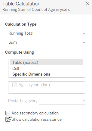
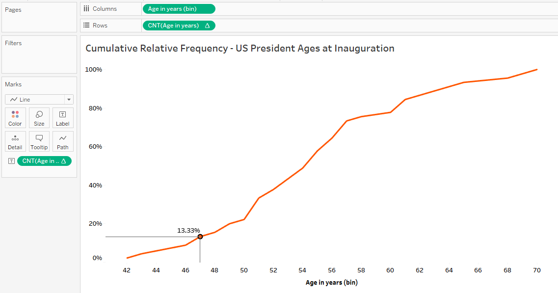
Click on the green pill on the rows (the COUNT) and add a table calculation.

table calc freq dist

Actually, TWO table calculations

First choose “Running Total”, then click on the box “add secondary calculation”:

table calcs 1

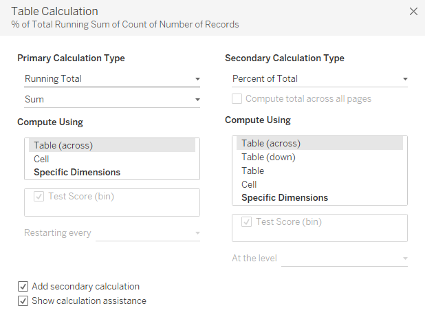
Next, choose “percent of total” as the secondary calculation:

table calcs

Polish it up

Add drop lines…

drop lines

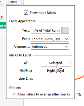
…and CTRL drag the COUNT (age in years) green pill from the rows to labels. Click on “Label” on the marks card and change the marks to label from “all” to “selected”.

label


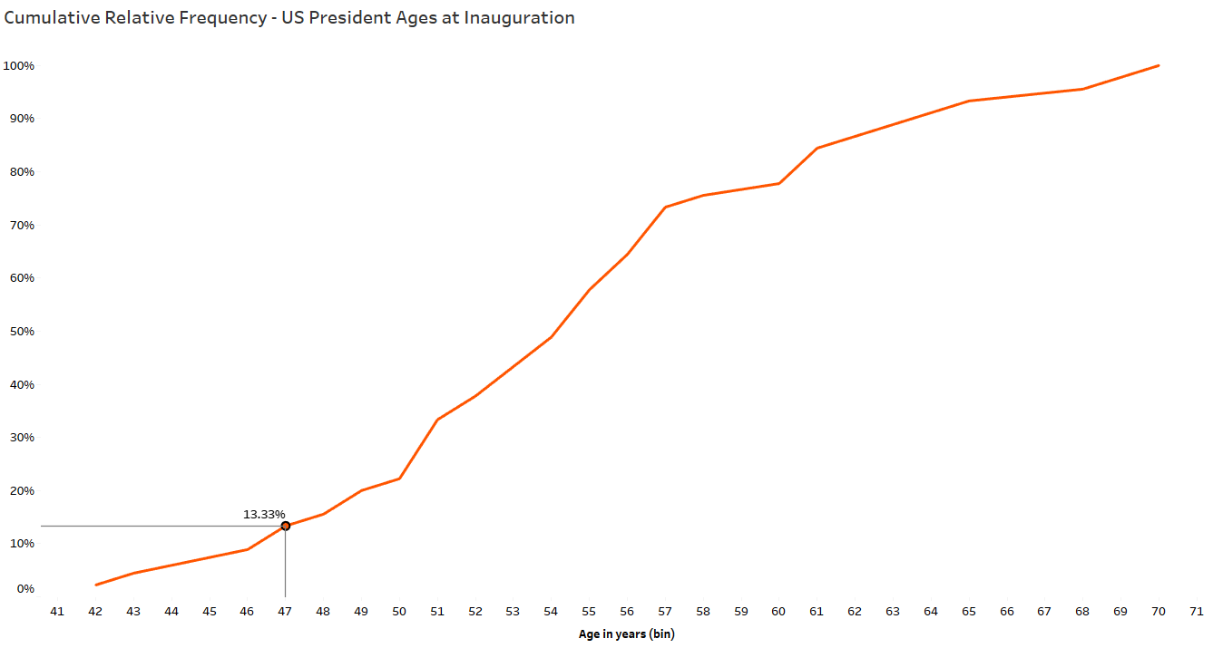
And there you have it.

full graph 2

Interpreting percentiles

Percentiles describe the position of a data point relative to the rest of the dataset using a percent. That’s the percent of the rest of the dataset that falls below the particular data point. Using the baby weights example, the percentile is the percent of all babies of the same age and gender weighing less than your baby.

Back to the US president example.

Since I know Barack Obama was 47 when inaugurated, let’s look at his age relative to the other US presidents’ ages at inauguration:

obama point
13.3% of US presidents were younger than Barack Obama when inaugurated.                           Source: The Practice of Statistics, 5th Edition

And another way to look at this percentile: 87% of US presidents were older than Barack Obama when inaugurated.

Thank you for reading and have an amazing day!

-Anna

The Ways of Means

As a follow-up to last week’s webinar with Andy Kriebel and Eva Murray, I’ve put together just a few common examples of means other than the ubiquitous arithmetic mean. A great deal of work on each of these topics can be found throughout the interwebs if your Googling fingers get itchy.

The Weighted Mean

My favorite of all the means. Sometimes called expected value, or the mean of a discrete random variable.

Grades

When computing a course grade or overall GPA, the weighted mean takes into account each possible outcome and how often that outcome occurs in a dataset. A weight is applied to each possible outcome — for example, each type of grade in a course — then added together to return the overall weighted mean. And since Econ was my favorite course in college…

syllabus

If you have an exam average of 80, quiz/homework average of 65 and lab average of 78, what is your final grade? (Hint: Don’t forget to change percentages to decimals.)

grades
If your professor’s software is forgiving, that’s a 76.

Vegas

Weighted means are also effective for assessing risk in insurance or gambling. Also known as the expected value, it considers all possible outcomes of an event and the probability of each possible outcome. Expected values reflect a long-term average. Meaning, over the long run, you would expect to win/lose this amount. A negative expected value indicates a house advantage and a positive expected value indicates the player’s advantage (and unless you have skills in the poker room, the advantage is never on the player’s side). An expected value of $0 indicates you’ll break even in the long-run.

I’ll admit my favorite casino game is American roulette:

Casino complete table with roulette and chips, 3d render

As you can see, the “inside” of the roulette table contains numbers 1-36 (18 of which are red, the other 18 black). But WAIT! Here’s how they fool you — see the numbers “0” and “00”? 0 and 00 are neither red nor black, though they do count towards the 38 total outcomes on the roulette board. When the dealer spins the wheel, a ball bounces around and chooses from numbers 1 thru 36, 0 AND 00 — that’s 38 possible outcomes.

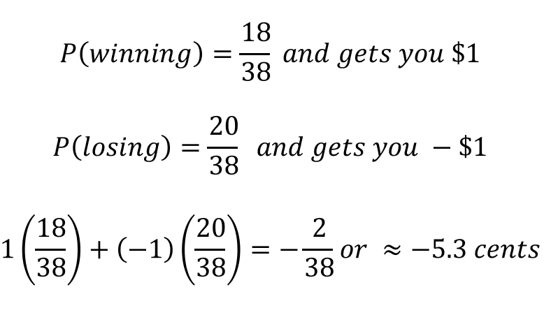
Let’s say you wager $1 on “black”. And if the winning number is, in fact, black, you get your original dollar AND win another (putting you “up” $1). Unsuspecting victims new to the roulette table think they have a 50/50 shot at black; however, the probability of “black” is actually 18/38 and the probability of “not black” is 20/38″.

Here’s how it breaks down for you:

roulette table math

Just as in the grading example, each outcome (dollars made or lost) is first multiplied by its weight, where the weight here is the theoretical probability assigned to that outcome. After multiplying, add each product (outcome times probability) together. Note: Don’t divide at the end like you’d do for the arithmetic mean – it’s a common mistake, but easy to remedy if you check your work.

Some Gambling Advice: The belief that casino games adhere to some “law of averages” in the short run is called the Gambler’s Fallacy. Just because the ball on the roulette wheel landed on 5 red numbers in a row doesn’t mean it’s time for a black number on the next spin! I watched a guy lose $300 on three spins of the wheel because, as he exclaimed, “Every number has been red It’s black’s turn! It’s the law of averages!”

The Geometric Mean

A Geometric mean is useful when you’re looking to average a factor (multiplier) applied over time – like investment growth or compound interest.

investments

I enjoyed my finance classes in school, especially the part about how compound interest works. If you think about compound interest over time, you may recall the growth is exponential, not linear. And exponential growth indicates that in order to grow from one value to the next, a constant was multiplied (not added).

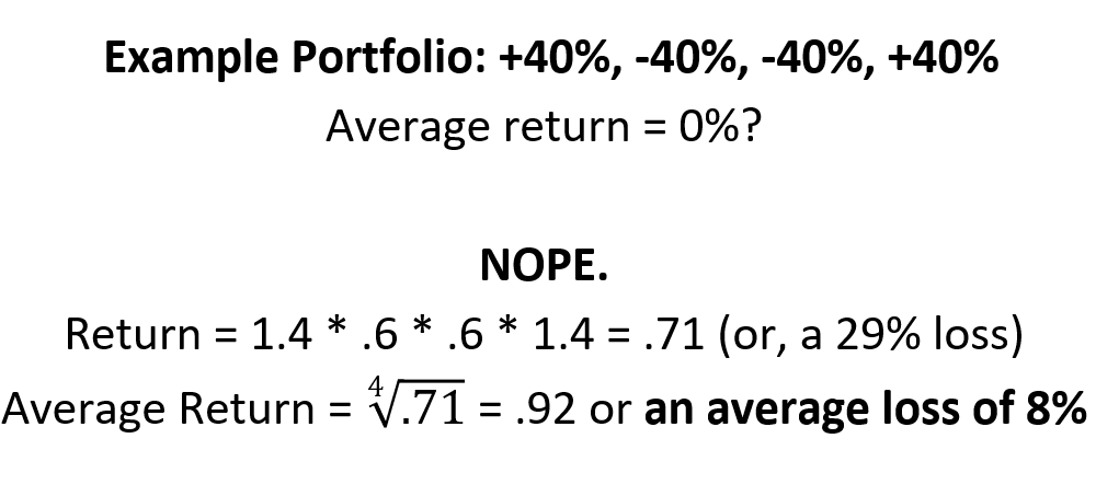
As a basic example, let’s say you invest $100,000 at the beginning of 4 years. For simplicity, let’s say the growth rate followed the pattern +40%, -40%, +40%, -40% over the 4 years. At the end of 4 years, you’ve got $70,560 left.

excel growth

So you know your 4-year return on the investment is: (70,560 – 100,000)/100,000 = -.2944 or -29.44%. But if you averaged out the 4 growth rates using the arithmetic mean, you’d have 0%. Which is why the arithmetic mean doesn’t make sense here.

Instead, apply the geometric mean:

geometric mean calc
Note: Multiplying by .4 (or -.4) only returns the amount gained (or lost). Multiplying by 1.4 (or .6) returns the total amount, including what was gained (or lost).

The Harmonic Mean

You drive 60 mph to grandma’s house and 40 mph on the return trip. What was your average speed?

grandma

Let’s dust off that formula from physics class: speed = distance/time

Since the speed you drive plays into the time it takes to cover a certain distance, that formula may clue you in as to why you can’t just take an arithmetic mean of the two speeds. So before I introduce the formula for harmonic mean, I’ll combine those two trips using the formula for speed to determine the average speed.

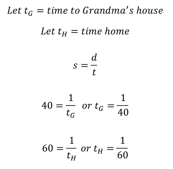
The set-up Distance doesn’t matter here so we’ll use 1 mile. Feel free to use a different distance to verify, but you’d be reducing fractions a good bit along the way and I’m all about efficiency. Use a distance of 1 mile for each leg of the journey and the two speeds of 40mph and 60 mph.

First determine the time it takes to go 1 mile by reworking the speed formula:

harmonic mean calcs 1

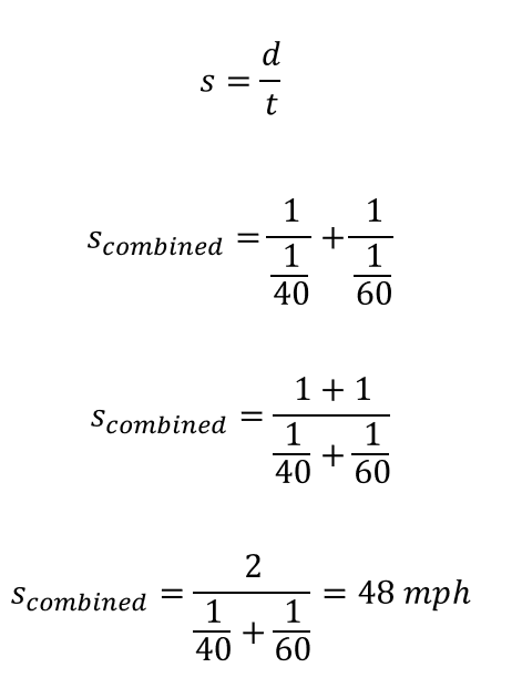
To determine the average speed, we’ll combine the two legs of the trip using the speed formula (which will return the overall, or average, speed of the entire trip):

harmonic mean calcs 2
If, instead of driving equal distances, you were looking for the average speed it took you to drive two equal amounts of time, the arithmetic mean WOULD be useful.

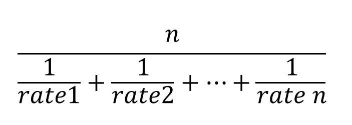
The formula for the harmonic mean looks like this:

harmonic mean

Where n is the number of 1-mile trips, in this example, and the rates are 40 and 60 mph:

harmonic mean calcs 3

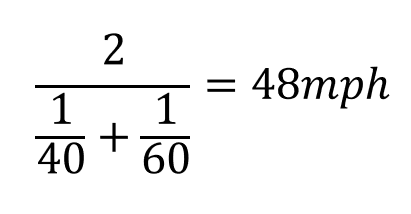
If you scroll up and check out that last step using the speed formula (above), you’ll see the harmonic mean formula was merely a clean shortcut.

qed.jpeg

If you want more information about measures of center, check out the previous blog post — Mean, Median, and Mode: How Visualizations Help Measure What’s Typical

If your organization is looking to expand its data strategy, fix its data architecture, implement data visualization, and/or optimize using machine learning, check out Velocity Group.

Mean, Median, and Mode: How Visualizations Help Find What’s “Typical”

I was a high school math and statistics teacher for 14 years. And my stats course always began by visualizing the distribution of a variable using a simple chart or graph. One variable at a time we’d focus on creating, interpreting, and describing appropriate graphs. For quantitative variables, we’d use histograms or dot plots to discuss the distribution’s specific physical features. Why? Data visualization helps students draw conclusions about a population using sample data than summary statistics alone.

This post aims to review the basics of how measures of central tendency — mean, median, and mode — are used to measure what’s typical. Specifically, I’ll show you how to inspect distributions of variables visually and dissect how mean, median, and mode behave, in addition to common ways they are used. Ultimately it may be difficult, impossible, or misleading to describe a set of data using one number; however, I hope this journey of data exploration helps you understand how different types of data can effect how we describe what’s typical.

Remember Middle School?

Fair enough — I too try to forget the teased hair and track suit years. But I do recall learning to calculate mean, median, mode, and range for a set of numbers with no context and no end game. The math was simple, yet painfully boring. And I never fully realized we were playing a game of Which One of These is Not Like the Other.

worksheet
middle school worksheet, recreated…why range tho?

It wasn’t until my first college stats course that I realized descriptive statistics serve a purpose – to attempt to summarize important features of a variable or dataset. And mean, median, mode – the measures of central tendency – attempt to summarize the typical value of a variable. These measures of typical may help us draw conclusions about a specific group or compare different groups using one numerical value.

To check off that middle school homework, here’s what we were programmed to do:

Mean: Add the numbers up, divide by the total number of values in the set. Also known as the arithmetic mean and informally called the “average”.

Median: Put the numbers in order from least to greatest (ugh, the worst part) and find the middle number. Oh, there’s two middle numbers? Average them. Did you leave out a number? Start over.

Mode: The number(s) that appear the most.

Repeat until you finish the worksheet.

Because we arrive at mean, median, and mode using different calculations, they summarize typical in different ways. The types of variables measured, the shape of the distribution, the context, and even the size of the set of data can alter the interpretation of each measure of central tendency.

Visually Inspecting Measures of Typical

What do You Mean When You Say, “Mean”?

We’re programmed to think in terms of an arithmetic mean, often dubbed the average; however, the geometric and harmonic means are extremely useful and worth your time to learn. Furthermore, when you want to weigh certain values in a dataset more than others, you’ll calculate a weighted mean. But for simplicity of this post, I will only use the arithmetic mean when I refer to the “mean” of a set of values.

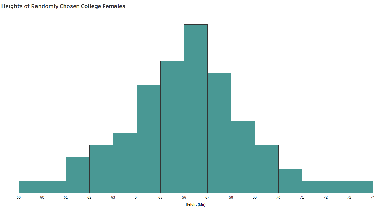
Think of the mean as the balancing point of a distribution. That is, imagine you have a solid histogram of values and you must balance it on one finger. Where would you hold it? For all symmetric distributions the balancing point – the mean – is directly in the center.

female heights
I completely made these up

The Median

Just like the median in the road (or, “neutral ground” if you’re from Louisiana), the median represents that middle value, cutting the set of values in half — 50% of the data values fall below and 50% lie above the median. No matter the shape of the distribution, the median is the measure of central tendency reflecting the middle position of the data values.

The Mode(s)

The mode describes the value or category in a set of data that appears the most often. The mode is specifically useful when asking questions about categorical (qualitative) variables. In fact, mode is the only appropriate measure of typical for categorical variables. For example: What is the most common college mascot? What type of food do college students typically eat? Where are most 4+ Year colleges and universities located?

most colleges labelled
Note: Bar charts don’t have a “shape”, though it is easy to confuse a bar chart with a histogram at first glance. Source: US Dept of Education

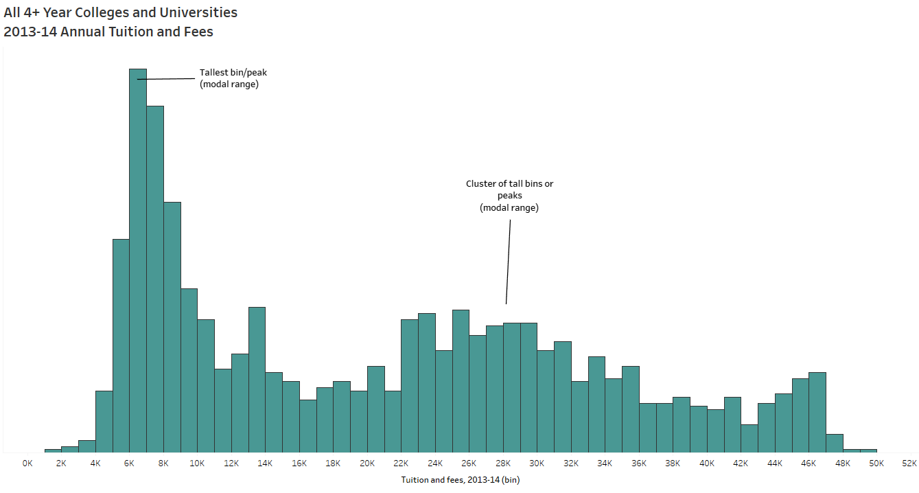
Modes are also used to describe features of a distribution. In large sets of quantitative data, values are binned to create histograms. The taller “peaks” of the histogram indicate where more common data values cluster, called modes. A cluster of tall bins is sometimes called a modal range. A histogram having one tall peak is called unimodal while two peaks is referred to as bimodal. Multiple peaks = multimodal.

tuition modes
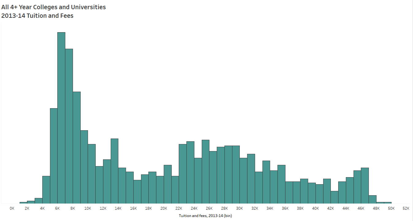
Example of a bimodal, possibly multimodal, distribution. Source: US Department of Education, 2013

You may notice multiple tall peaks of varying heights in one histogram — despite some bins (and clusters of bins) containing fewer values, they are often described as modes or modal ranges since they contain local maximums.

When the Mean and the Median are Similar

female heights labeled
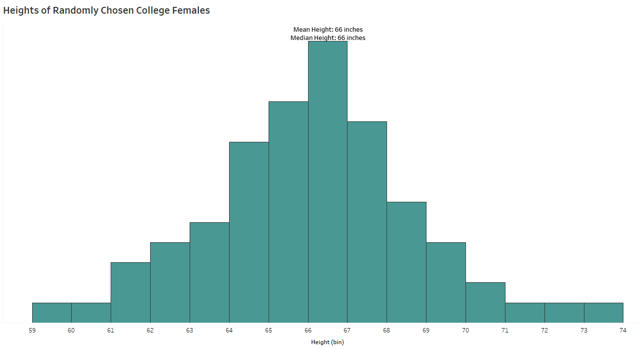
The shape of this distribution of female’s heights is symmetric and unimodal. Often called bell-shaped, Gaussian, or approximately normal.

The histogram above shows a distribution of heights for a sample of college females. The mean, median, and mode of this distribution are equal at about 66.5 inches. When the shape of the distribution is symmetric and unimodal, the mean, median, and mode are equal.

Now I want to see what happens when I add male heights into the histogram:

all college heights
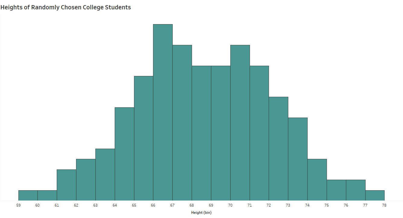
This distribution of heights of college students is symmetric and bimodal.

This histogram shows the distribution of heights of both male and female college students. It is symmetric, so the mean and median are equal at about 68.5 inches. But you’ll notice two peaks, indicating two modal ranges — one from 66 – 67 inches and another from 70 – 71 inches.

Do the mean and median represent the typical college student height when we are dealing with two distinctly different groups of students?

When the Mean and the Median Differ

In a skewed distribution, the median remains the center of the values; however, the mean is pulled away from the median from extreme values and outliers.

enrollment
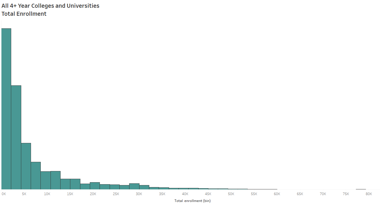
The distribution of enrollment for all 4+ year U.S. colleges and universities is strongly skewed to the right. Source: US Dept of Education, 2013

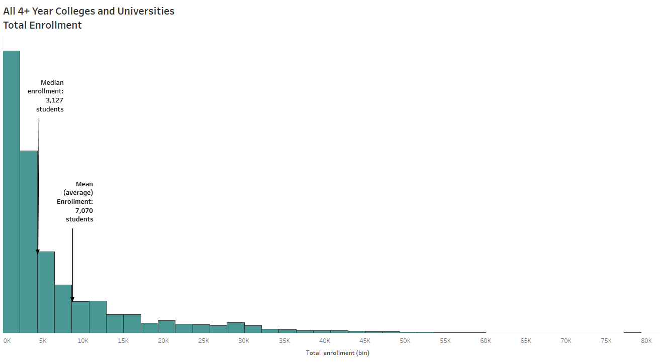
For example, the histogram above shows the distribution of college enrollment numbers in the United States from 2013. The shape of the distribution is skewed to the right — that is, most colleges reported enrollment below 5,000 students. However, the “tail” of the distribution is created by a small number of larger universities reporting much higher enrollment. These extreme outlying values pull the mean enrollment to the right of the median enrollment. 

enrollment labelled
A skewed right distribution – the mean is pulled away from the median, to the right.

Reporting an average enrollment of 7,070 students for colleges in 2013 exaggerates the typical college enrollment since most US colleges and universities reported enrollment under 5,000 students.

The median, on the other hand, is resistant to outliers since it is based on position relative to the rest of the data. The median helps you conclude that half of all colleges enrolled fewer than 3,127 students and half of the colleges enrolled more than 3,127 students.

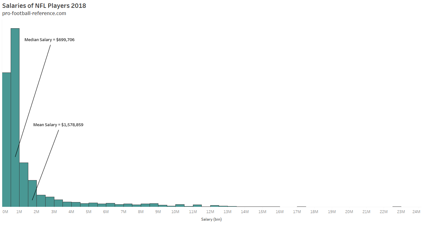
Depending on your end goal and context, median may provide a better measure of typical for skewed set of data. Medians are typically used to report salaries and housing prices since these distributions include mostly moderate values and fewer on the extremely high end. Take a look at the salaries of NFL players, for example:

nfl salaries with labels
The salary distribution of NFL players in 2018 is strongly skewed to the right.

Are we to only report medians for skewed distributions?

  • The median is not a good description of typical for a very small dataset (eg, n<10, depending on context).
  • The median is helpful when you want to ignore (or lessen effects of) outliers. Of course, as Daniel Zvinca* points out, your data could contain significant outliers that you don’t want to ignore.

average cartoon 2

In school, our grades are reported as means. However, students’ grade distributions can be symmetric or skewed. Let’s say you’re a student with three test grades, 65, 68, 70. Then you make a 100 on the fourth test. The distribution of those 4 grades is skewed to the right with a mean of 75.8 and median of 69. Despite the shape of the distribution, you may argue for the mean in this situation. On the other hand, if you scored a 30 on the fourth test instead of 100, you’d argue for the median. With only 4 data points, the median is not a good description of typical so here’s hoping you have a teacher who understands the effects of outliers and drops your lowest test score.

Inserting my opinion: As a former teacher, I recognize that when averaging all student grades from an assignment or test, the result is often misleading. In this case, I believe the median is a better description of the typical student’s performance because extreme values usually exist in a class set of grades (very high or very low) and will affect the calculation of the mean. After each test in AP statistics, I would post the mean, median, 5 number summary and standard deviation for each class. It didn’t take long for students to draw the same conclusion.

Ultimately, context can guide you in this decision of mean versus median but consider the existence of outliers and the distribution shape.

Using Modality to Find the Story

By investigating a distribution’s physical features, students are able to connect the numbers with a story in the data. In quantitative data, unusual features can include outliers, clusters, gaps and “peaks”. Specifically, identifying causes of the multimodality of a distribution can build context behind the metrics you report.

all tuition
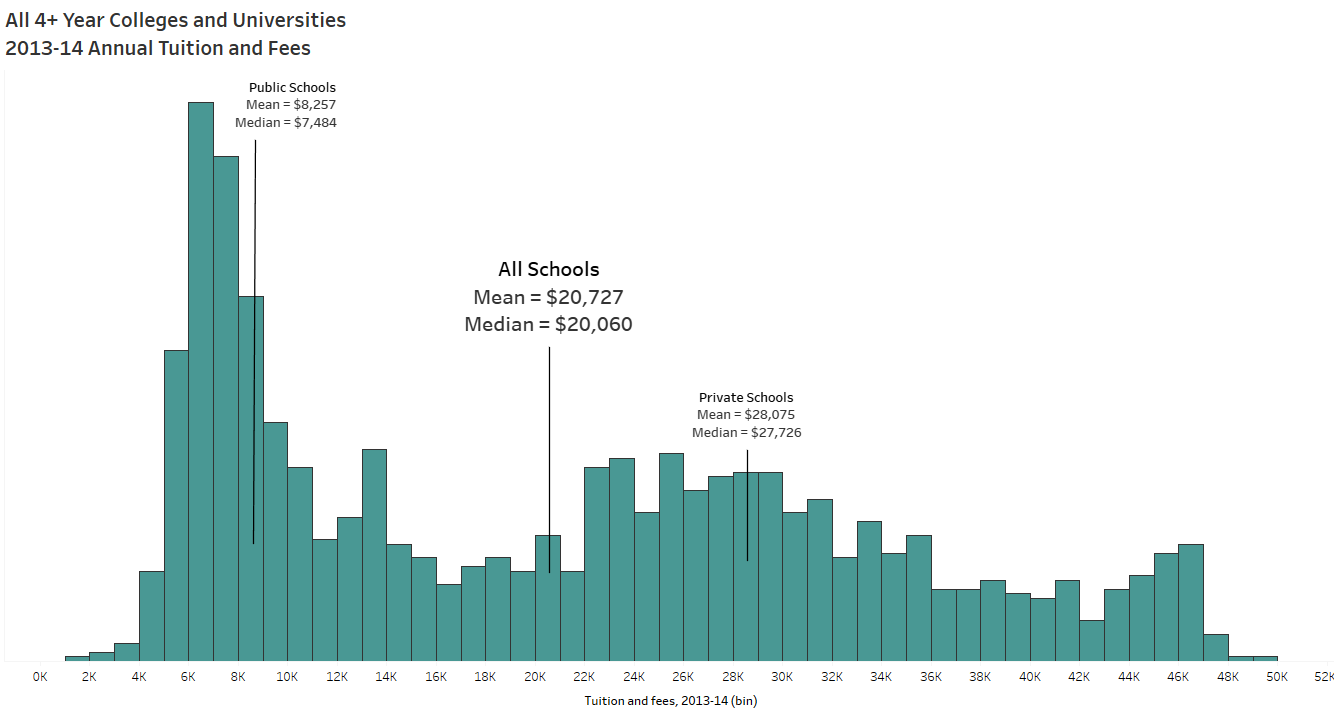
This histogram of college tuition for all 4+ year colleges in 2013 two distinct “peaks”. Although the peaks are not equal in height, they tell a story. Source: US Dept of Education

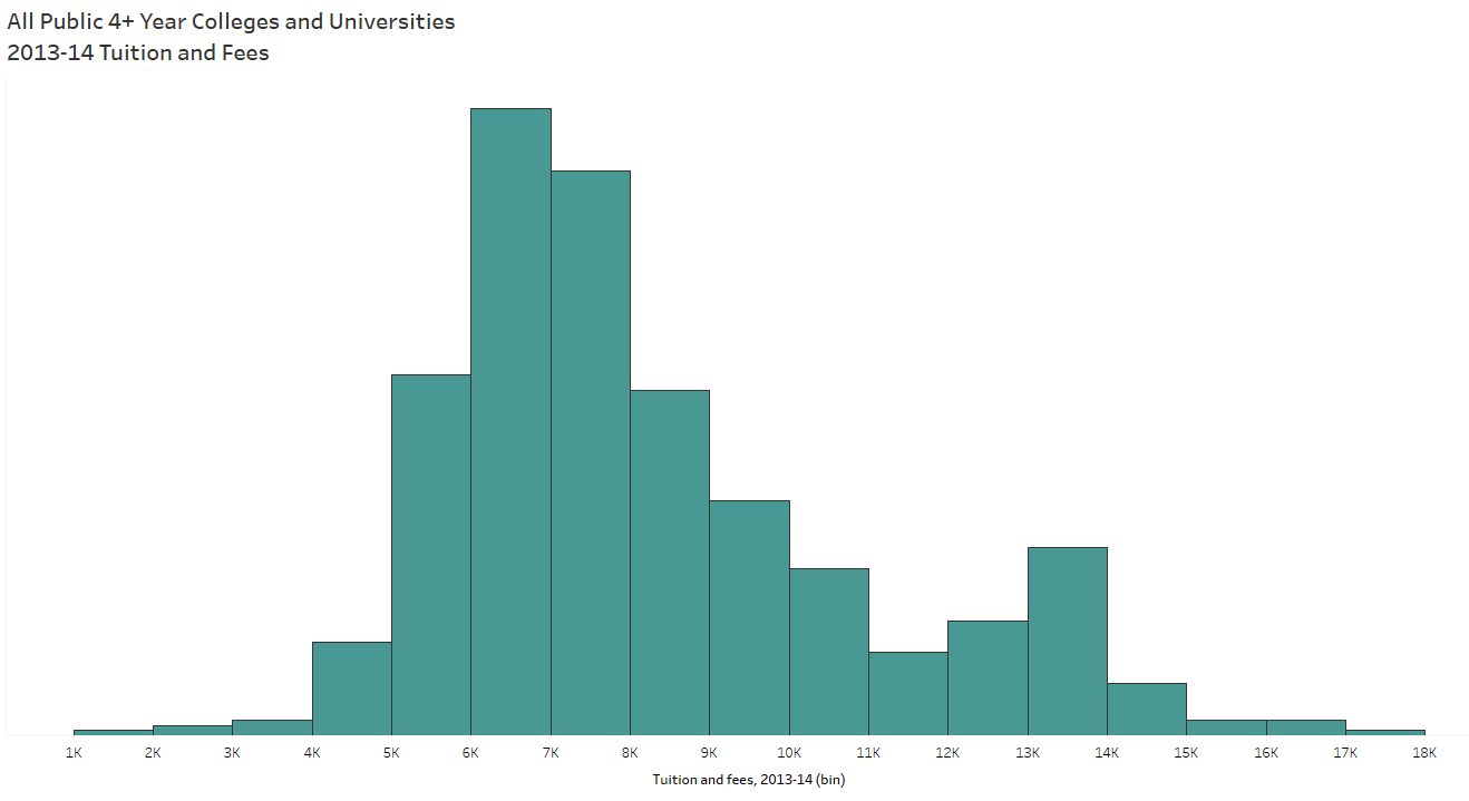
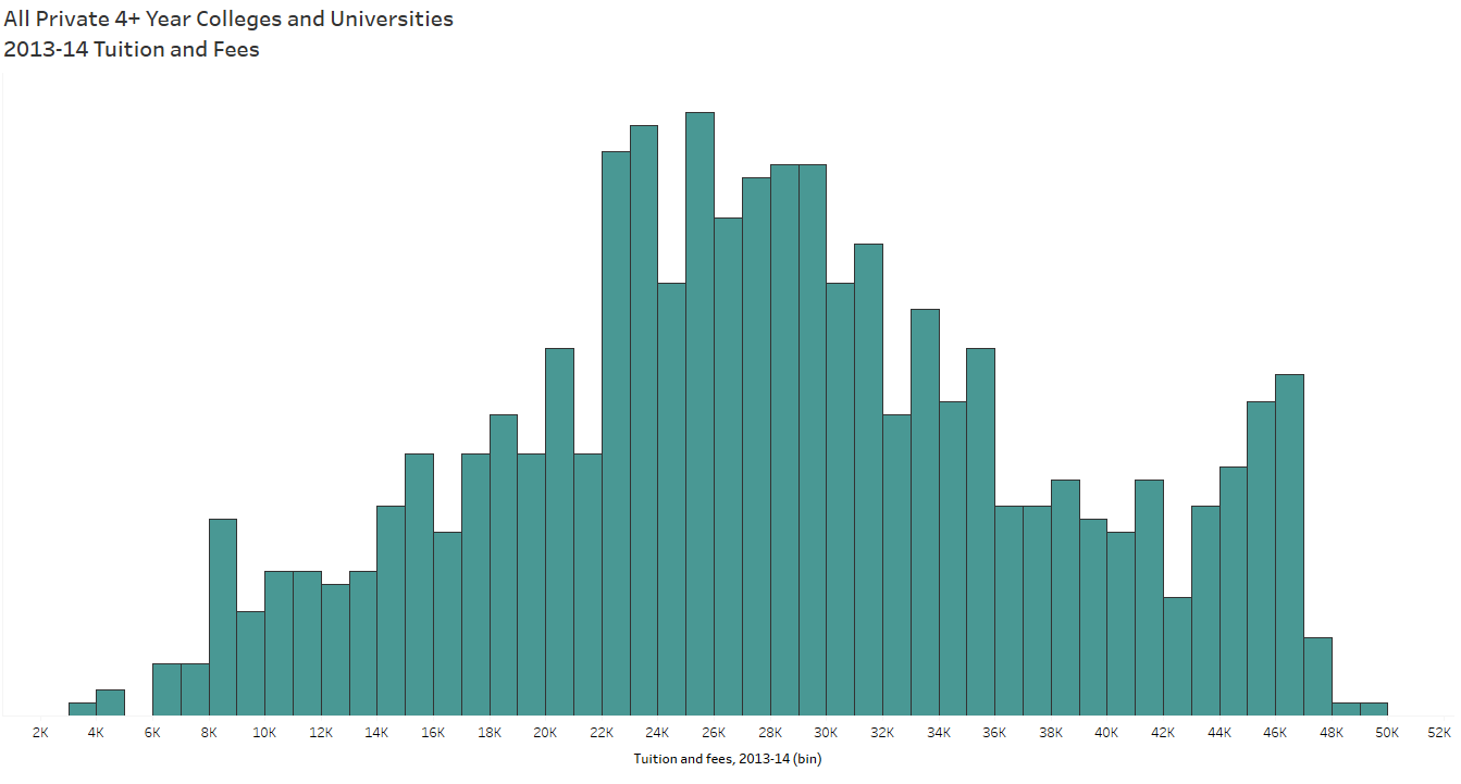
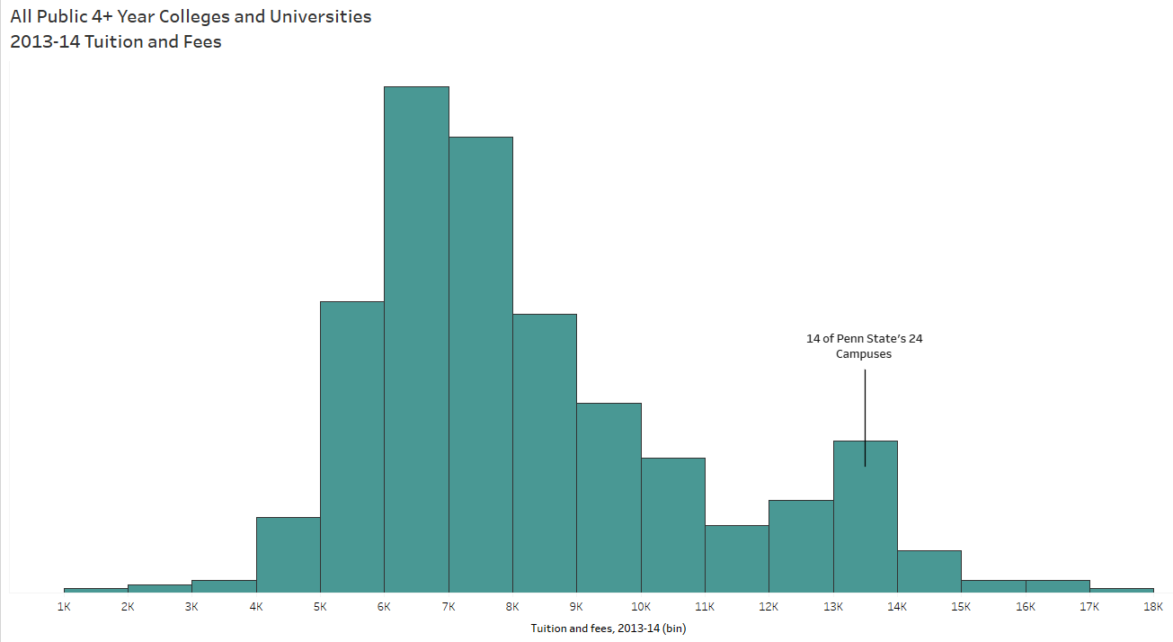
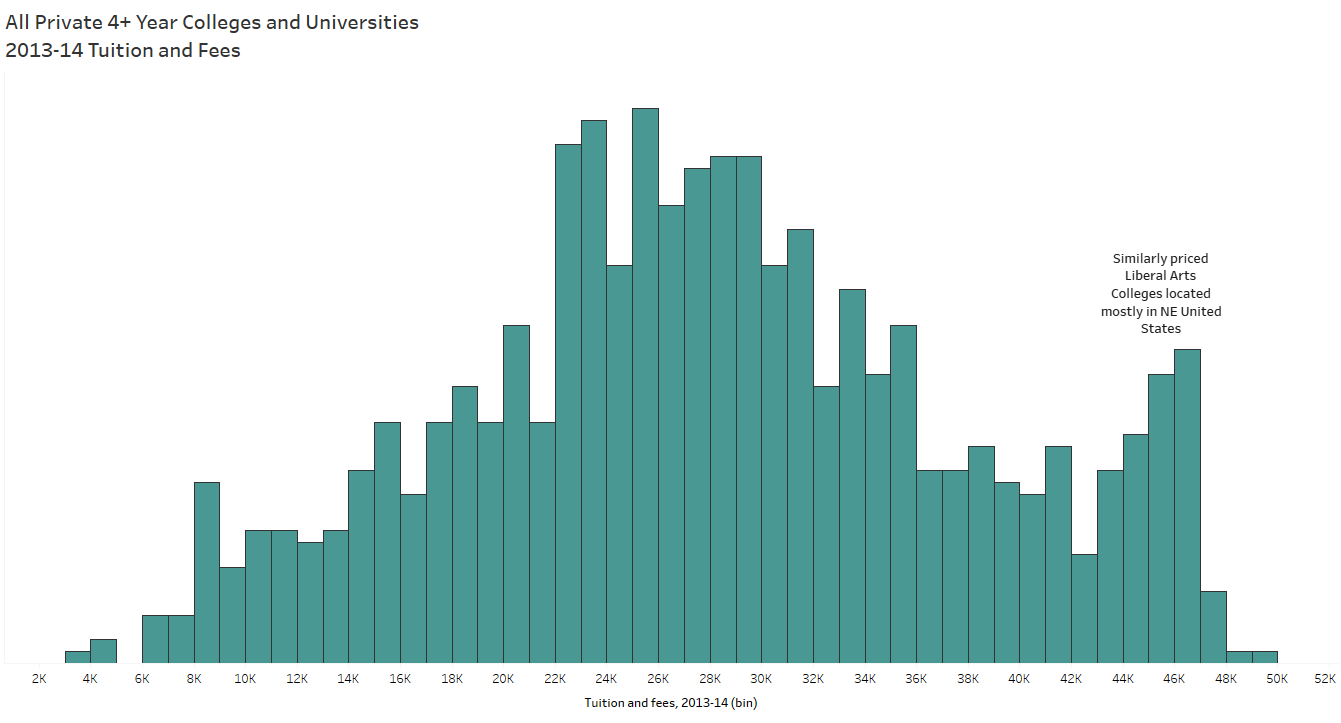
When I investigated the distribution of college tuition, I expected the shape to appear skewed. I did not expect to find the smaller peak in the middle. So I filtered the data by type of college (public or private) and found two almost symmetric distributions of tuition:

public tuition
Tuition for public colleges and universities in 2013

private tuition
Tuition for private colleges and universities in 2013


The existence of the modes in this data makes it difficult to find a typical US college tuition; however, they did point to the existence of two different types of colleges mixed into the same data.

tuition all schools labelled
Notice how different the means and medians of the data subsets (public schools and private schools, separated) are from the mean and median of the entire dataset!

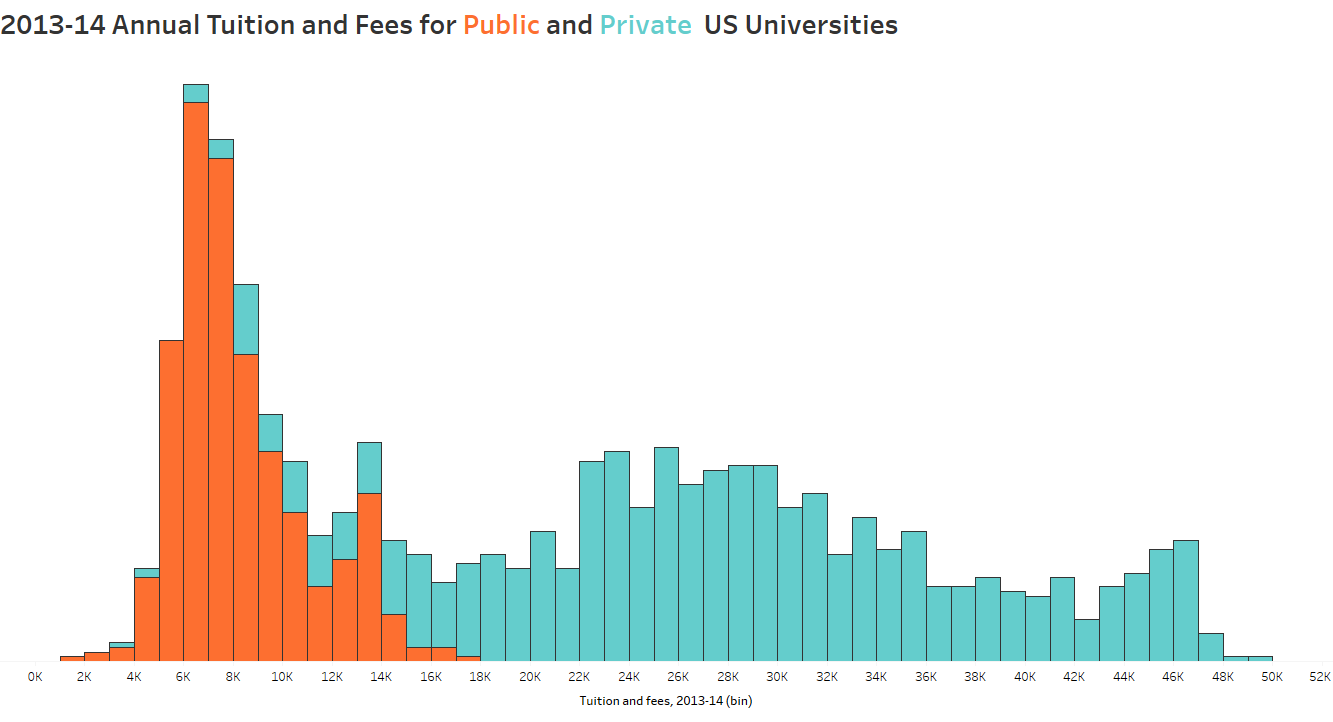
all tuition by color
The shape of the distribution makes a bit more sense to me now

Now I’m not confident that one number would represent the typical college tuition in the U.S., though I can say, “The typical tuition for 4+ year colleges in the US for the 2013-14 school year was about $7,484 for public schools and $27,726 for private schools.”

Oh and did you notice the slight peaks on the right side of both private and public tuition distributions? Me too. Which prompted me to look deeper:

public tuition annotated
Did you know Penn State has 24 campuses? I didn’t!

private tuition annotated
Several Liberal Arts schools in the Northeast are competitively priced between $43K and $47K per year

Measuring what’s Typical

So here’s the thing: Summarizing a set of values for a variable with one numerical description of “center” can help simplify a reporting process and aid in comparisons of large sets of data. However, sometimes finding this measure proves difficult, impossible, or even misleading.

As I suggest to my students, visualizing the distribution of the variable, considering its context and exploring its physical features will add value to your overall analysis and possibly help you find an appropriate measure of typical.

80s
I have no pictures of myself in middle school, so please enjoy this re-creation of the 80s before a Bon Jovi concert.


*Special thank you to Daniel Zvinca for providing feedback for this post with his domain knowledge and extensive industry expertise.

How to Interpret P-values: Webinar Reflection

Big thanks to Eva Murray and Andy Kriebel for inviting me onto their BrightTalk channel for a second time. If you missed it, Stats for Data Visualization Part 2 served up a refresher on p-values:

webinar 2

Since our primary audience tends to be those in data visualization, I used the regression output in Tableau to highlight the p-value in a test for regression towards the end. However, I spent the majority of the webinar discussing p-values in general because the logic of p-values applies broadly to all those tests you may or may not remember from school: t-tests, Chi-Square, z-tests, f-tests, Pearson, Spearman, ANOVA, MANOVA, MANCOVA, etc etc.

I’m dedicating the remainder of this post to some “rules” about statistical tests. If you consider publishing your research, you’ll be required to give more information about your data for researchers to consider your p-value meaningful. In the webinar, I did not dive into the assumptions and conditions necessary for a test for linear regression and it would be careless of me to leave it out of my blog. If you use p-values to drive decisions, please read on.

More about Tests for Linear Regression

Cautions always come with statistical tests – those cautions do not fall solely on the p-value “cut-off” debate.

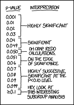
p_values
Note: This cartoon uses sarcasm to poke fun at blindly following p-values.

Do you plan to publish your findings?

To publish your findings in a journal or use your research in a dissertation, the data must meet each condition/assumption before moving forward with the calculations and p-value interpretation, else the p-value is not meaningful.

Each statistical test comes with its own set of conditions and assumptions that justify the use of that test. Tests for Linear Regression have between 5 and 10 assumptions and conditions that must be met (depending on the type of regression and application).

Below I’ve listed a non-exhaustive list of common assumptions/conditions to check before running a test for linear regression (in no particular order).

  1. The independent and dependent variables are continuous variables.
  2. The two variables exhibit a linear relationship – check with scatterplot.
  3. No significant outliers present in the residual plot (AKA points with extremely large residuals) – check with residual plot.
  4. Observations are independent of each other (as in, the existence of one data point does not influence another) – test with Durbin-Watson statistic.
  5. The data shows homoscedasticity (which means the variances remains the same along entire line of best fit) – check the residual plot, then test with Levene’s or Brown-Forsythe’s tests.
  6. Normality – residuals must be approximately normally distributed – check using a histogram, normal probability plot of residuals. (In addition, a dissertation chair may require a Kolmogorov-Smirnov or Shapiro-Wilk test on the dependent and independent variables separately.) As sample size increases, this assumption may not be necessary thanks to the Central Limit Theorem.
  7. There is no correlation between the independent variable(s) and the residuals – check using a correlation matrix or variance inflation factor (VIF).

yo dawg
In other words, these are tests that must be performed in order to perform the test you actually care about.

Note: Check with your publication and/or dissertation chair for complete list of assumptions and conditions for your specific situation.

Can I use p-values only as a sniff test?

Short answer: Yes. But I recommend learning how to interpret them and their limitations. Glancing over the list of assumptions above can give a good indication of how sensitive regression models are to outliers and outside variables. I’d also be hesitant to draw conclusions based on a p-value alone for small datasets.

I highly recommend looking at the residual plot (from webinar 1) to determine if your linear model is a good overall fit, keeping in mind the assumptions above. Here is a guide to creating a residual plot using Tableau.

marky mark

How to Create a Residual Plot in Tableau

In this BrightTalk webinar with Eva Murray and Andy Kriebel, I discussed how to use residual plots to help determine the fit of your linear regression model. Since residuals show the remaining error after the line of best fit is calculated, plotting residuals gives you an overall picture of how well the model fits the data and, ultimately, its ability to predict.

residual 4runner
In the most common residual plots, residuals are plotted against the independent variable.

For simplicity, I hard-coded the residuals in the webinar by first calculating “predicted” values using Tableau’s least-squares regression model. Then, I created another calculated field for “residuals” by subtracting the observed and predicted y-values. Another option would use Tableau’s built in residual exporter. But what if you need a dynamic residual plot without constantly exporting the residuals?

Note: “least-squares regression model” is merely a nerdy way of saying “line of best fit”.

How to create a dynamic residual plot in Tableau

In this post I’ll show you how to create a dynamic residual plot without hard-coding fields or exporting residuals.

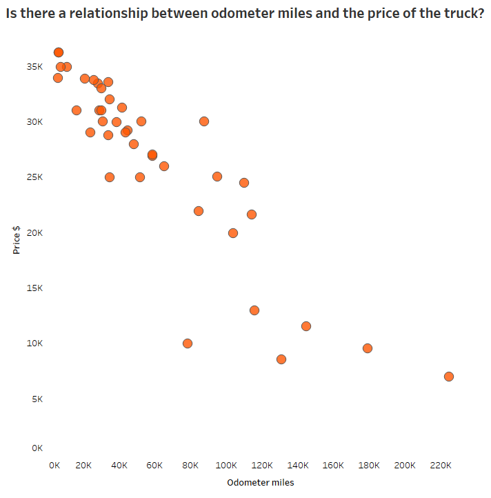
Step 1: Always examine your scatterplot first, observing form, direction, strength and any unusual features.

scatterplot 4Runner

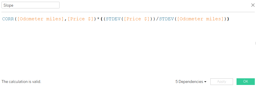
Step 2: Calculated field for slope

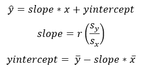
The formula for slope: [correlation] * ([std deviation of y] / [std deviation of x])

  • correlation doesn’t mind which order you enter the variables (x,y) or (y,x)
  • y over x in the calculation because “rise over run”
  • be sure to use the “sample standard deviation”

slope 4runner

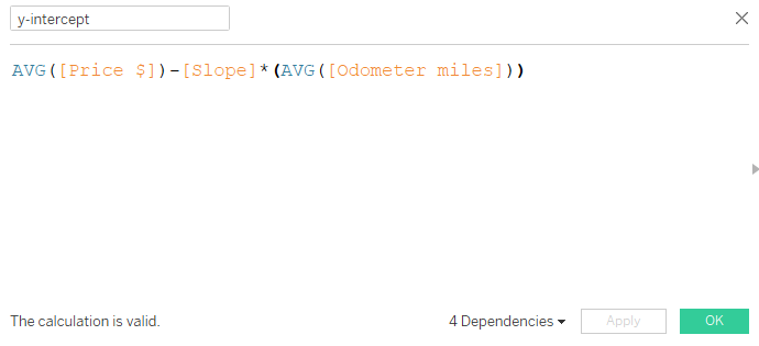
Step 3: Calculated field for y-intercept

The formula for y-intercept: Avg[y variable] – [slope] * Avg[x variable]

y-intercept 4runner

Step 4: Calculated field for predicted dependent variable

The formula for predicted y-variable = {[slope]} * [odometer miles] + {[y-intercept]}

  • Here, we are using the linear equation, y = mx + b where
    • y is the predicted dependent variable (output: predicted price)
    • m is the slope
    • x is the observed independent variable (input: odometer miles)
    • b is the y-intercept
  • Since the slope and y-intercept will not change value for each odometer mile, but we need a new predicted output (y) for each odometer mile input (x), we use a level of detail calculation. Luckily the curly brackets tell Tableau to hold the slope and y-intercept values at their constant level for each odometer mile.

equation 4runner

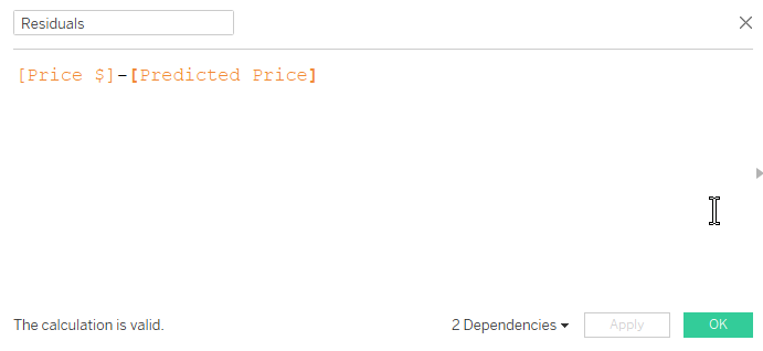
Step 5: Create calculated field for residuals

The formula for residuals: observed y – predicted y

Residual calc

Step 6: Drag the independent variable to columns, residuals to rows

pills 4runber

Step 7: Inspect your residual plot.

Don’t forget to inspect your residual plot for clear patterns, large residuals (possible outliers) and obvious increases or decreases to variation around the center horizontal line. Decide if the model should be used for prediction purposes.

  • The horizontal line in the middle is the least-squares regression line, shown in relation to the observed points.
  • The residual plot makes it easier to see the amount of error in your model by “zooming in” on the liner model and the scatter of the points around/on it.
  • Any obvious pattern observed in the residual plot indicates the linear model is not the best model for the data.

In the plot below, the residuals increase moving left to right. This means the error in predicting 4Runner price gets larger as the number of miles on the odometer increase. And this makes sense because we know more variables are affecting the price of the vehicle, especially as mileage increases. Perhaps this model is not effective in predicting vehicle price above 60K miles on the odometer.

residual 4runner

To recap, here are the basic equations we used above:

equations

For more on residual plots, check out The Minitab Blog.

Webinar Reflection: Stats for Data Visualization Part 1

Thank you to Makeover Monday‘s Eva Murray and Andy Kriebel for allowing me to grace their BrightTALK air waves with my love language of statistics yesterday! If you missed it, check out the recording.

webinar 1

With 180 school days and 5 classes (plus seminar once/week), you can imagine a typical U.S. high school math teacher has the opportunity to instruct/lead between 780 and 930 lectures each year. After 14 years teaching students in Atlanta-area schools (plus those student-teaching hours, and my time as a TA at LSU), I’ve instructed somewhere in the ballpark of 12,000 to 13,500 lessons in my lifetime.

So let’s be honest. Yesterday I was nervous to lead my very first webinar. After all, I depend on my gift of crowd-reading to determine the pace (and the tone) of a presentation. Luckily, I’m an expert at laughing at my own jokes so after the first few slides (and figuring out the delay), I felt comfortable. So Andy and Eva, I am ready for the next webinar on December 20th — Audience, y’all can sign up here.

Fun Fact: In 6th grade I was in the same math class as Andy Kriebel’s sister-in-law. It was also the only year I ever served time in in-school suspension (but remember, correlation doesn’t imply causation).

Webinar Questions and Answers

I was unable to get to all the questions asked on the webinar but rest assured I will do my best to field those here.

  1. Q: Can you provide the dataset? A: Here’s a link to the 4Runner data I used for most of the webinar. Let me know if you’d like any others.
  2. Q: Do you have the data that produced the cartoon in the beginning slide? A: A surprising number of people reproduced the data and the curves from the cartoon within hours of its release. Here is one person’s reproduction in R from this blog post 
  3. Q: Do you have any videos on the basics of statistics? A: YES! My new favorite is Mr. Nystrom on YouTube, we use similar examples and he looks like he loves his job. For others, Google the specific topic along with the words “AP Statistics” for some of the best tutorials out there.
  4. Q: Could you explain about example A with r value -0.17, it seems as 0. A: The picture when r = -.17 is slightly negative — only slightly. This one is very tricky because we tend to think r = 0 if it’s not linear. But remember correlation is on a continuous scale of weak to positive – which means r = -.17 is still really, realAly weak. r = 0 is probably not very likely to be observed in real data unless the data creates a perfect square or circle, for example.
  5. Q: Question for Anna, does she also use Python, R, other stats tools? A: I am learning R! R-studio makes it easier. When I coach doctoral candidates on dissertation defense I use SPSS and Excel; one day I will learn Python. Of course, I am an expert on the TI-84. Stop laughing.TI84

6. Q: So with nonlinear regression [is it] better to put the prediction on the y-axis? A: With linear and nonlinear regression, the variable you want to predict will always be your y-axis (dependent) variable. That variable is always depicted with a y with a caret on top : y hatAnd it’s called “y-hat”

Other Helpful Links

If you haven’t had time to go through Andy’s Visual Vocabulary, take a look at the correlation section.

At the end of the webinar I recommended Bora Beran’s blog for fantastic explanations on Tableau’s modeling features. He has a statistics background and explains the technical in a clear, easy-to-understand format.

Don’t  forget to learn about residual plots if you are using regression to predict.

ice cube quote


How to Maximize Your Jellybeans

Milestone birthday this week.

As you’d imagine, I’ve been introspective. Am I living my best life? If I go out tomorrow, will I have regrets?

Regrets.

If you’ve asked my advice, I’ve recommended the adventure over the status-quo; the challenge over the straight path; the Soup Number 5 over the chicken fingers.  I’ve told you challenges grow you and discomfort makes you stronger. I come from personal experience — I’ve found regrets only inside the comfortable and the “supposed tos”.

My good friend Ericka lost her brother Daniel 5 years ago yesterday in a base-jumping accident. To honor his memory, Ericka posted a video he’d “have others watch for inspiration.”

So watch the video. And afterwards, if you want, you can keep reading this short post. But I won’t be offended if you choose to act on the emotions of the question, “What if you just had one more day? What are you going to do today?”

The day I had regrets.

Thursday, December 3rd 2015 started off with a strange, uncomfortable internal pain – which I chose to ignore. I was married to my schedule and my routine. So I went to the gym, got ready for work, dropped the kids off at their schools, and was at my school by 7:50am. A little voice told me, “Go to the hospital” as I walked into my classroom, but my duty was to my students, to my school, and to my responsibility to everyone else. “I’m sure it’s nothing,” I told my brain.

The pains would come and go every 5 minutes by that time. I taught (or, I tried to teach) my first period pre-calculus class. (I’ll never forget – it was a lesson on the Law of Sines ambiguous case. The “ASS” case. A tricky lesson involving logic, geometry, and effective cursing.) But I hit a point where the pain was so intense I’d have to stop the lesson and sit to take deep breaths. A student suggested I had appendicitis. And I remembered from natural childbirth the indication of real pain was the inability to walk or talk when it hit – and THIS is when I decided to step off that path of expectations of others and ask for help.

A coworker drove me to the hospital and a short while later, I was lying on a stretcher receiving an ultrasound on my abdomen. Stunned techs ran around me loudly relaying their confusion to each other. I’d had enough pain medicine to take the edge off the intensity, but at this point my stomach was beginning to protrude near my belly button and I understood the voices around me were screaming, “Emergency!”

When you think you are on your death bed, or when you’re given terrible news, or when you are in your last moments, I think the thoughts are the same: Have I said and done enough? Do the people I love know how I feel about them? Will my children remember me?

No regrets.

At 40 my regrets are now the words I didn’t say to the people I love.

But few are given a second chance to change how they live their life.

For the record, I had an intussusception – my small intestine telescoped into my large intestine and was sucked further and further until emergency surgery saved my life. It took a while for the doctors to solve my mystery because an intussusception is so rare in adults, especially in females. I was told at first it was most likely caused by colon cancer, though thankfully, the pathology report came back clear a few days later. After a full 6 days in the hospital and 26 staples down my abdomen, I was released into the arms of my loving family.

What if you just had one more day? What are you going to do today?

Rest in peace, Daniel Moore.

For what it’s worth … it’s never too late, or in my case too early, to be whoever you want to be. There’s no time limit. Start whenever you want. You can change or stay the same. There are no rules to this thing. We can make the best or the worst of it. I hope you make the best of it. I hope you see things that startle you. I hope you feel things you never felt before. I hope you meet people who have a different point of view. I hope you live a life you’re proud of, and if you’re not, I hope you have the courage to start all over again.

– F. Scott Fitzgerald, The Curious Case of Benjamin Button

The Analytics PAIN Part 3: How to Interpret P-Values with Linear Regression

You may find Part 1 and Part 2 interesting before heading into part 3, below.

p-value-statistics-meme

Interpreting Statistical Output and P-Values

To recap, you own Pearson’s Pizza and you’ve hired your nephew Lloyd to run the establishment. And since Lloyd is not much of a math whiz, you’ve decided to help him learn some statistics based on pizza prices.

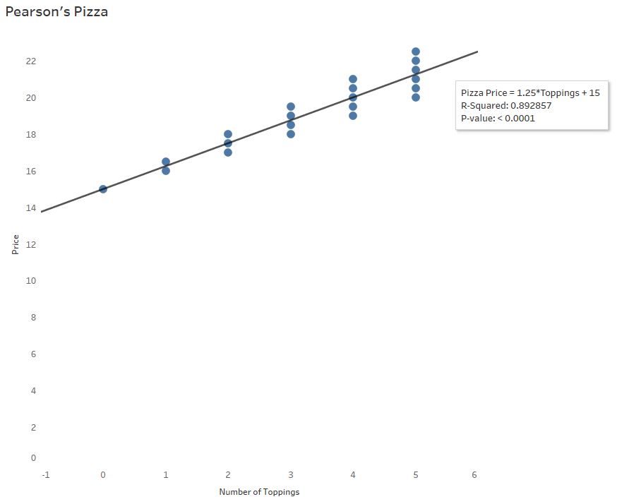
When we left off, you and Lloyd realized that, despite a strong correlation and high R-Squared value, the residual plot suggests that predicting pizza prices from toppings will become less and less accurate as the number of toppings increase:

Shiny Residual Plot 2
A clear, distinct pattern in a residual plot is a red flag

Looking back at the original scatterplot and software output, Lloyd protests, “But the p-value is significant. It’s less than 0.0001.”

hold my beer
watch this


pizza4
The original software output. What does it all mean?


Doesn’t a small p-value imply that our model is a go?

freddie

A crash course on hypothesis testing

In Pearson Pizza’s back room, you’ve got two pool tables and a couple of slot machines (which may or may not be legal). One day, a tall, serious man saunters in, slaps down 100 quid and challenges (in an British accent), “My name is Ronnie O’Sullivan. That’s right. THE. Ronnie O’Sullivan.”

You throw the name into the Google and find out the world’s best snooker player just challenged you to a game of pool.

Then something interesting happens. YOU win.

Suddenly, you wonder, is this guy really who he says he is?

Because the likelihood of you winning this pool challenge to THE Ronnie O’Sullivan is slim to none IF he is, indeed, THE Ronnie O’Sullivan (the world’s best snooker player).

Beating this guy is SIGNIFICANT in that it challenges the claim that he is who he claims he is:

You aren’t SUPPOSED to beat THE Ronnie O’Sullivan – you can’t even beat Lloyd.

But you did beat this guy, whoever he claims to be.

So, in the end, you decide this man was an impostor, NOT Ronnie O’Sullivan.

In this scenario:

The claim (or “null hypothesis”): “This man is Ronnie O’Sullivan” you have no reason to question him – you’ve never even heard of snooker

The alternative claim (or “alternative hypothesis”): “This man is NOT Ronnie O’Sullivan”

The p-value: The likelihood you beat the world’s best snooker player assuming he is, in fact, the real Ronnie O’Sullivan.

Therefore, the p-value is the likelihood an observed outcome (at least as extreme) would occur if the claim were true. A small p-value can cast doubt on the legitimacy of the claim – chances you could beat Ronnie O’Sullivan in a game of pool are slim to none so it is MORE likely he is not Ronnie O’Sullivan. Still puzzled? Here’s a clever video explanation.

Some mathy stuff to consider

The intention of this post is to tie the meaning of this p-value to your decision, in the simplest terms I can find. I am leaving out a great deal of theory behind the sampling distribution of the regression coefficients – but I would be happy to explain it offline. What you do need to understand, however, is your data set is just a sample, a subset, from an unknown population. The p-value output is based on your observed sample statistics in this one particular sample while the variation is tied to a distribution of all possible samples of the same size (a theoretical model). Another sample would indeed produce a different outcome, and therefore a different p-value.
The hypothesis our software is testing

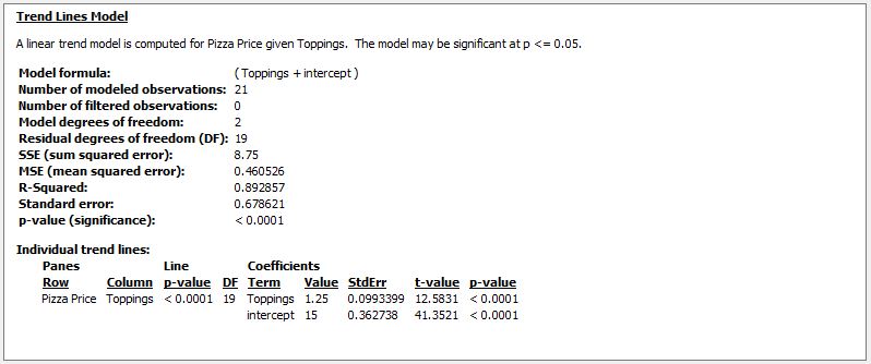
The output below gives a great deal of insight into the regression model used on the pizza data. The statistic du jour for the linear model is the p-value you always see in a Tableau regression output: The p-value testing the SLOPE of the line.

Therefore, a significant or insignificant p-value is tied to the SLOPE of your model.

Recall, the slope of the line tells you how much the pizza price changes for every topping ordered. Slope is a reflection of the relationship of the variables you’re studying. Before you continue reading, you explain to Lloyd that a slope of 0 means, “There is no relationship/association between the number of toppings and the price of the pizza.”

Tableau Regression Output

Zoom into that last little portion – and look at the numbers in red below:

Panes Line Coefficients
Row Column p-value DF Term Value StdErr t-value p-value
Pizza Price
Toppings
< 0.0001
19
Toppings
1.25
0.0993399
12.5831
< 0.0001
intercept
15
0.362738
41.3521
< 0.0001

In this scenario:

The claim: “There is no association between number of toppings ordered and the price of the pizza.” Or, the slope is zero (0).

The alternative claim: “There is an association between the number of toppings ordered and the price of the pizza.” In this case, the slope is not zero.* 

The p-value = Assuming there is no relationship between number of toppings and price of pizza, the likelihood of obtaining a slope of  at least $1.25 per topping is less than .01%.

The p-value is very small** — A slope of at least $1.25 would happen only .01% of the time just by chance. This small p-value means you have evidence of a relationship between number of toppings and the price of a pizza.

What the P-Value is NOT

  • The p-value is not the probability the null hypothesis is false – it is not the likelihood of a relationship between number of toppings and the price of pizza.
  • The p-value is not evidence we have a good linear model – remember, it’s only testing a relationship between the two variables (slope) based on one sample.
  • A high p-value does not necessarily mean there is no relationship between pizza price and number of toppings – when dealing in samples, chance variability (differences) and bias is present, leading to erroneous conclusions.
  • A statistically significant p-value does not necessarily mean the slope of the population data is not 0 – see the last bullet point. By chance, your sample data may be “off” from the full population data.

The P-Value is Not a Green Light

archer

The p-value here gives evidence of a relationship between the number of toppings ordered and the price of the pizza – which was already determined in part 1. (If you want to get technical, the correlation coefficient R is used in the formula to calculate slope.)

Applying a regression line for prediction requires the examination of all parts of the model. The p-value given merely reflects a significant slope — recall there is additional error (residuals) to consider and outside variables acting on one or both of the variables.

Ultimately, Pearson’s Pizza CAN apply the linear model to predict pizza prices from number of toppings. But only within reason. You decide not to predict for pizza prices when more than 5 toppings are chosen because, based on the residual plot, the prediction error is too great and the variation may ultimately hurt long-term budget predictions.

In a real business use case, the p-value, R-Squared, and residual plots can only aid in logical decision-making. Lloyd now realizes, thanks to your expertise, that using data output just to say he’s “data-driven” without proper attention to detail and common sense is unwise.

Statistical methods can be powerful tools for uncovering significant conclusions; however, with great power comes great responsibility.

p_values
Note: This cartoon uses sarcasm to poke fun at blindly following p-values.

—Anna Foard is a Business Development Consultant at Velocity Group


*Note this is an automatic 2-tailed test. Technically it is testing for a slope at least $1.25 AND at most -$1.25. For a 1-tailed test (looking only for greater than $1.25, for example) divide the p-value output by 2. For more information on the t-value, df, and standard error I’ve included additional notes and links at the bottom of this post.

**How small is small? Depends on the nature of what you are testing and your tolerance for “false negatives” or “false positives”. It is generally accepted practice in social sciences to consider a p-value small if it is under 0.05, meaning an observation at least as extreme would occur 5% of the time by chance if the claim were true. 

More information on t-value, df:

For those curious about the t-value, this statistic is also called the “critical value” or “test statistic”. This value is like a z-score, but relies on the Student’s t-distribution. In other words, the t-value is a standardized value indicating how far a slope of “1.25” will fall from the hypothesized mean of 0, taking into account sample size and variation (standard error).

In t-tests for regression, degrees of freedom (df) is calculated by subtracting the number of parameters being estimated from the sample size. In this example, there are 21 – 2 degrees of freedom because we started with 21 independent points, and there are two parameters to estimate, slope and y-intercept. 

Degrees of freedom (df) represents the amount of independent information available. For this example, n = 21 because we had 21 pieces of independent information. But since we used one piece of information to calculate slope and another to calculate the y-intercept, there are now n – 2 or 19 pieces of information left to calculate the variation in the model, and therefore the appropriate t-value.